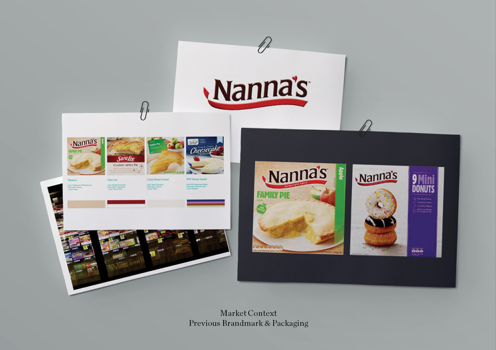
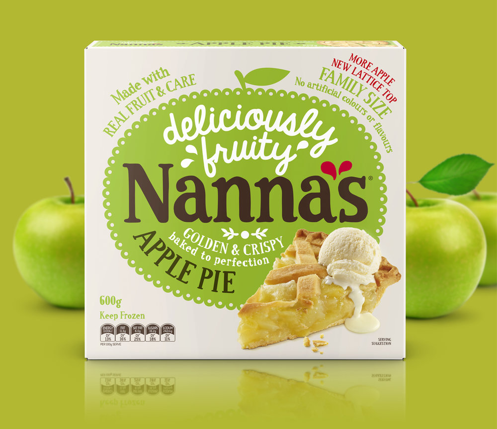
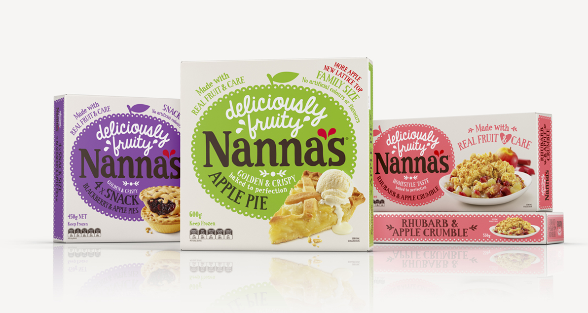
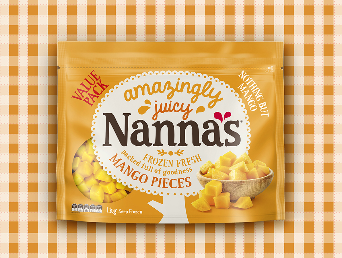
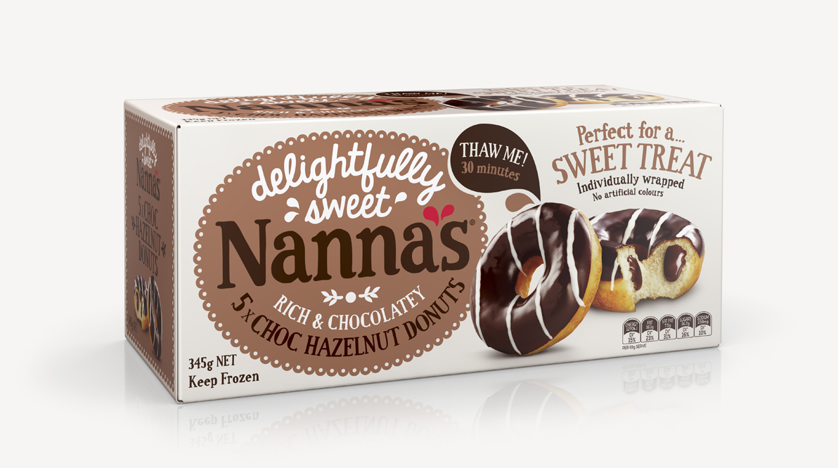
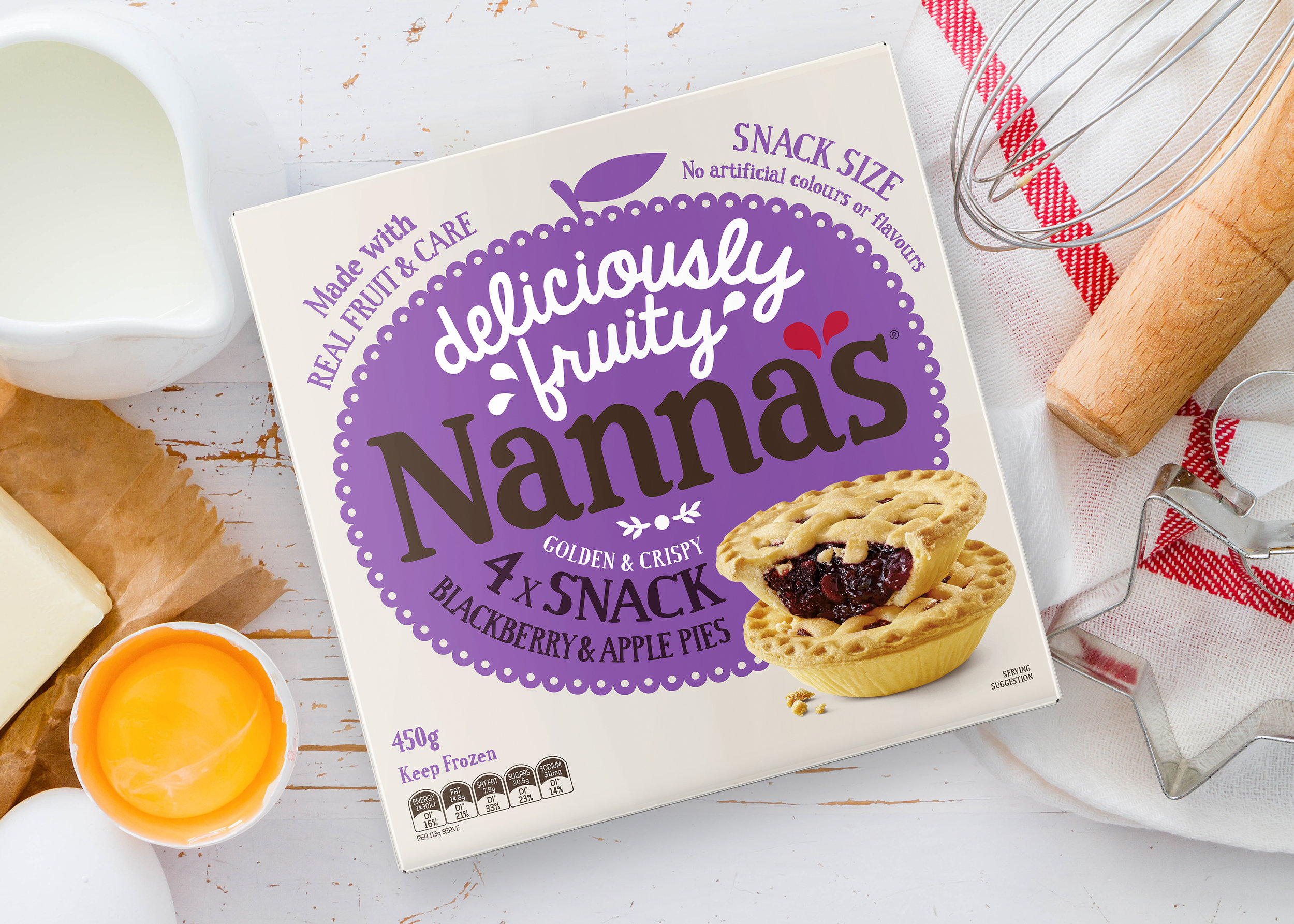
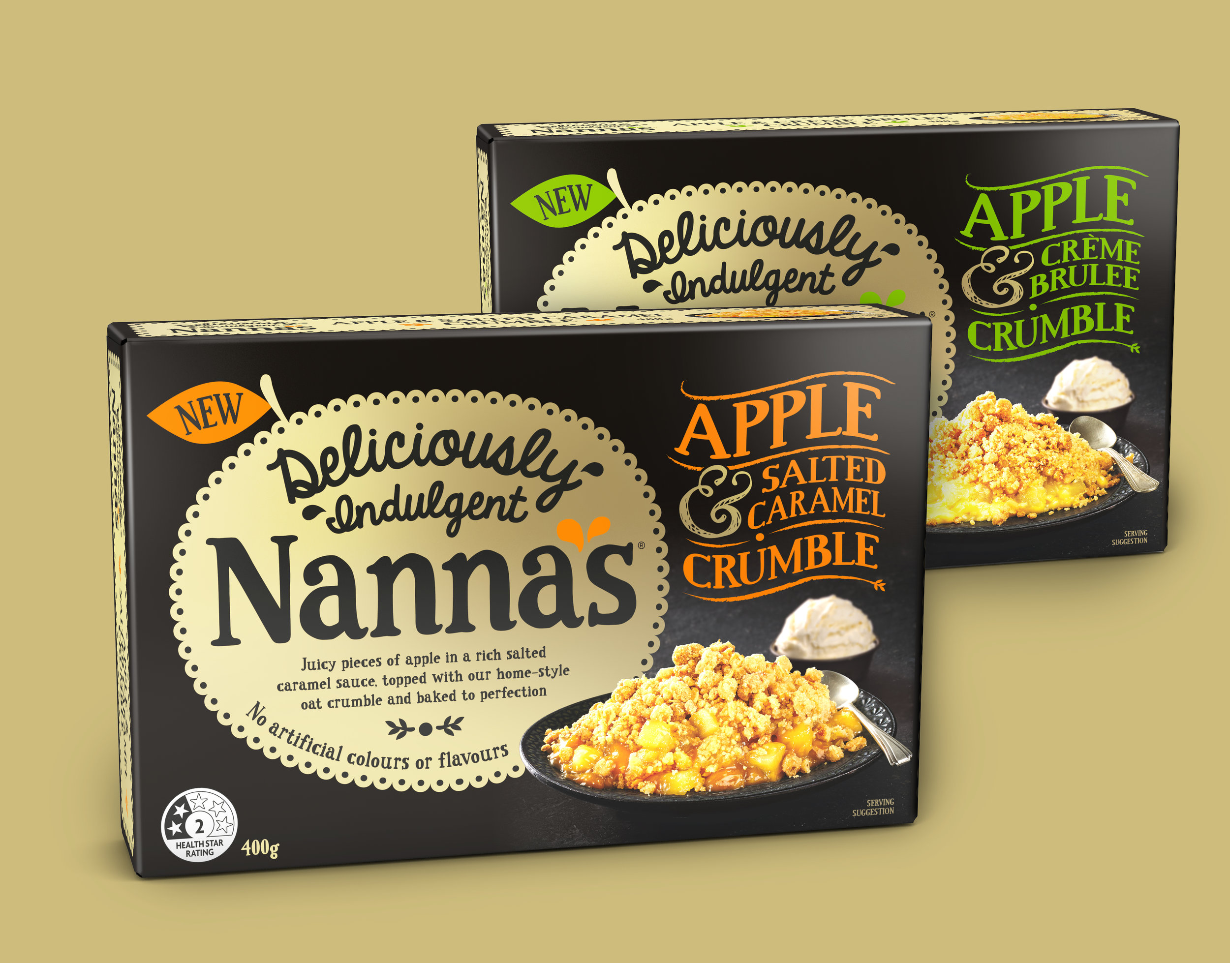
I, for one, did not get enough pie last week during Thanksgiving and am still craving it. Unfortunately, to get a good pie one usually has to bake it themselves. I’m a little jealous of Australian brand Nanna’s because their frozen pies actually look like they could be pretty good, but unless I manage to go Down Under, I can’t say for sure. For now, I can only drool over the lovely packaging, rebrand, and typography done by Brand Society for this Australian supermarket staple.
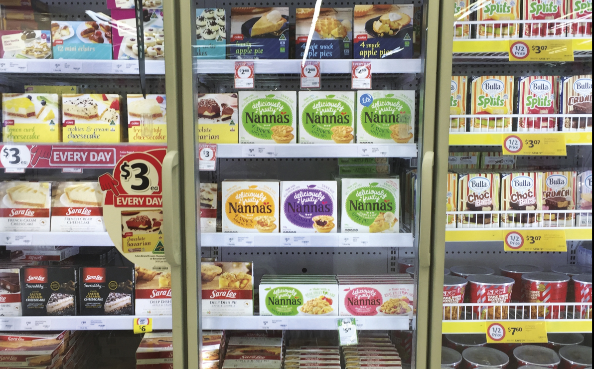
Brand Society did a great job of taking the Nanna’s brand from drab and homely to whimsical, warm, and nostalgic. I love the versatility of the doily graphic across the packaging system and how it easily integrates into the different types of products. It’s a smart use of a shape that most people associate with dusty old dark wood tables, and the use of it as a solid swatch of bright color really draws the eyes in, especially in a crowded supermarket freezer shelf (see last picture below). Additionally, I love the personable touch that the typography adds. I don’t think its hand-lettered due to the consistency across the same characters; if I had anything to change about this project it would be to make it feel more hand-done by changing up the typography a bit, but across a large system like this, it’s understandable why they opted for a font instead.
Branding and Packaging by Brand Society.