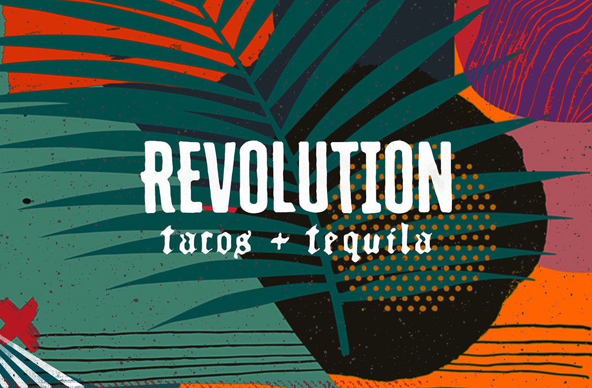
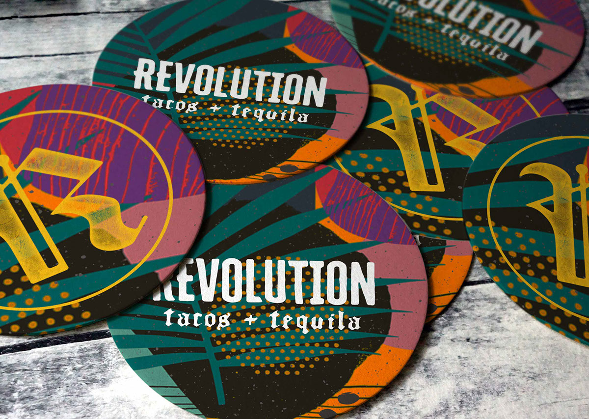
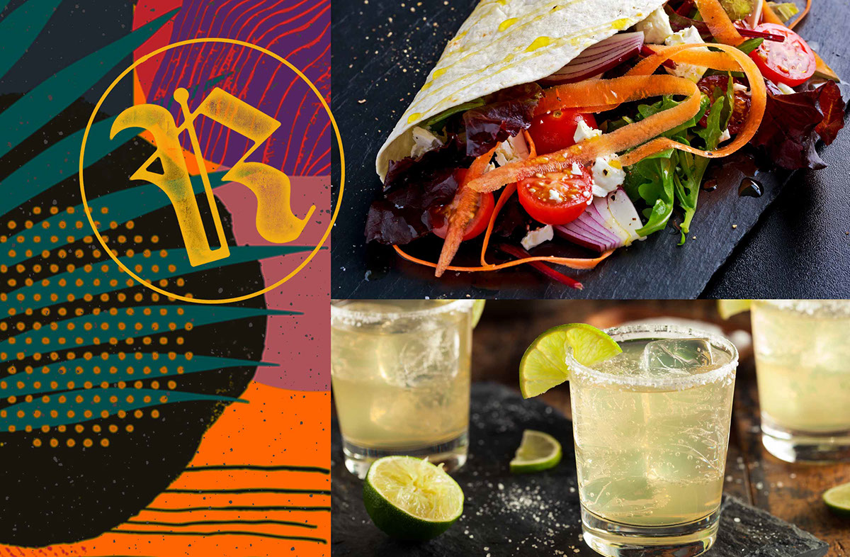
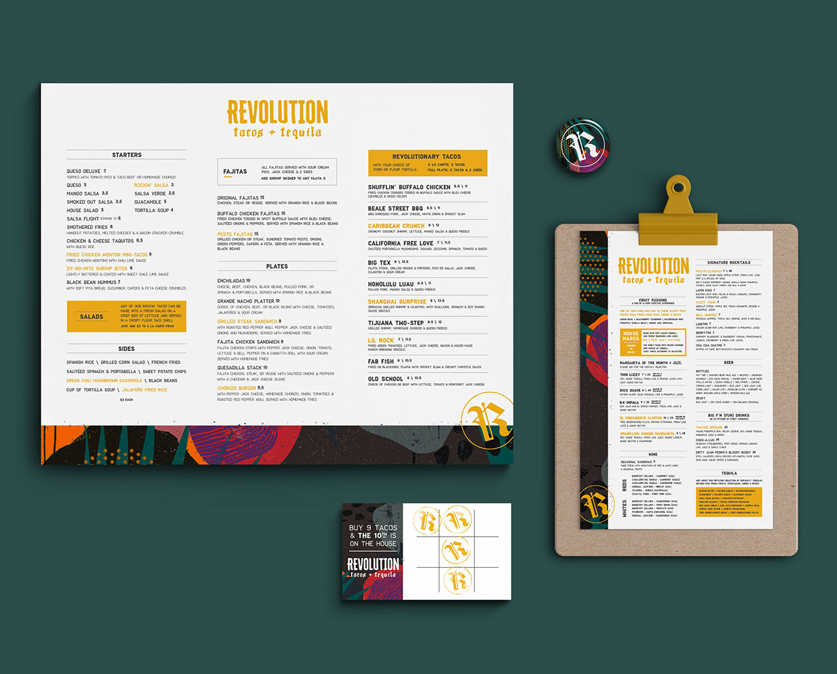
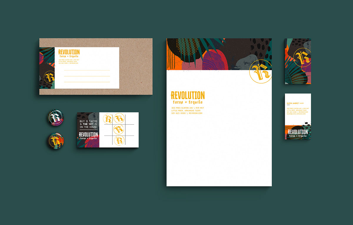
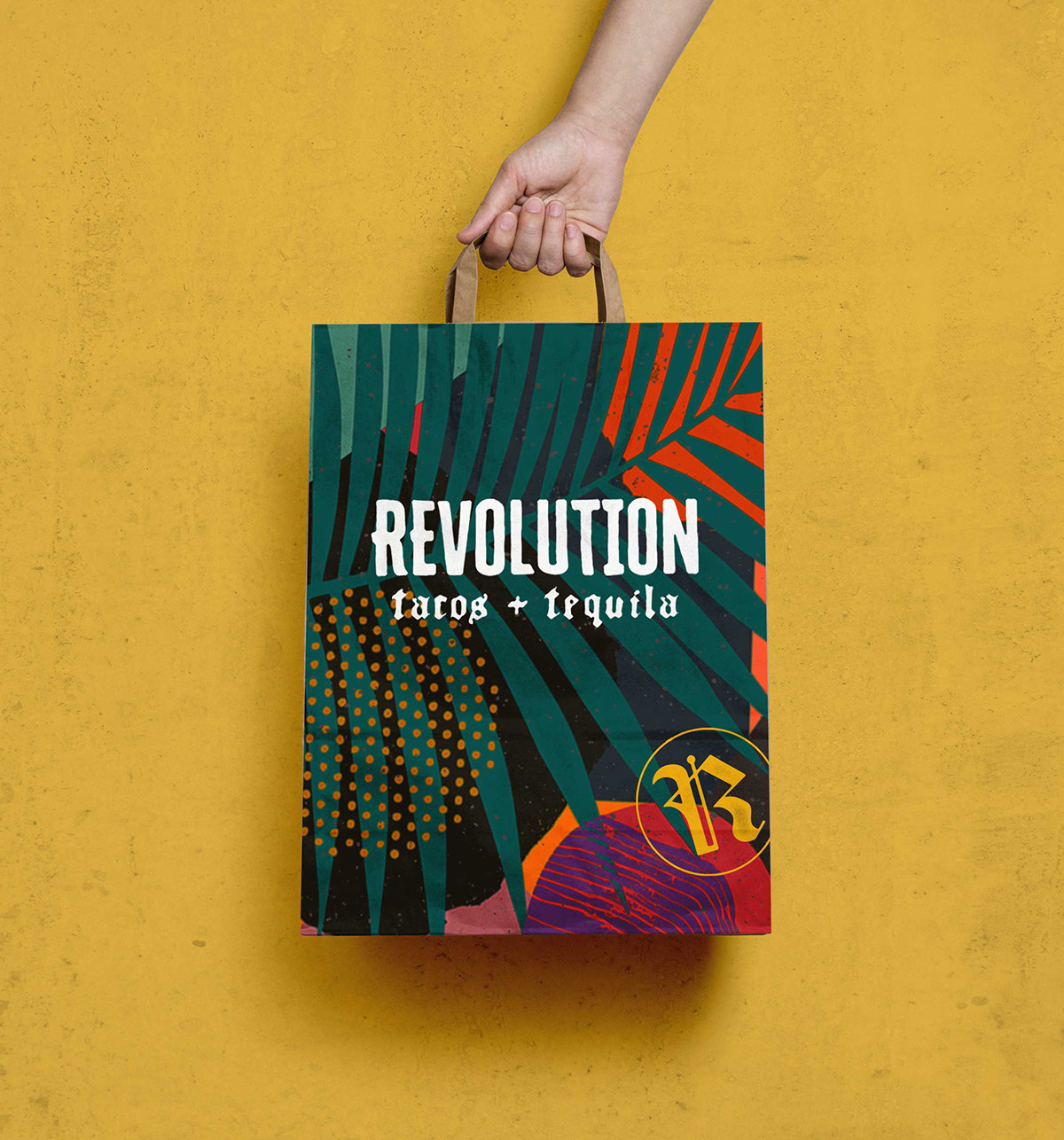
It’s Taco Tuesday y’all! What better way to celebrate than to feature a taco restaurant? Take in the lush sophisticated jungle vibes of Revolution Tacos & Tequila. Located in the River Market District of downtown Little Rock, this rebrand (done by Elizabeth Kilgore) comes ten years after the restaurant’s opening, as a response to the expanding food scene in Little Rock. This new look was meant to reposition Revolution as an upscale but not snooty place to get your taco fix, representing the fresh and vibrant flavors of the food and atmosphere in the prominent brand pattern.
Overall, I’m really digging the handmade quality to the logo and the pattern, as well as the rich colors. Using a sliver of the pattern on the printed menu and loyalty card draws the eye in because of the sharp contrast, and the use of the bright yellow directs you exactly where to look. I especially like the places where the pattern breaks and crosses the crisp white divide, like on the back of the business cards. The clean gridded layout of the typography also contrasts nicely with the texture of the pattern.
Branding and design by Elizabeth Kilgore.
