Ultra Violet.
Pulled from the Pantone website, here’s what they have to say behind their choice this year:
Complex and contemplative, Ultra Violet suggests the mysteries of the cosmos, the intrigue of what lies ahead, and the discoveries beyond where we are now. The vast and limitless night sky is symbolic of what is possible and continues to inspire the desire to pursue a world beyond our own.
Enigmatic purples have also long been symbolic of counterculture, unconventionality, and artistic brilliance. Musical icons Prince, David Bowie, and Jimi Hendrix brought shades of Ultra Violet to the forefront of western pop culture as personal expressions of individuality. Nuanced and full of emotion, the depth of PANTONE 18-3838 Ultra Violet symbolizes experimentation and non-conformity, spurring individuals to imagine their unique mark on the world, and push boundaries through creative outlets.
As you may or may not now, Grits & Grids is operated by the team at Vigor, and we proudly don a purple as our main color. Needless to say, we love the new choice for 2018, even if Pantone’s reasoning behind it is a little heady.
However, purple is not a color you often see in restaurant and beverage branding. Purple isn’t a color that occurs naturally in food often, so any brand that takes cues from its ingredients is likely to not include purple. Additionally, the foods that do include purple (eggplants, cabbage, and red onions to name a few) tend to fall into the ‘hate-it-or-love-it’ category. Some researchers also claim that purples and blues suppress hunger, possibly stemming from the time our ancestors were hunters and gatherers and those colors signified something poisonous.
So, in knowing the kind of trends that the new color of the year usually sets off, how do you think this is going to affect the world of restaurant and beverage branding? I, personally, think it’s going to do to the food industry what purple has done and continues to do for Taco Bell.
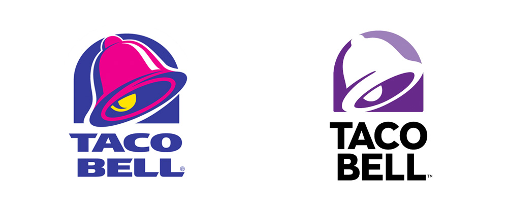
 Taco Bell, before their 2016 rebrand, was arguably one of the most recognizable brands in the fast food landscape. No other chain boasted the vibrancy and contrast of their color palette, and it made them stand out from the competition, along with their insane menu items of course. When they rebranded in 2016, the one color they kept (albeit altered) was the purple. You could joke about how the purple is warning you about the harm you’re about to cause to your digestive tract by having a quesarito (a burrito wrapped in a quesadilla, you pleab), but the purple really captures Taco Bell’s boldness. From their crazy menu items to their brand personality and marketing ploys, purple is Taco Bell.
This purple symbolizes nonconformity, boldness and is a celebration of uniqueness. In an industry where a lot of brands are only doing things slightly different from their competitors, I hope the spirit of this purple makes its way into our industry.


