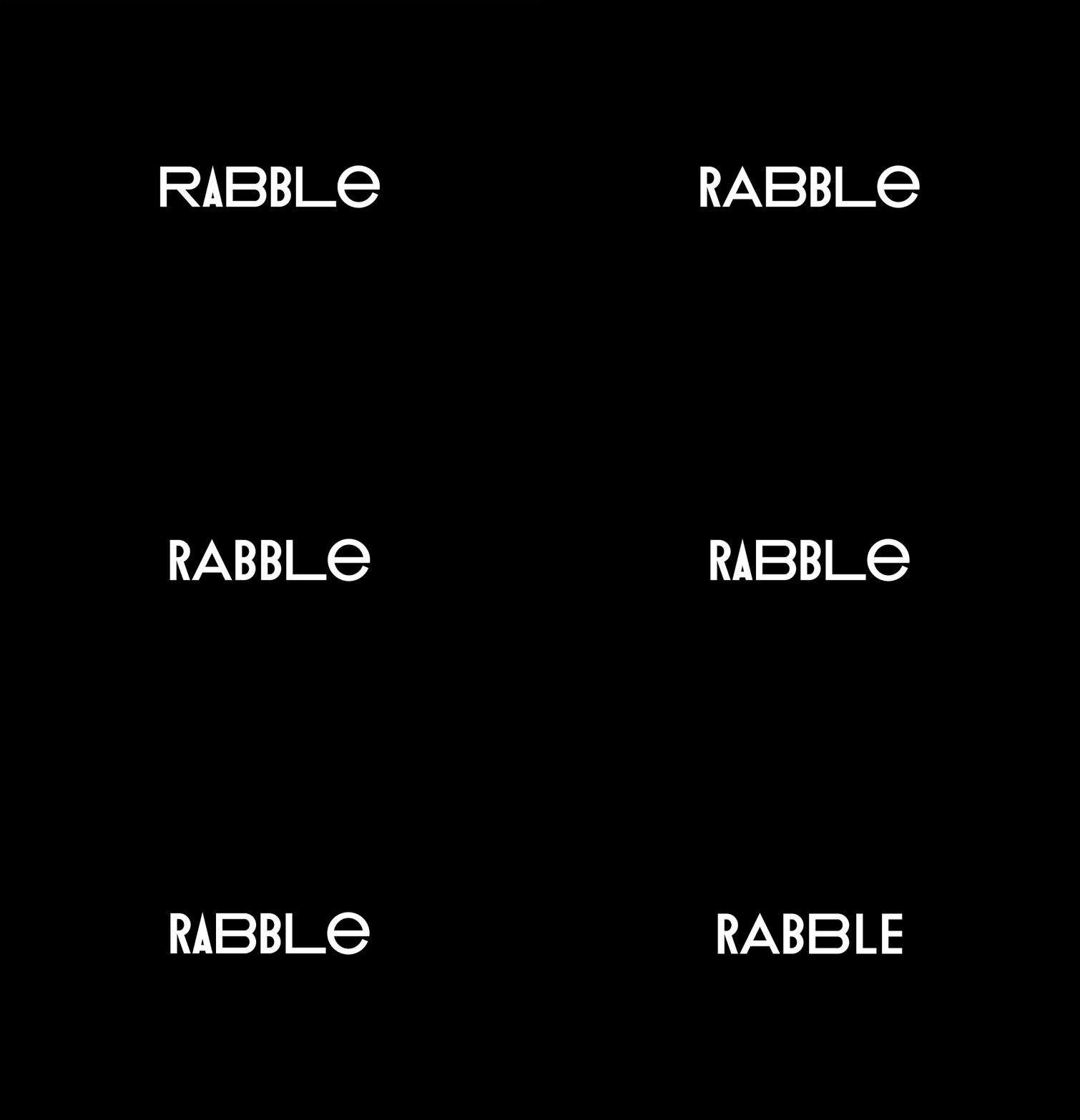
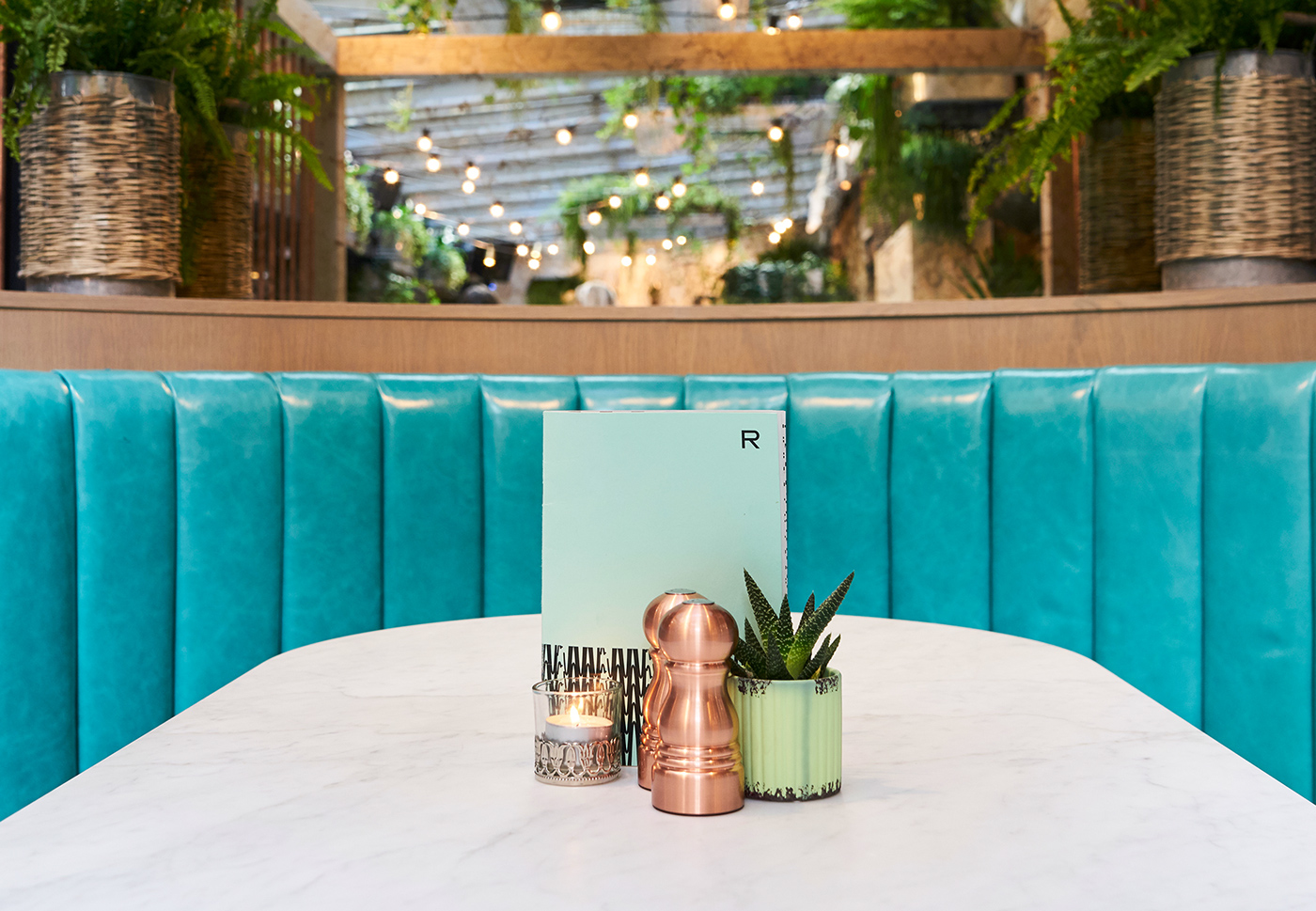
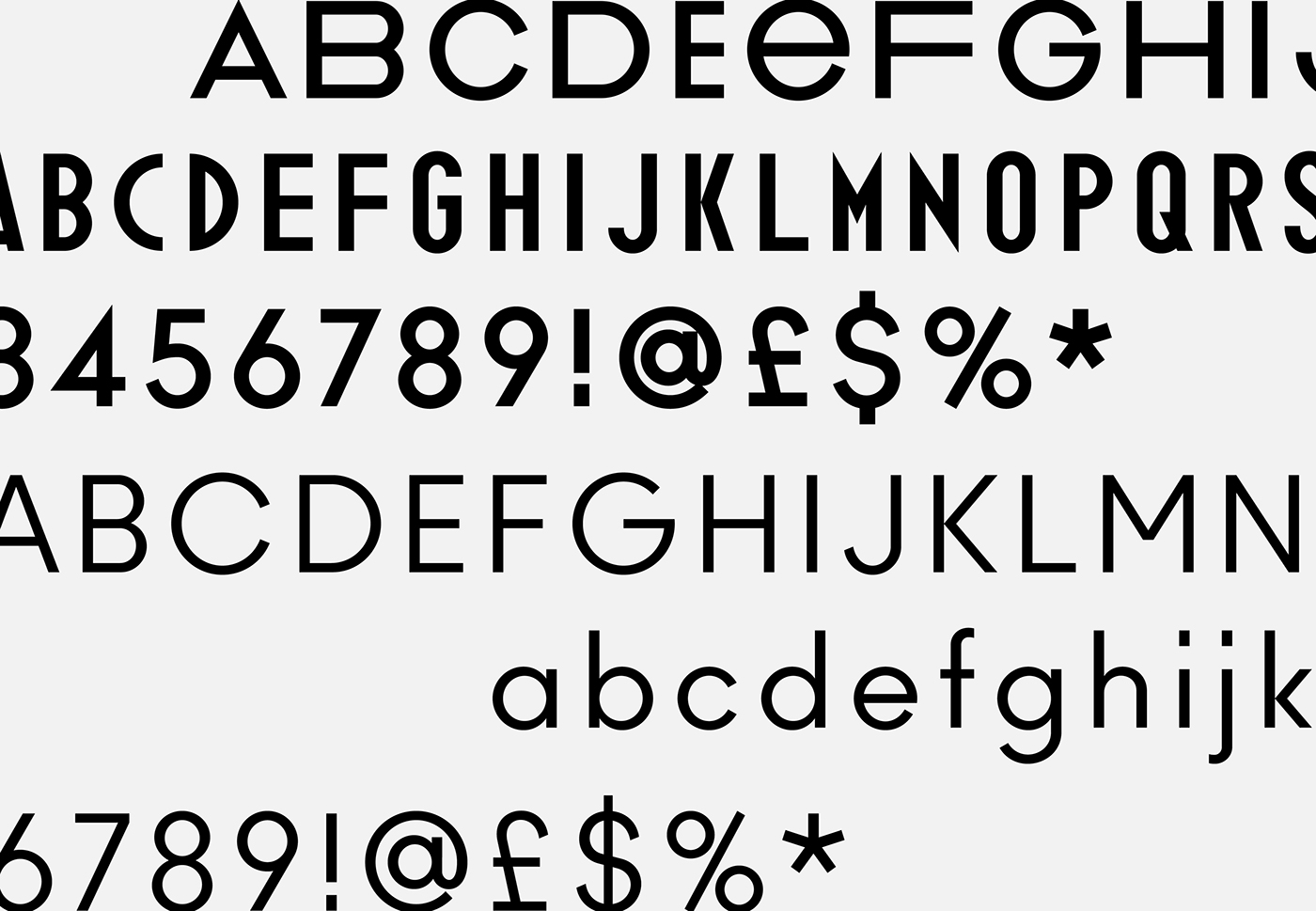
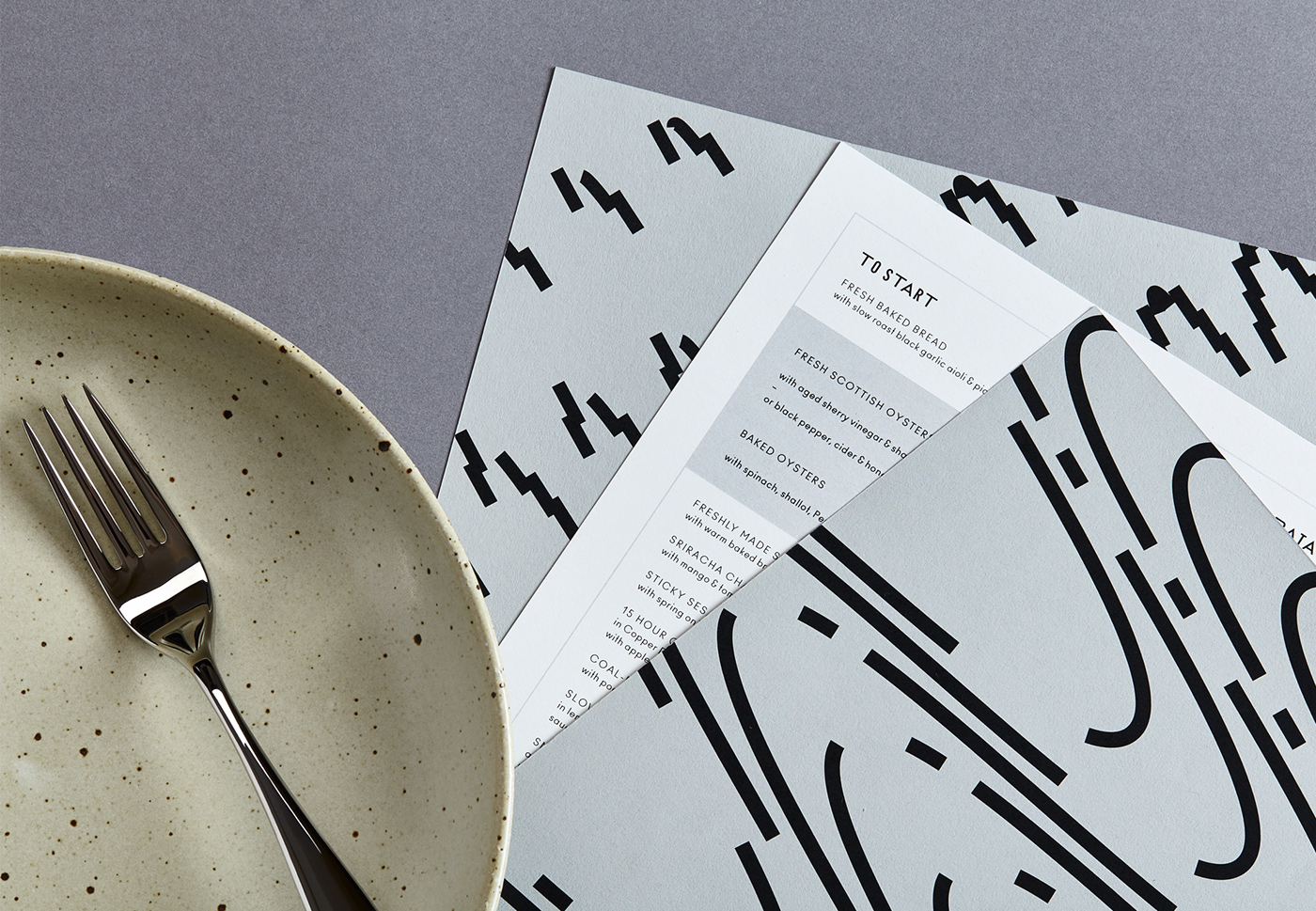
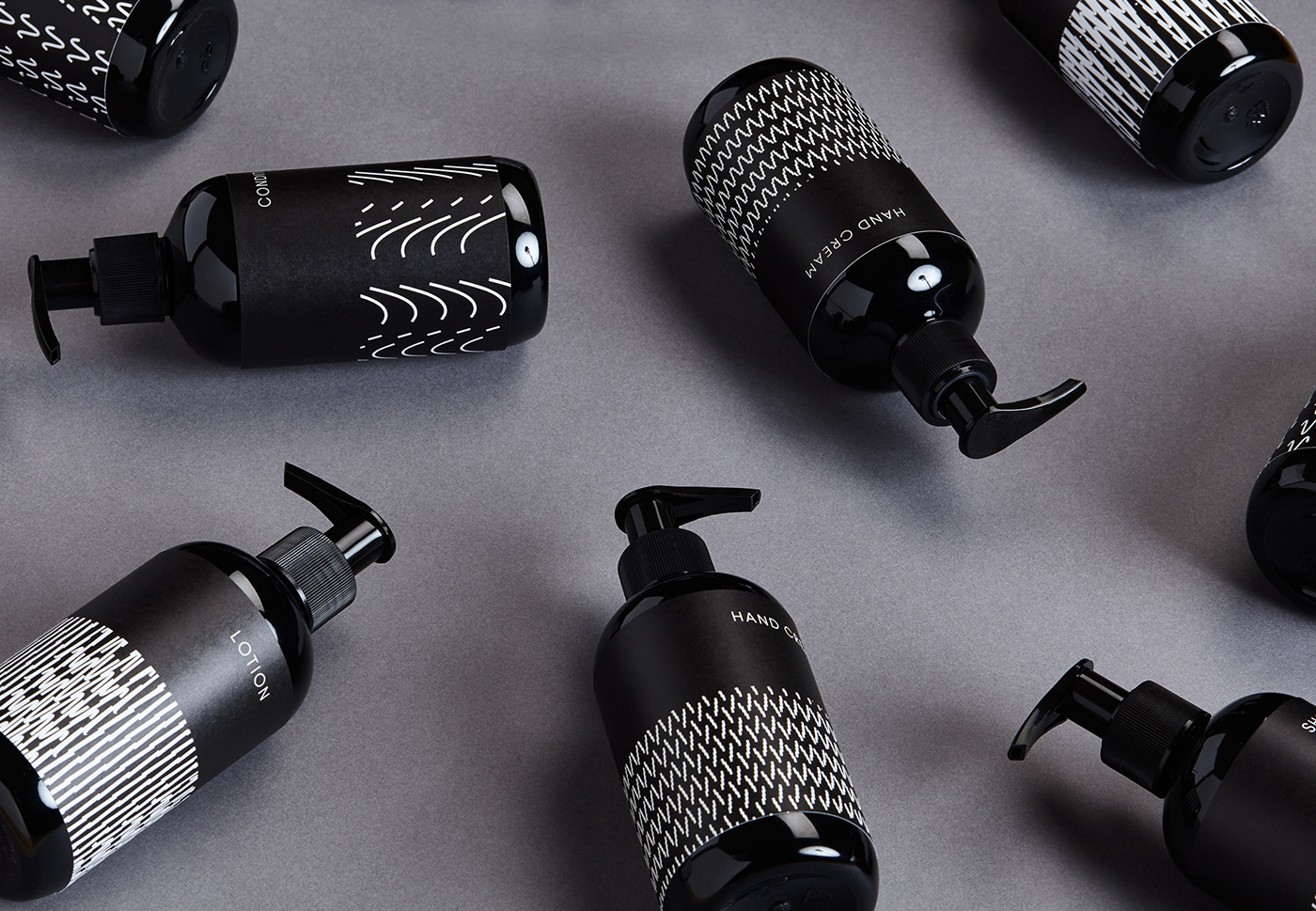
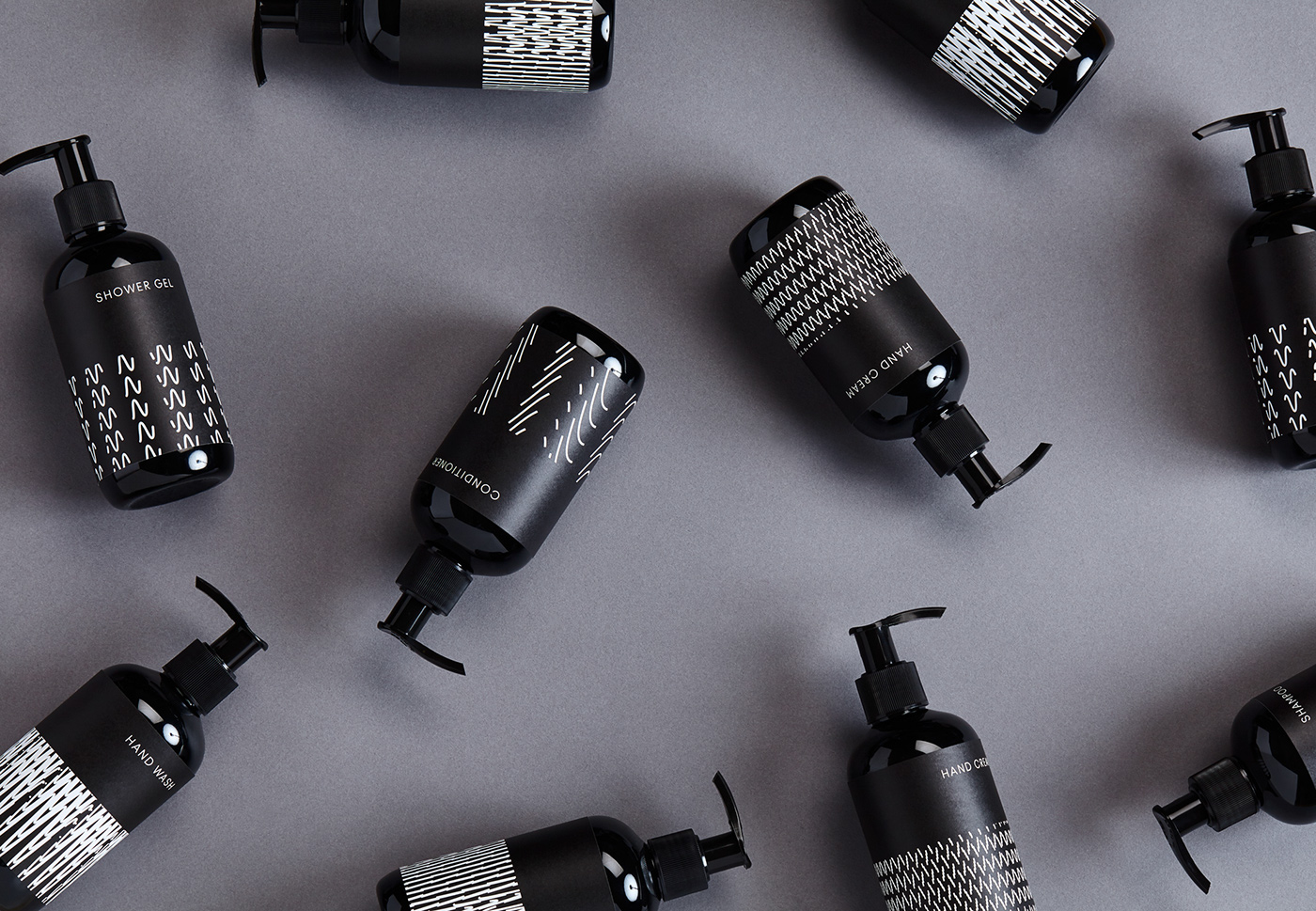
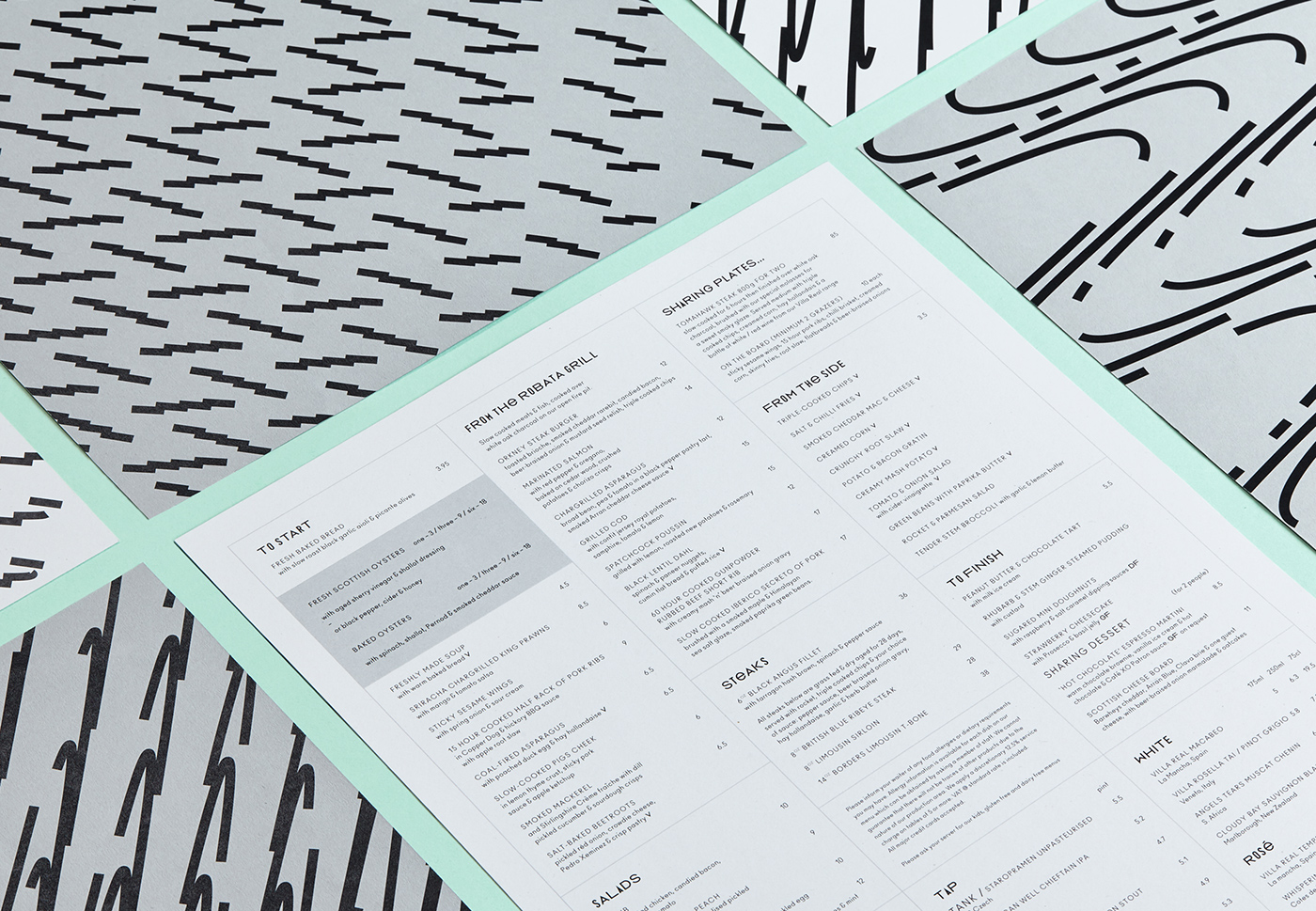
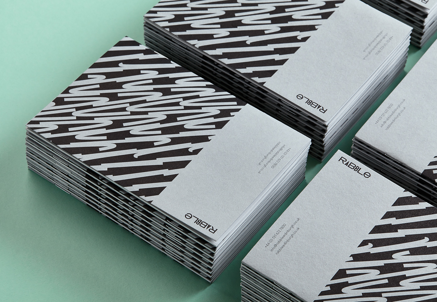
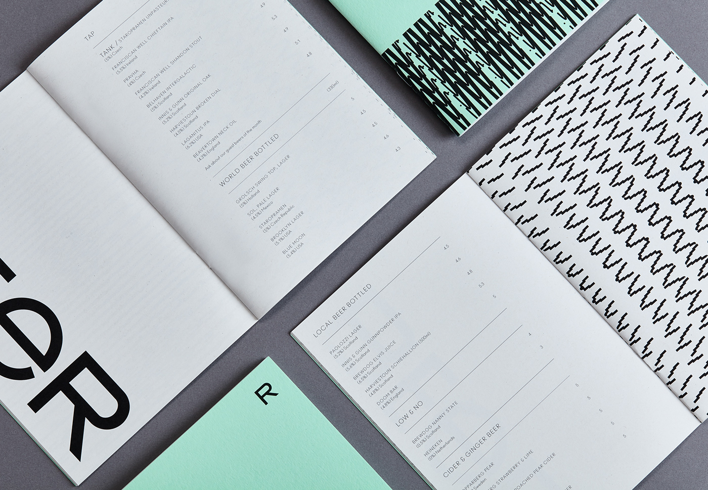
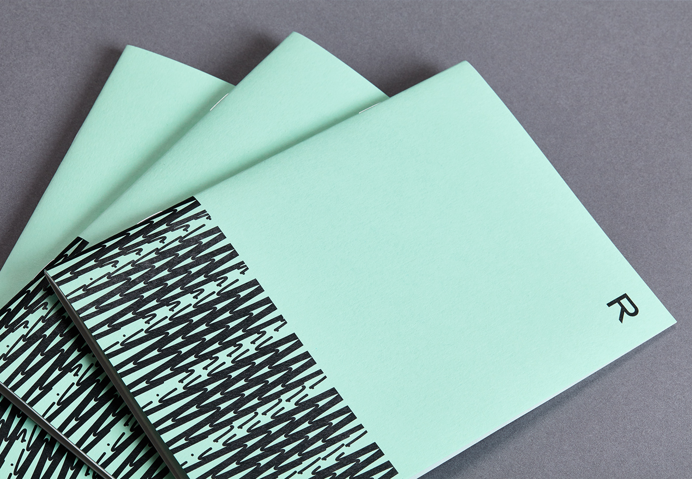
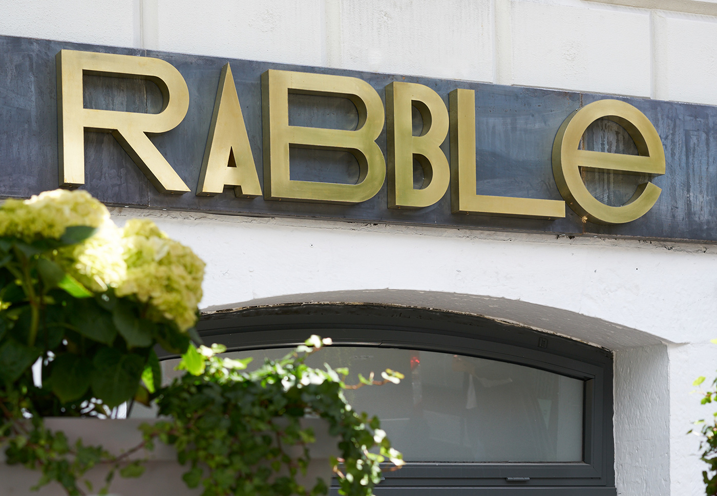
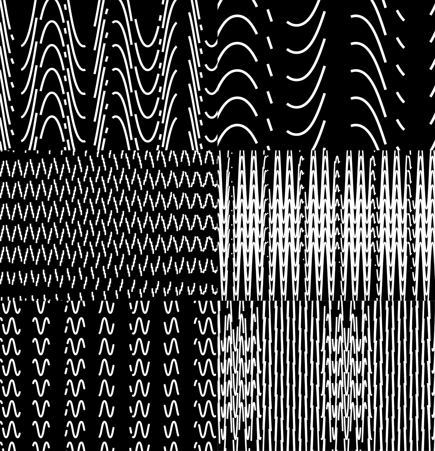
Here’s another post featuring the work of Touch Agency in Edinburgh. Last week we showed their colorful Pizzaluxe brand and here we are again showing Touch’s gif logos and bold use of color. This brand is a little more zipped up than Pizzaluxe, displaying copper and brass materials and this sea-green color with striking black and white graphics. I believe they also created a new font for this restaurant to use. Rabble likes to stretch and squeeze their typography and graphics throughout the brand, across their menus, notebooks, and packaging, including their in-house cosmetics.
I think this branding is really elegant and pushes the norm. I believe it will stand the test of time and still be relevant 10-20 years down the road. Maybe that’s just hopeful thinking.

SaveSave


