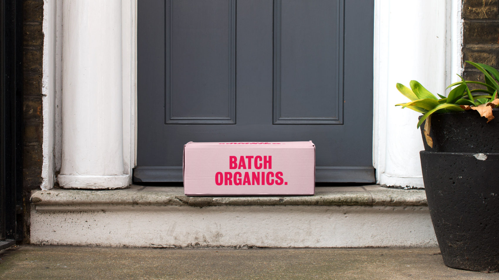
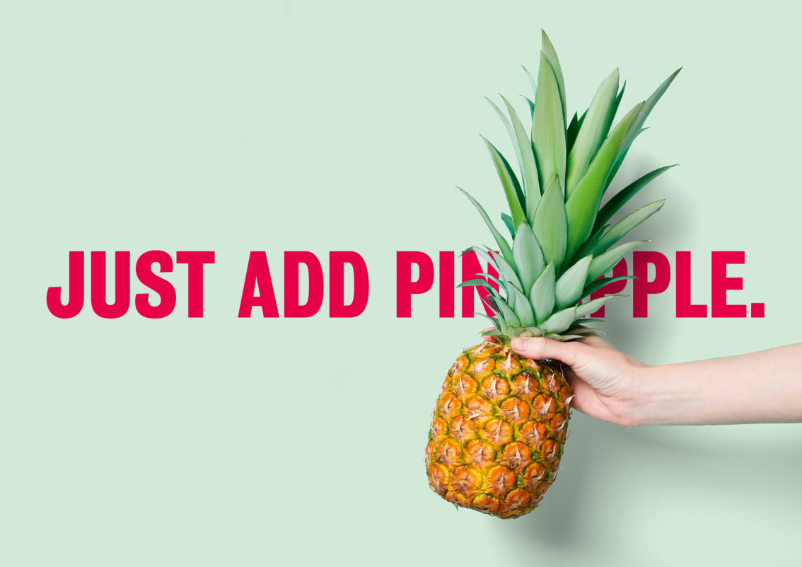
This one is for all you folks that are having trouble sticking to your new year’s resolution; hopefully this punchy health-food brand inspires you to get back on track.
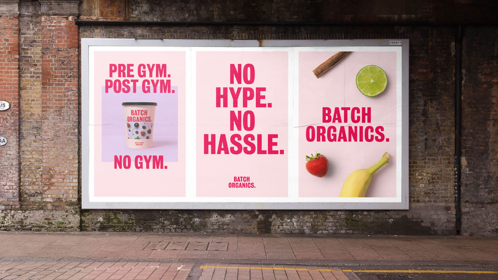
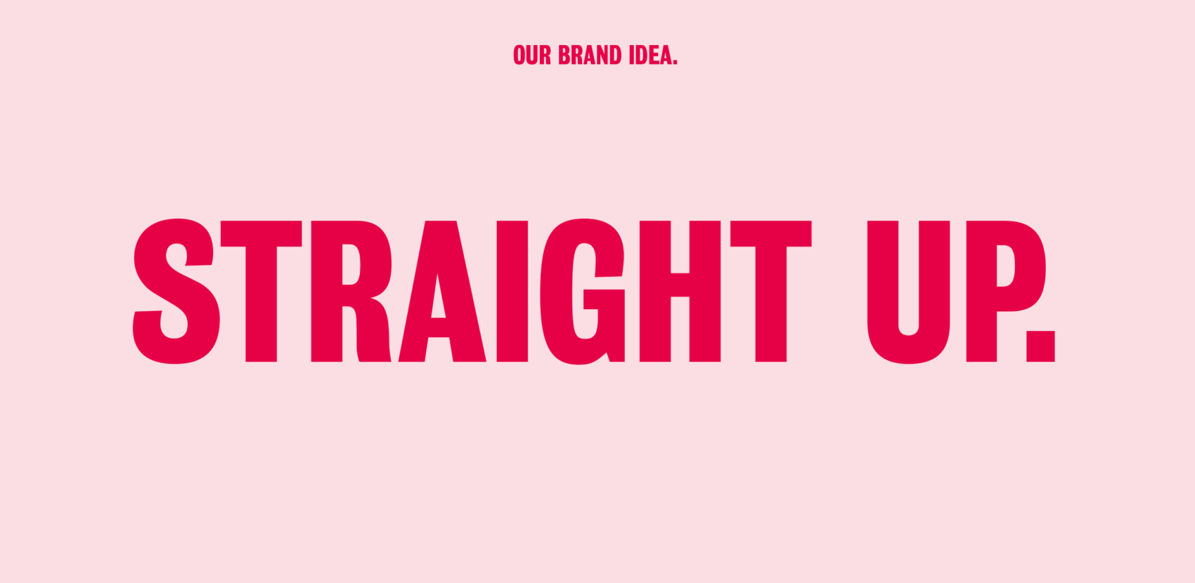
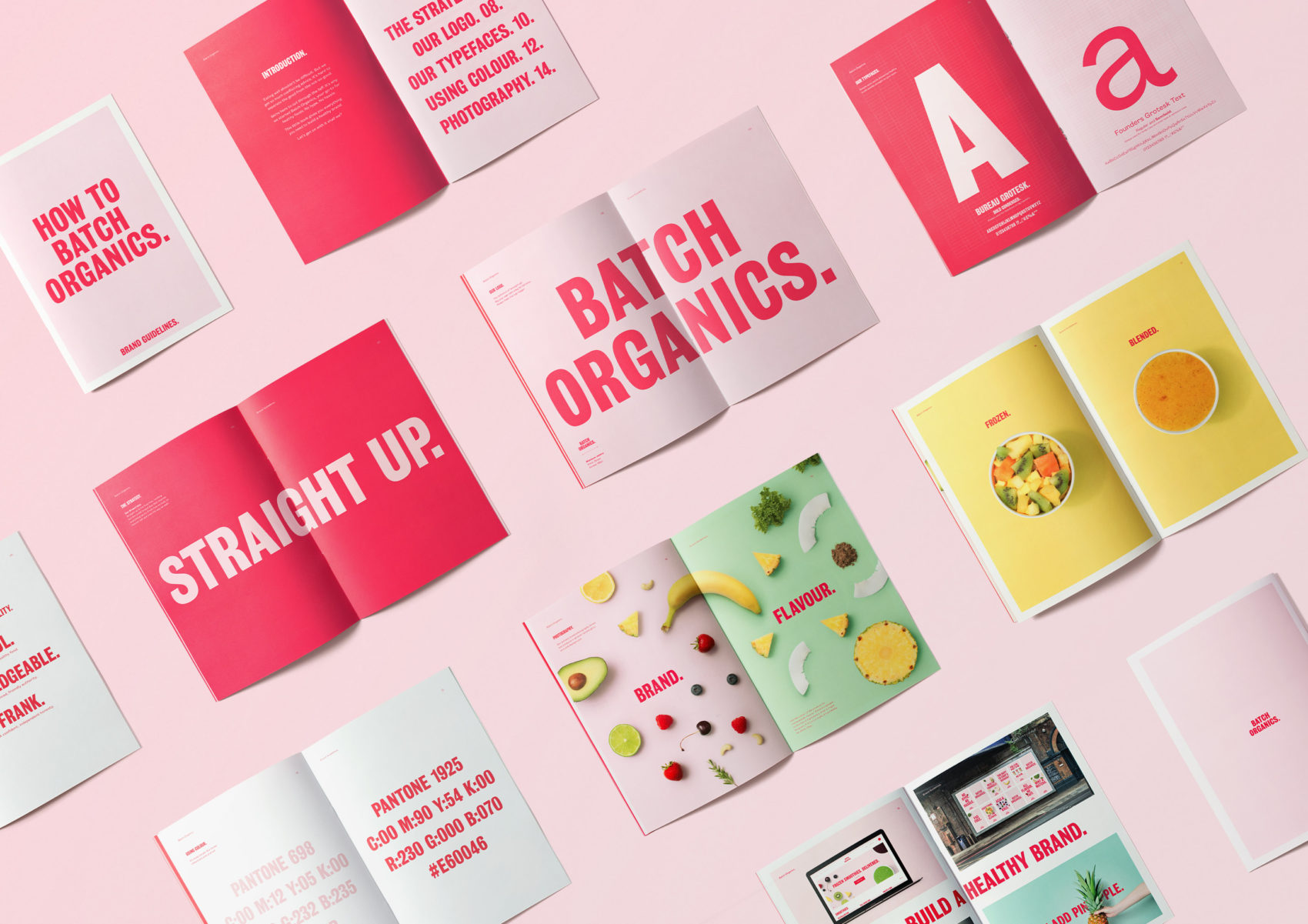
In a health and wellness market crowded by ‘miracle cures’ and unrealistic diet plans, Batch Organics’ frank, truth-telling approach cuts through the fanfare. Ragged Edge created a no hype, no hassle health food brand for busy people who want to eat well.
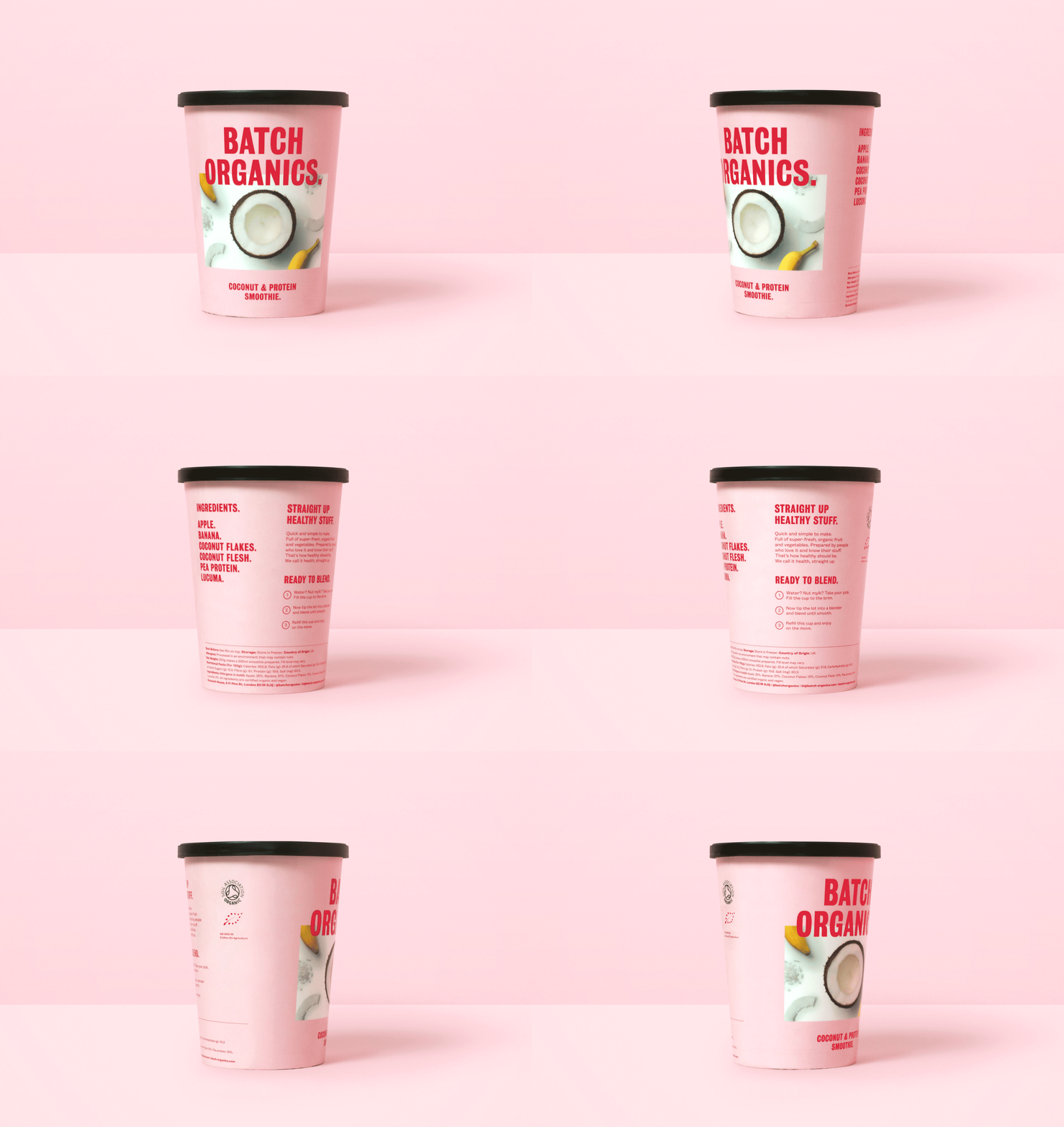
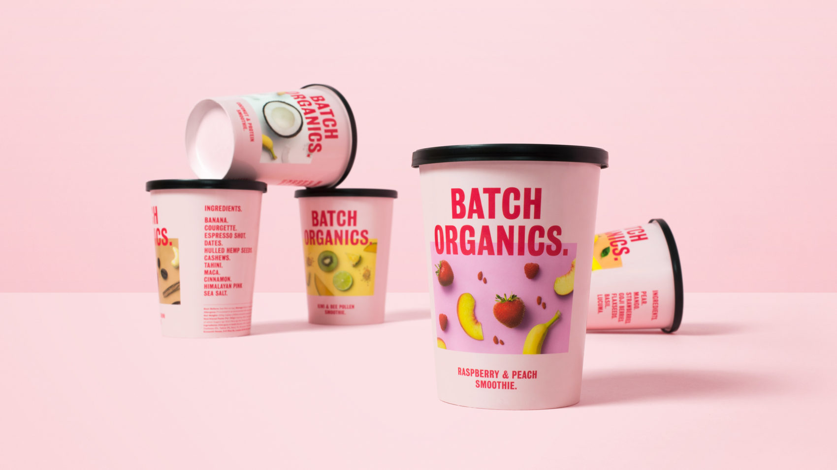
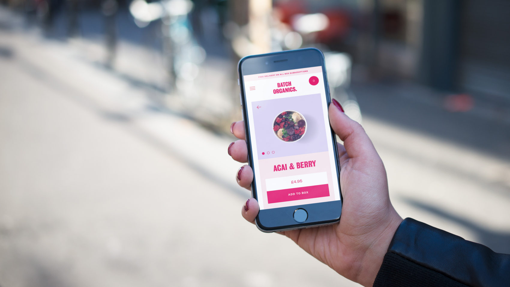
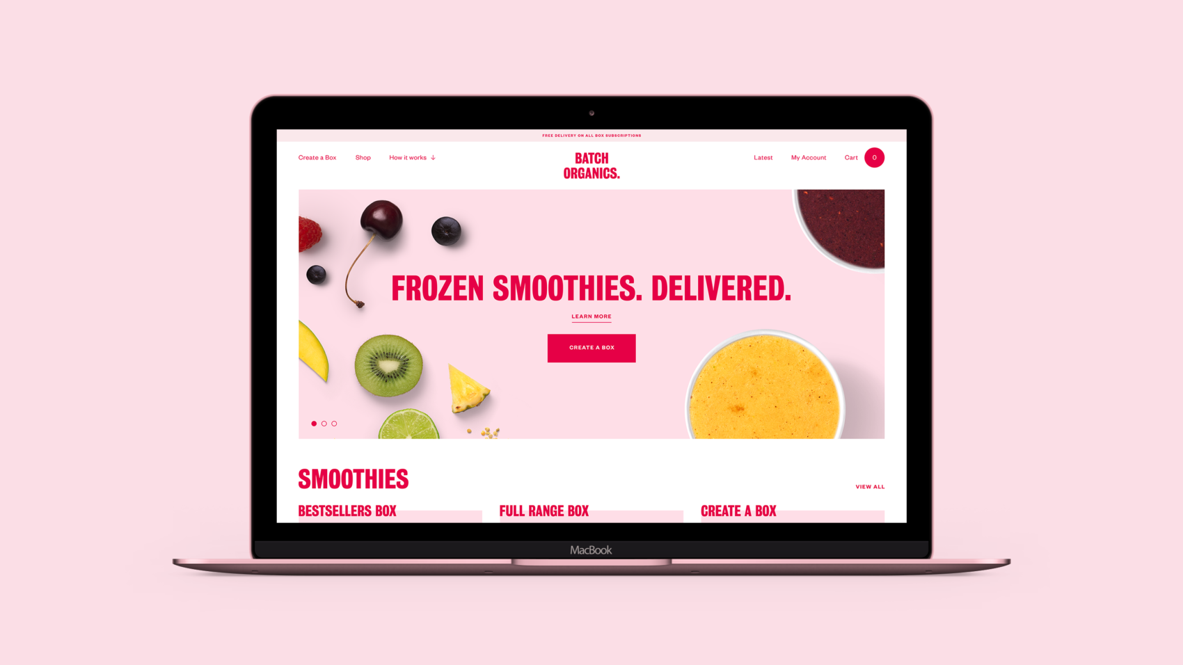
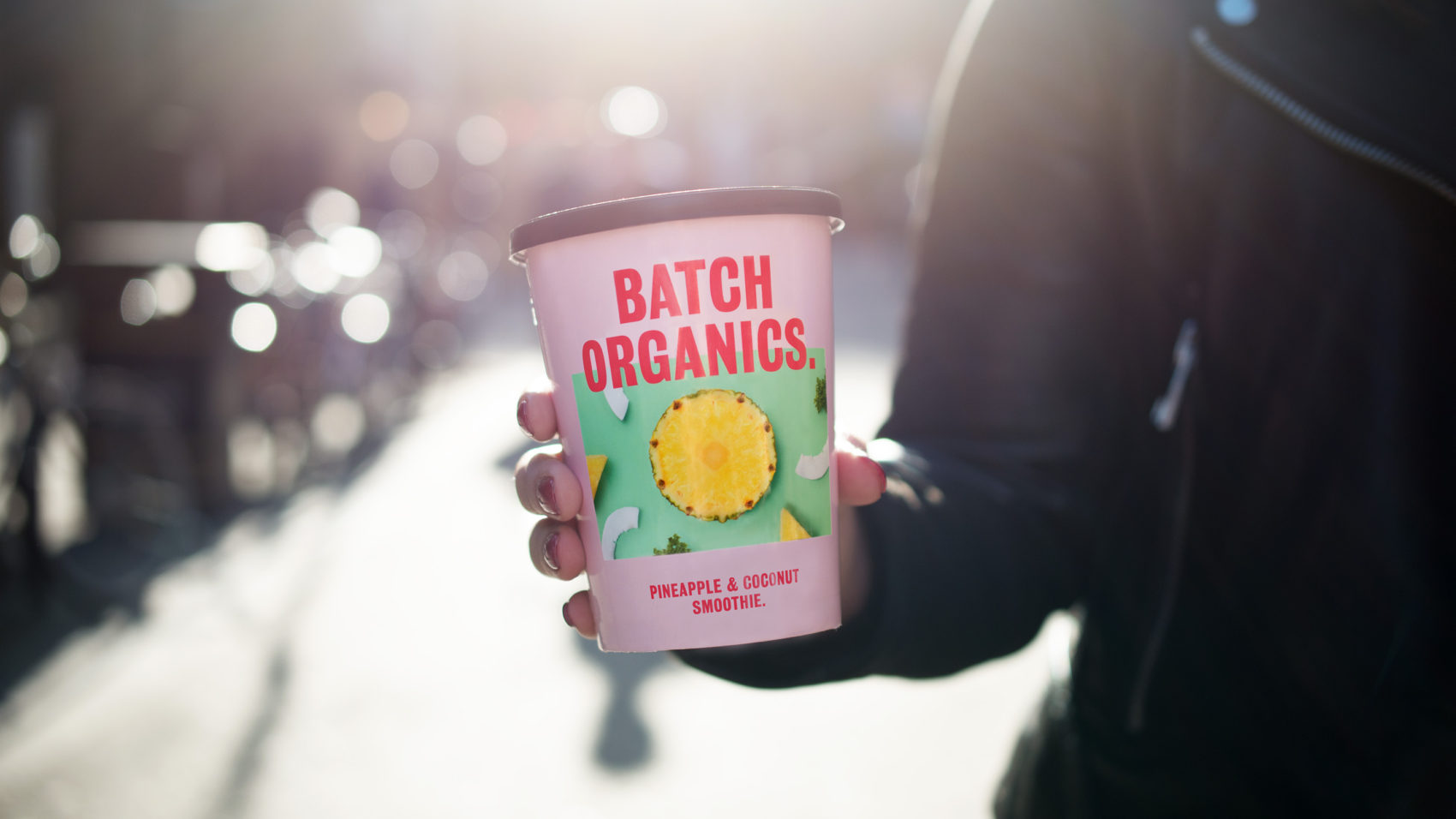
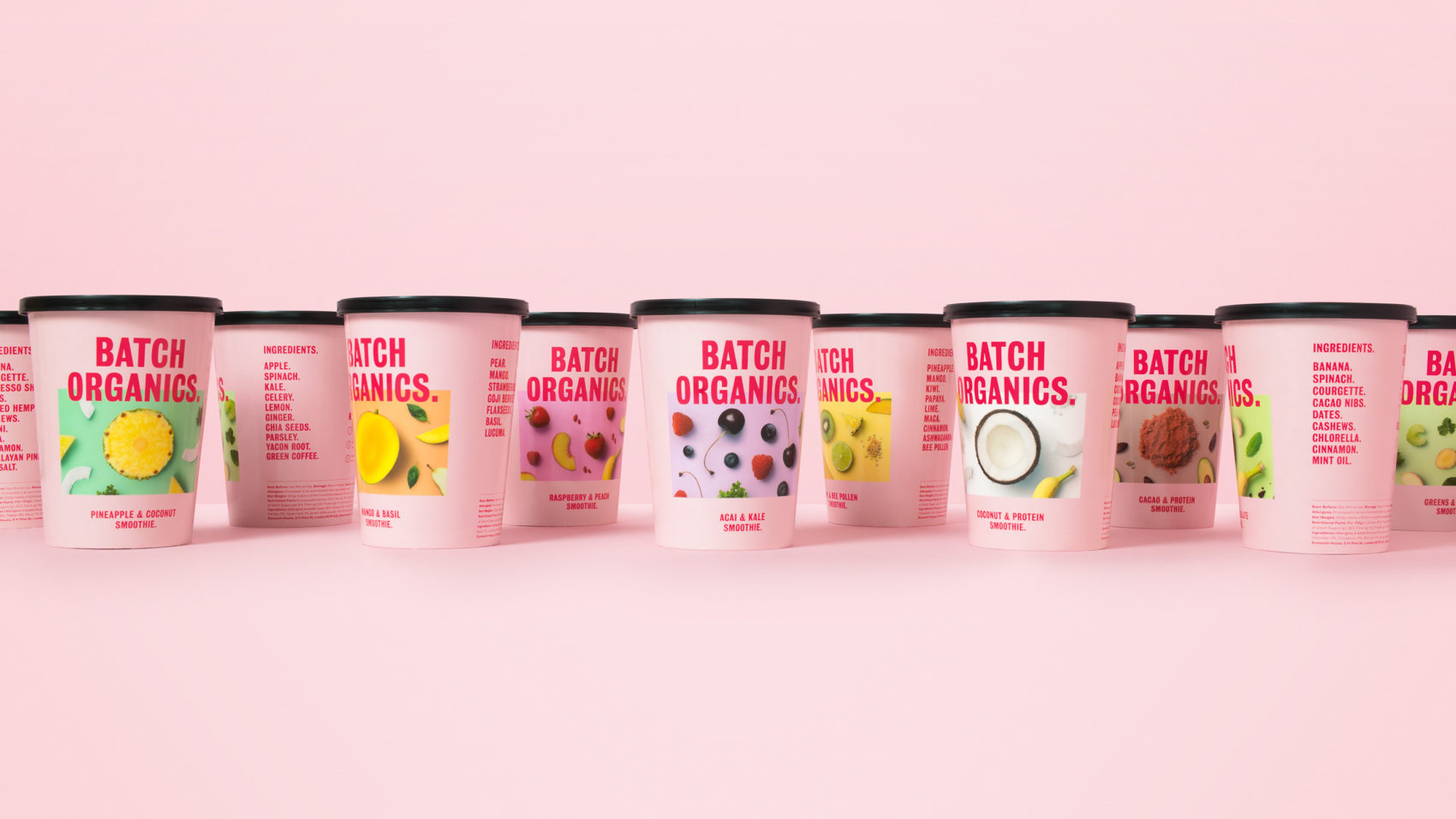
I really love how eye-catching this brand is; most health food brands feature shades of green and either a script typeface to reassure you how natural they are, or are over-the-top masculine focusing on muscle gains and pseudo nutritional science. I also appreciate that they kept their packaging simple, swapping out great food photography to represent each different flavor instead of relying on colors or other special treatments to set each product apart. While I do wonder how long of a shelf-life this look has considering its dripping in Millenial Pink, I do appreciate the energy this look injects into a product space that was in need of a facelift.
Identity, Web & Package Design by London-based agency Ragged Edge.
Batch Organics Brand Film from Ragged Edge on Vimeo.
