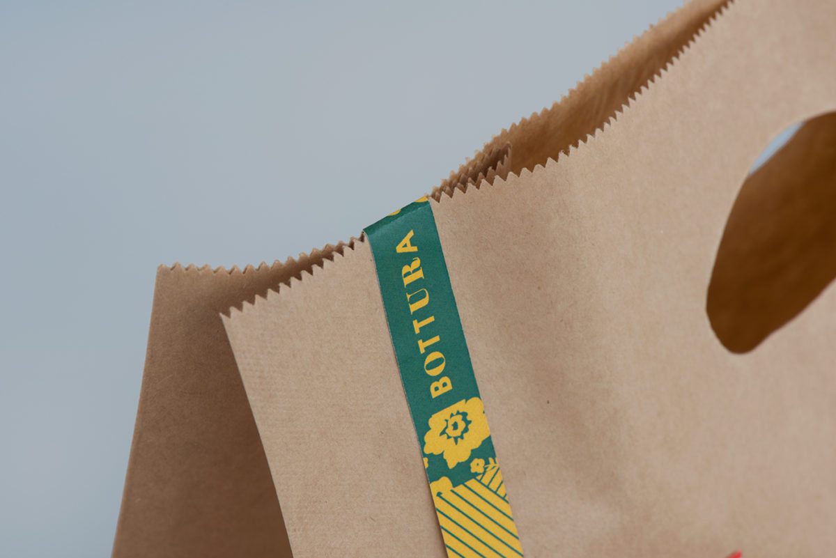
This one is an oldie but a goodie. Unfortunately for us, Bottura has been closed for a while but we can still awe at its uniqueness and have us all craving someone else’s Italian grandmother’s pasta. Allora, we all know good things come and they go. Foreign Policy was inspired by grandmothers and Italian patterns, Bottura was designed with the feel of home at the end of your fork. Personally, this feels like watching Sesame Street while sick at home with Campbell’s tomato soup and a grilled cheese mom made. I really think that’s the driving force behind this identity, the euphoric feeling of home and a family member making food just for you.
Foreign Policy isn’t afraid of using color or multiple patterns with this brand, in fact, they embrace both and the result is spot on. Their color palette is bold, patterns unique and their typography is classic. It really is a shame this place is closed because the look of it feels timeless.


