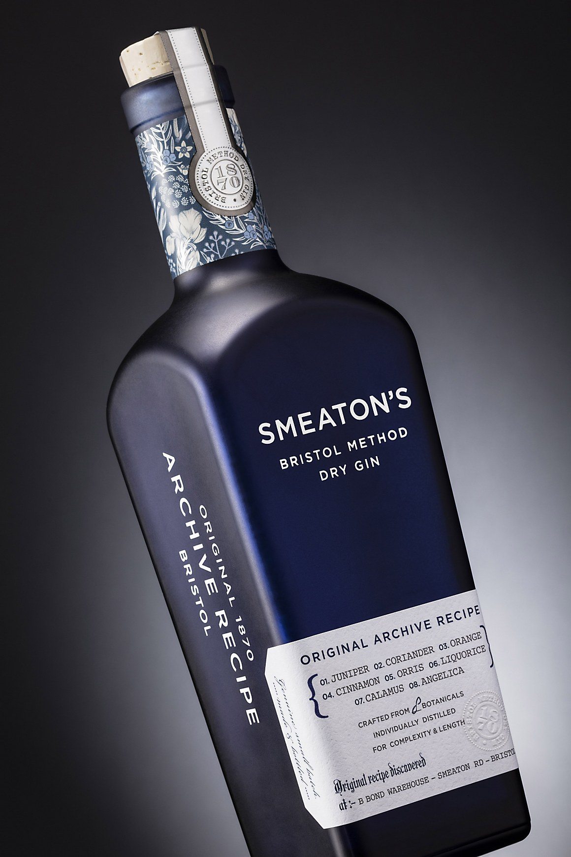
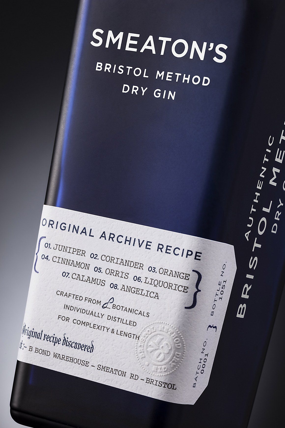
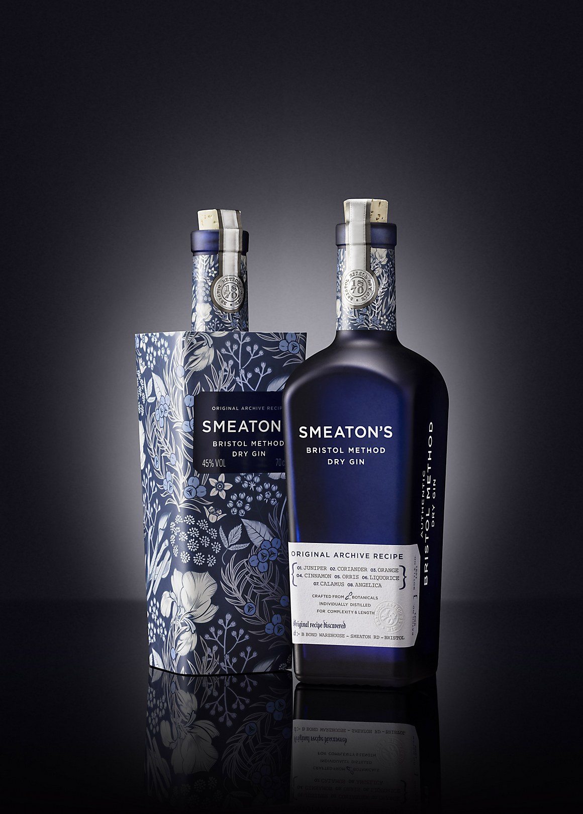
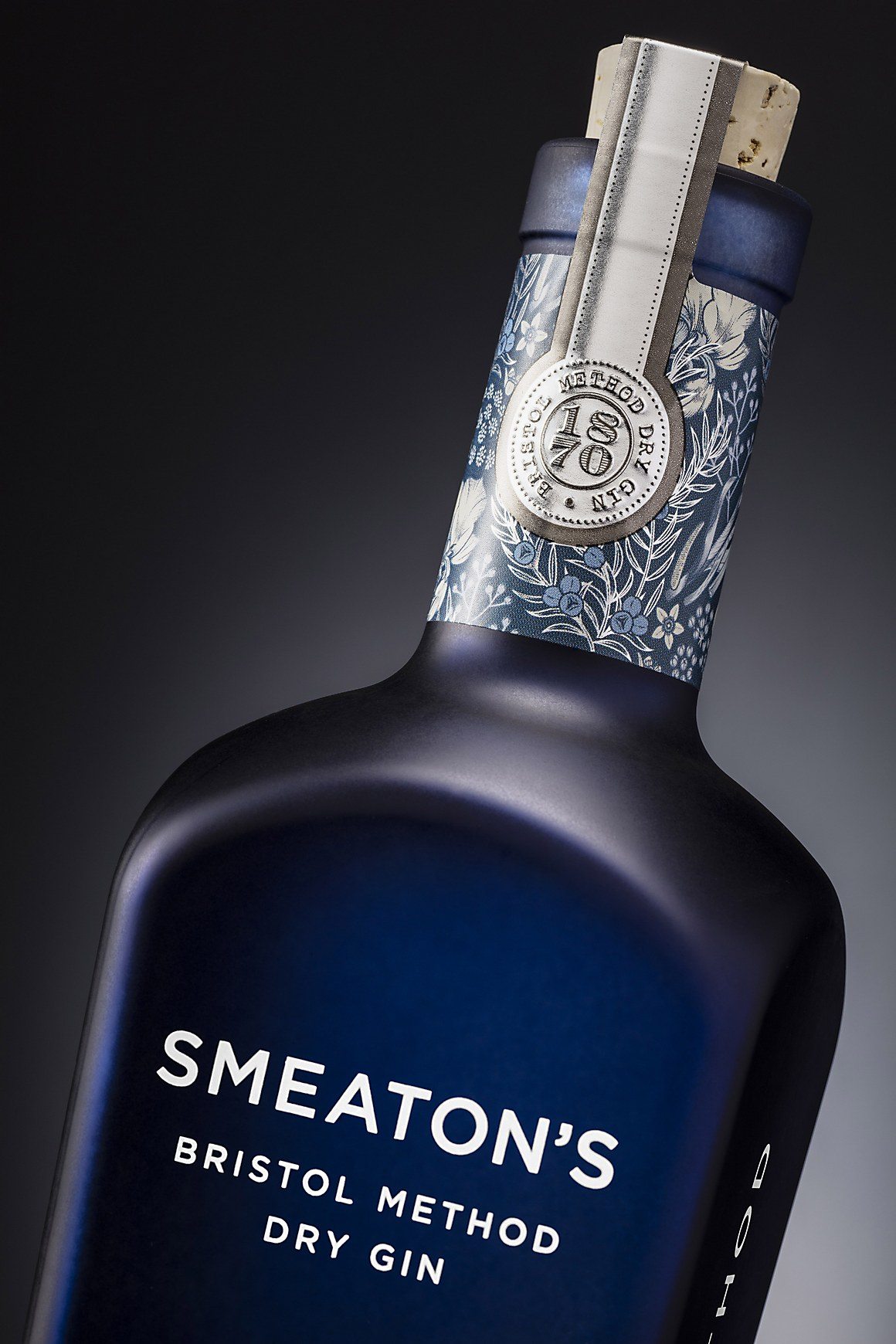
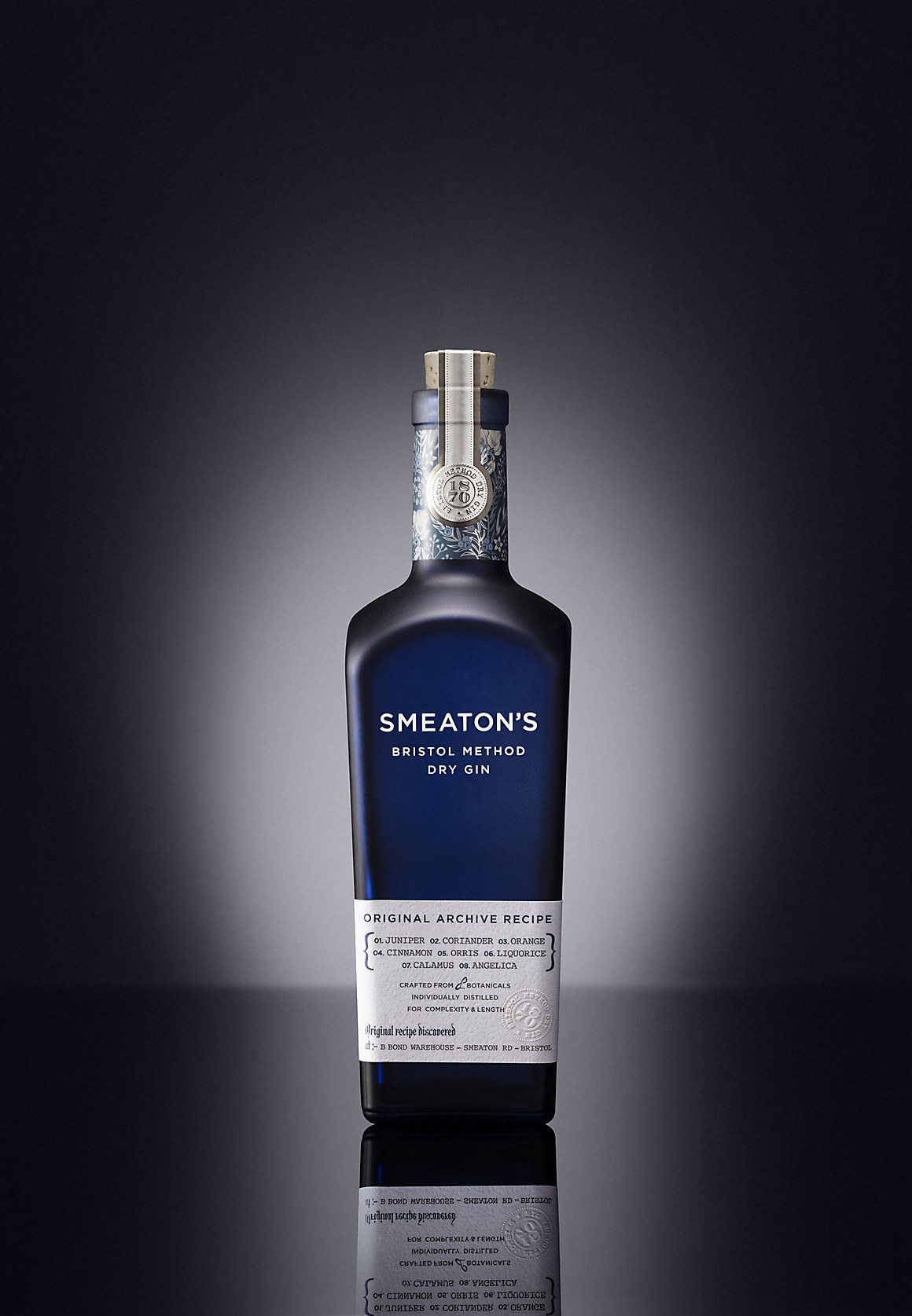
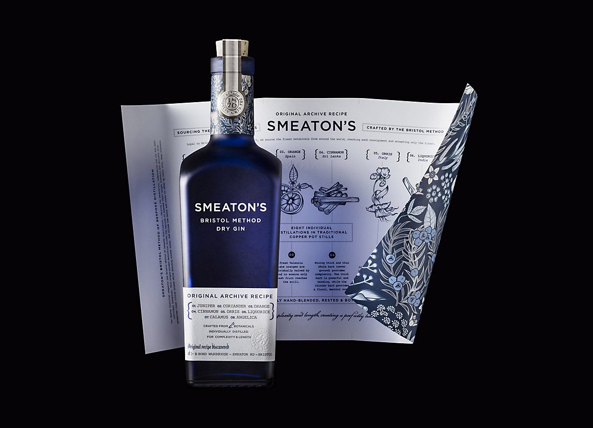
Smeaton’s Bristol Method Dry Gin may be a newcomer to the slew of gin distilleries that are already operating in the UK, but their recipe is an authentic historical recipe dating back to 1870, setting it apart from its competitors that feature quirky new ingredients. Like most gins, Smeaton’s plays on the apothecary/medicinal trope in their labeling and packaging, the difference here is that it is historically accurate to what gin in the 1870s would have looked like. The glass color, illustration style, and typography all are true to the time period.
Some key things to notice; the overwrap features each of the gin’s ingredients as an illustration, the bottle itself is a glass that has been frosted with its blue hue, and the typography was screen printed on each bottle.
Packaging design by Denomination.
