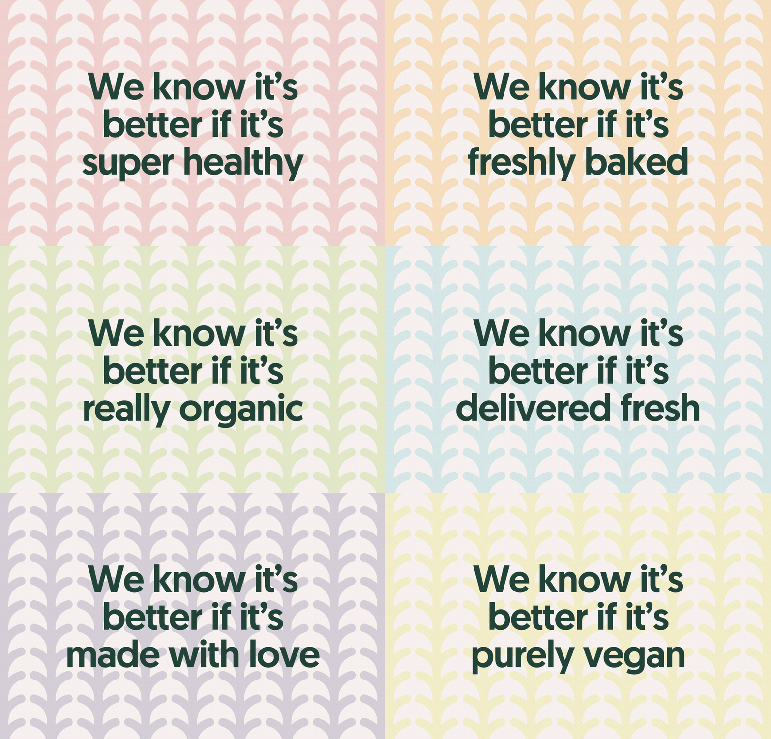
Better Breads is a Singapore-based vegan bakery whose mission is to feed the body and soul of their customers through their product. To achieve this, they prepare different breads daily that are truly vegan, nutritious, and organic. The brand itself is simple and clean, reflecting the purity of the ingredients going into each loaf. The main logo features a (what I can tell) a stalk of wheat or some other grain as the crossbar of the B, and this element is used as a building block for its icon and product classification system, via differently colored patterns. The packaging looks like it was made simply so that the bakery could edit the labels themselves as they came up with new products with no loss in brand consistency. The copy written for the bakery is also short and concise without beating you over the head with the fact that the bread is Vegan, and is overall warm and welcoming.
Better Breads Branding & Package Design by Diferente.


