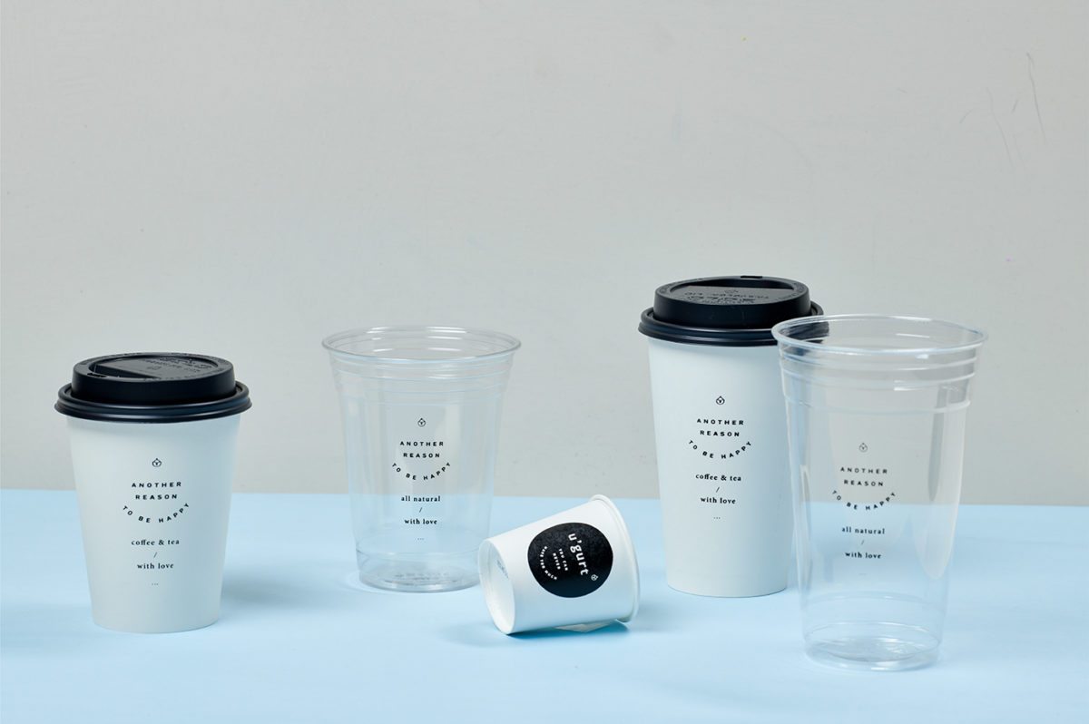
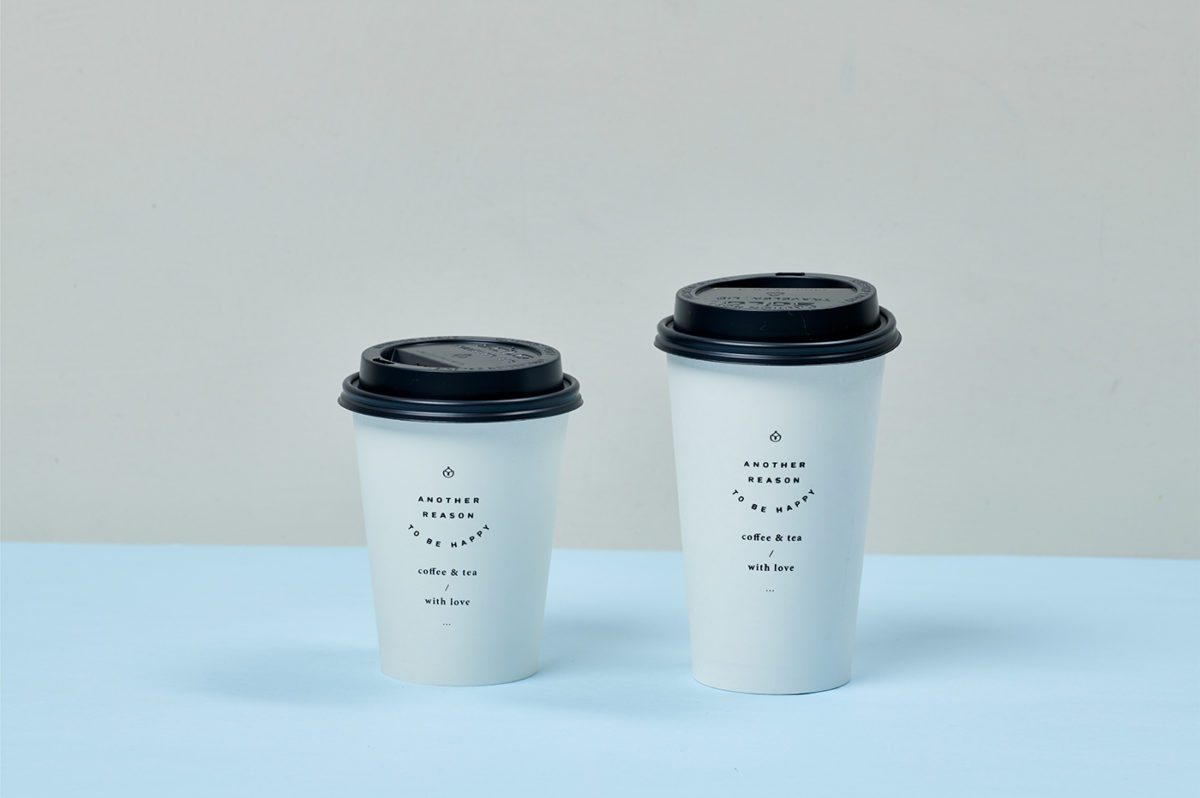
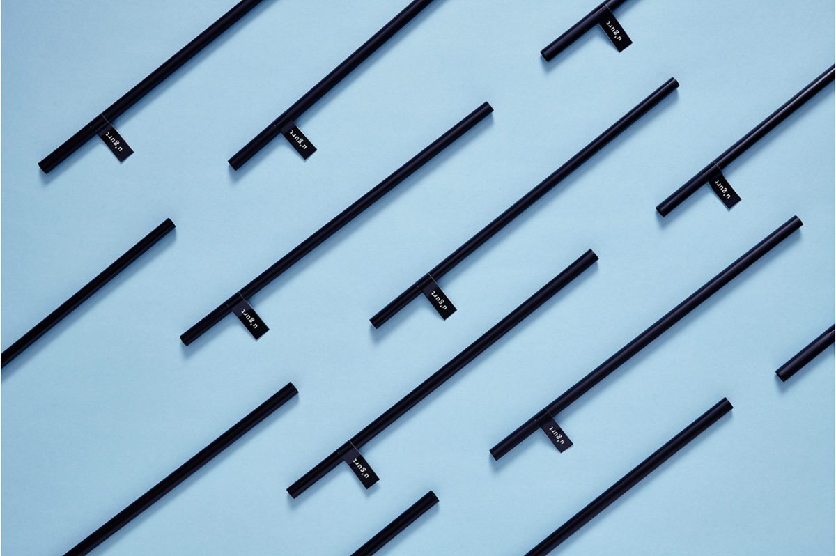
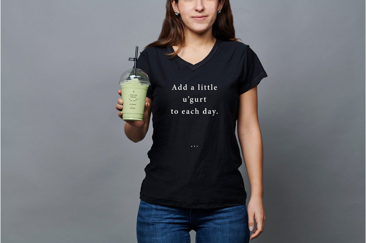
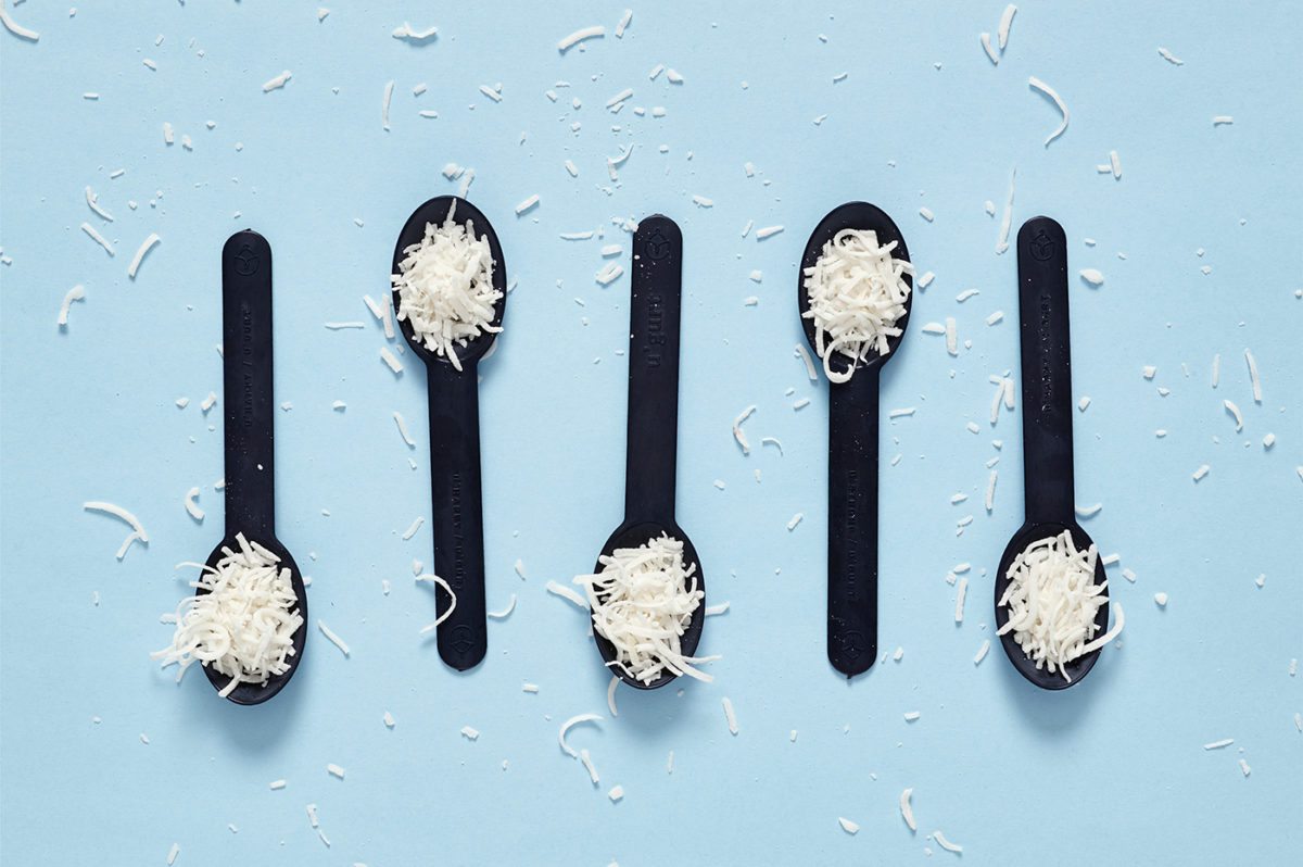
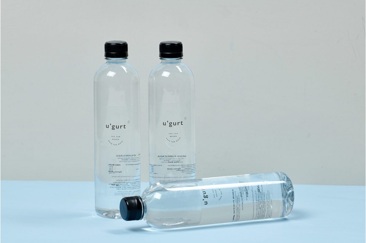
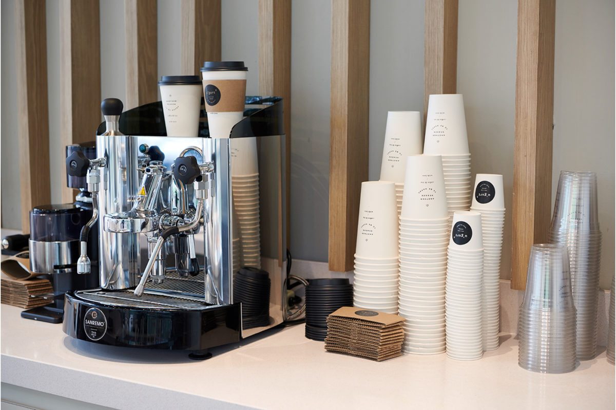
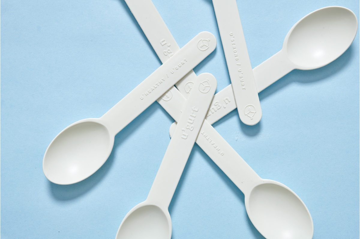
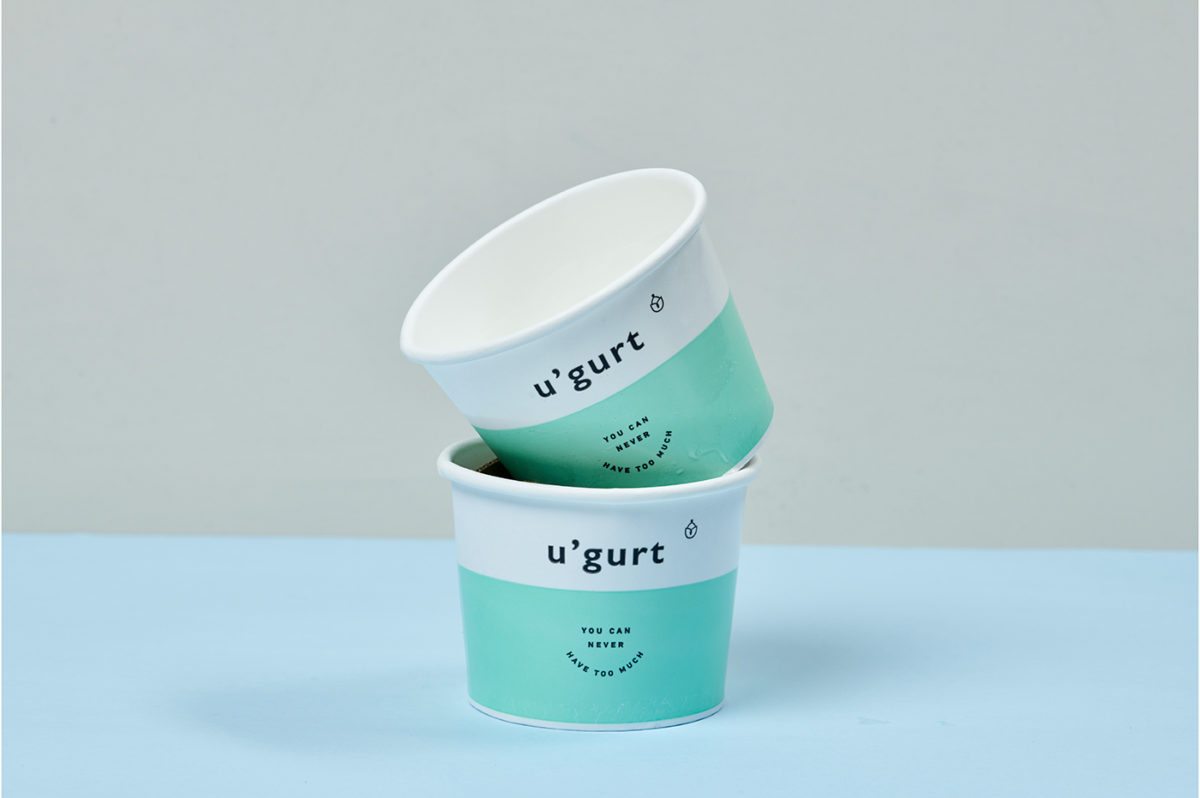
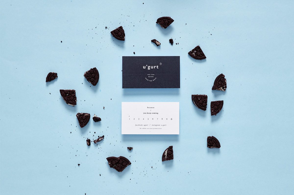
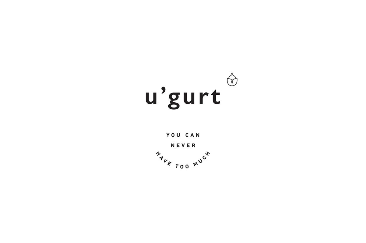
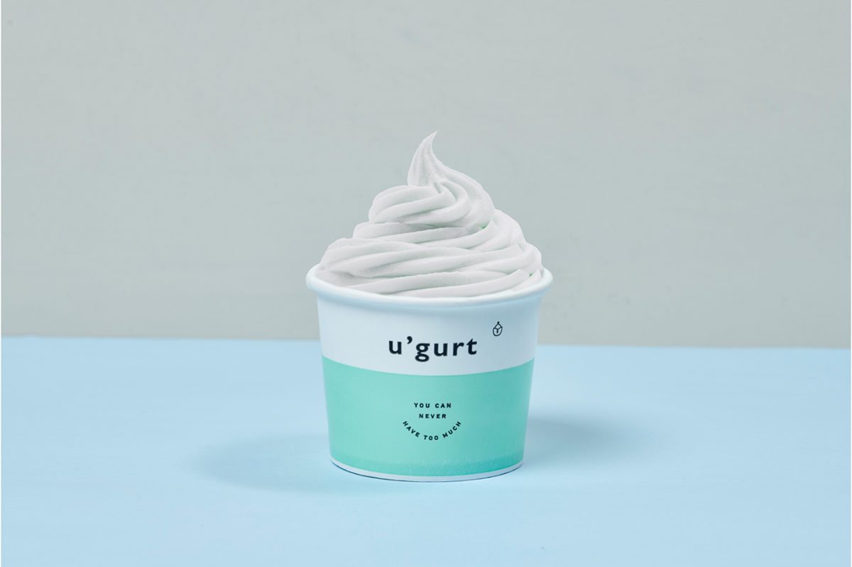
You can never have too much frozen yogurt, right? That’s the idea behind u’gurt’s branding, injecting happiness into each spoonful. I love the clean and minimal but still warm and inviting look that u’gurt has, both across its packaging and the interiors. They have this lovely little typographic mockup that looks like a smiling face, and used with their other lines of copy and little froyo line icon, creates a centered almost zen-like layout on each cup, spoon, and printed piece.
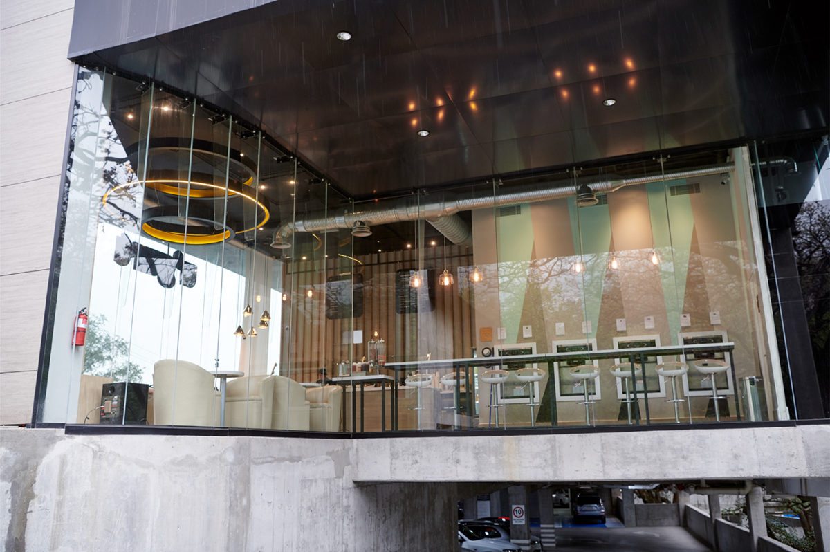
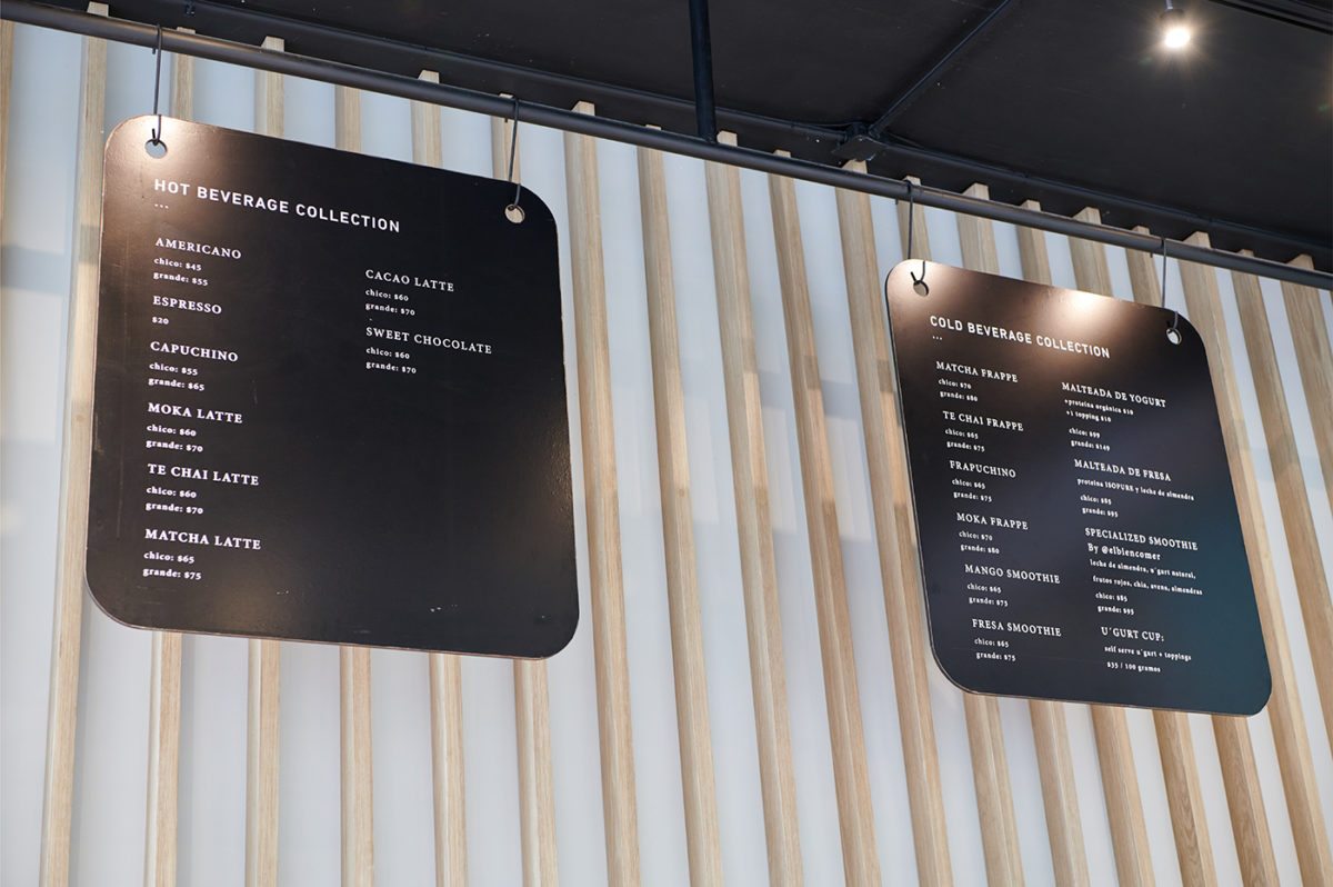
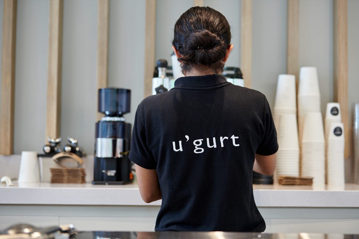
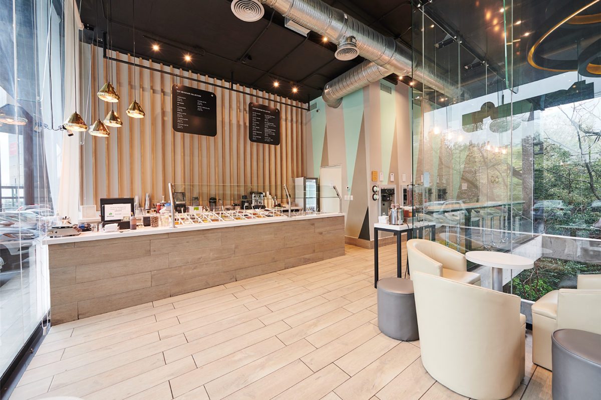
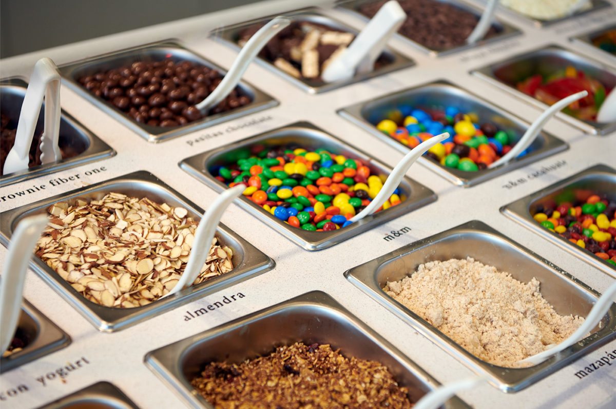
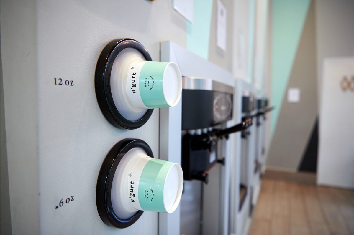
The interiors are my favorite part of this brand; they are a clear departure of most other frozen yogurt franchises. They’re either obnoxiously bright and cute, with pictures of fruit on every surface reminding the customer how much ‘healthier’ it is than regular ice cream, or the pendulum swings the other way and they are overly stark and cold. u’gurt’s interiors straddle the divide, opting for clean lines and warm woods but still utilizing soft colors and geometric graphics to draw attention to their frozen yogurt wall.
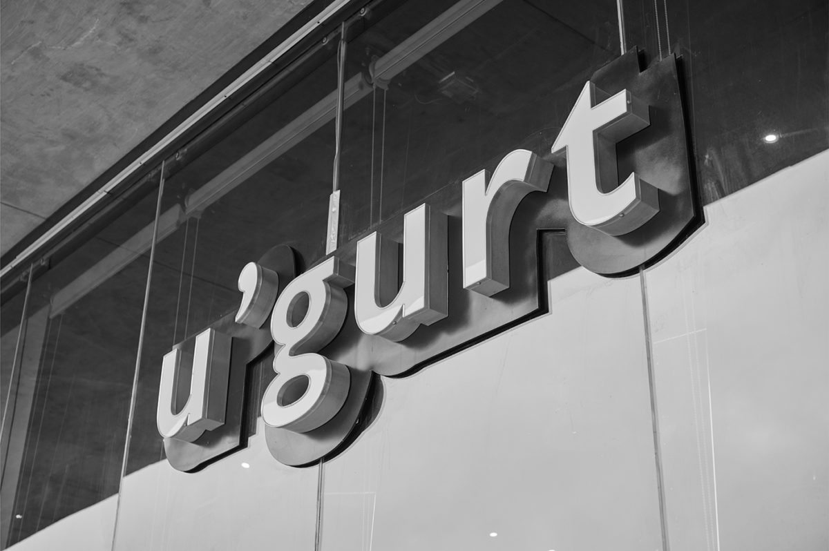
u’gurt Branding, Packaging & Interior Design by Emblema Design Studio.