Design Womb redesigned the Mt. Comfort’s brand identity, packaging design, and Shopify e-commerce website, which offers mail subscription coffee. To quote the agency:
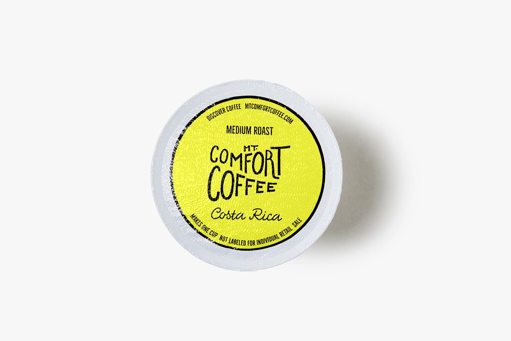
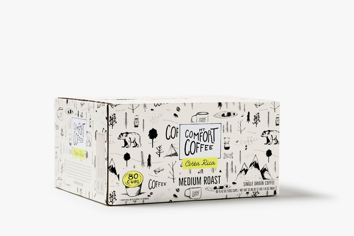
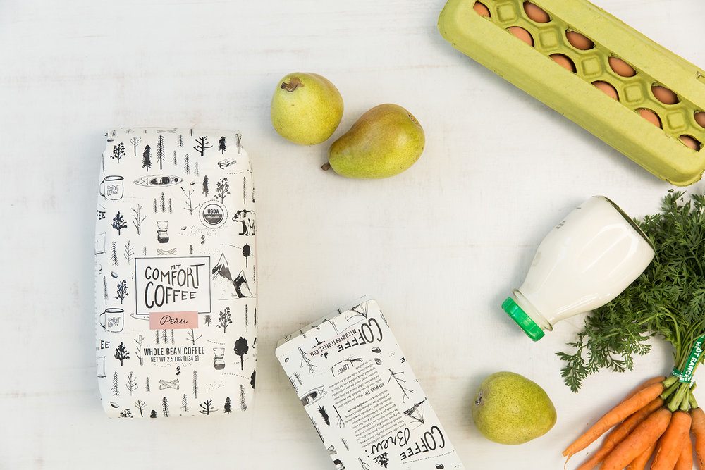
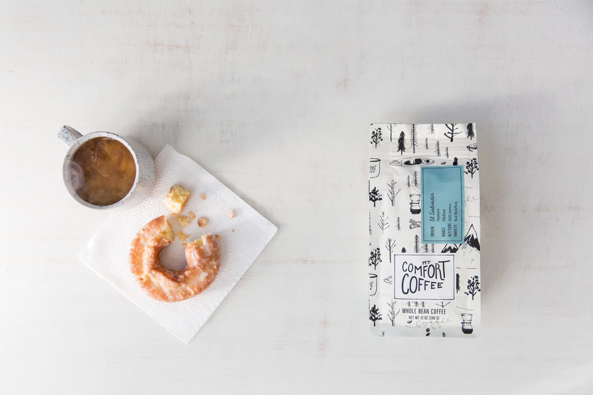
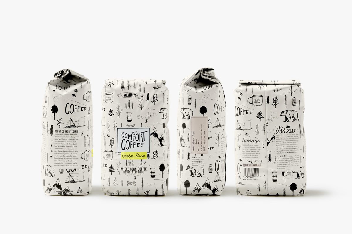
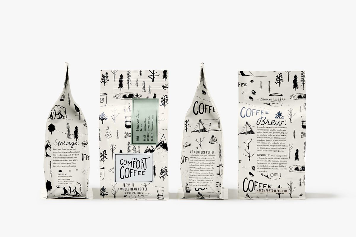
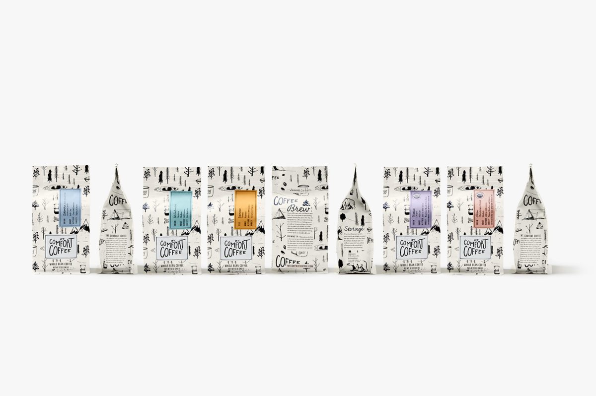
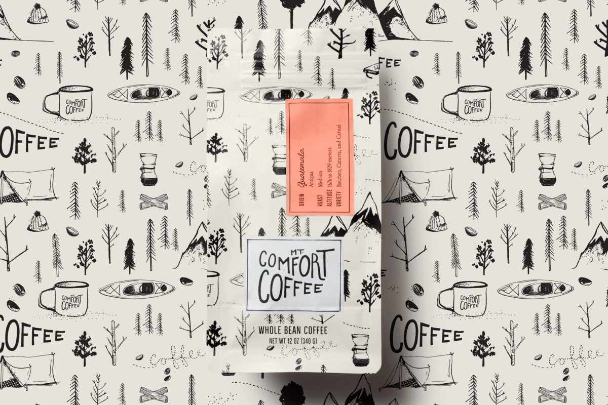
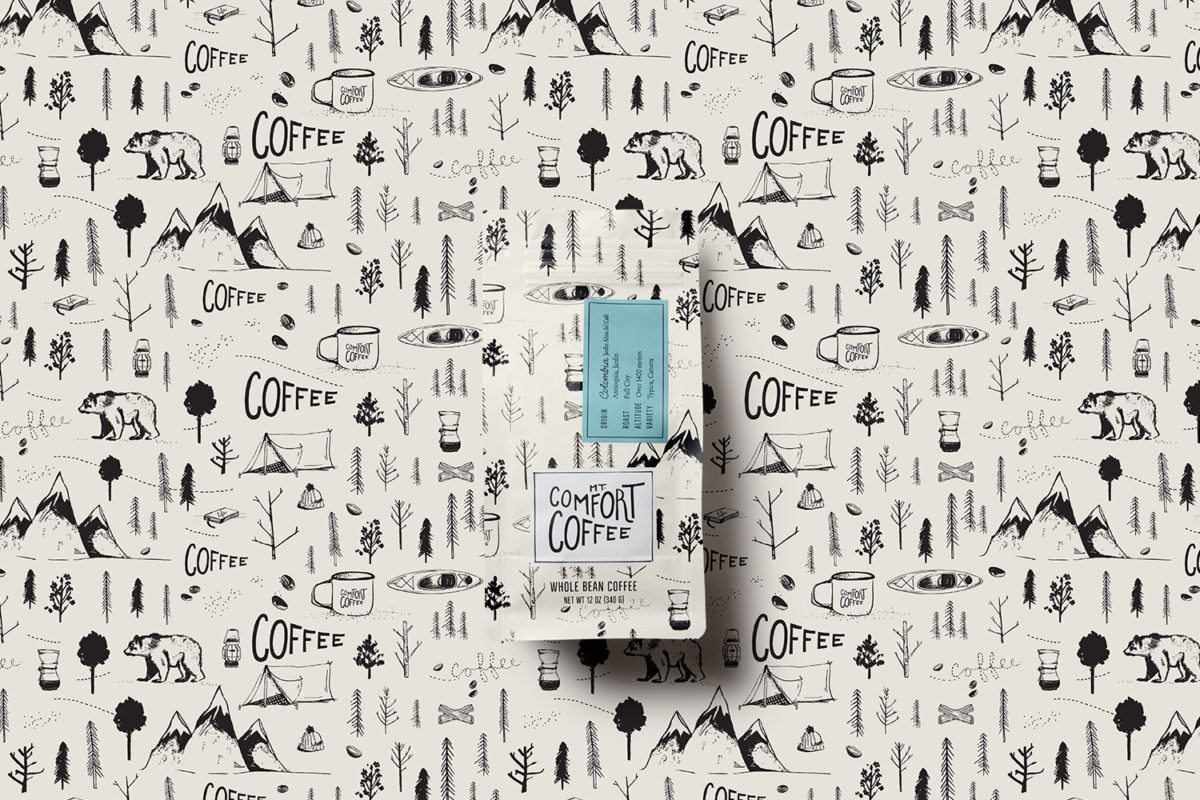
Creating a perfect cup of coffee is a sacred and cozy ritual down to every detail, so we aimed to capture this spirit. We crafted a hand drawn logo with sloping perfectly imperfect typography, paired with a set of custom artistic illustrations inspired by the wilderness, coffee, and adventure. The illustrations were used to create a unique repeat branded pattern and pair with bright or earthy colored patches showcasing each coffee’s details.
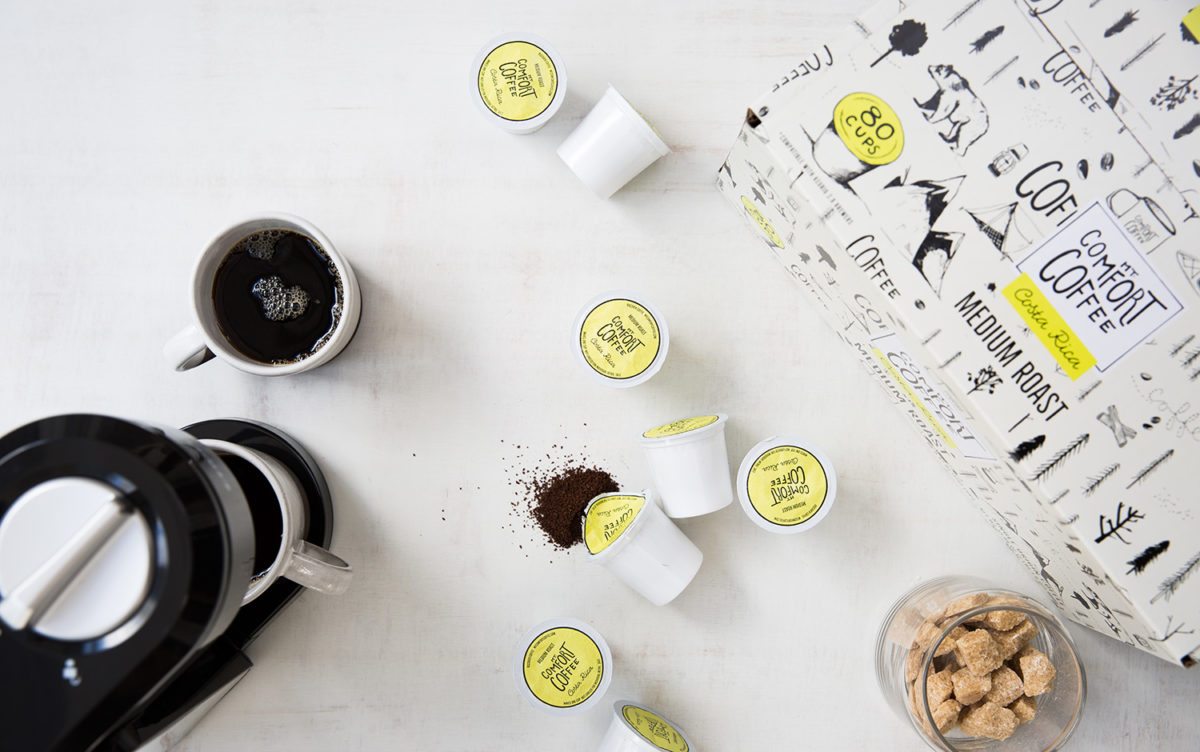
The results are whimsical, playful, and (dare I say it) comforting looking coffee brand. The black and white pattern illustrative pattern is simple but not lacking in warmth due to the hand-drawn quality of the illustrations, and the warmer tints of off white and charcoal. Using bright pastels as labels, assigning a different color to each place of the coffee’s origin, separates this important information from the busy background without being shocking. I love how this look has seamlessly worked onto k-cups and boxes, making it stand out from the other brands that live in that space.
Mt. Comfort Coffee Brand Identity & Packaging by Design Womb.