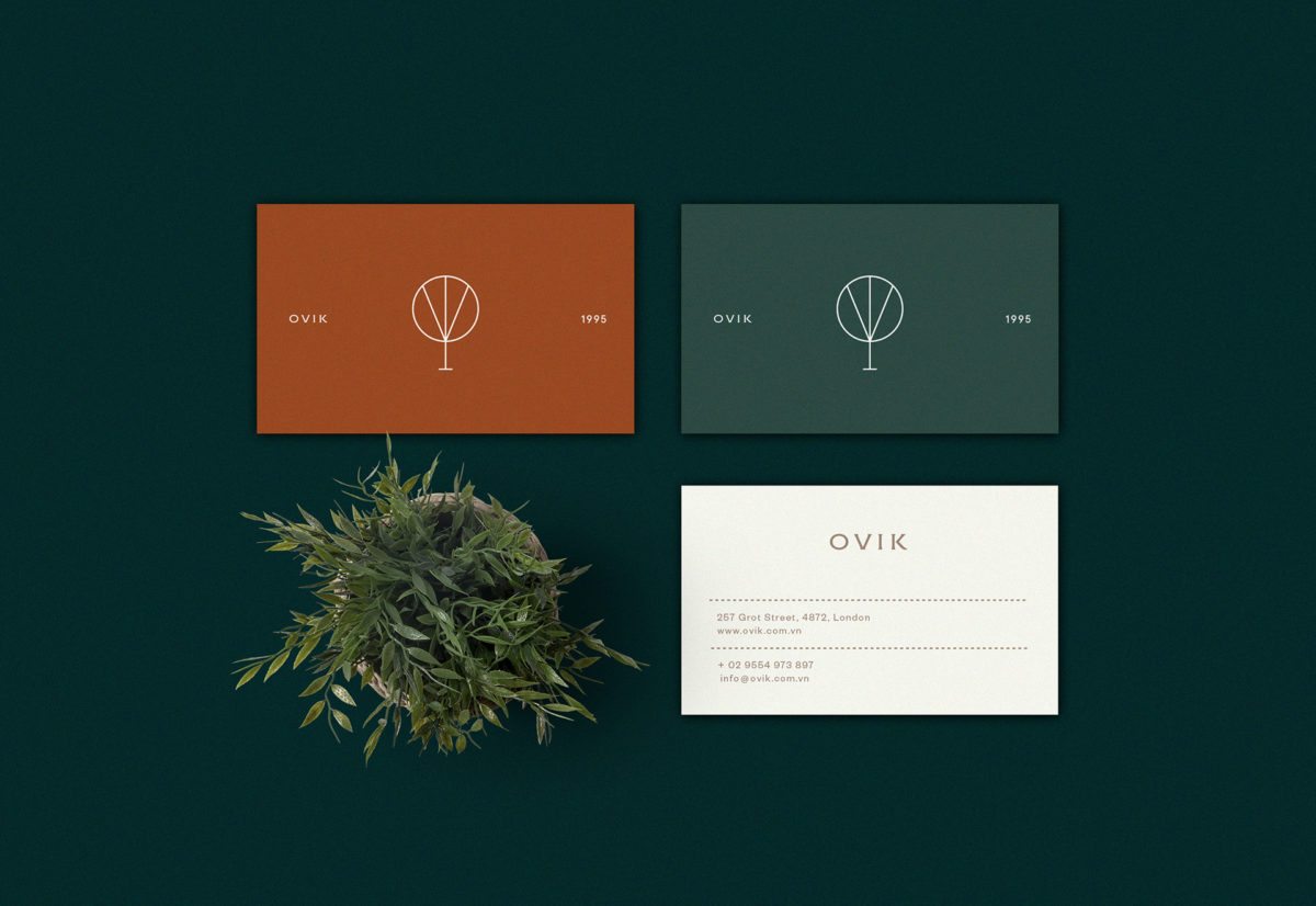
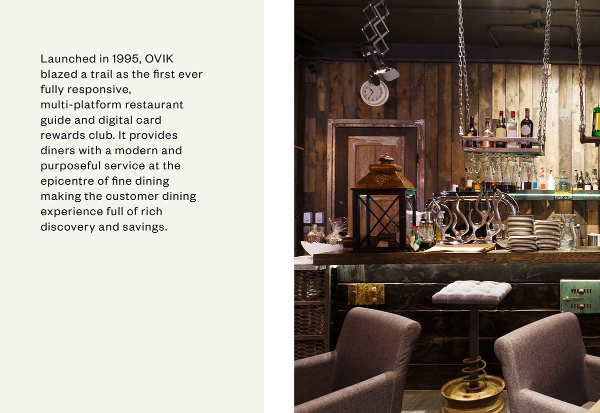
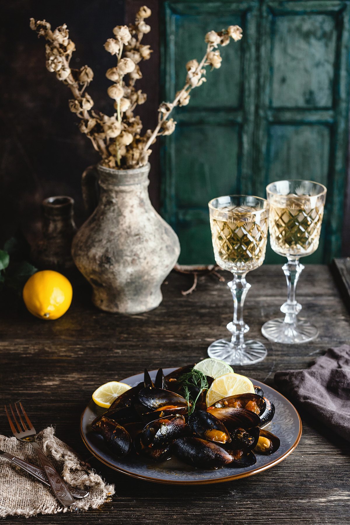
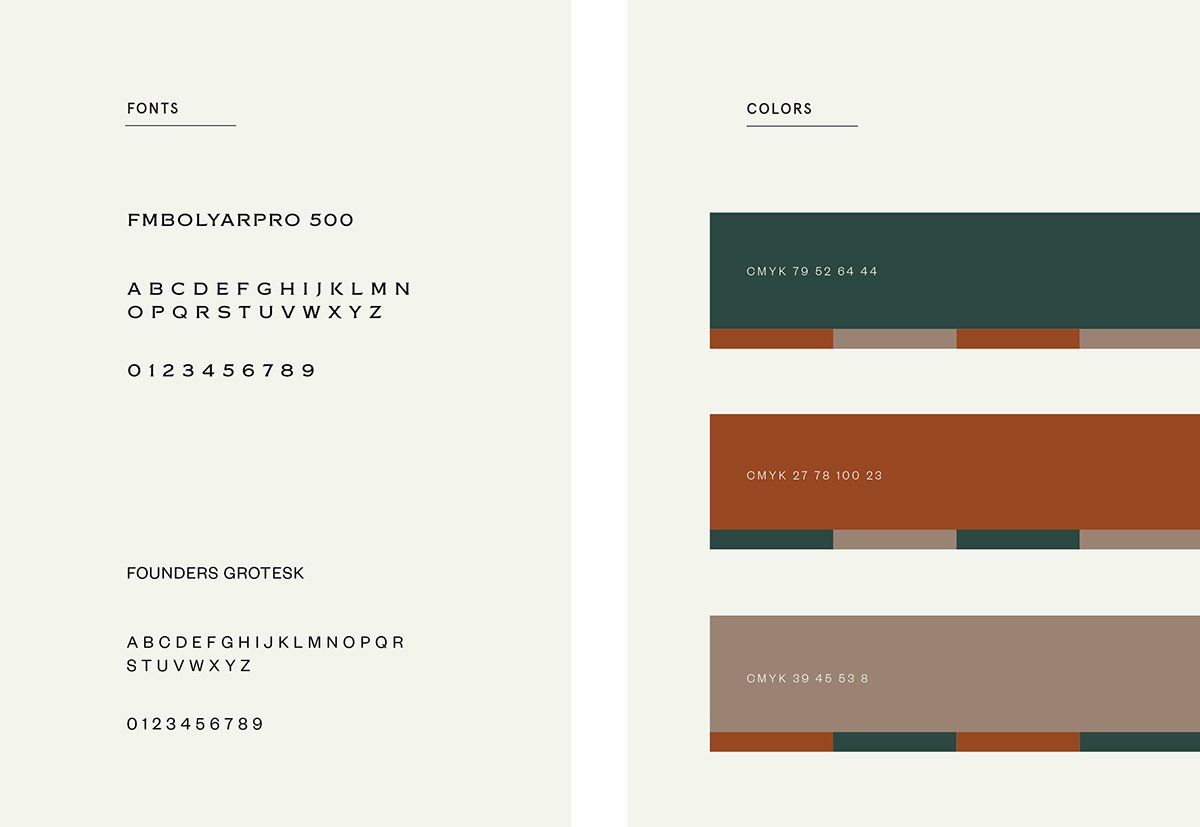
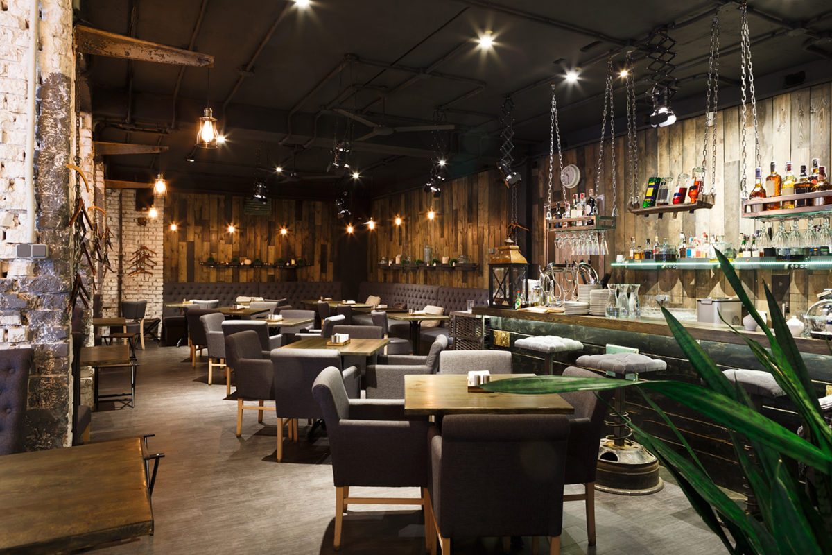
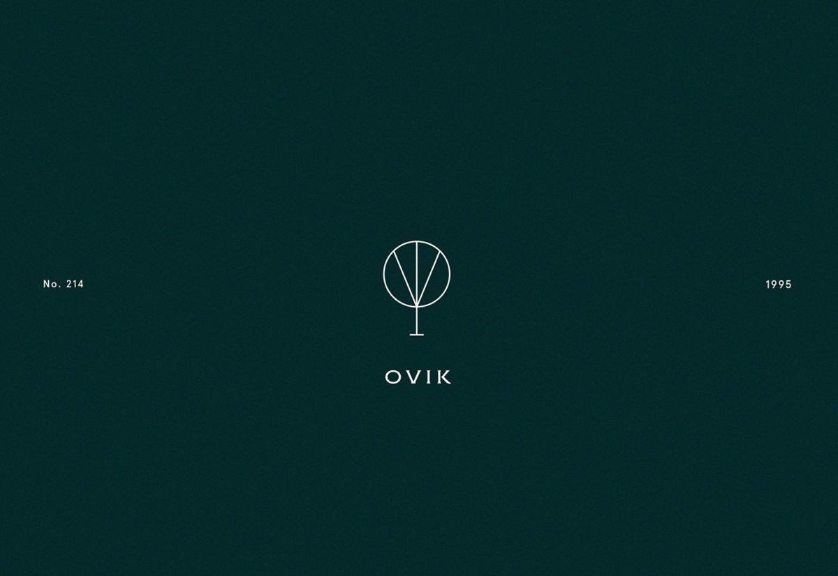
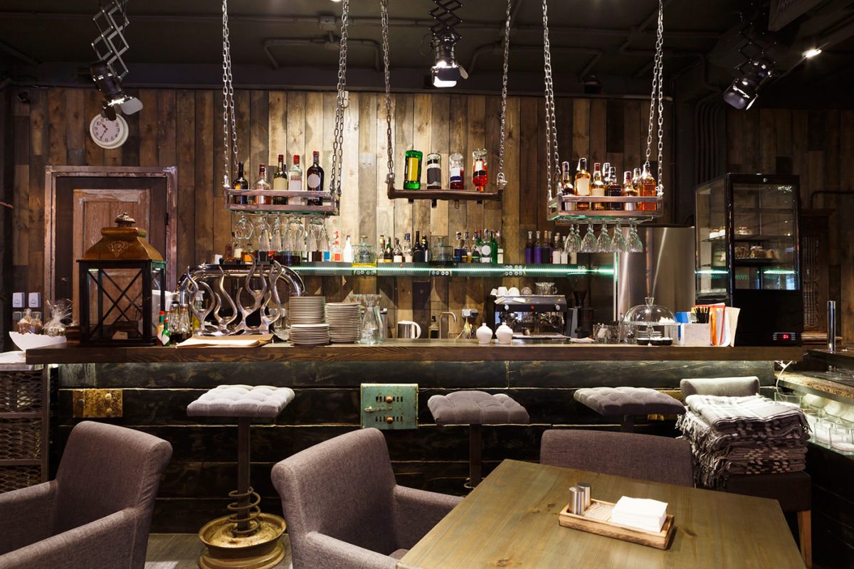
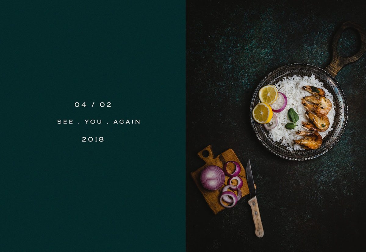
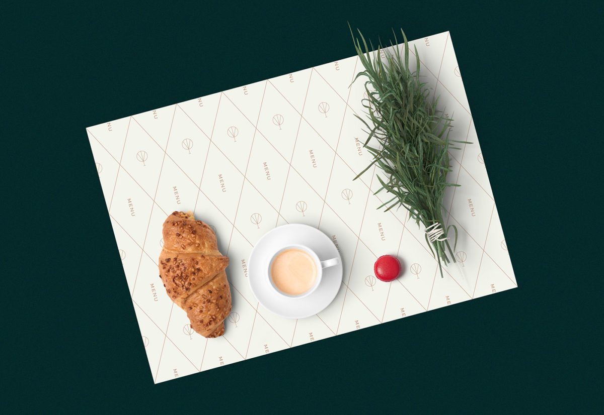
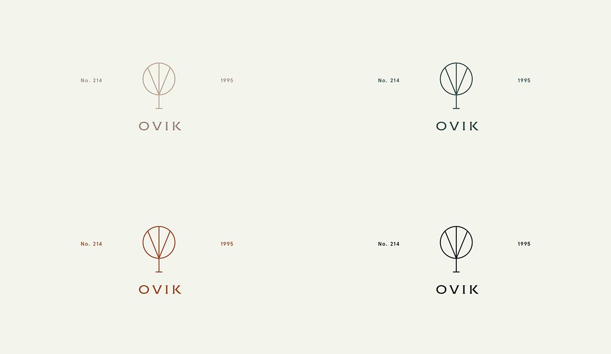
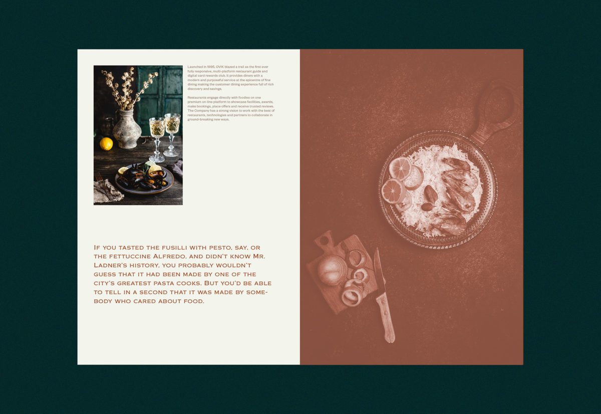
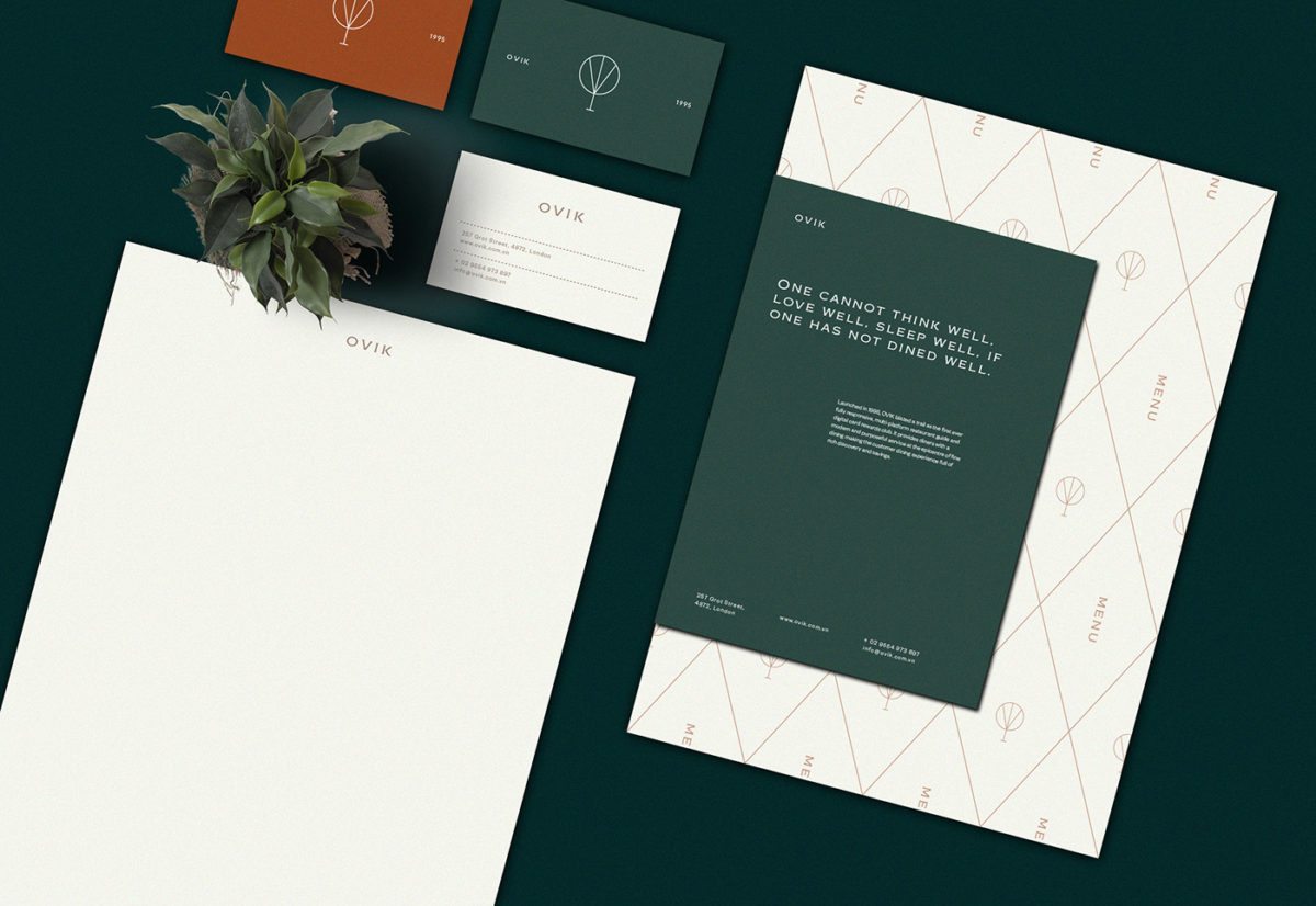
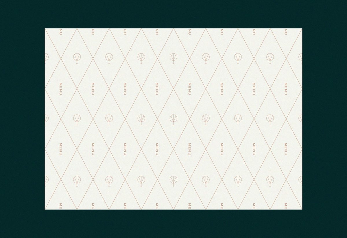
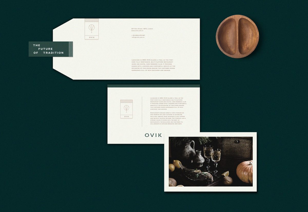
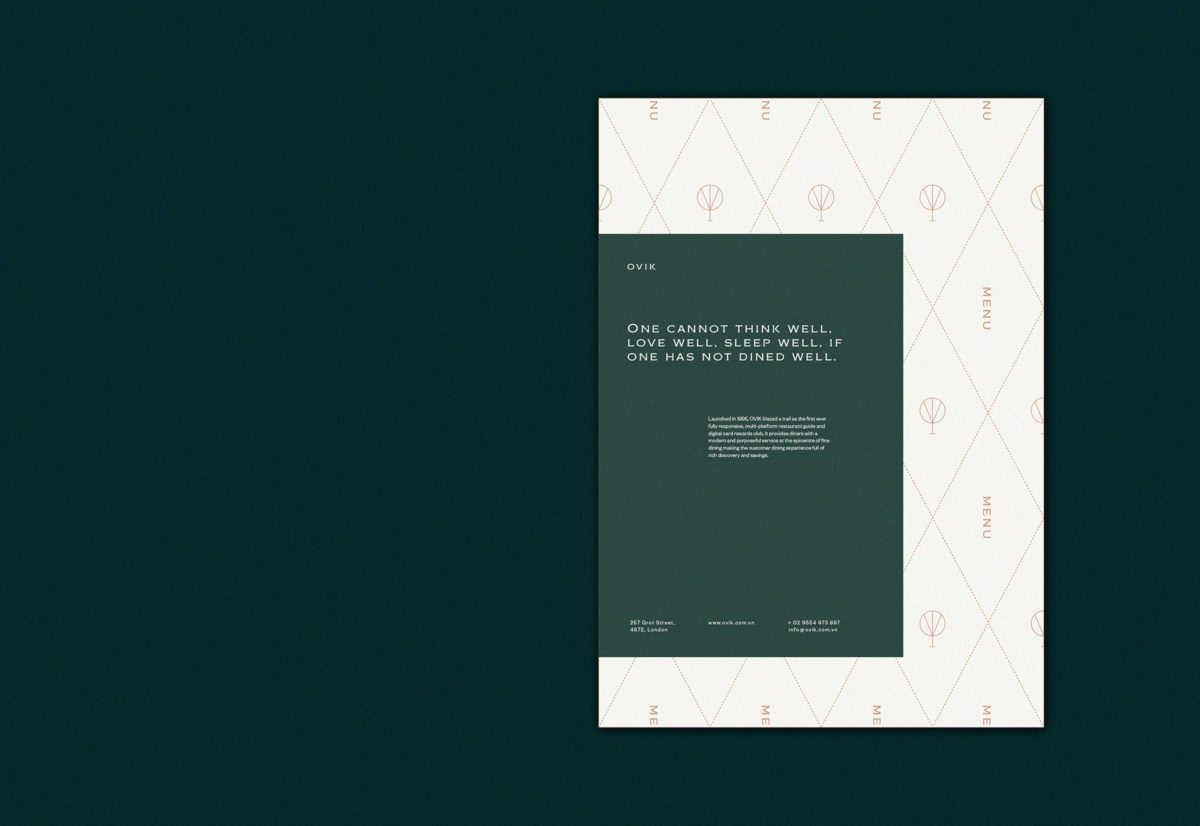
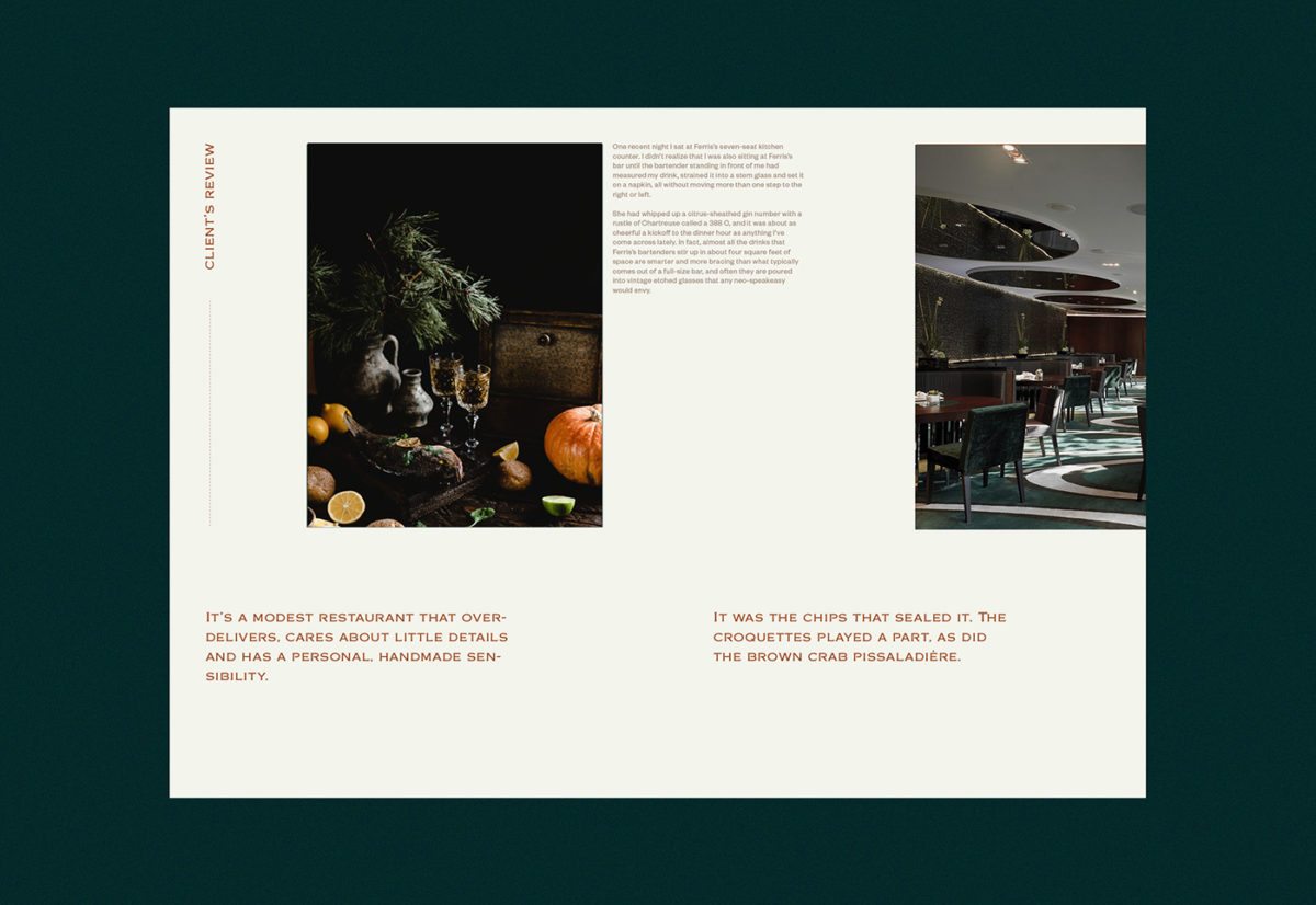
OVIK is an Italian luxury restaurant in London, located Hotel Brunet. It has only seven tables, accommodating at most 24 guests, which lends itself to an intimate and unique experience for diners. The brand itself is minimal yet warm thanks to its rich color palette; while only using three colors, the earthy tones are cozy and refined. The wordmark for the restaurant uses a subtle spur serif, adding a bit of personality to the typographic styles, which otherwise use a relative plan sans serif. This spur serif is also used to accentuate important bits of copy. One detail to note: the tree icon that is used as the logo is formed from the letters of Ovik; at least most of them are. The K is a bit hard for me to see, but the O, V, and I are strongly apparent.
