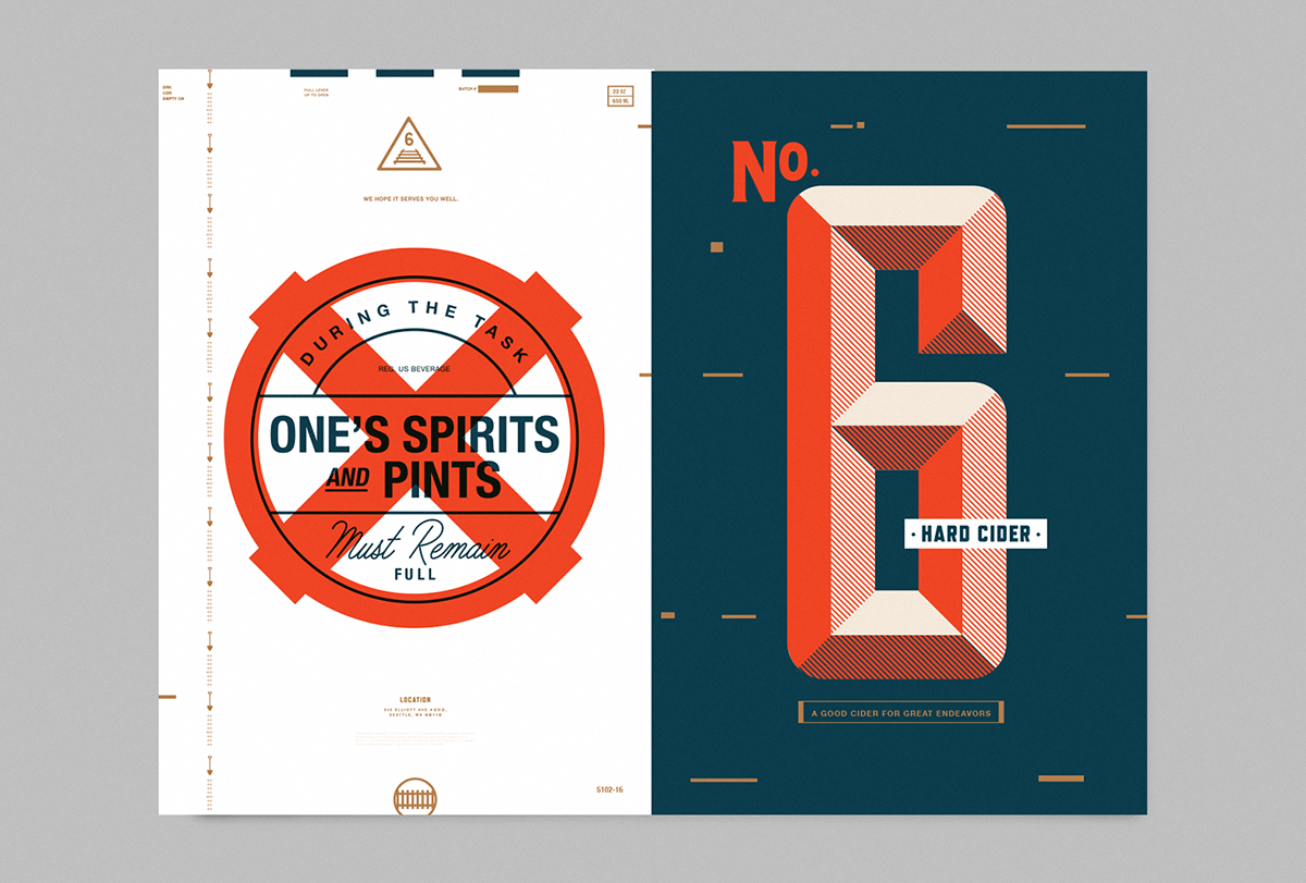
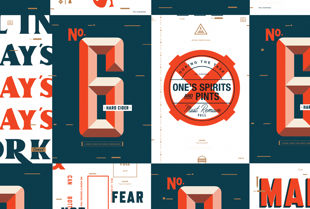
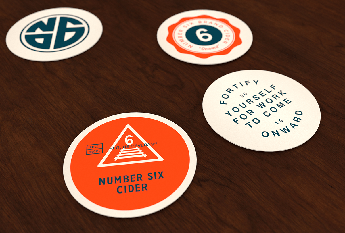
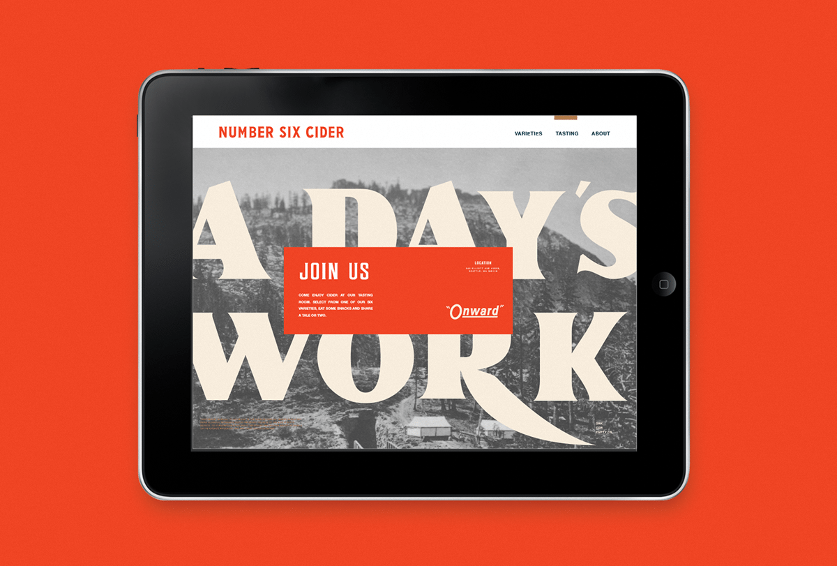
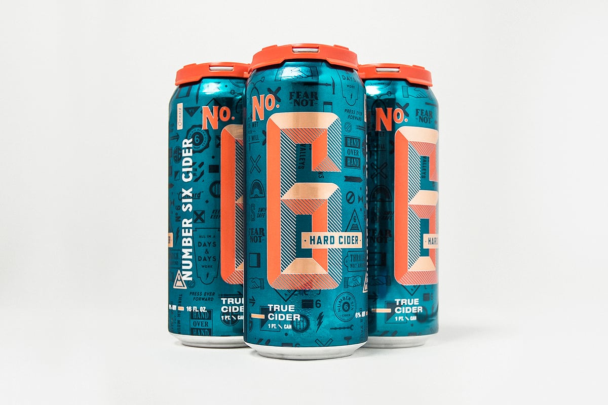
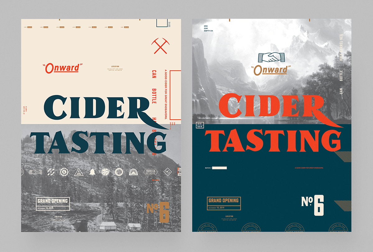
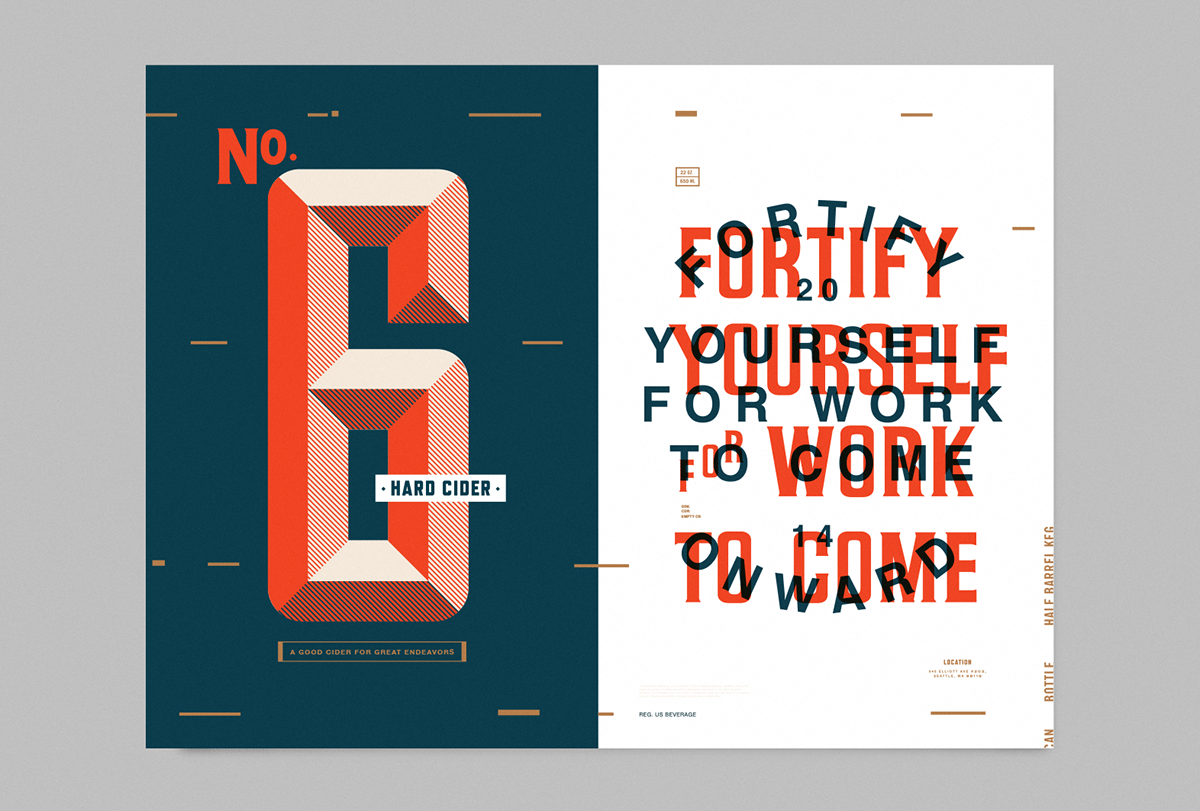
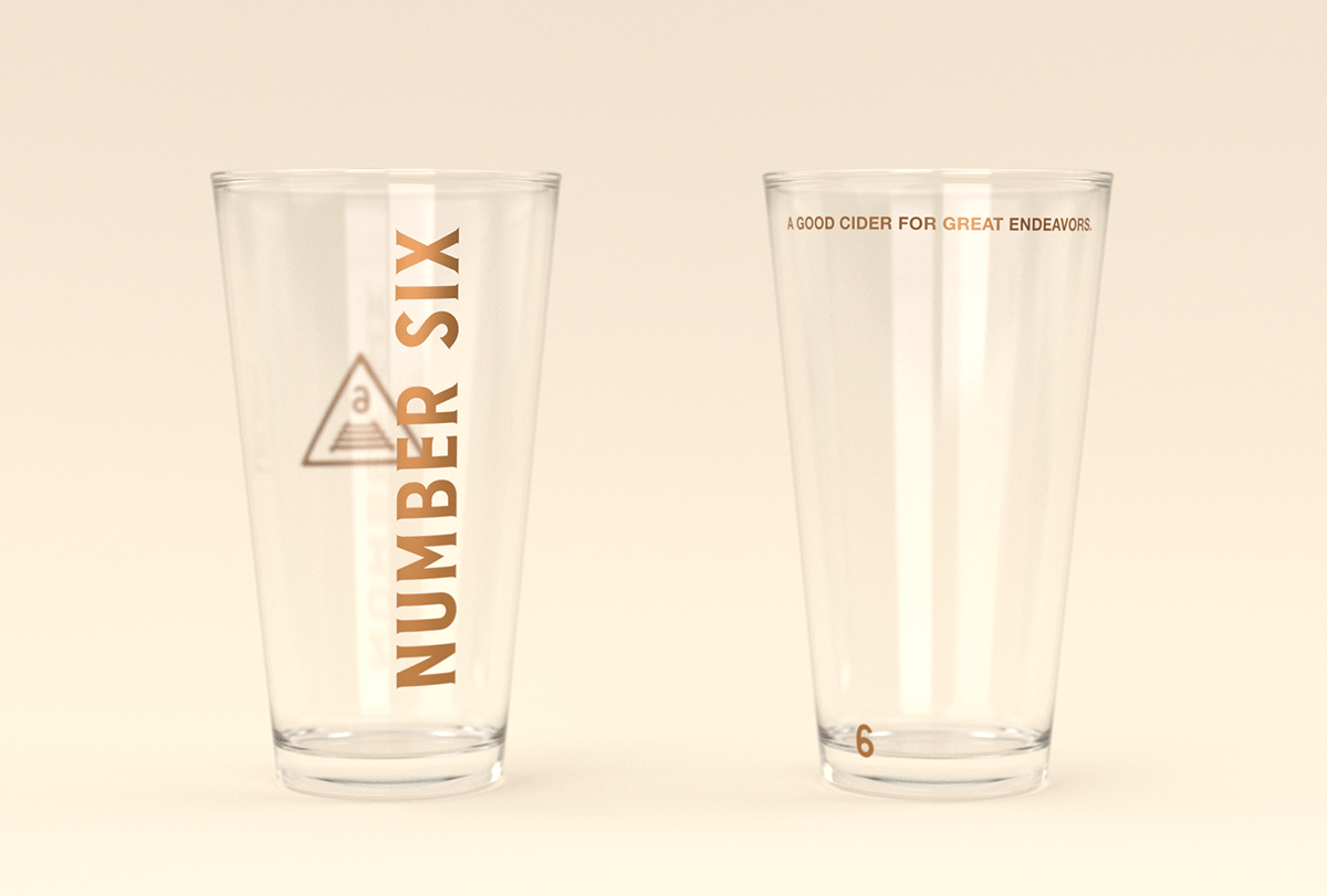
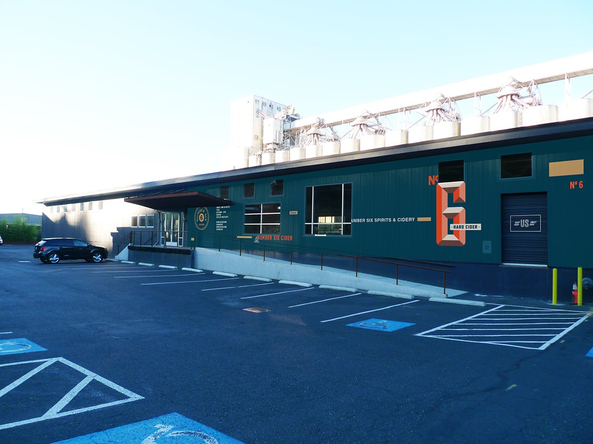
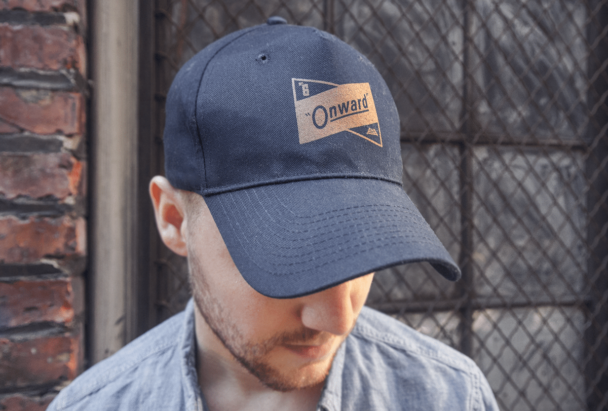
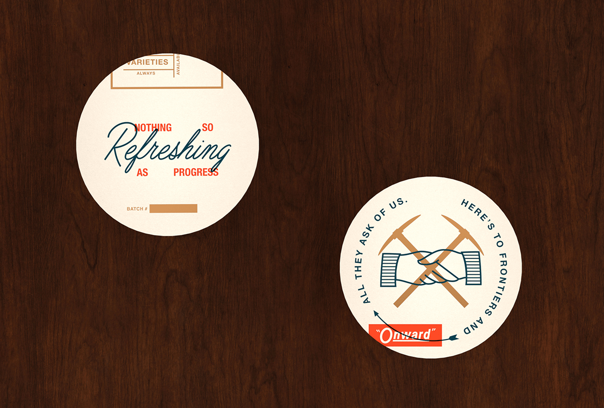
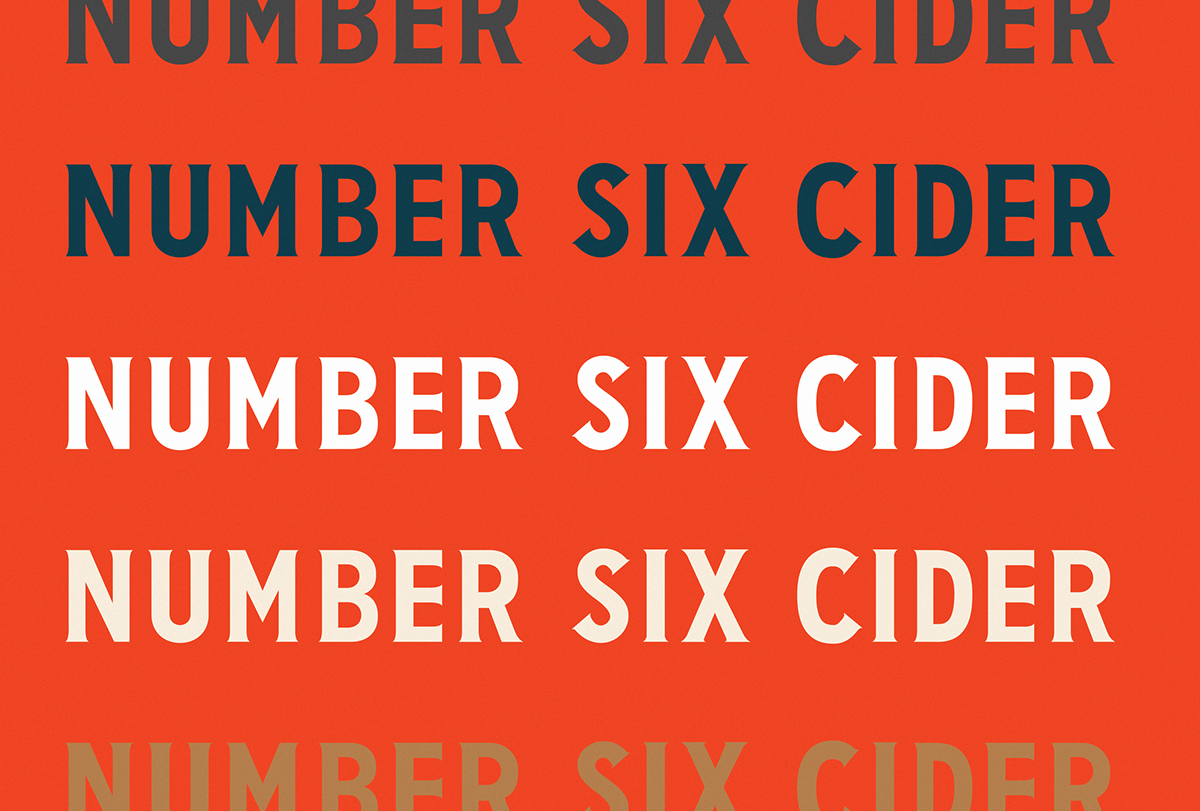
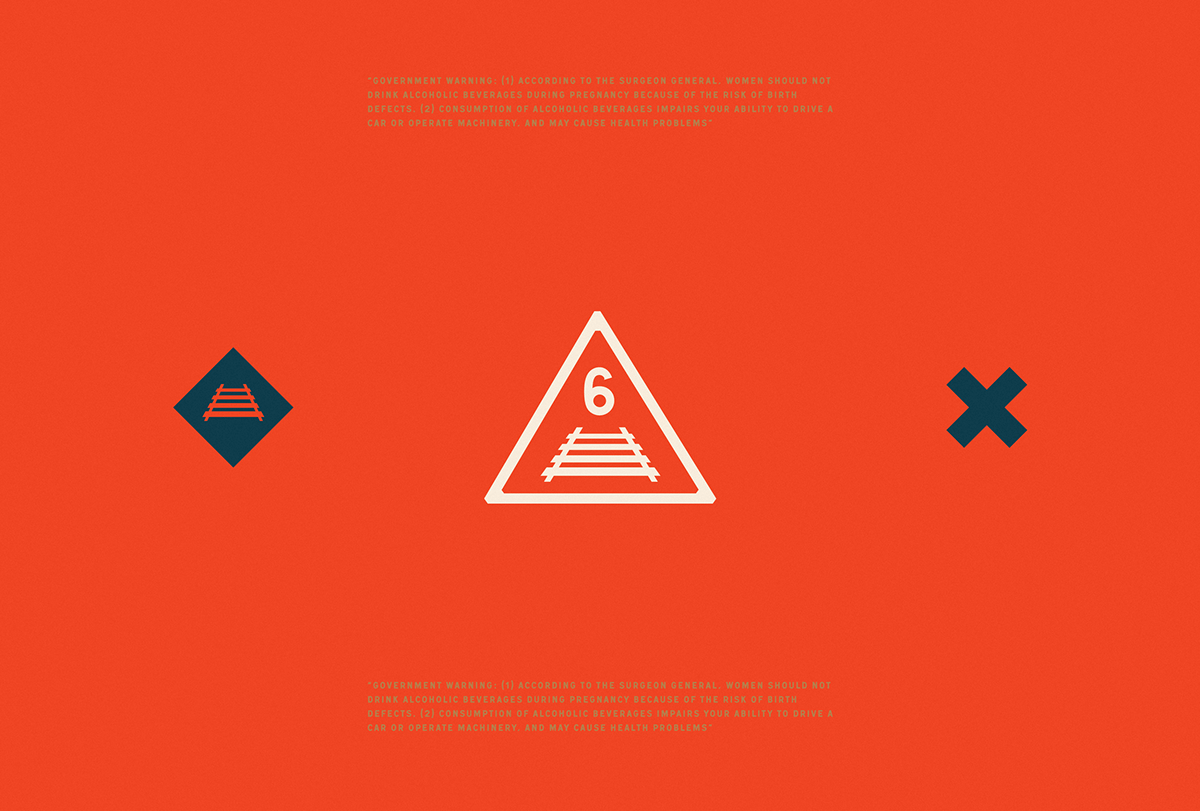
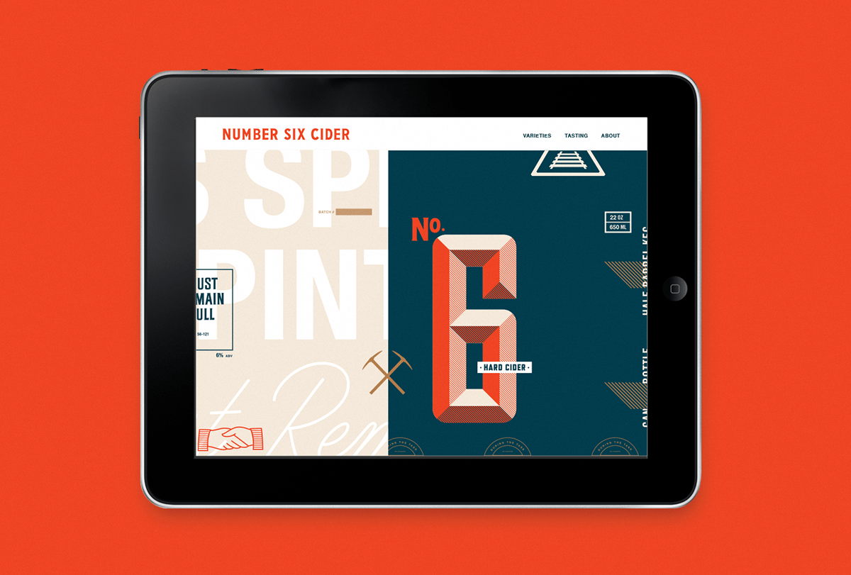
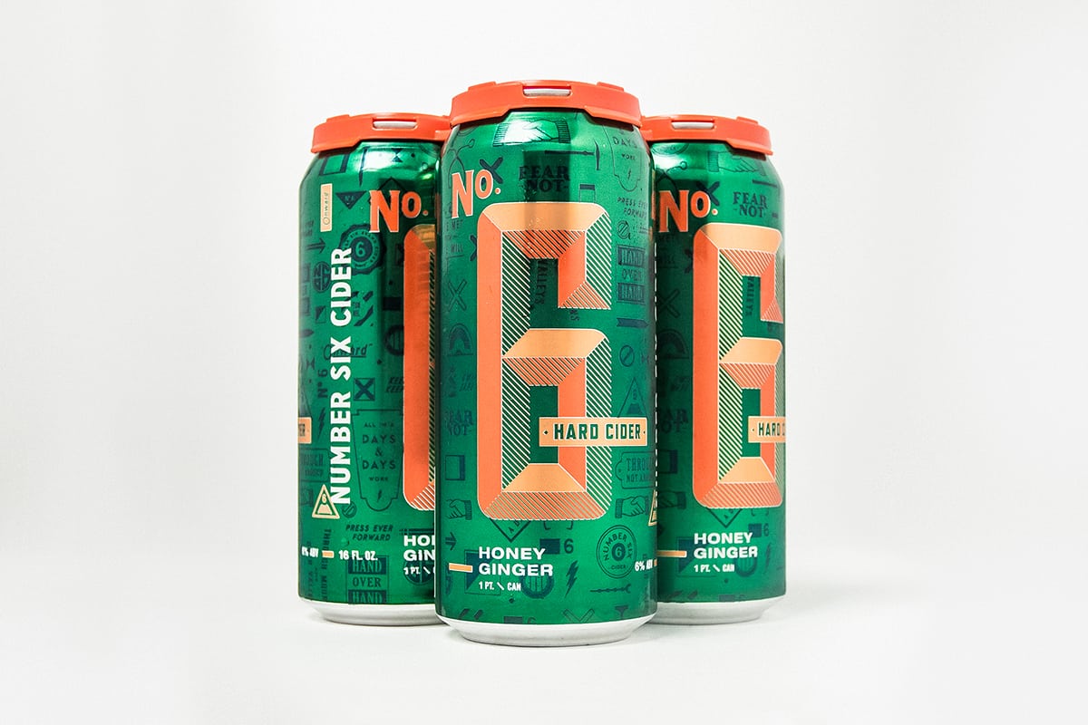
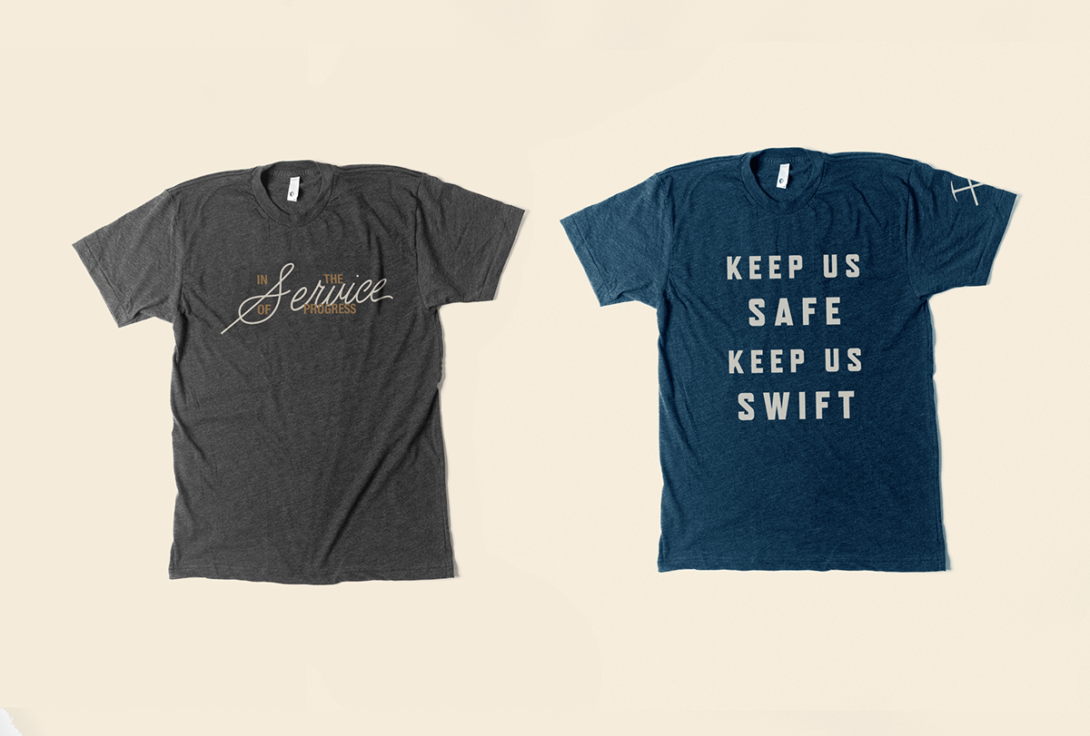
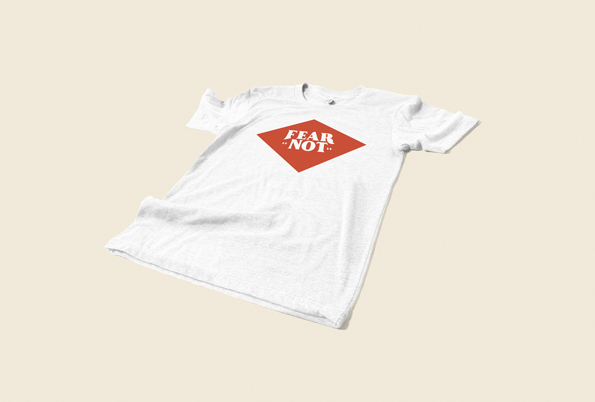
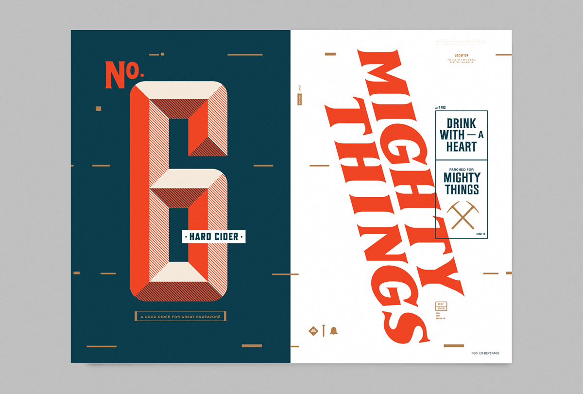
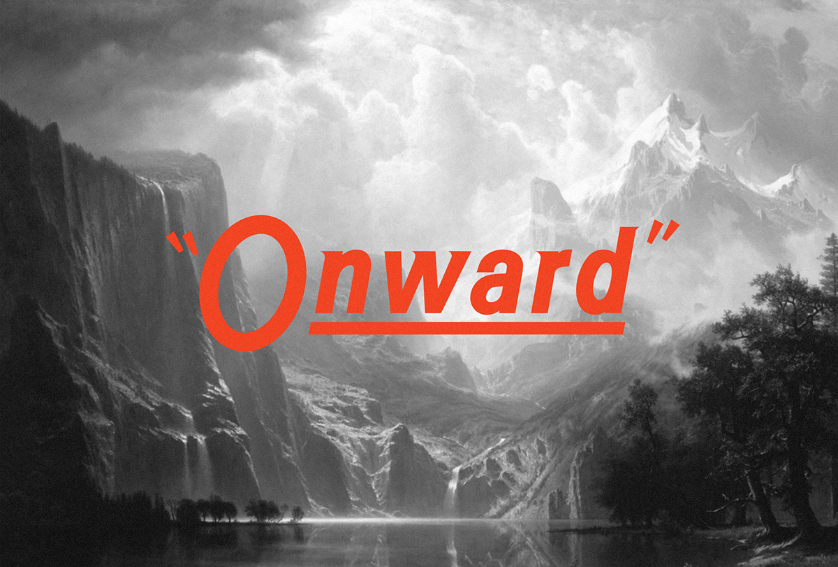
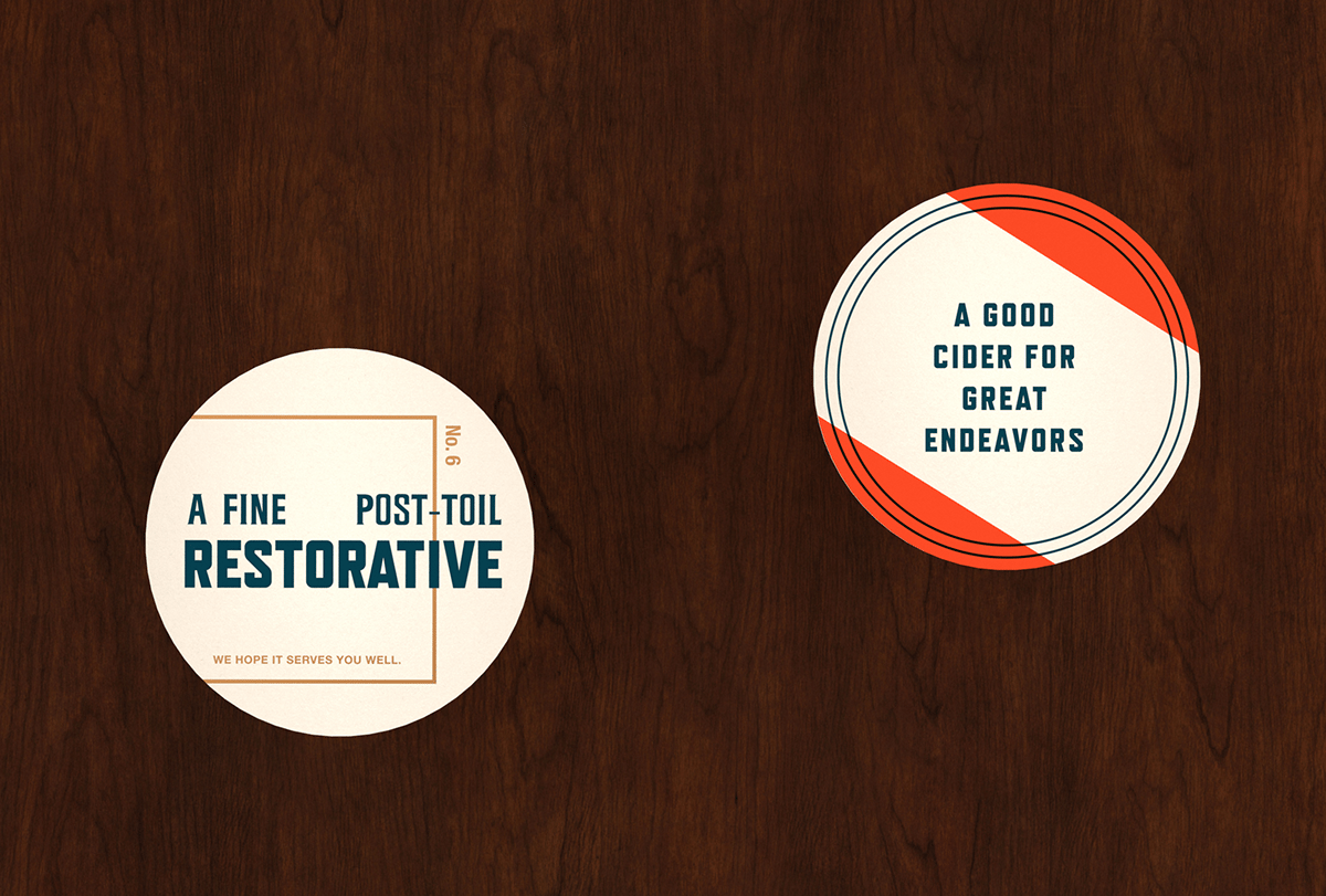
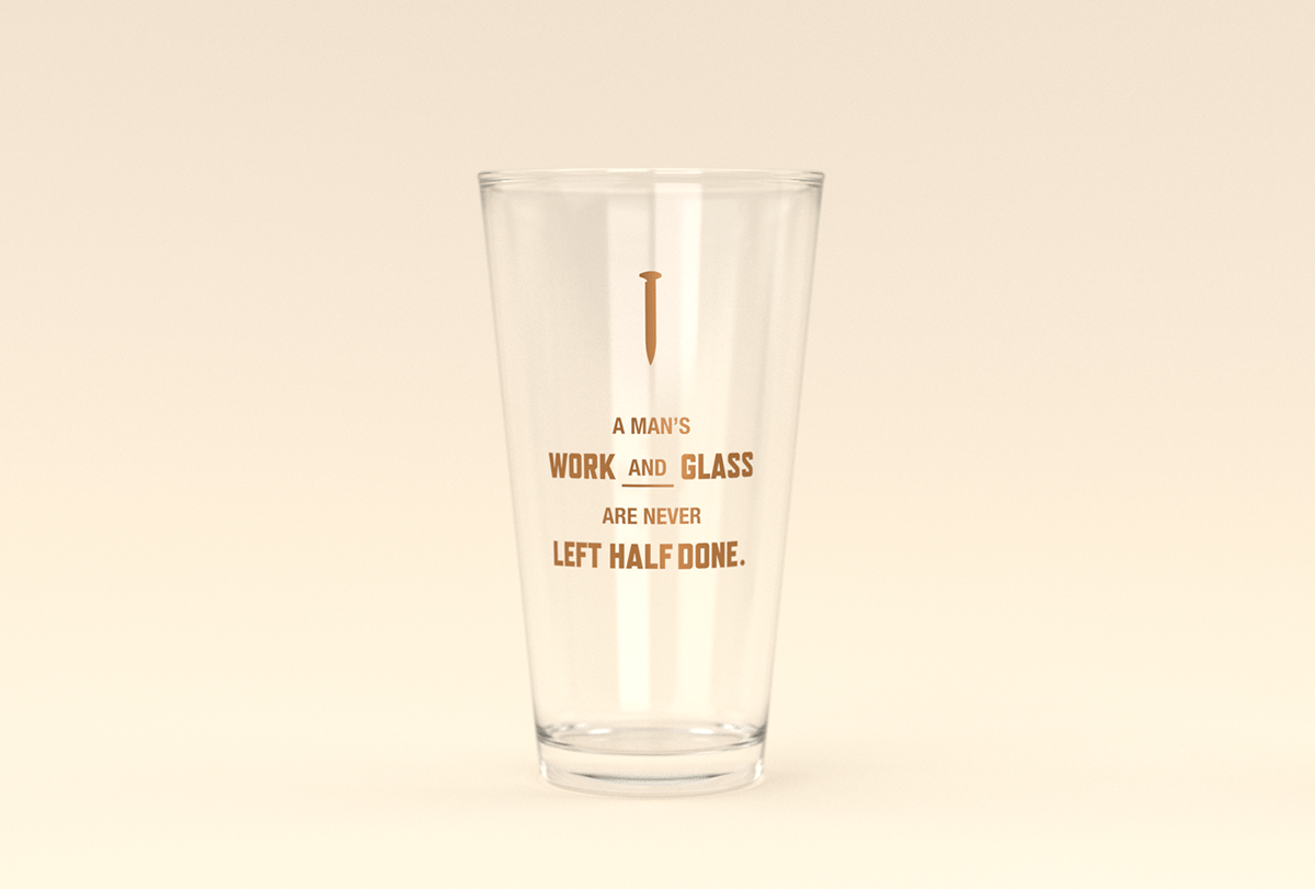
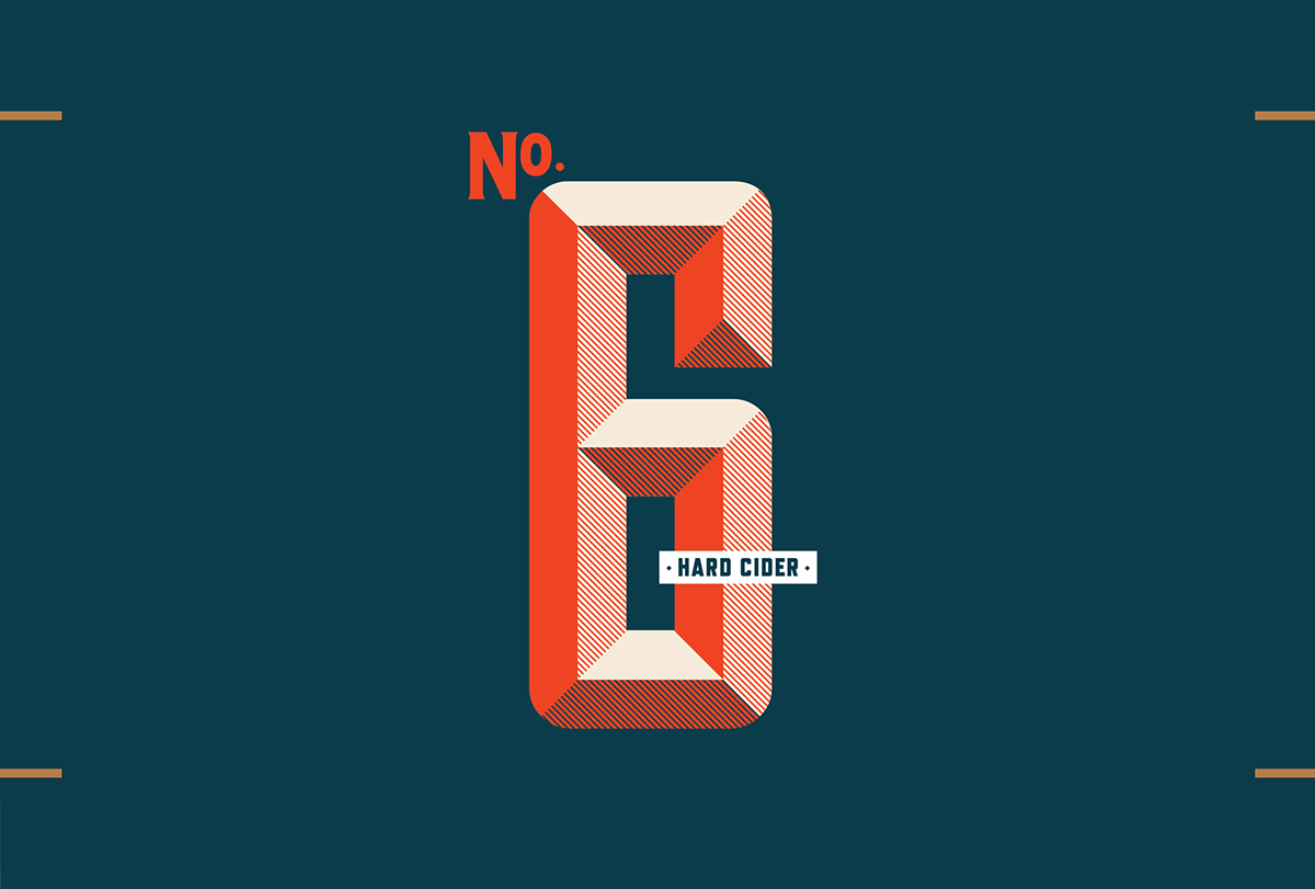
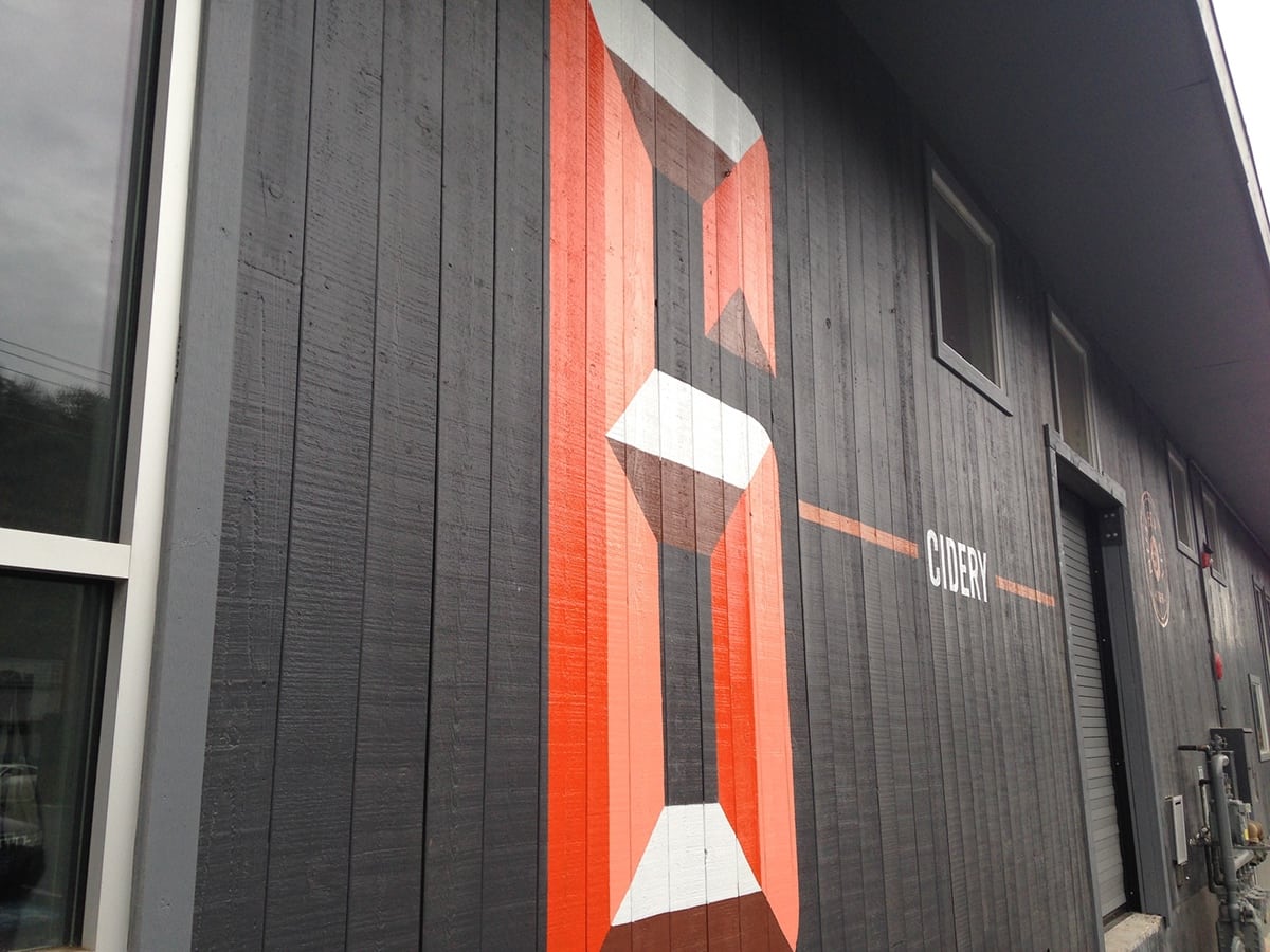
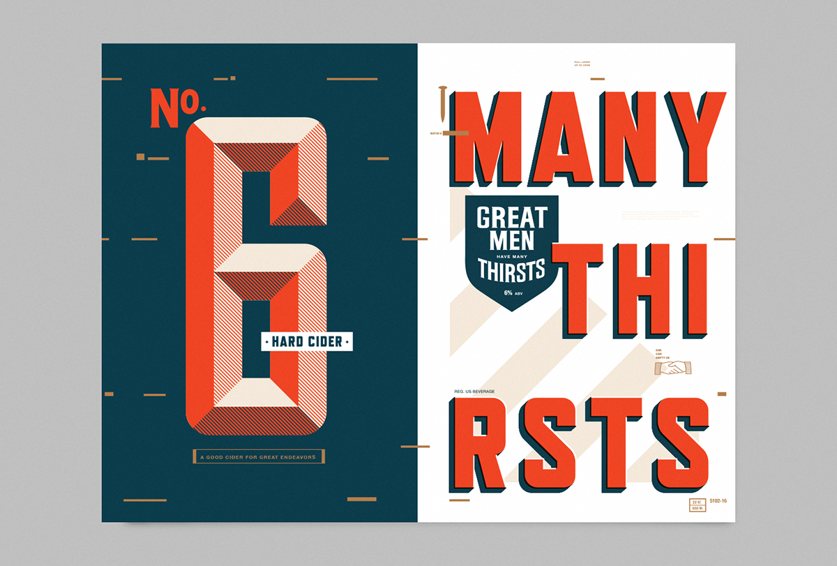
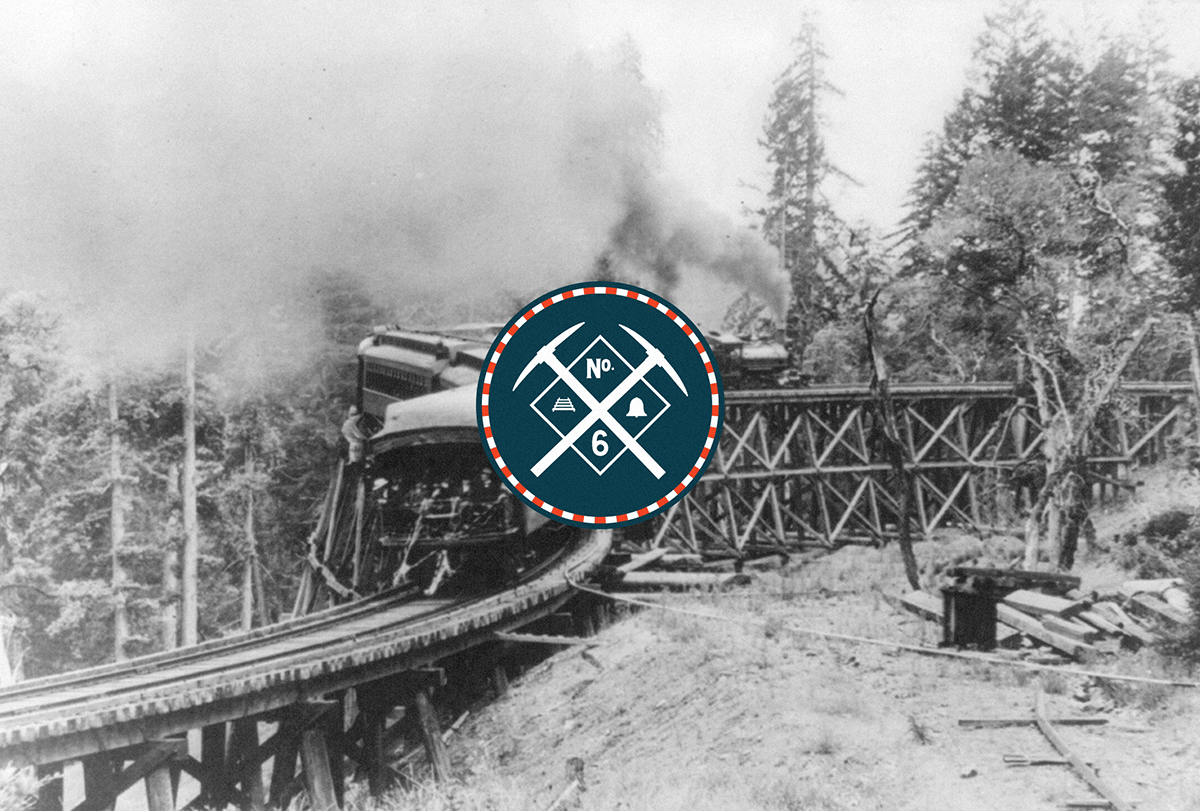
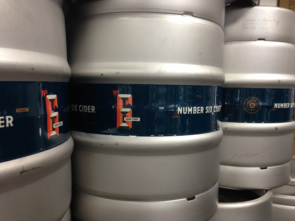
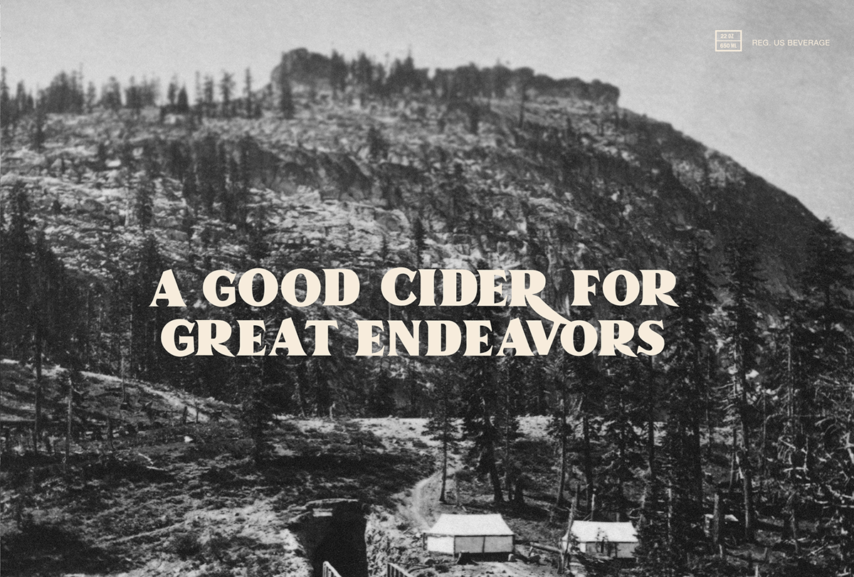
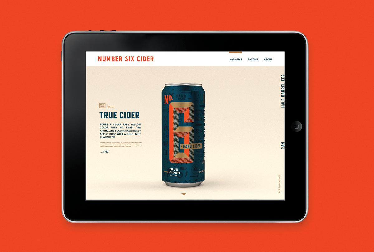
No 6 Hard Cider is situated alongside the rail yards of Seattle, and features a brand forged in the spirit of Manifest Destiny. It takes cues from the American railway system, and the hard work it took to connect America’s east coast and west coast. It features a patriotic color palette, shifted so that the red leans more orange and the blue leans navy. Strong vintage-inspired typography feels deliciously throwback Americana, especially with how multiple typefaces are layered and used across several brand touchpoints. The larger than life layouts that break the grid bring this late 19th century inspired brand into the 21st century. Regarding the name No 6, here’s a quote from Creature’s Behance page that really captures the brand spirit:
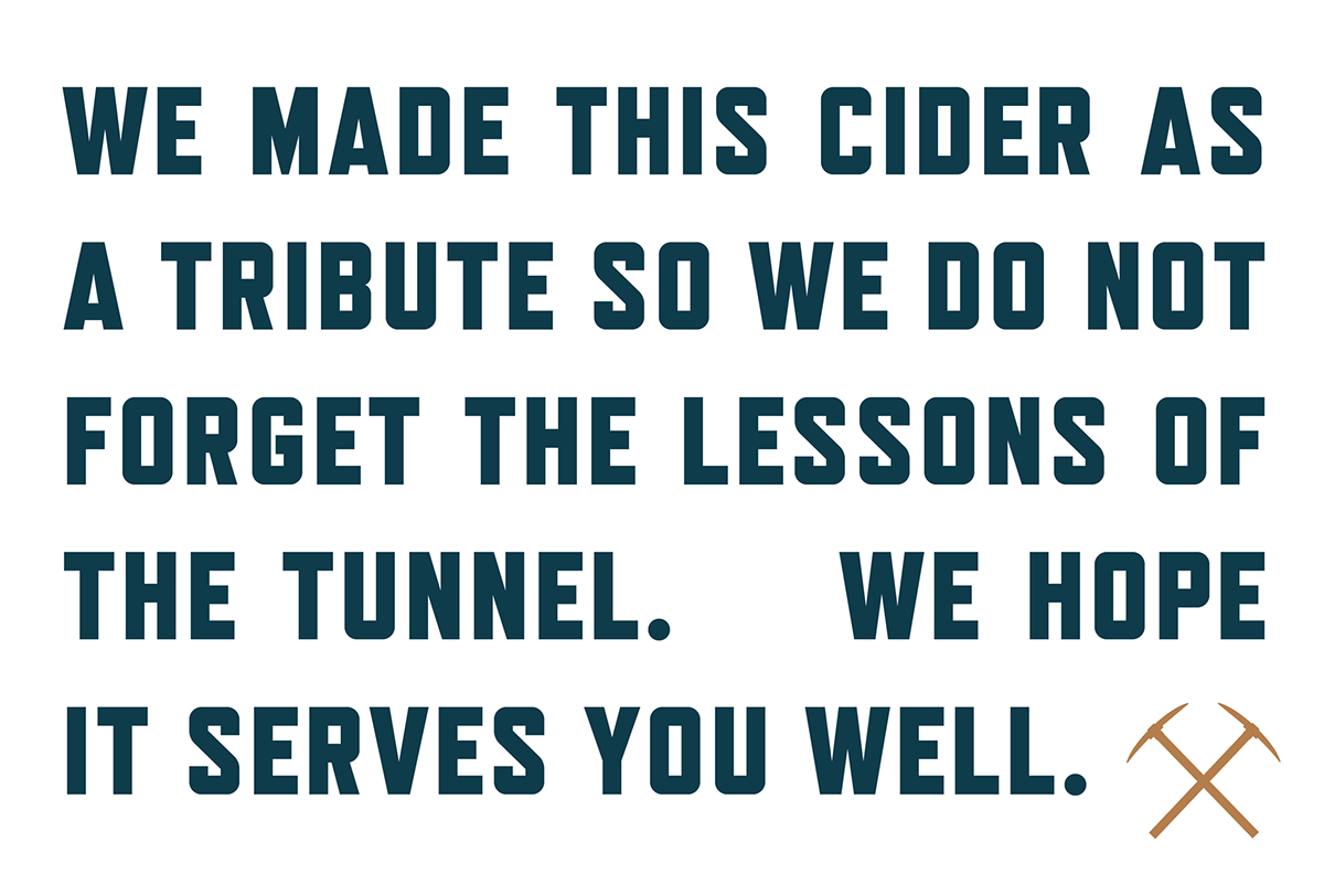
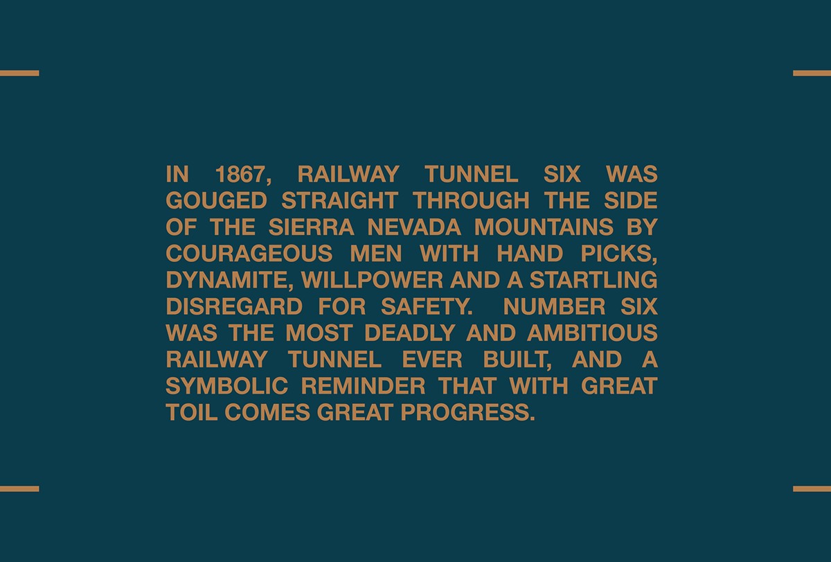
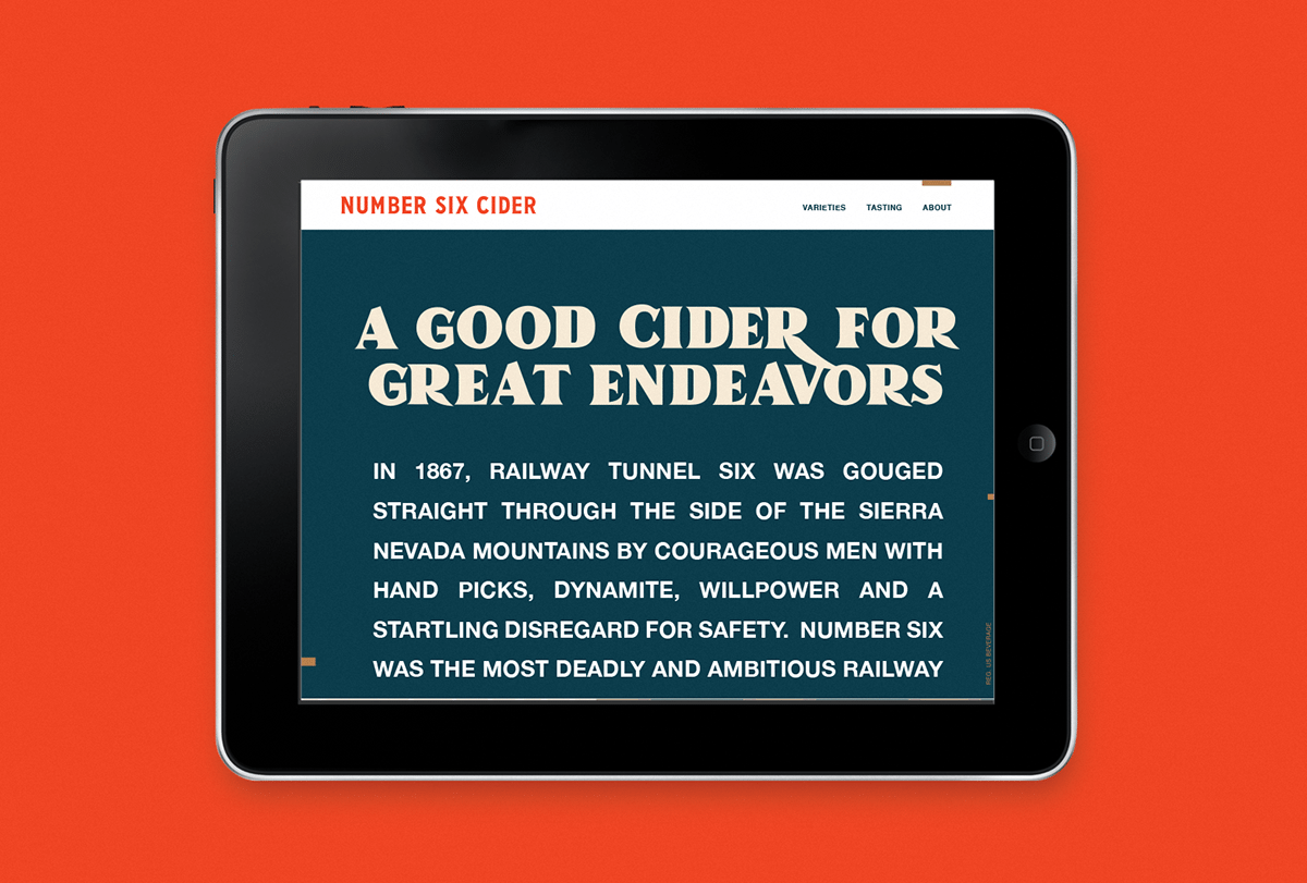
In 1867, railway tunnel six was gouged straight through the side of the Sierra Nevada mountains by courageous men with hand picks, dynamite, willpower and a startling disregard for safety. Number six was the most deadly and ambitious railway tunnel ever built, and a symbolic reminder that with great toil comes great progress.
No 6 Cider branding and Packaging by Creature.