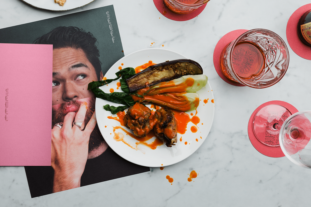
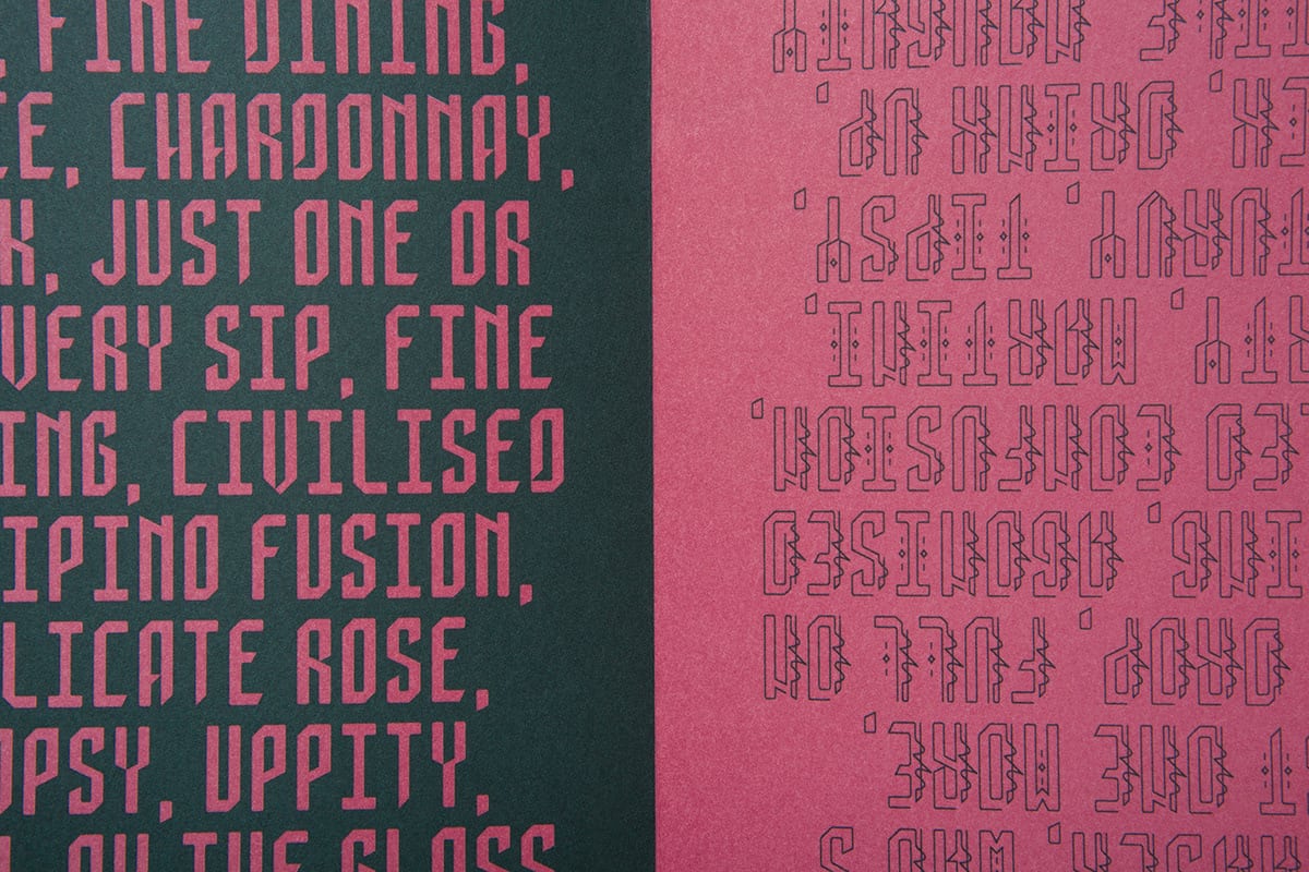
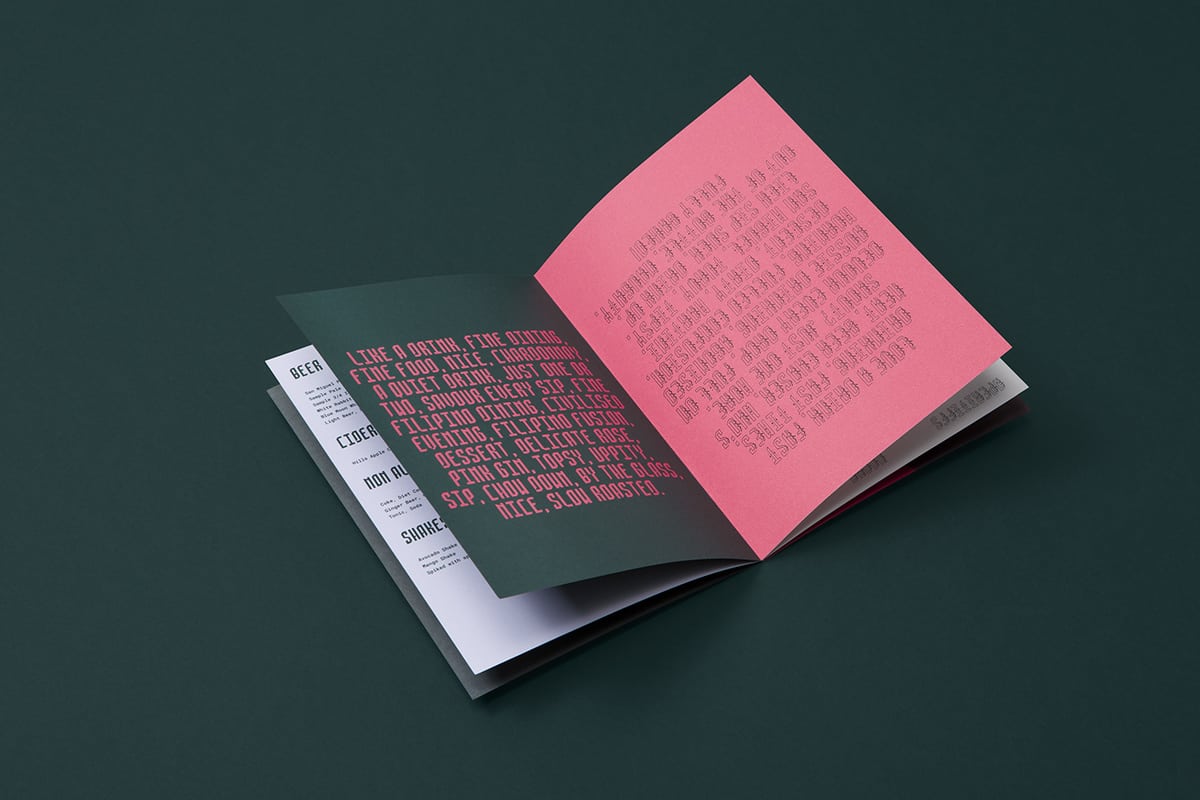
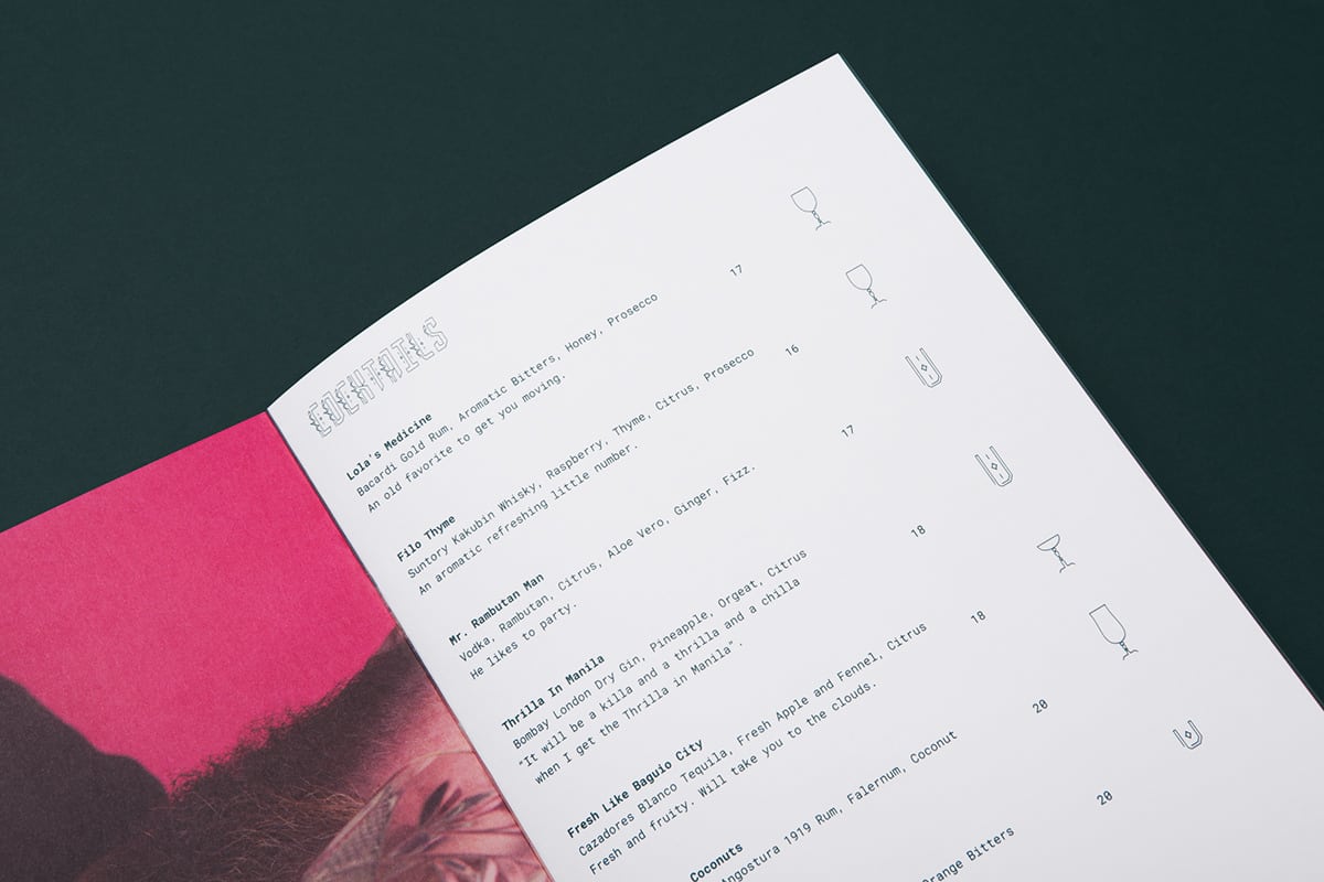
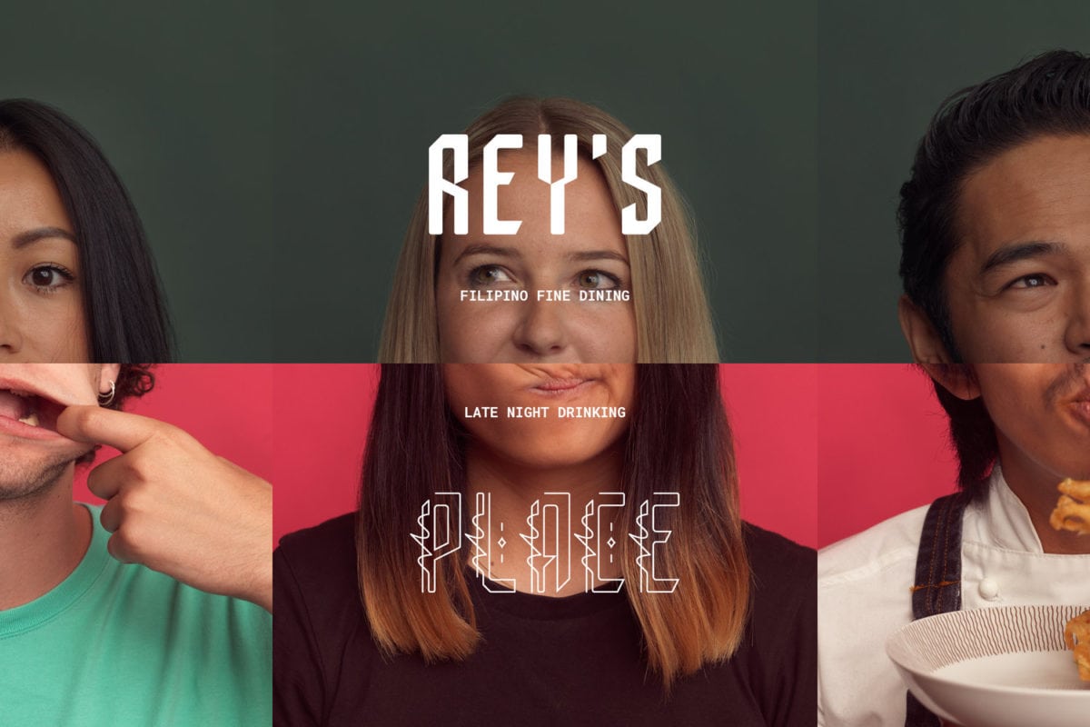
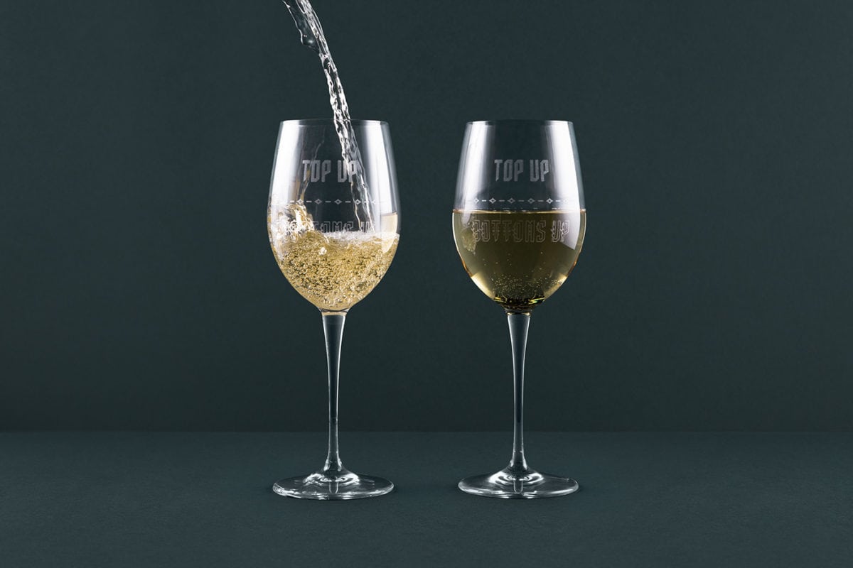
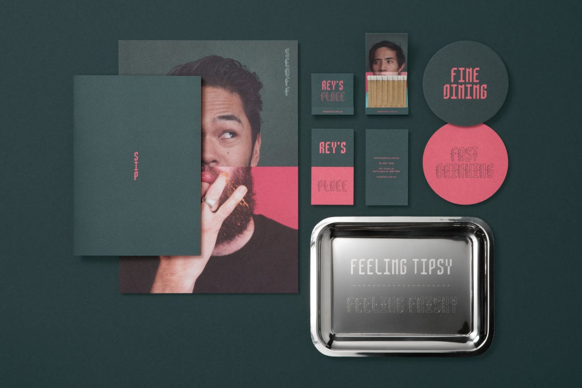
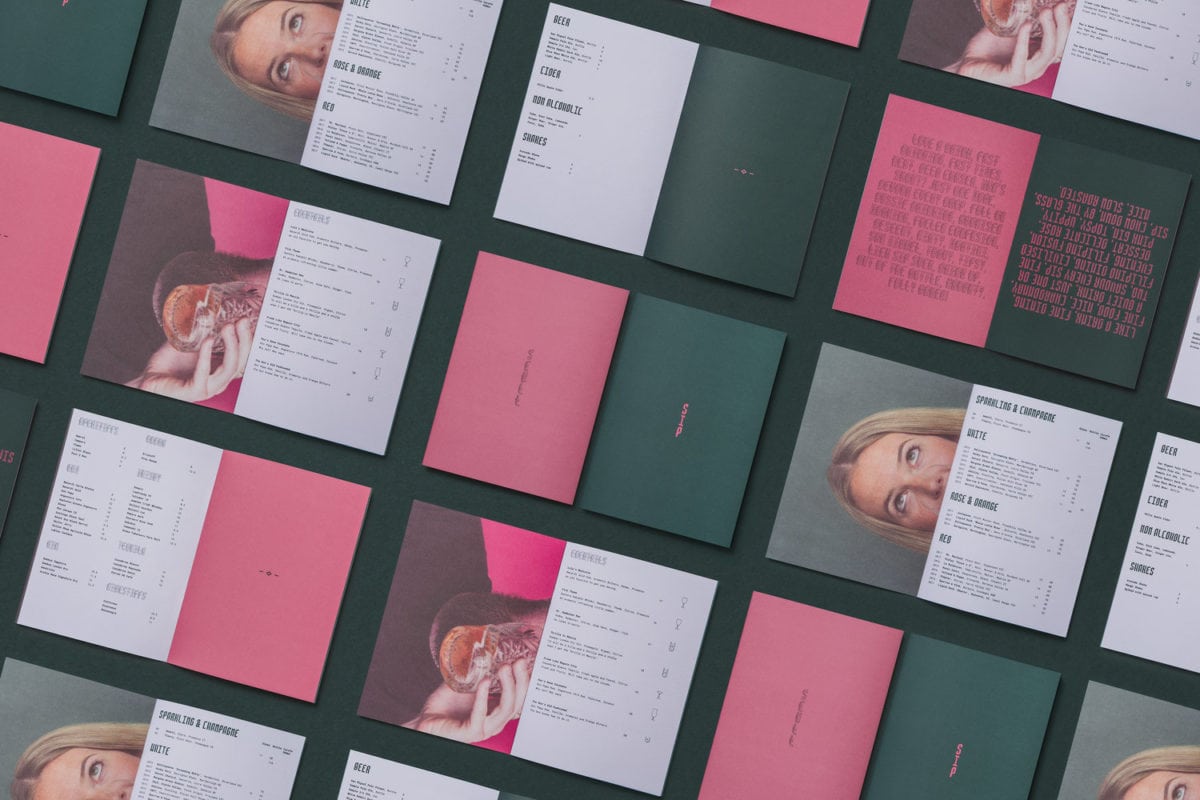
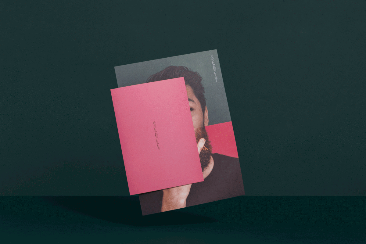
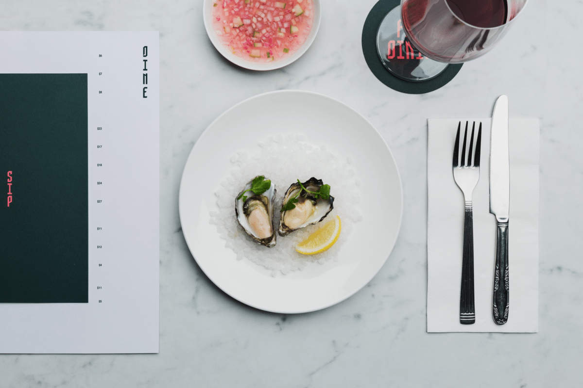
Rey’s Place is the first Filipino fine dining experience in Sydney. It’s also got a basement level, that turns into a late-night drinking, shot-smashing bar after hours. This dichotomy is represented via the duality of the brand; split colors, split typefaces, two different stories to tell, brought together harmoniously.
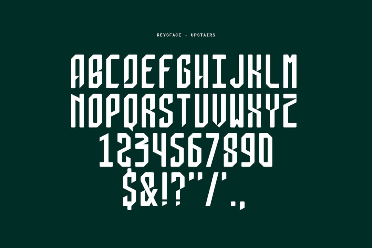
The way the designs are split directly references the fine dining experience upstairs and the basement bar; the photos, for example, are softly lit on top and desaturated slightly, while the bottom half of the photos are boisterous, bright, and fun. All the restaurant collateral has a dedicated dark sage green palette; the bar has a dedicated pink palette, and the two intermingle freely when both stories need to be told. Additionally, a custom typeface was created for Rey’s Place inspired by traditional Filipino calligraphy; the version with sharp edges and hard cuts is refined and reserved for restaurant usage, the the other weight with winding lines and more personality is reserved for the bar usage.
