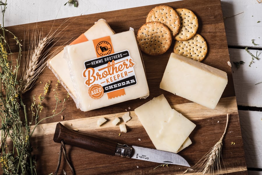
The Hemme brothers take their cheesemaking very seriously, to the point where they grow the corn that is fed to the cows that make the cheese themselves. This attention to detail is reflected in the packaging and brand created by We Hate Sheep. It stands out from other farmstead cheeses on the shelf by using a bright orange as its primary color and taking a type-heavy approach. Other details not to miss; a subtle lowercase h is hidden in the barn illustration, and don’t forget to oogle at that script in their main logomark and on other packaging touchpoints.
Hemme Brothers Creamery by We Hate Sheep.


