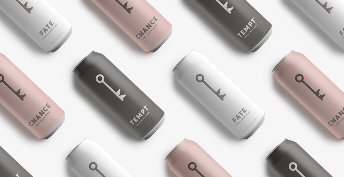
Can wine in a can, a concept that’s typically associated with low-quality box wines and wine coolers, be repositioned as a quality product? As it turns out, yes, yes it can (ha!). Hyperquake worked closely with Wine Society to not only transform perceptions of non-bottled wine into a premium product, but also develop a brand language that leads with clever copy, intrigue, and beautifully minimal design.
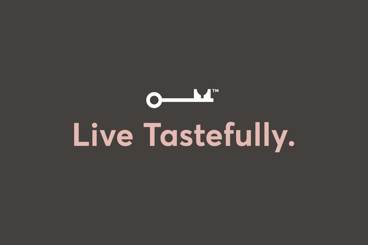
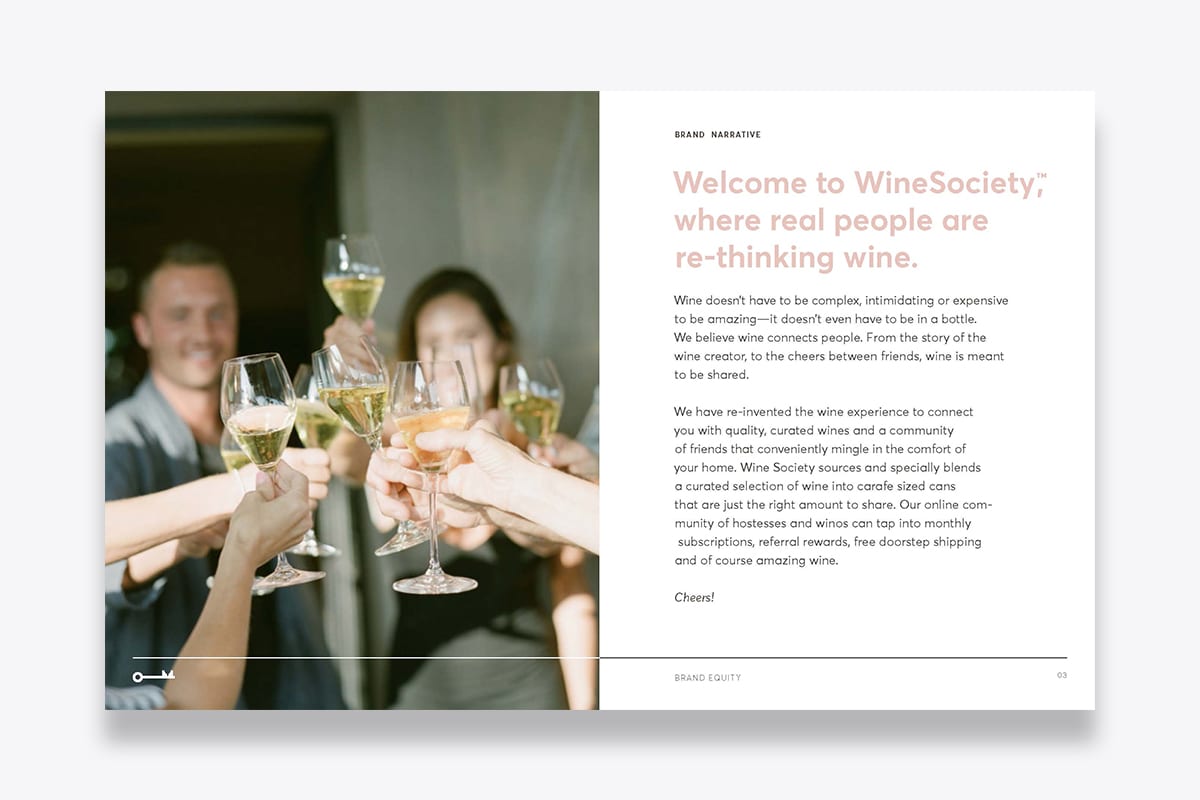
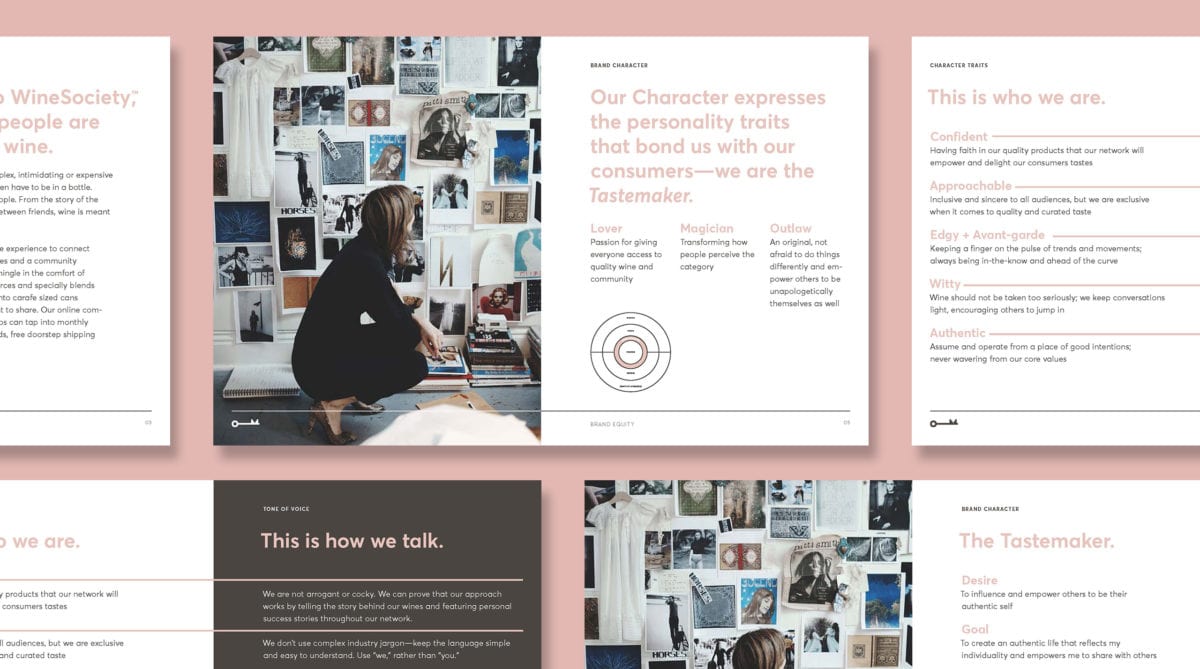
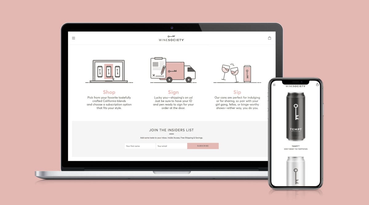
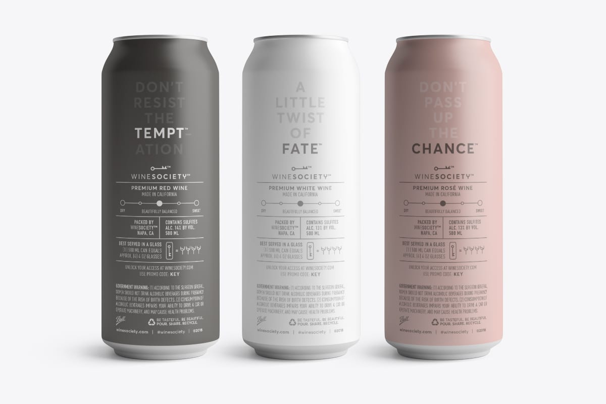
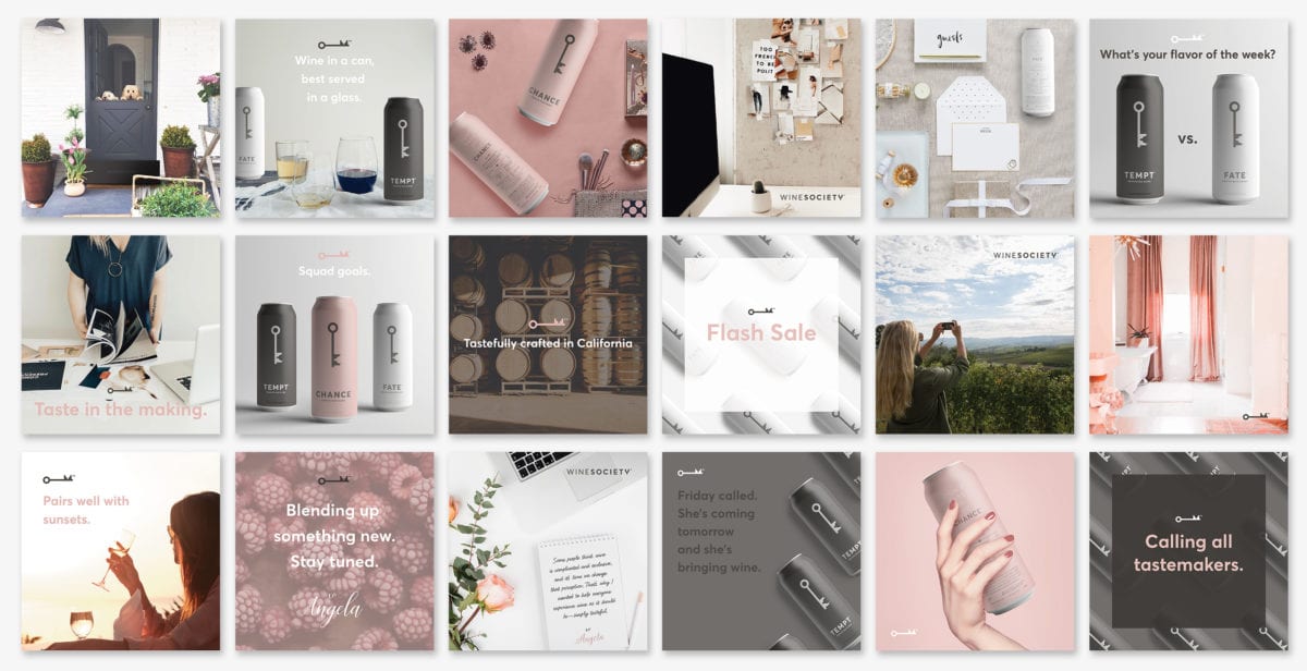
Starting with the marque, the minimalist geometric key (as a lockup or alone) gives the consumer a sense of exclusivity in its simplistic, yet informative form. The color palette, while quiet, is a timeless and elegant combination of neutrals and a soft rose pink typically found in upscale beauty products and luxury goods. Combined with the product category, these branded assets, packaging, and snappy copy absolutely nails their target audience and silences any preconceived notion of non-bottled wines being low-grade. On top of the visual language, their emphasis on sharing also gives it solid footing it in a society powered by social media.
Wine Society by Hyperquake.