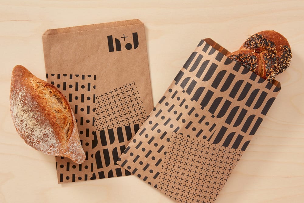
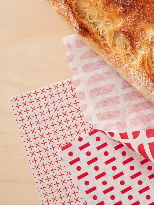
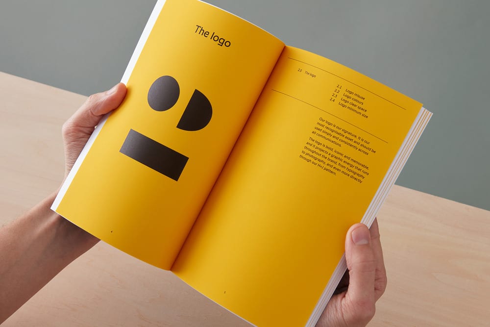
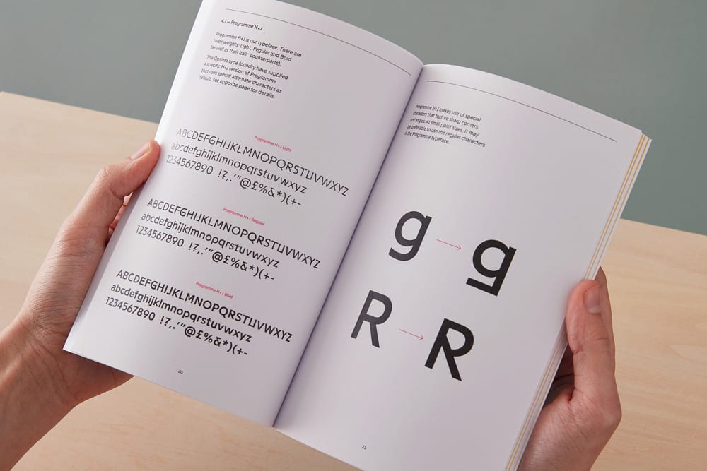
H+J is food event/catering company that works with iconic venues on large, ambitious projects. Spy Studio was tasked with creating a new look for them that reflected their creativity, independent streak and ambition. The wordmark, composed of individual, abstract geometric shapes, is broken down and rebuilt as several different brand patterns, haphazardly splashed across stationary and packaging. Food is used as an architectural element in H+J’s brand photography, creating surreal and dreamlike landscapes that add a sense of the avant-garde to their website and books. I particularly like the ‘office lunch’ still life; stacks upon stacks of Post-It Notes, interwoven with perfectly cut sandwiches, suggests that H+J’s catered office lunches are anything but boring.
H+J Branding, Art Direction and Photography by Spy Studio.


