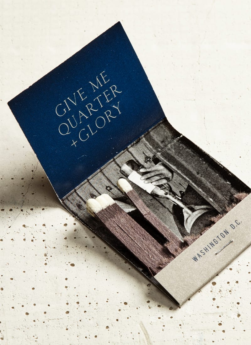
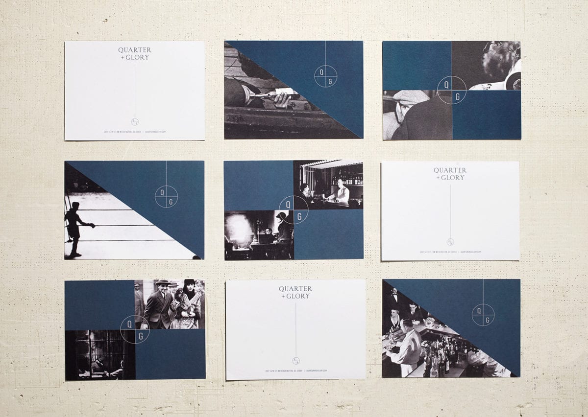
Quarter + Glory is a nod to classic bars where your average American gathered to share good drinks and good conversation. The branding seems to take inspiration from the early 20th century (1940s if I had to guess), embodying the creative spirit of that era and the individuals who came together to discuss their craft and process. These characters are represented through the curation of black and white photography used as the main visual element throughout the brand. Each photo ‘gives glory’ to one of these characters; most of them seem in the midst of introspection, planning their next big move.
Quarter + Glory Branding & Print Design by LMNOP Creative.


