A simple concept, when done well, can fold in multiple layers of symbolism and meaning in visuals that can be deceivingly minimal. Santafe Wine is a great example of this methodology. Backbone Branding worked together with the Santafe café to create a label for their seasonal wine in a way that really encompasses the nature of their unique offering.
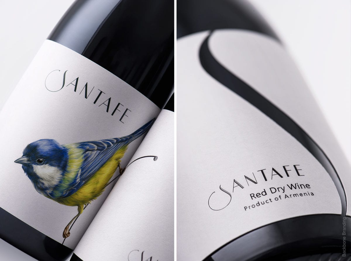
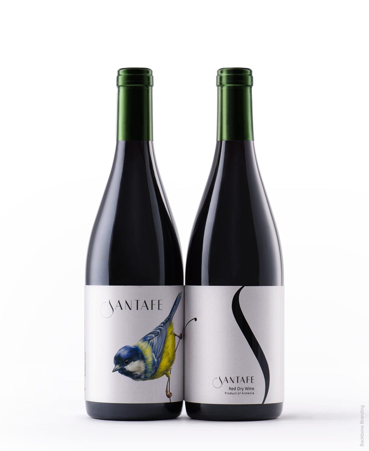
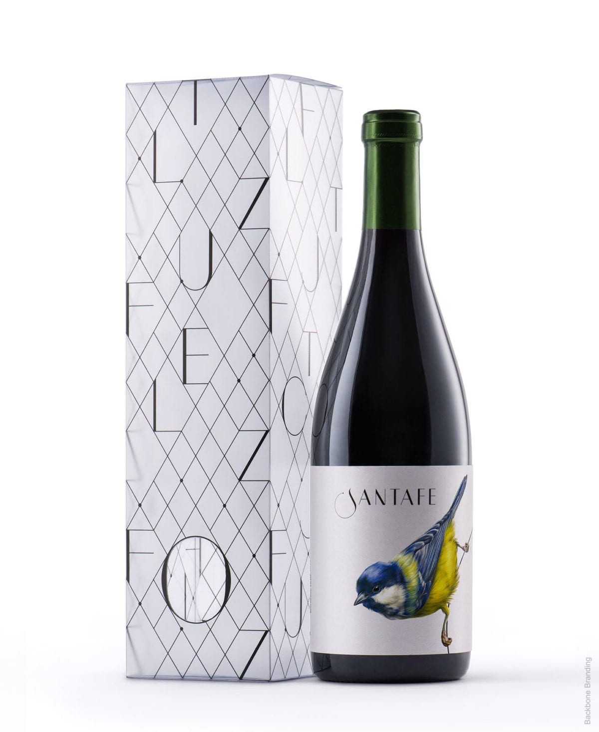
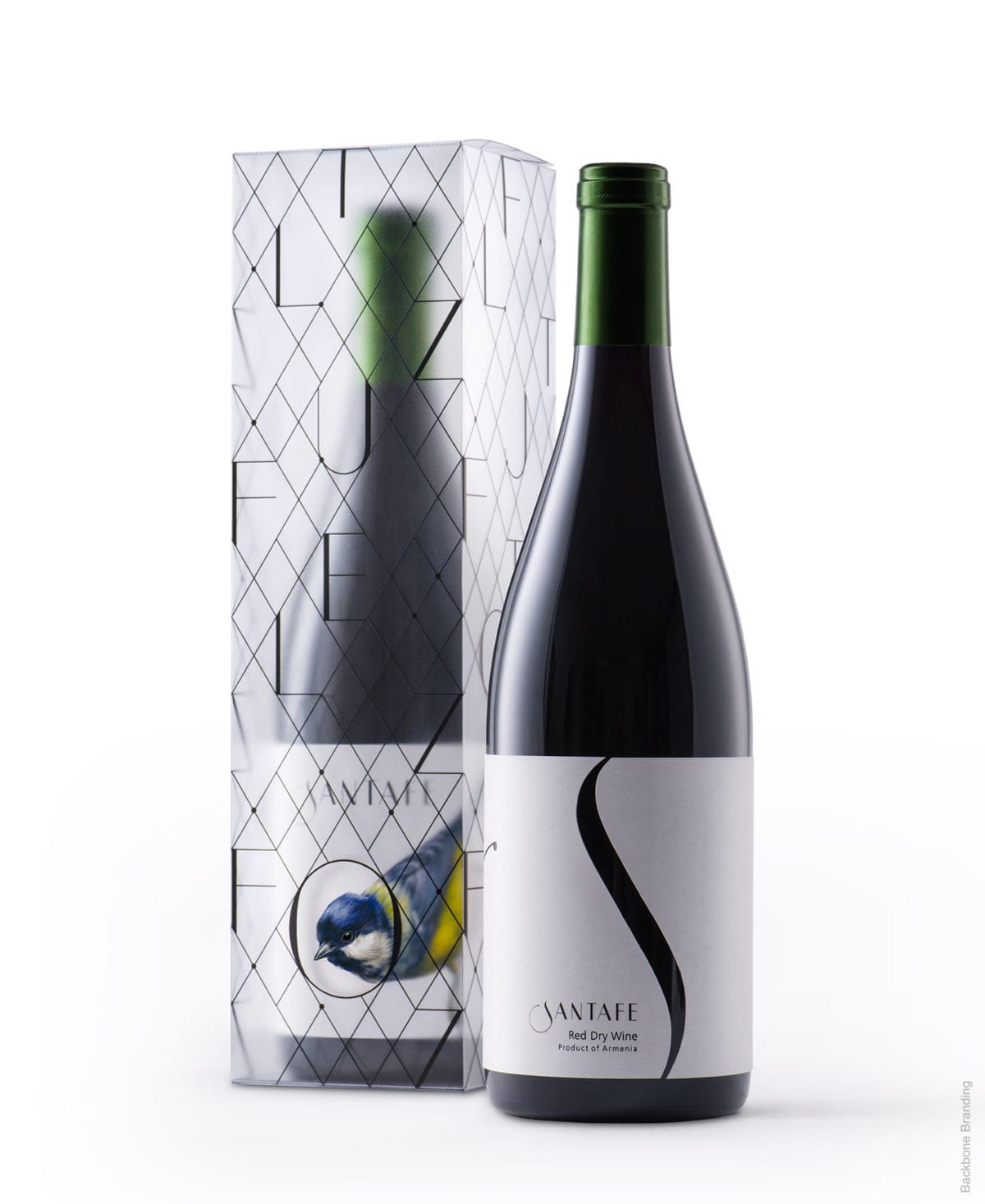
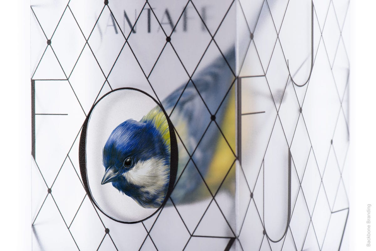
Based off of the Blue Tit, a bird that is non-migratory and mostly only seen during warmer seasons, the containing box represents both a cage and a nest in which the bird resides in until more welcoming conditions are present. In practice, the user is able to physically free the bird from its confines which then reveals the bird in its entirety and the wonderfully minimalist label. The simple cuts and ample use of negative space across the board becomes a framing device for their bird concept and is free of visual distraction to detract from the beverage.
Deceivingly simple but wonderfully executed, Santafe Wine by Backbone Branding.