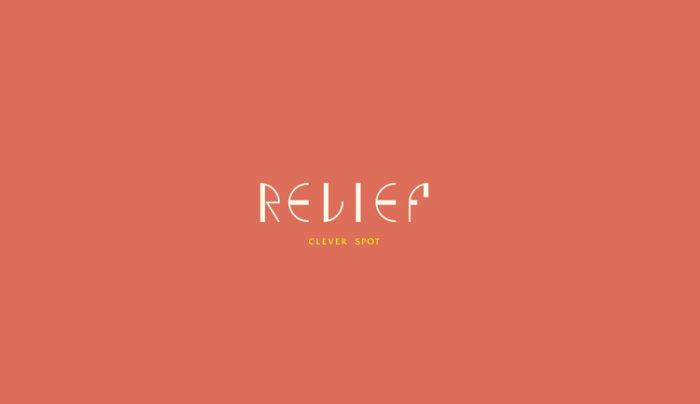
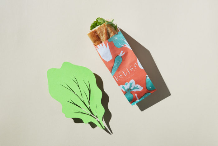
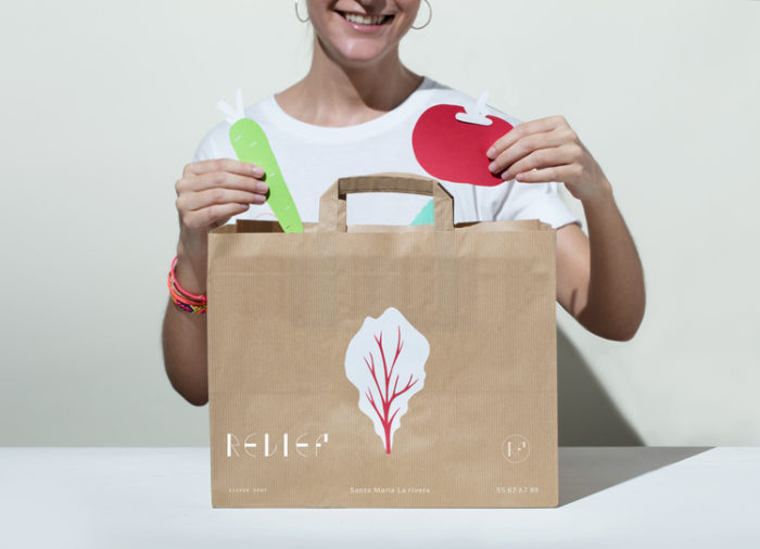
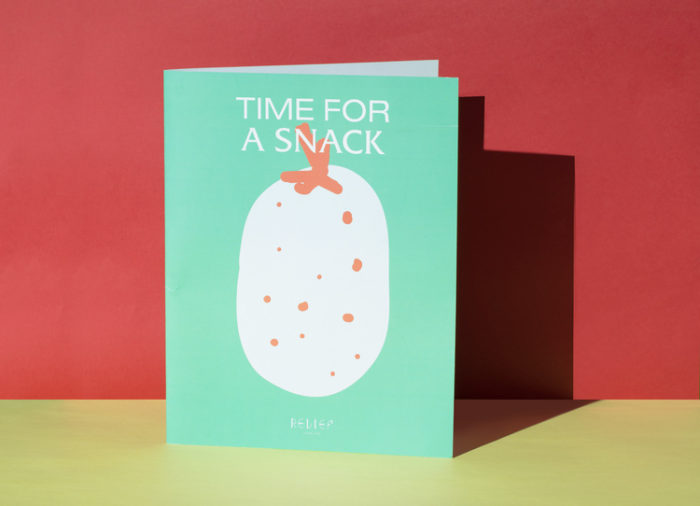
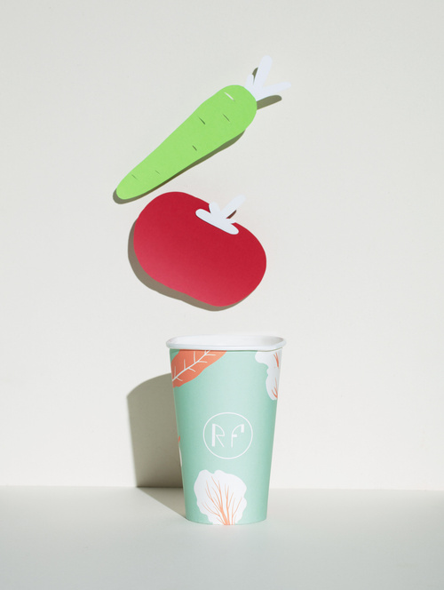
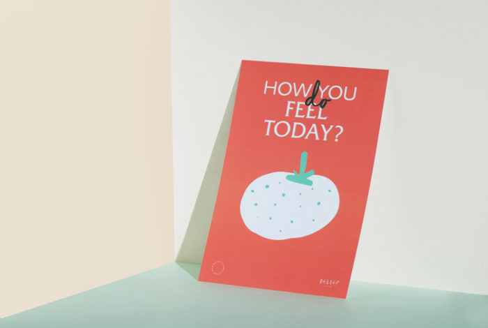
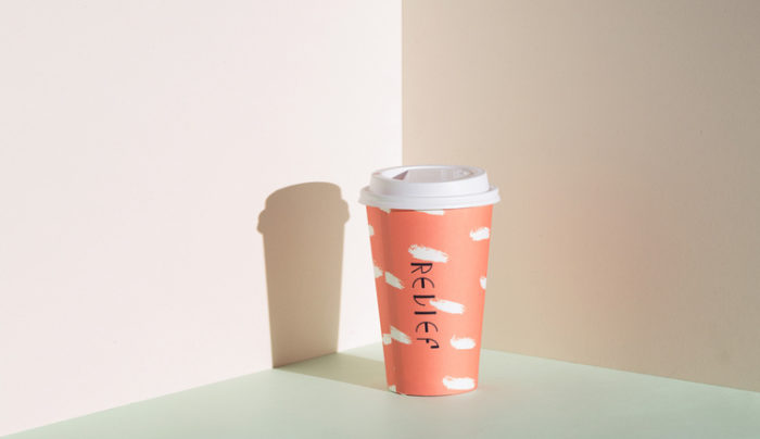
Relief speaks to a healthy, natural and carefree lifestyle via a set of organic, paper-cut illustrations and soft colors. The unique typography found in the wordmark showcases the brands’ whimsical flair, as does the unique mustache ‘clever spot’ in place of ‘cafe’. Floating compositions of illustration and type relay a sense of airiness, tying into the brand’s mission of providing relief and effortless health to its customers.

Relief Branding, Packaging and Art Direction by Estudio Yeye.
The Forktales Podcast™: Interviews with restaurant industry leaders and visionaries

Restaurant and advertising industry headlines and thinking

Reviews of restaurant experiences from around the globe 

Reviews of our favorite design, business, & restaurant books

Our favorite typography and fonts

Inspiration in your inbox

Get the latest inspiration in your inbox every Monday morning, for FREE!

"*" indicates required fields

This field is for validation purposes and should be left unchanged.

Delicious Bits in your Inbox!

Get the latest and greatest content delivered to your inbox for free!

"*" indicates required fields

This field is for validation purposes and should be left unchanged.