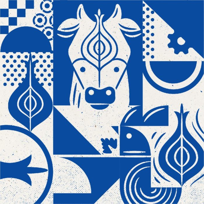
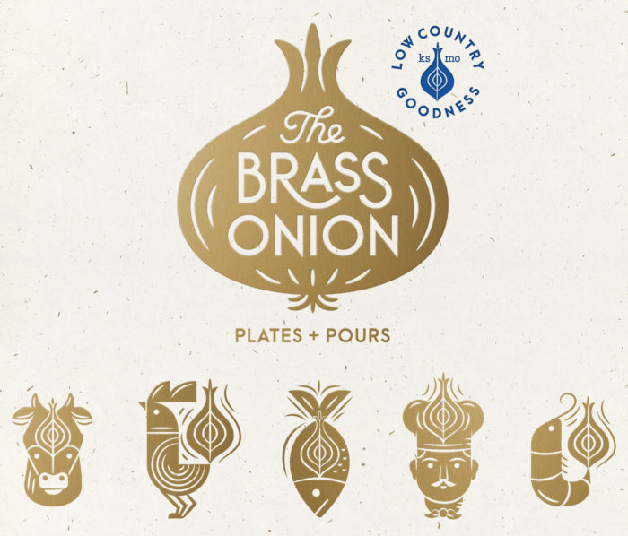
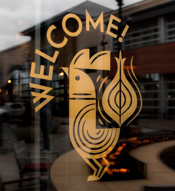
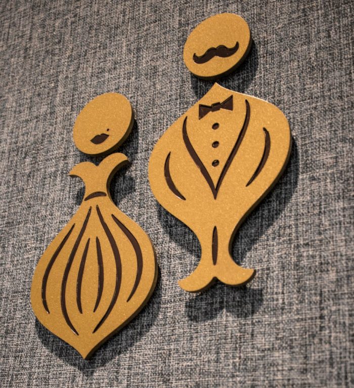
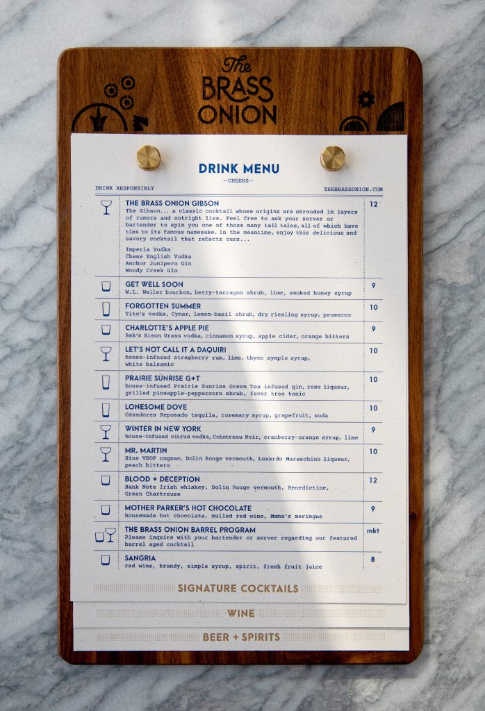
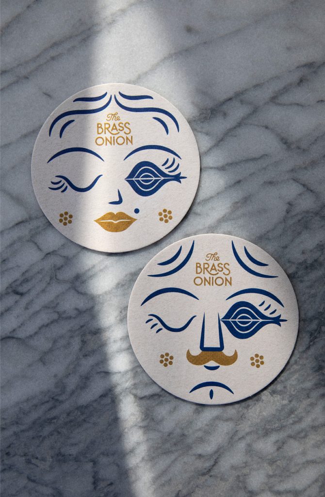
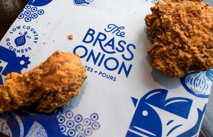
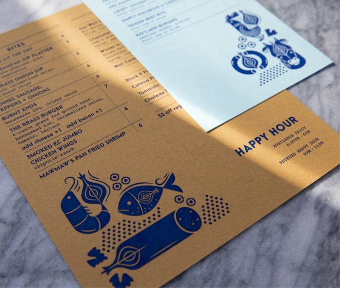
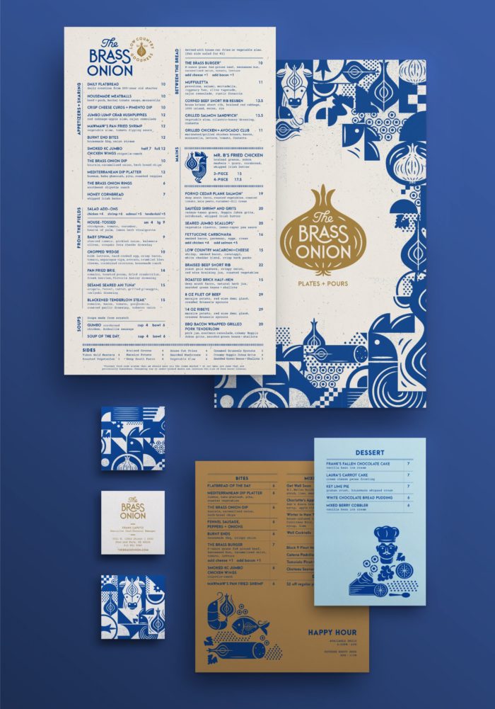
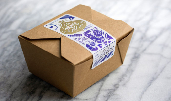
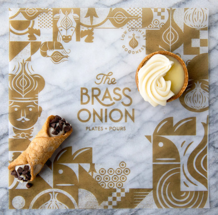
It’s always a joy to see a new case study from the team at Carpenter Collective, and the work they’ve done for The Brass Onion is no exception. A modern American restaurant, the Brass Onion features playful, light-hearted illustrations in Carpenter Collective’s signature style, seamlessly integrating the onion motif into each character. Despite this approachable illustration style, the visual identity still feels somewhat elevated thanks to the use of
The Brass Onion Brand Identity, Packaging & Interior Direction by Carpenter Collective.

