Ricolta Branding & Art Direction by Ethos

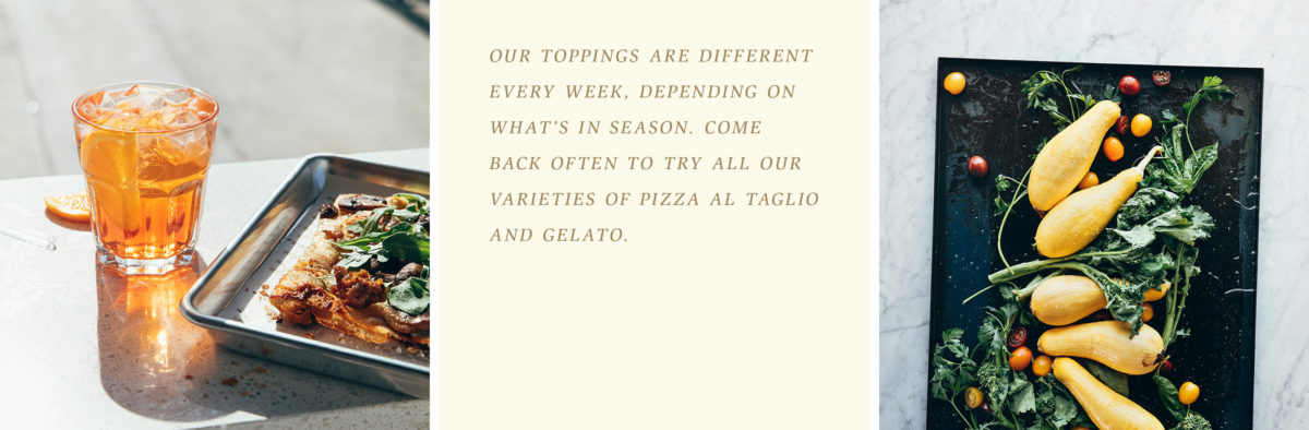
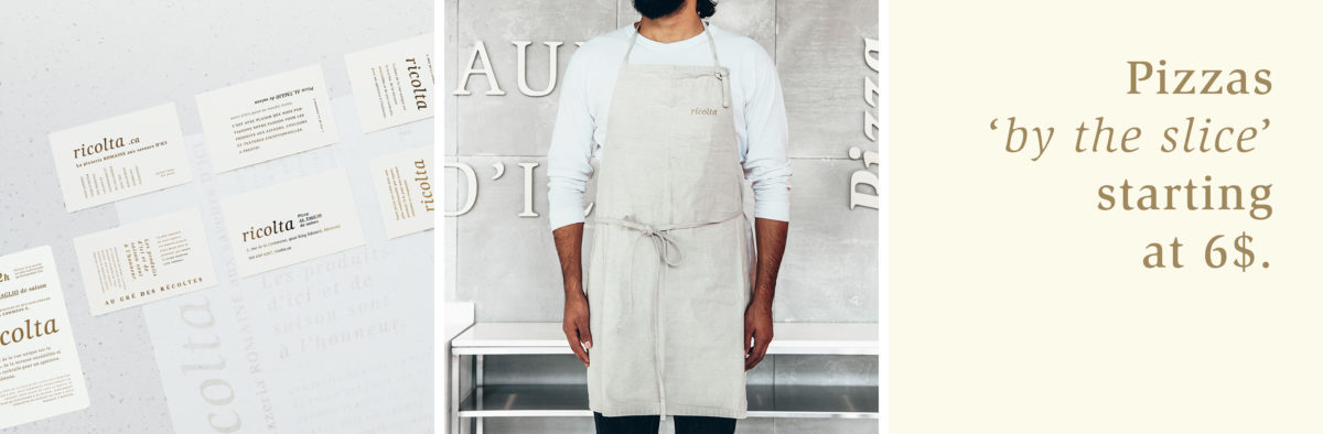
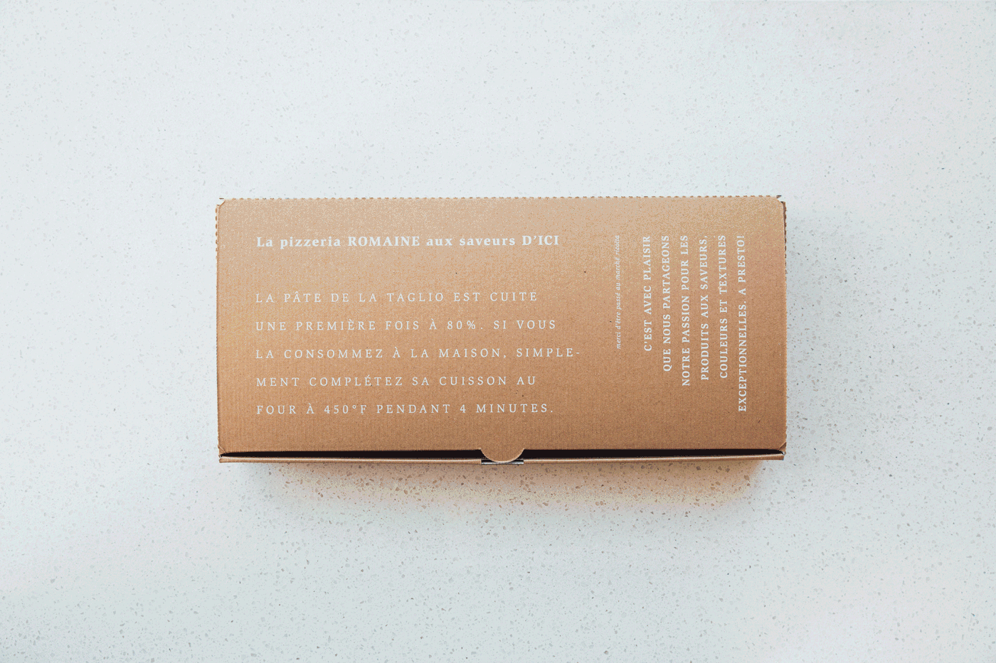
Ricolta is a rare example of an entirely typographic brand that’s done well. By utilizing various weights, styles, and sizes, Ethos was able to successfully activate their printed collateral with insightful content using the beautiful, organic serif typeface. The smart choice of gold foil in addition to a warm neutral palette helps to really let their pizza and ingredients shine as their brand colors.

Typography 101, elevated. Ricolta by Ethos.

The Forktales Podcast™: Interviews with restaurant industry leaders and visionaries

Restaurant and advertising industry headlines and thinking

Reviews of restaurant experiences from around the globe 

Reviews of our favorite design, business, & restaurant books

Our favorite typography and fonts

Inspiration in your inbox

Get the latest inspiration in your inbox every Monday morning, for FREE!

"*" indicates required fields

This field is for validation purposes and should be left unchanged.

Delicious Bits in your Inbox!

Get the latest and greatest content delivered to your inbox for free!

"*" indicates required fields

This field is for validation purposes and should be left unchanged.