Hiatus Tequila Branding & Packaging by Lyon & Lyon

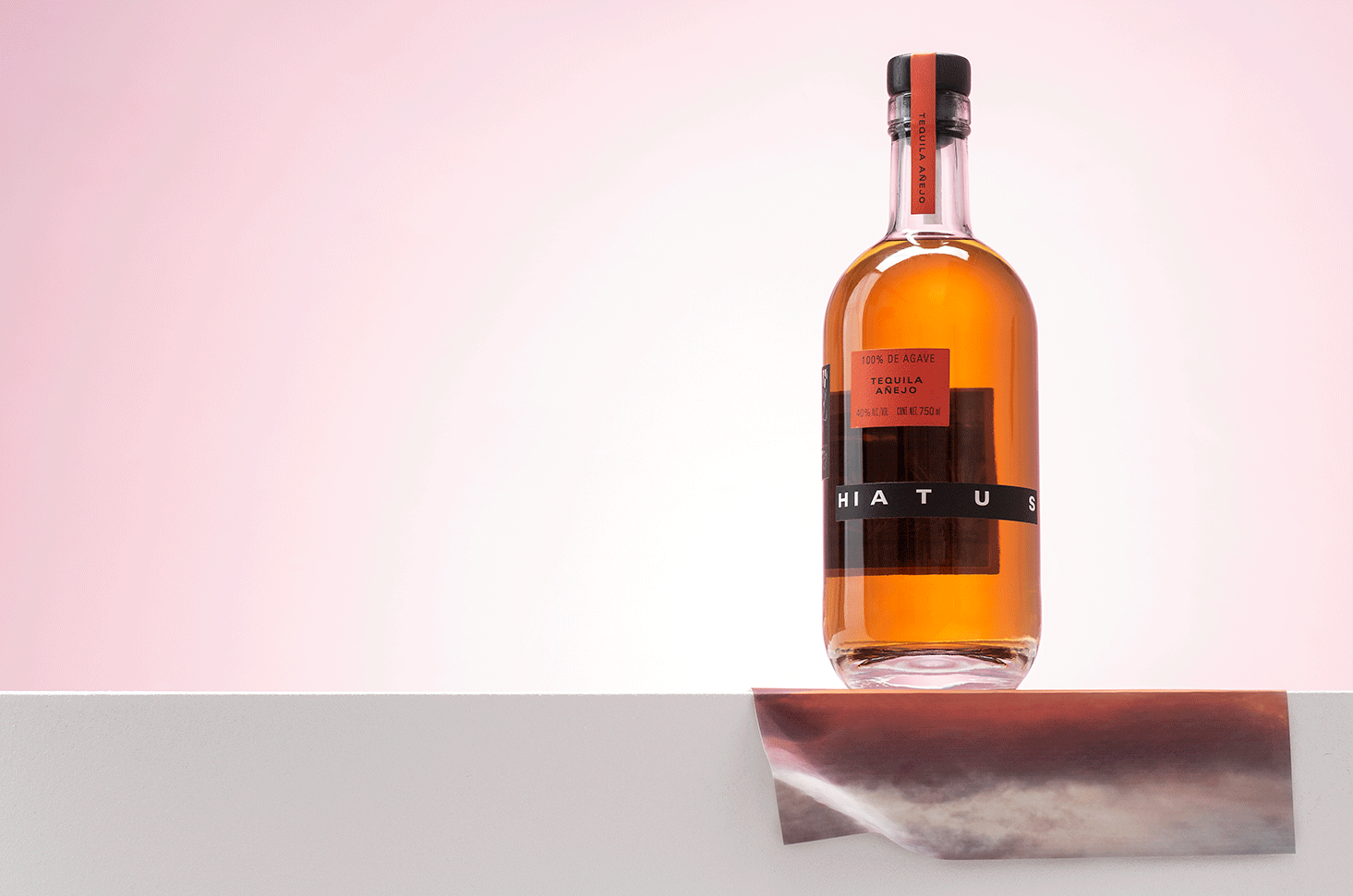
The concept around Hiatus Tequila is centered around the idea of space, like the kind of mental space and clarity that one tries to find while on a hiatus.  As such, white space is a key feature through the visual language. The bottle, for example, features several stickers in a floating arrangement. When displayed in a backdrop of clear tequila, it creates the illusion that the labels are floating in space.

Hiatus Tequila Branding & Packaging by Lyon & Lyon.

The Forktales Podcast™: Interviews with restaurant industry leaders and visionaries

Restaurant and advertising industry headlines and thinking

Reviews of restaurant experiences from around the globe 

Reviews of our favorite design, business, & restaurant books

Our favorite typography and fonts

Inspiration in your inbox

Get the latest inspiration in your inbox every Monday morning, for FREE!

"*" indicates required fields

This field is for validation purposes and should be left unchanged.

Delicious Bits in your Inbox!

Get the latest and greatest content delivered to your inbox for free!

"*" indicates required fields

This field is for validation purposes and should be left unchanged.