Mo? Branding and Packaging by Spiilka Design Buro

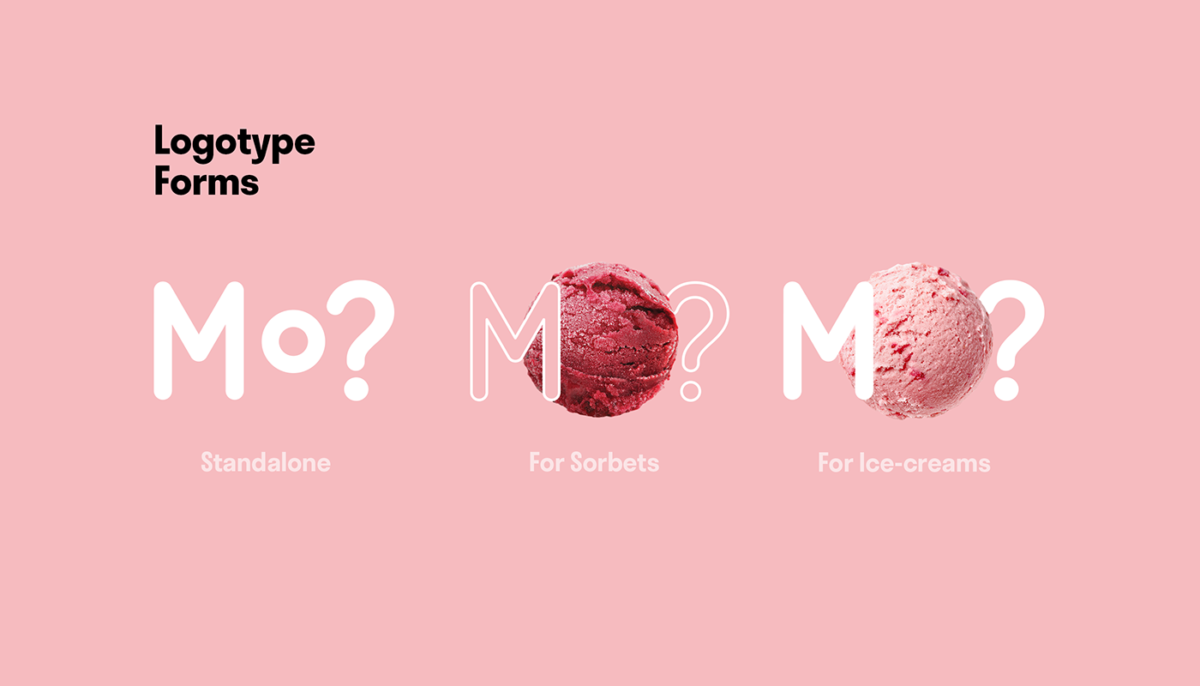
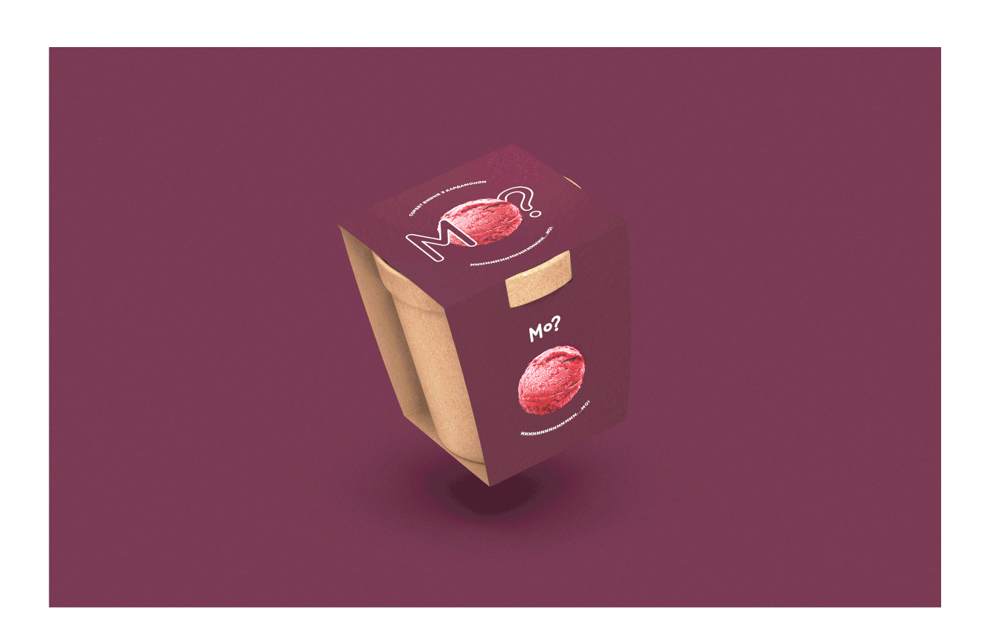
Playing off the Ukrainian word for ice cream “Morozyvo”, Mo? is both a verbal invitation to get some ice cream and a light-hearted tagline that helps to define this easy-going brand. The rounded brand typography is wonderfully accented with product photography on their minimalist, joyful compositions. This aesthetic is further enhanced with a soft, yet varied palette that is made even more approachable with the use of natural, eco-friendly packaging.

Fun aesthetic wonderfully expressed with minimalism. Mo? by Spiilka Design Buro.

The Forktales Podcast™: Interviews with restaurant industry leaders and visionaries

Restaurant and advertising industry headlines and thinking

Reviews of restaurant experiences from around the globe 

Reviews of our favorite design, business, & restaurant books

Our favorite typography and fonts

Inspiration in your inbox

Get the latest inspiration in your inbox every Monday morning, for FREE!

"*" indicates required fields

This field is for validation purposes and should be left unchanged.

Delicious Bits in your Inbox!

Get the latest and greatest content delivered to your inbox for free!

"*" indicates required fields

This field is for validation purposes and should be left unchanged.