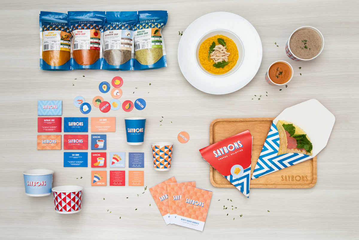
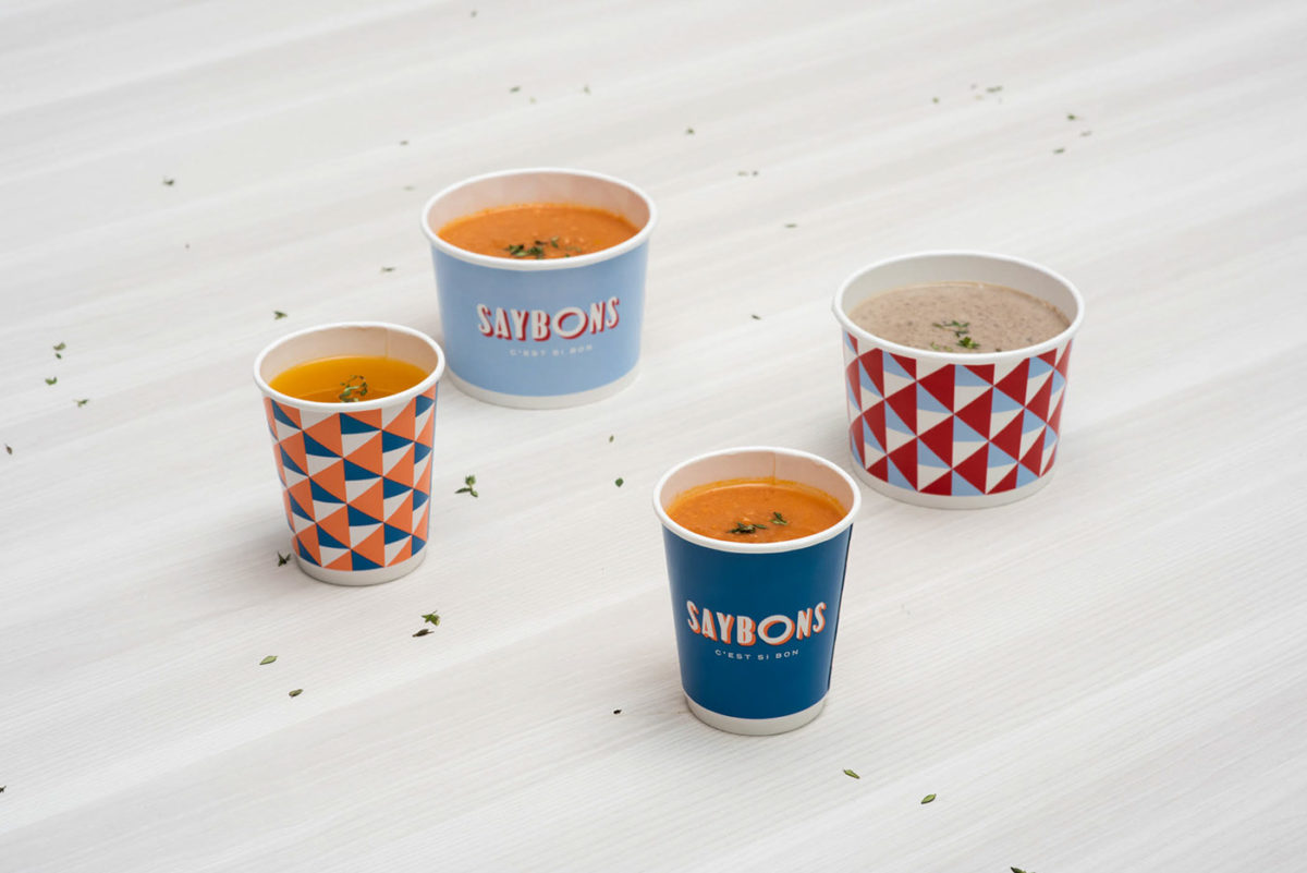
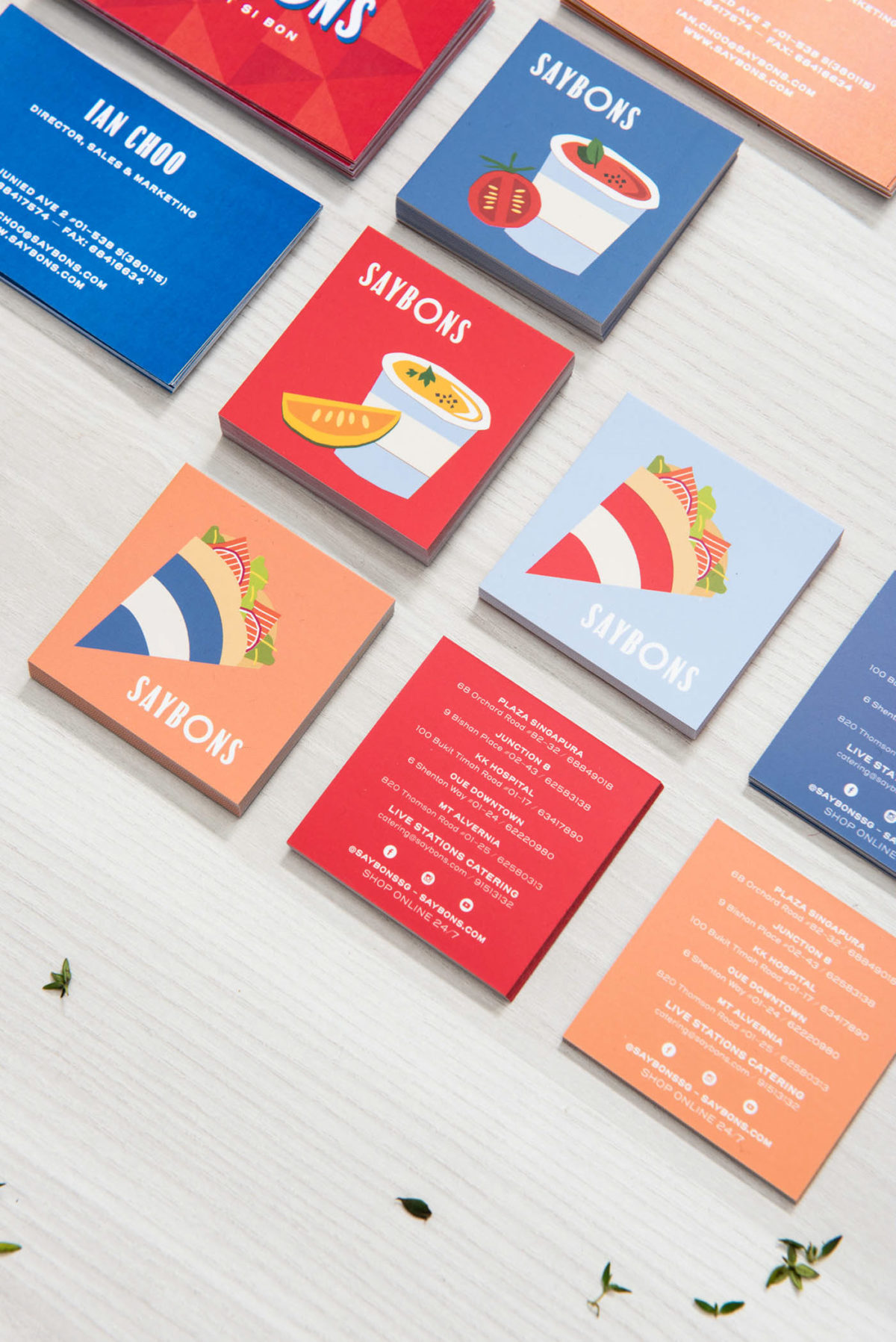
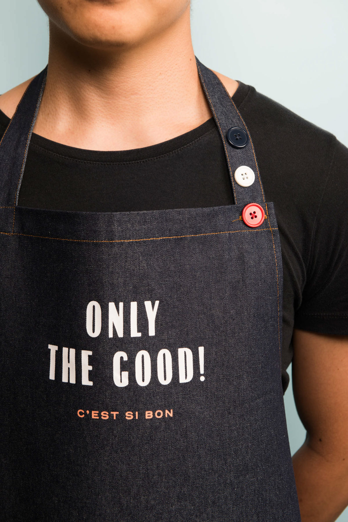
Saybons is a French-inspired diner chain based out of Singapore serving crepes, galettes, and soups. ACRE Design recently rebranded the nine-year-old chain, modernizing it with a mix of French-inspired architectural features, Art Deco tropes, and Matisse-inspired illustrations. The typography in the wordmark is directly inspired from signage and posters of the early 1900s, with the exception of the O, which stands out quite a bit next to the other condensed letters, adding a bit of playful flair to the mark overall. The brand colors are the typical blue, white and red found in a lot of French restaurants. What makes the palette distinctive is the additional use of baby blue and salmon, adding monochromatic depth to the scheme.
Saybons Cafe Branding by ACRE Design.


