
The city starts to calm from the tourist hustle despite the daylight barely threatening to dusk. We walk across bridge after bridge, and canal after canal on our way to the Jordaan neighborhood that flanks Amsterdam’s Centrum area. As we stroll up the street, Daalder’s iconic “D” mark glows from behind rusted steel on the street corner. It’s at this moment we notice the evening is starting to present itself, and the excitement surrounding the experience we’re about to have hit its pinnacle.
Restaurant Daalder / Chef Denis Huwaë
Lindengracht 90 / 1015KK Amsterdam / +31 20 624 8864
www.daalderamsterdam.nl
The Food
We started with a delicious Aperol Spritz, and some house-baked bread that had an amazing crusty-to-tender ratio. After the spritz, we decided to indulge in our own bottle of wine rather than going with the wine pairings. I had a thirst for a white Bordeaux, and Daalder had one that sparked my interest: 2016 Domaine de Chevalier Blanc.
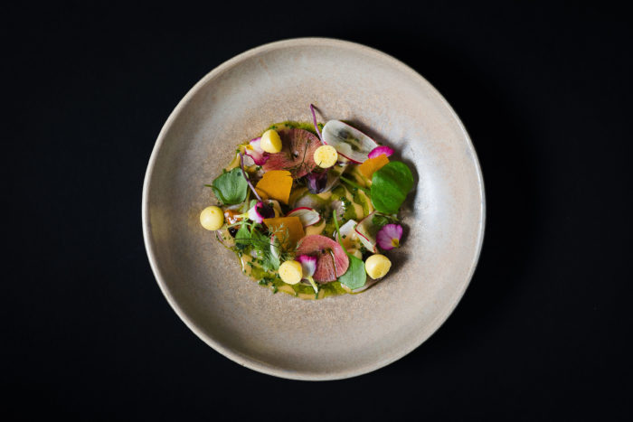
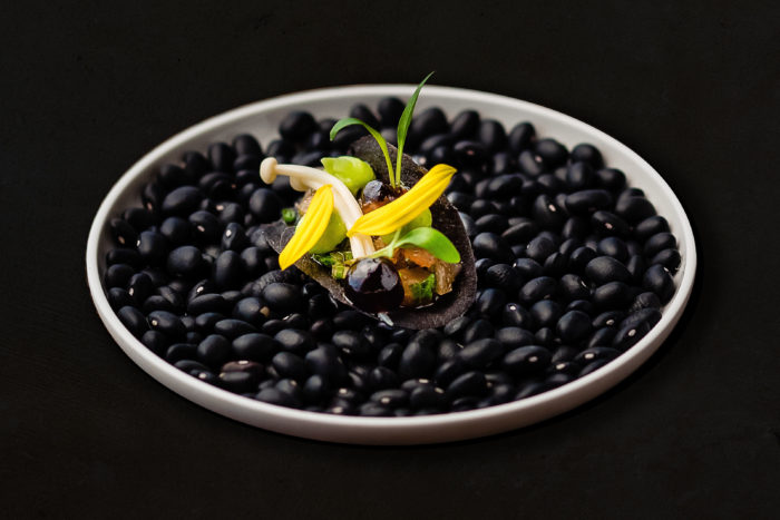
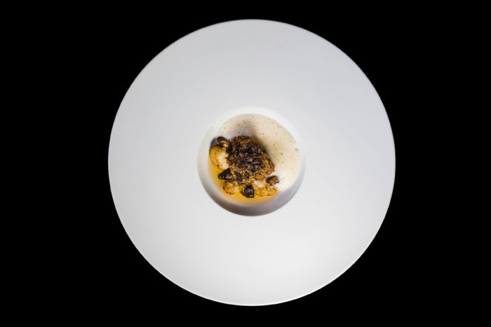
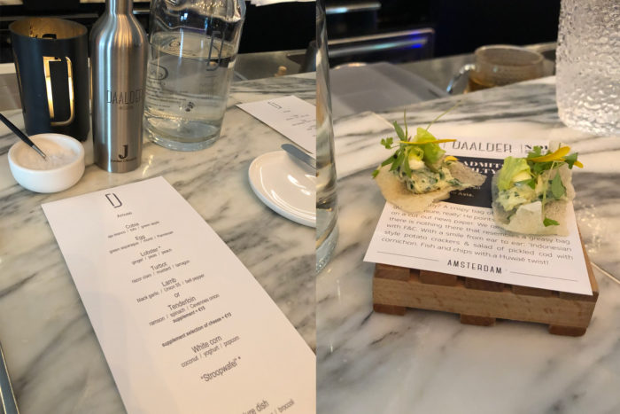
From this moment, each of the seven courses was built in front of our eyes and served with a simple, yet powerful description. Daalder’s cuisine is a rich journey through brilliant flavors. From the opening amuse through the finishing touch, an inverted take on the famous stroopwafel, each dish was a celebration of highly controlled flavor. One is given the unique opportunity to enjoy a cadence of tastes that pleasantly linger after the moment has passed.
Take a gander at the full menu here.
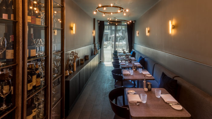
The Interiors
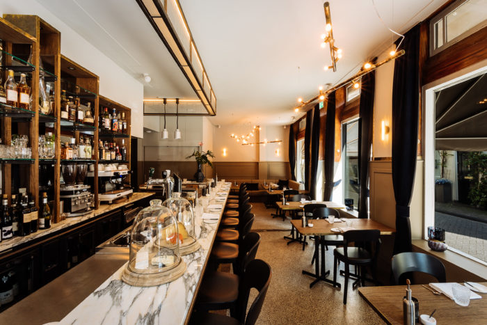
Our “table” was at the bar in this quaint and comfy corner spot. What struck me immediately was the subtle details with the space itself. Brass accents with warm woods helped smooth transitions from rich colors and textures to stark whites made creamy by warm lighting. Strong lines in the design felt connected to the discipline found in the kitchen and behind the bar (see notes below.)
Behind the bar, one is presented with the true artforms of mixology and culinary finishing touches. Yes, at Daalder’s bar, one can see the culinary team creating and finishing each dish from the architecture of the plating through the most influential detail, merely 5 feet away. This connection to the food and the drink creates uniquely intimate moments that elevate the overall remarkability of Daalder.
In summary, the vibe was contemporary with healthy amounts of inspiration from turn of the century aesthetics. A perfect setting for a fantastic meal.
Interior Design / V3RS
The Brand
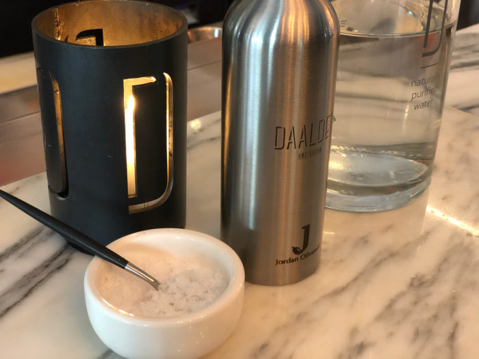
Daalder’s identity continues the strength in simplicity found throughout the space. It’s classic yet modern. Understated, yet confident. Throughout the interiors, one finds subtle connections to the brand. For instance, the votive candle holders featured the iconic “D” brand mark cut into the steel. Steel much like that found on the signage above the entryway. That “D” mark was also worked into the glass that aligned the soffit area of the bar.
The menus were simple fabric wrapped boards that matched the color found along the wainscot that circumnavigated the outer walls of the space. Rich, dark aprons with tactile nuances created continuity with the curtains that flanked the windows.
Daalder’s typography is simple and modern. I would have liked to have seen more connectivity between the typography used for the menu content and the identity itself, but it’s not disconnected enough for most people to notice. There is a remarkable custom typography element found at the bottom of the menus. It denotes the course offerings: a “5” and “7.” These artistic expressions make use of modern-flourishes to inject a sense of organic, naturality to the overall identity. I would love to see this supporting typography explored further and used elsewhere.
Identity / Mas Brand Being
Notes
- Dinners should be booked in advance. When I booked, I lucked out with a Monday reservation. It’s safe to presume that Thursday-Sunday would require a few weeks of lead time. Daalder is closed on Tuesdays and Wednesdays and will be closed from 30 July to 14 August, 2019.
- The bartender/manager at Daalder was next level in his skill, craft, and dedication to his post. Every glass was cleaned, steamed, and polished. His knowledge of wine, cocktails, and food was impeccable. He commanded his bar as an admiral would command his ship. It was something to behold.
- Photographer / @lvffood / Lyan van Furth


