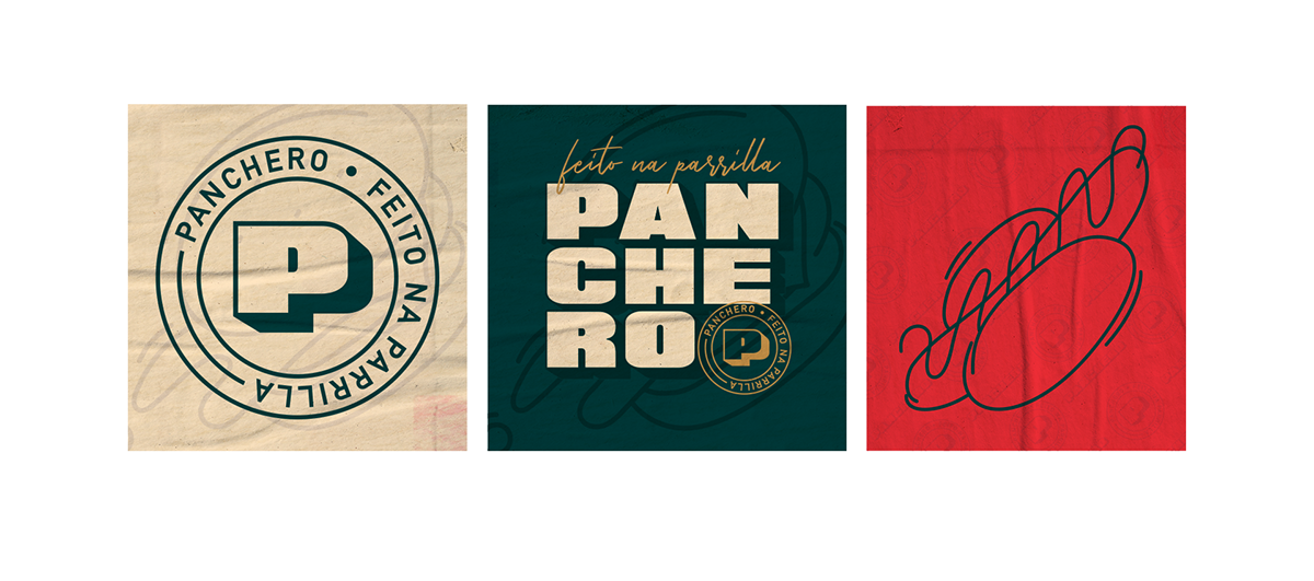
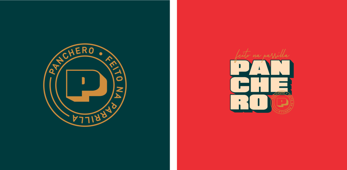
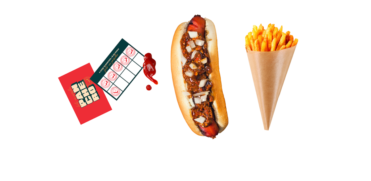
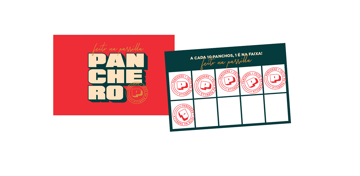
Panchero is a latin grilled fast-food delivery service with an urban, cool and striking brand. Big, bold typography makes up the bulk of the visual identity, punctuated with fun monoline illustrations of the product. Looking at Panchero, you wouldn’t think of them as a fast-food concept. Sure, they’ve got the typical red you find in a lot of grill-focused QSRs, but the rest of the identity tries to distance itself from those tropes as much as possible. Deep navy, a brown-mustard inspired gold and a warm beige all elevate the look and feel; you’re not getting a sad, soggy microwaved hamburger from Panchero, it says, you’re getting something substantial and well-considered. I particularly love the flexibility in this system. The main wordmark, set in an ultrabold san serif, is used several ways throughout the identity. Whether stacked or big and in your face as a monogram, this type (and brand) is hard to miss.
Panchero Restaurant Branding by Valkiria Creative.


