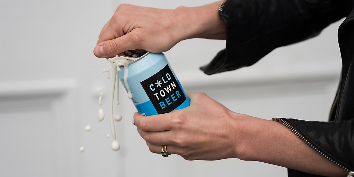
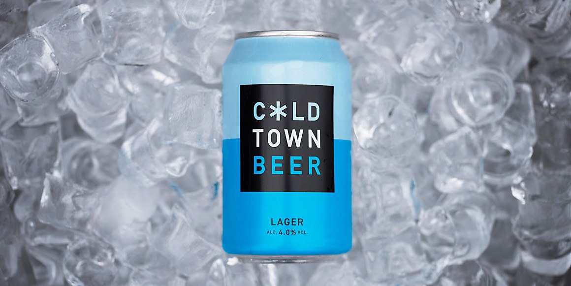
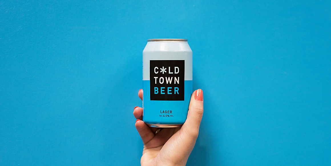
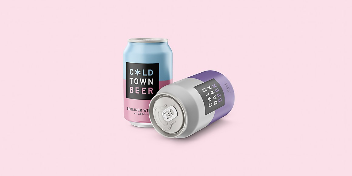
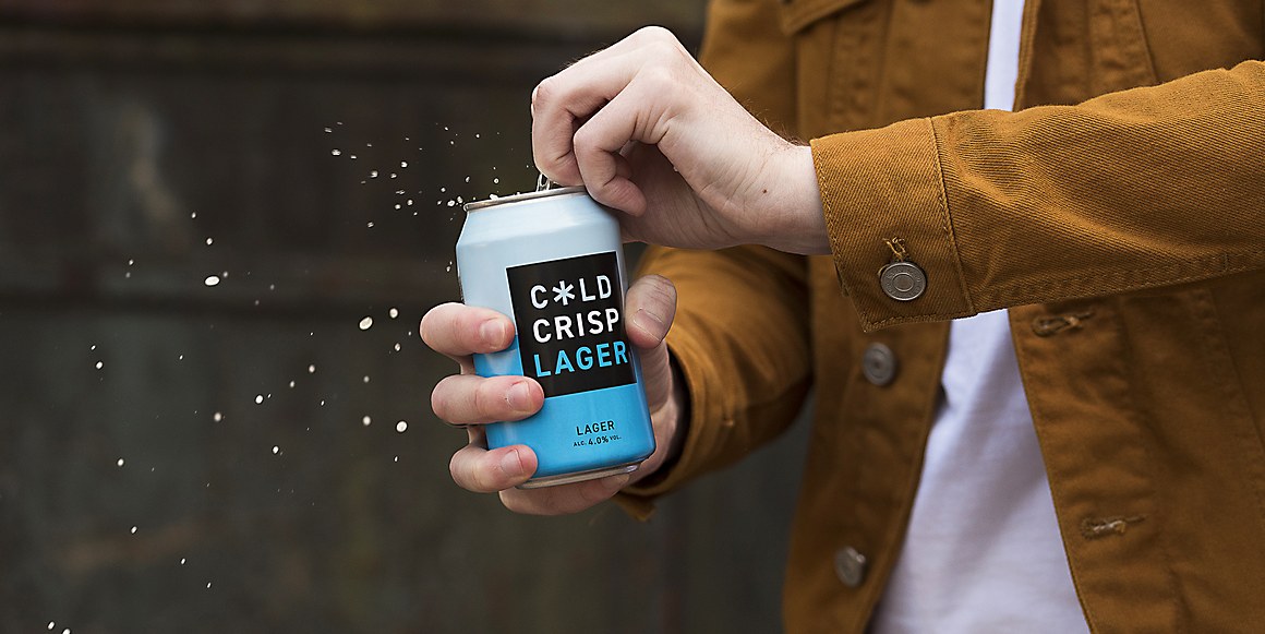
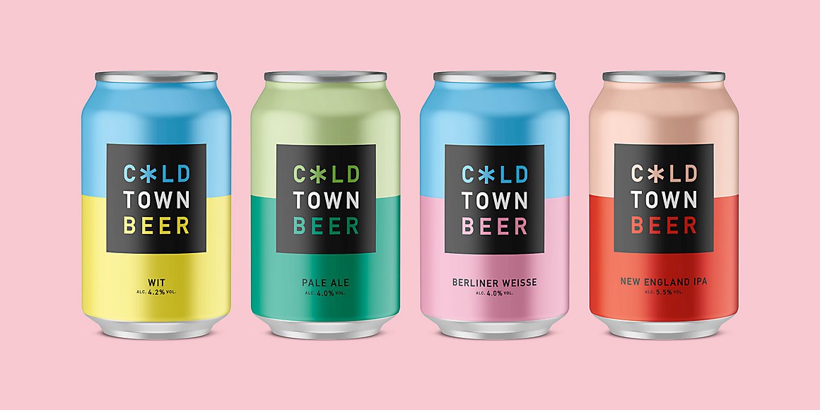
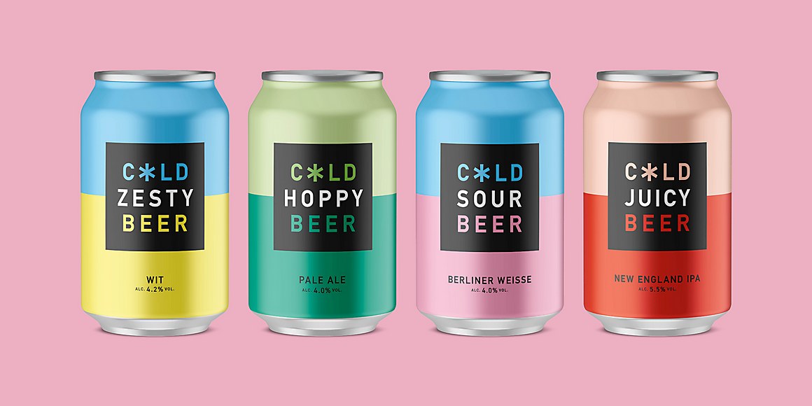
Based in the notoriously chilly city of Edinburgh, Cold Town Beer needed to do a lot to stand out among the 2,000 other breweries in the UK. To compete with all the noise, Thirst Craft created an identity and suite of can designs that cuts through the clutter, focusing on simple graphic devices and to-the-point communication. The snowflake-asterisk device, replacing the O in the name, is easily recognizable and due to its simple shape, works well across mediums and at various sizes. The cans are also cleverly two-faced, with one side featuring the logo in full and the other an alternate version that includes a straightforward one-word adjective to describe the beer inside.
Cold Town Beer Branding & Packaging Design by Thirst Craft.
