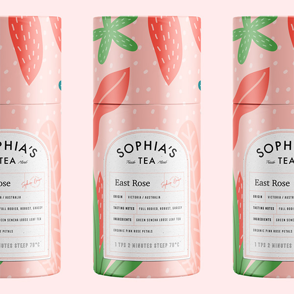
Sophia’s Tea features beautiful, organic illustrations with classic, apothecary-inspired typography. Each flavor of tea comes in a tube-shaped package; I’ve seen this style of packaging becoming more popular as of late, perhaps because of its softer, more feminine silhouette. The visual language expands over printed marketing posters, showing off their cheeky tone, contrasting against their calming visuals nicely.
Sophia’s Tea Branding & Packaging by Marka Network.


