Taresso Corporate Identity by Luminous Design Group

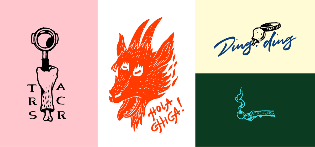
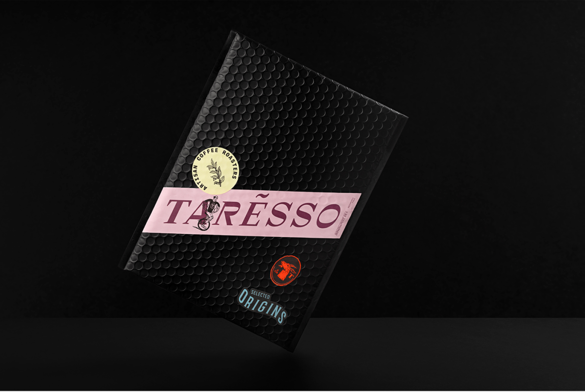
It all ties together. Somehow. Between the eclectic color palette, varied typography, and woodblock/tattoo flash sheet-style illustrations, Luminous managed to create a corporate brand language that can somehow be elegant, mysterious, and a rebel all at the same time. Their wildly varied use of texture, materials and visual treatment in a single package works and works well to convey the region and complexity of their coffee flavor profiles while still maintaining an overall aesthetic that is genuinely perplexing in the best way.

Taresso by Luminous Design Group.

The Forktales Podcast™: Interviews with restaurant industry leaders and visionaries

Restaurant and advertising industry headlines and thinking

Reviews of restaurant experiences from around the globe 

Reviews of our favorite design, business, & restaurant books

Our favorite typography and fonts

Inspiration in your inbox

Get the latest inspiration in your inbox every Monday morning, for FREE!

"*" indicates required fields

This field is for validation purposes and should be left unchanged.

Delicious Bits in your Inbox!

Get the latest and greatest content delivered to your inbox for free!

"*" indicates required fields

This field is for validation purposes and should be left unchanged.