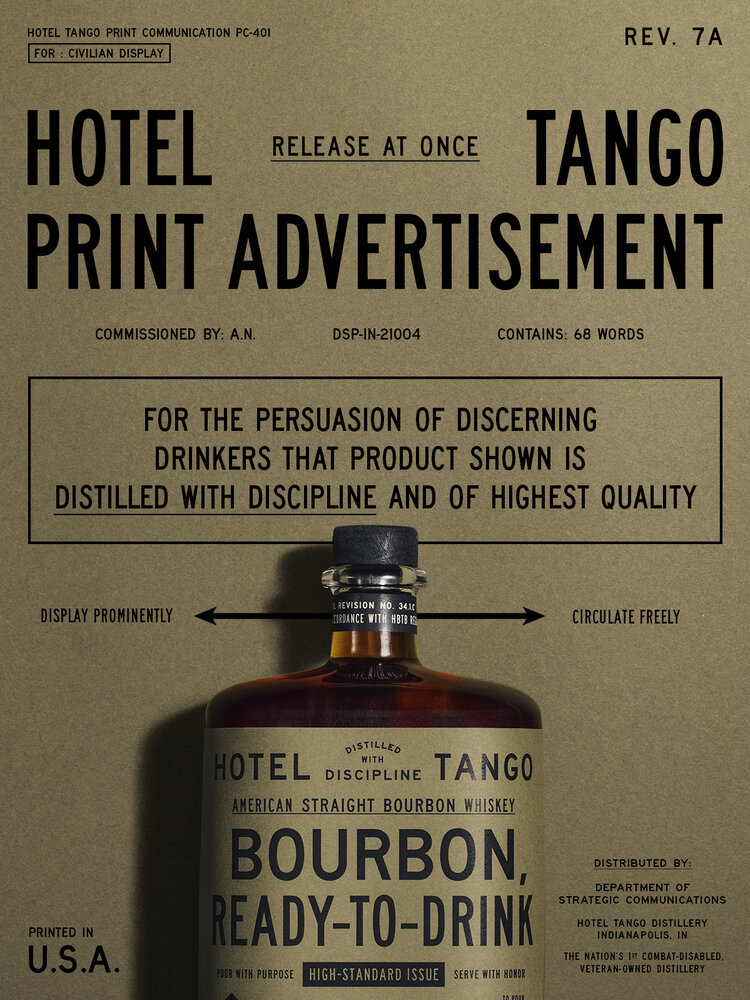
We love when a simple concept, smart copy and great execution come together in a beautifully cohesive brand. Hotel Tango is a distillery founded and operated by a U.S. Marine, with a simple central message: To Distill with Discipline. Dan Shearin worked to completely transform the visual identity of Hotel Tango, changing it’s military connection from a novelty to a reason to believe. The meticulously structured typography on each bottle, billboard, and poster reflects the disciplined approach of the head distiller. Likewise, the consistency from layout to layout can also be read to reflect the consistency of their product, and how their detail-oriented approach produces a great spirit, each time and every time. Pared with copy that doesn’t take itself too seriously, Hotel Tango features a beautiful balance between serious and the not-so-serious.
Hotel Tango Distillery Branding, Packaging & Advertising by Dan Shearin.


