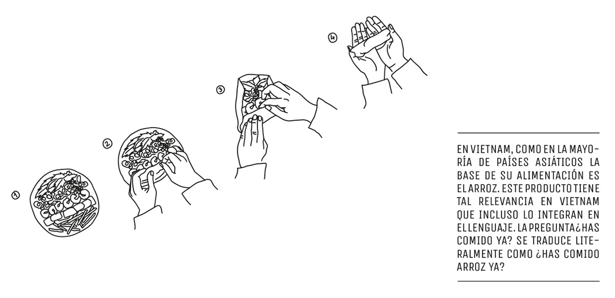
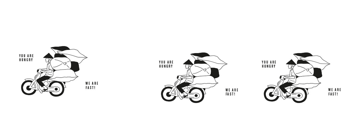
Kraving Kitchens is a food-delivery startup, a “ghost kitchen” specialized in offering fast-casual international food on demand through it’s subbrands. As third-party delivery continues to take a larger and larger share of the market, we’re seeing more and more of these ‘ghost kitchens’ and their interesting visual solutions to their unique challenge. Housing multiple brands under one roof, literally and figuratively, begs the eternal question: how to make everyone look like they’re part of the same brand family, without sacrificing individuality? Zoo Studio provides one solution to this problem, by having the parent brand of Kraving Kitchens be a minimal, black and white canvas that it’s children brands stand out against. Those child brands are also minimally designed in their own way, with some additional considerations such as a bright primary color that distinguishes one from the other, and their own suite of illustrations. However, even in these differences, there is congruency; all of them use a variant of the condensed type used by the parent brand, and all of them feature monoline illustrations, albeit with different textural tones.
Kraving Kitchens Restaurant Branding, Packaging, and Visual Identity System by Zoo Studio.


