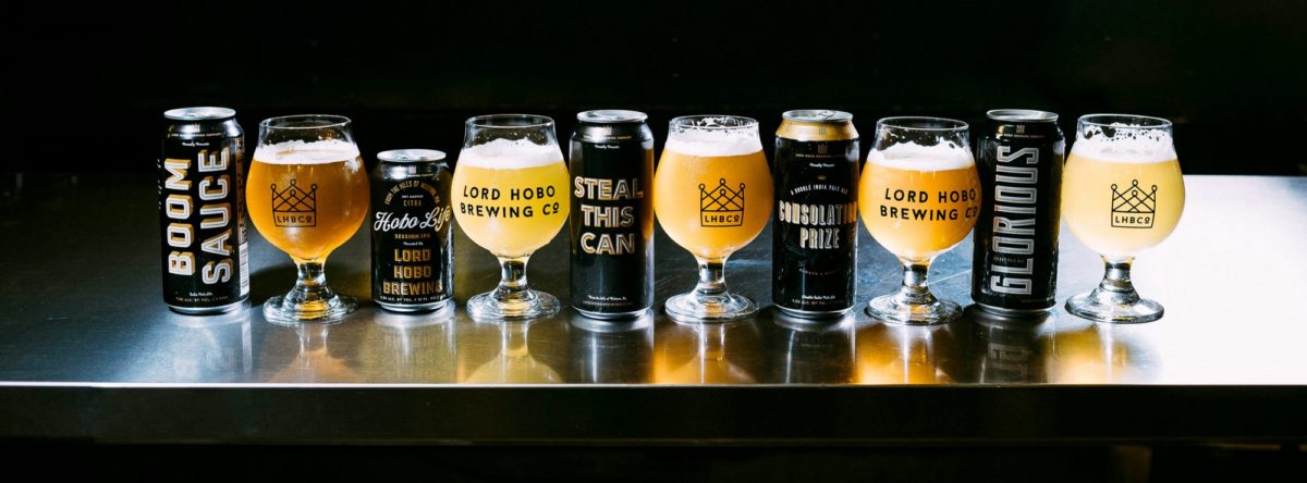
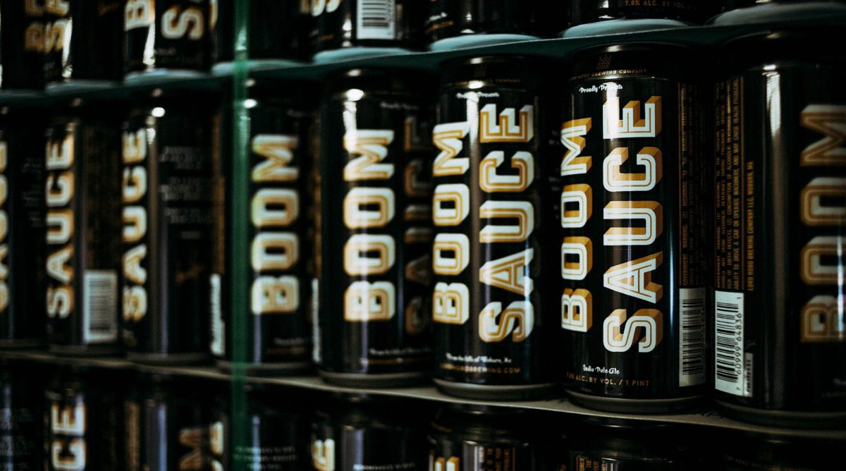
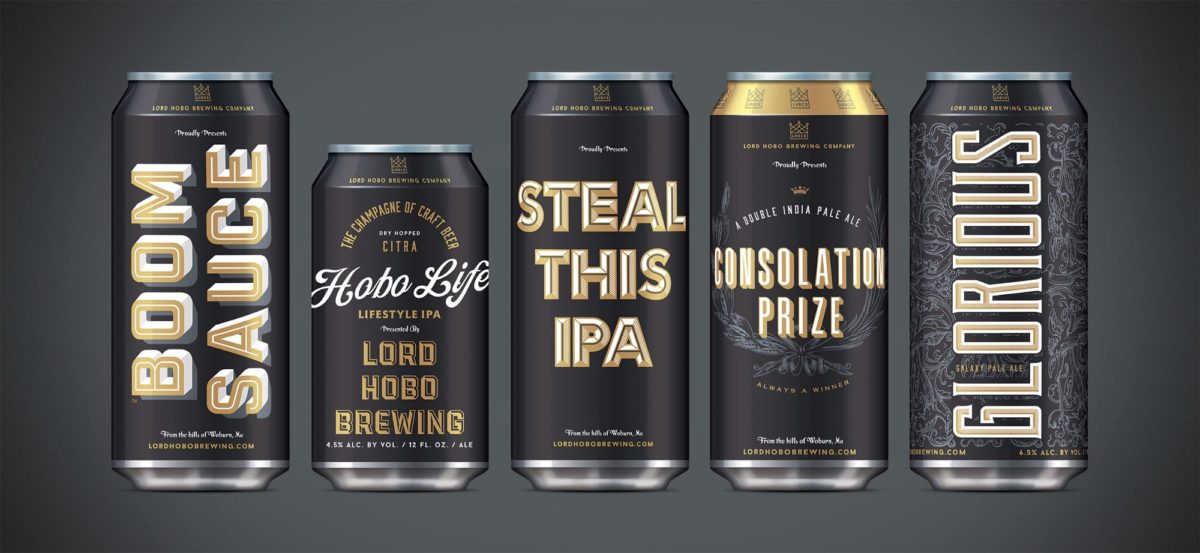
Sleek black cans, using predominantly type and limited illustrative elements define the look for Lord Hobo Brewing Company. A dedication to their striking and regal color palette of black, gold, and white across all of their packaging and other visual touchpoints creates a strong consistency across the board, despite the variance in layout and type choice. The core brand identity is refined yet simple, not getting in the way of the in-your-face can designs but still strong enough to stand on its own across glassware and brand merch.
Lord Hobo Brewing Company Brand Identity and Packaging Design by Ben Whitla.


