Ok, so we’re a little behind the eight ball on this one, but still wanted to share it for those who haven’t seen the fabulous work done by Helms Workshop.
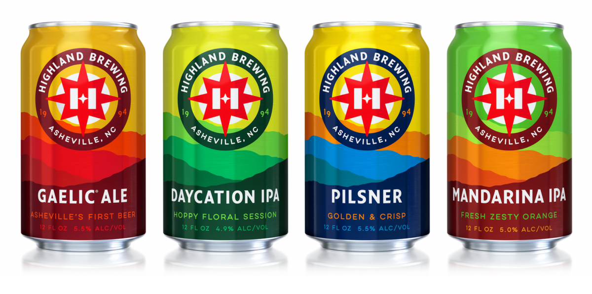
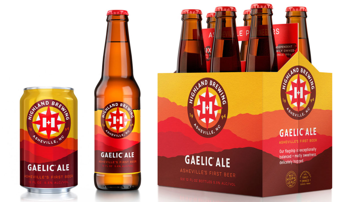
Highland Brewing is the oldest craft brewery in Ashevilles’ long list of craft beer residents. After 23 years of vaguely Scottish-inspired branding, it was time for Highland Brewing to revisit their look. Especially with exponential growth in the craft beer space, Highland needed to stand out among the ever-growing competition and introduce itself as a modern craft brewery in new markets. After surveying customers and stakeholders, Helms Workshop found that what was needed for Highland Brewing was a revolution in their brand, not an evolution of what they already had.
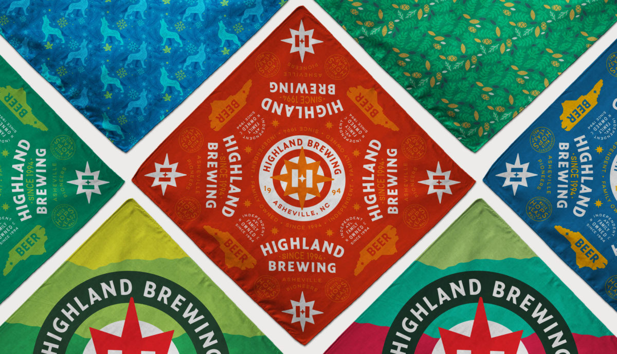
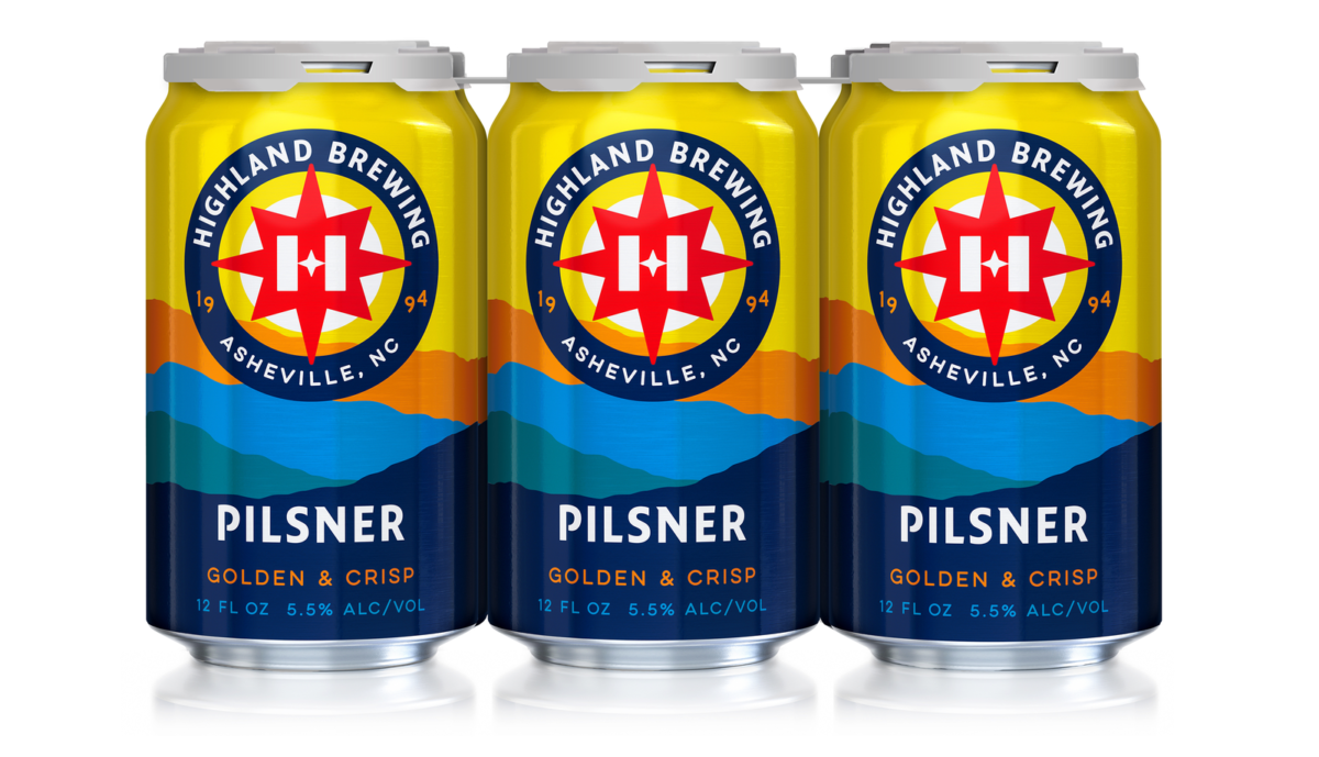
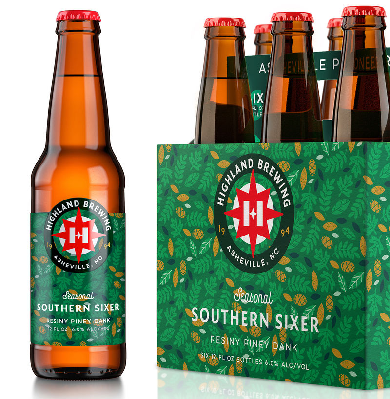
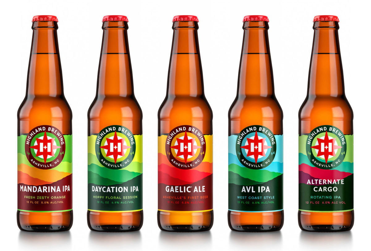
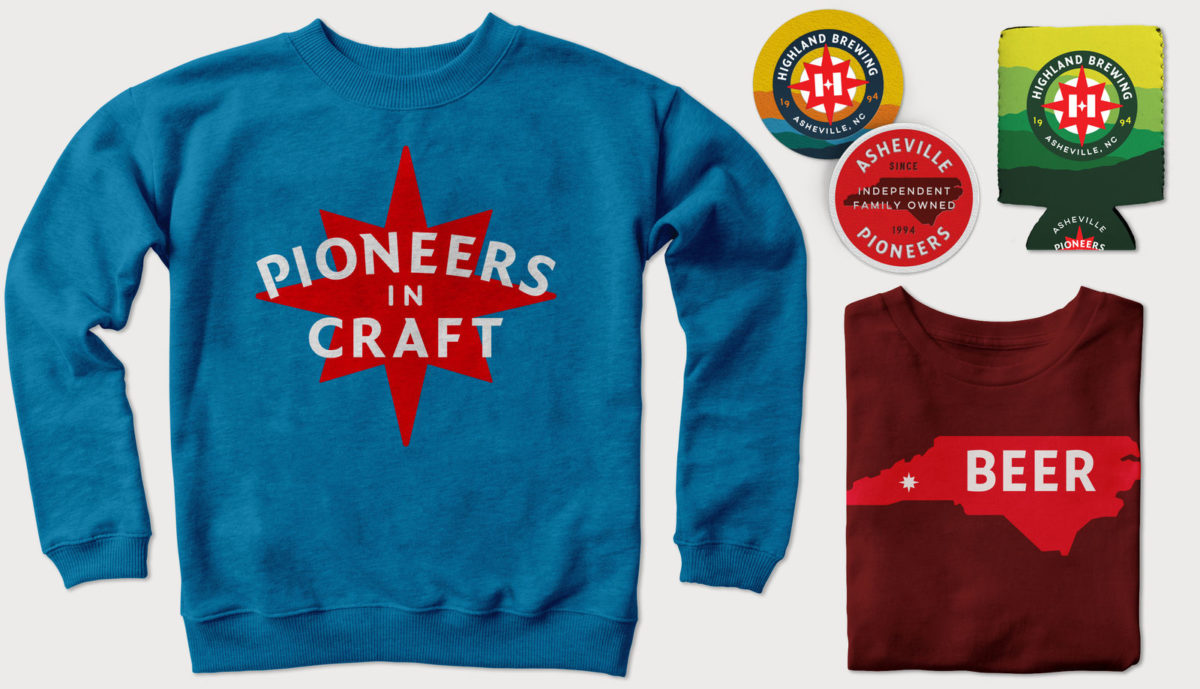
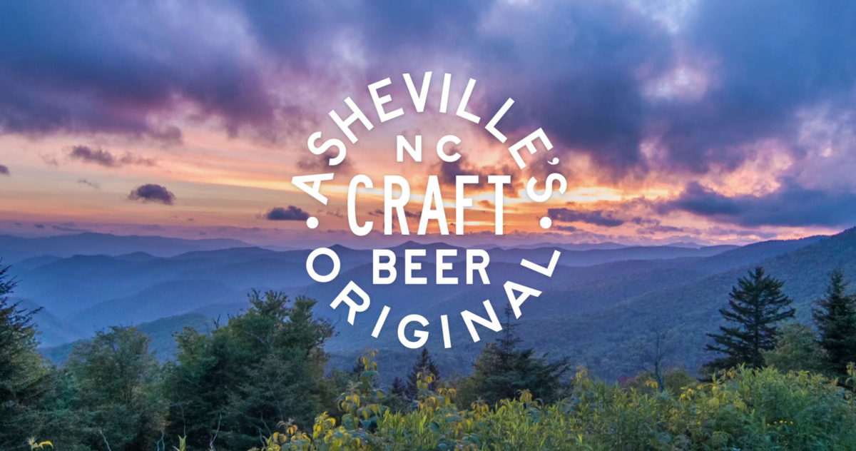
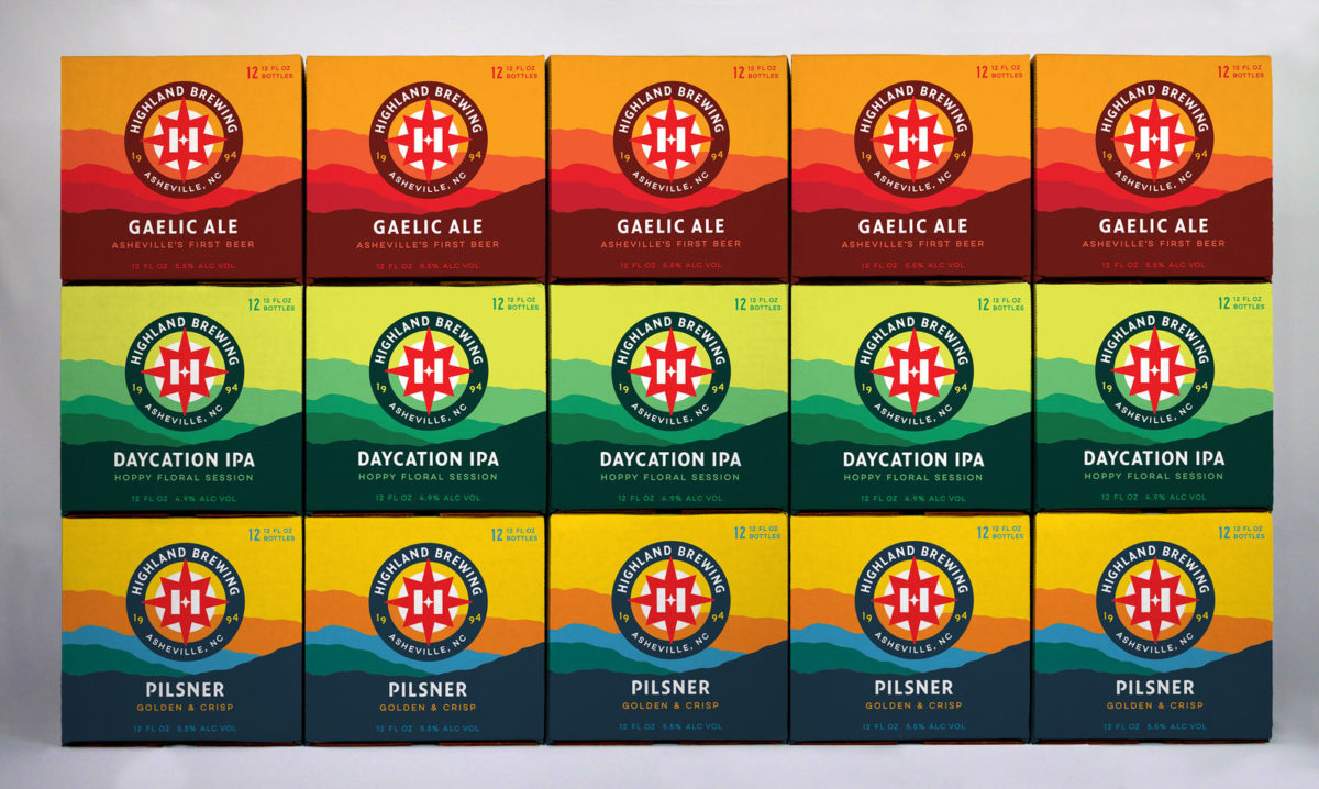
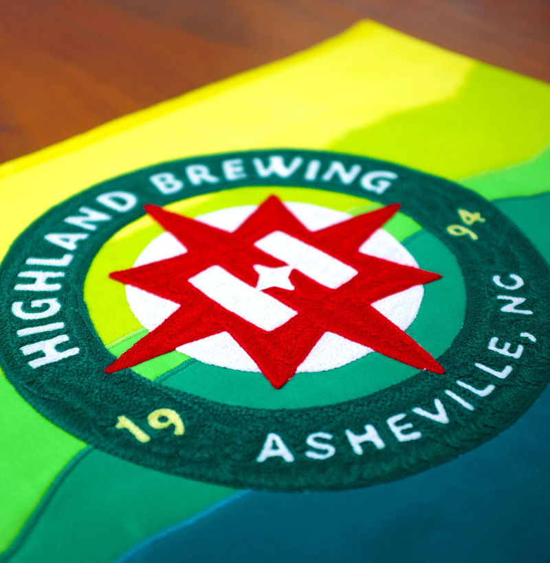
They looked to the brands history for inspiration and guiding north star; Highland Brewing was the first craft brewery in North Carolina since Prohibition and sparked the craft beer revolution in Asheville. Their brand is intrinsically tied to Asheville, and its surrounding mountains grace each can, bottle, and package as a visual reminder. The star compass symbol in their logo represents their pioneering spirit, and replacing the crossbar of their H with a star is a beautiful, subtle touch. Their packaging, for me, is the best part. It has a quiet confidence to it; simple, straightforward, but not lacking in impact, just like those mountains.
Highland Brewing Rebrand by Helms Workshop.
