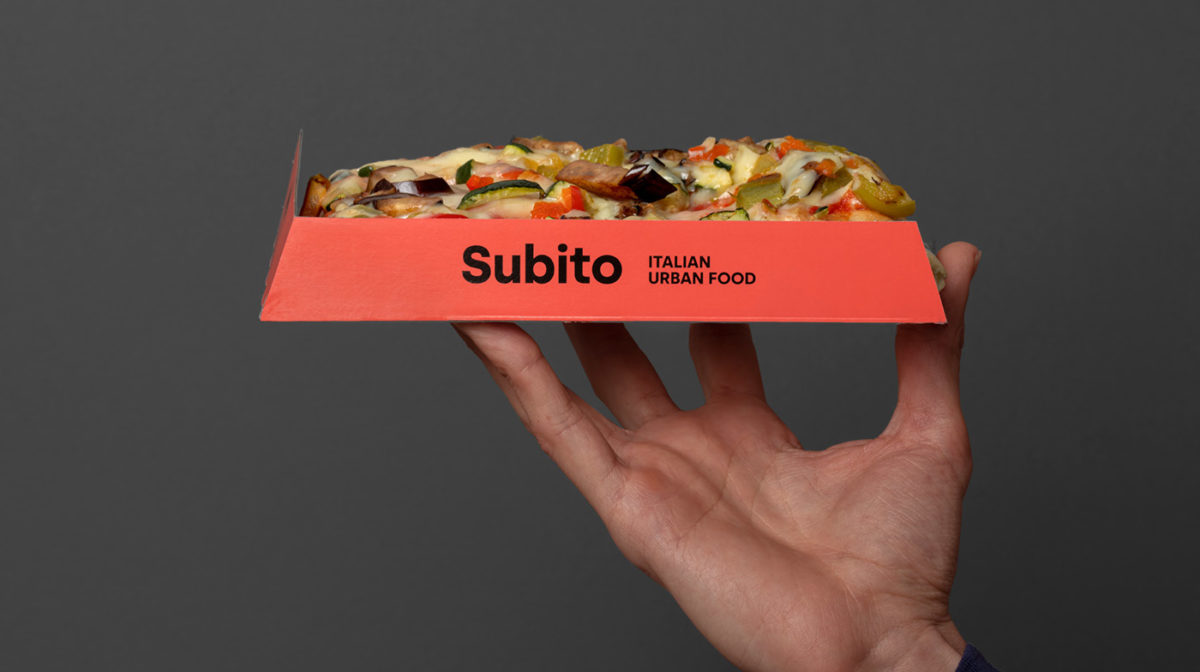
Often with higher-quality pizza brands you’ll see a lot of artisanal quality cues; a focus on ingredients, or the process of making dough from scratch, callouts to how ‘authentic’ the pizza is, things of that nature. Subito (‘immediately’ in Italian) wanted to do something a little different. We can’t a fast food delivery pizza be considered high-quality, and does it have to fall into the same tropes? Atipo says no, focusing instead to go the clean and bold route with the brand identity. Two pizza slices oriented on their side create a ‘fast forward’ icon, speaking to their quickness of their delivery. The bright singular use of the brands coral color is daring and fashionable; their packaging and printed pieces definitely pop in this shade. Paired with a bold geometric san serif, Subito is fresh, modern, and exciting. Other pizza delivery brands could learn a thing or two from this one.
Subito Pizza Delivery Branding by Atipo.


