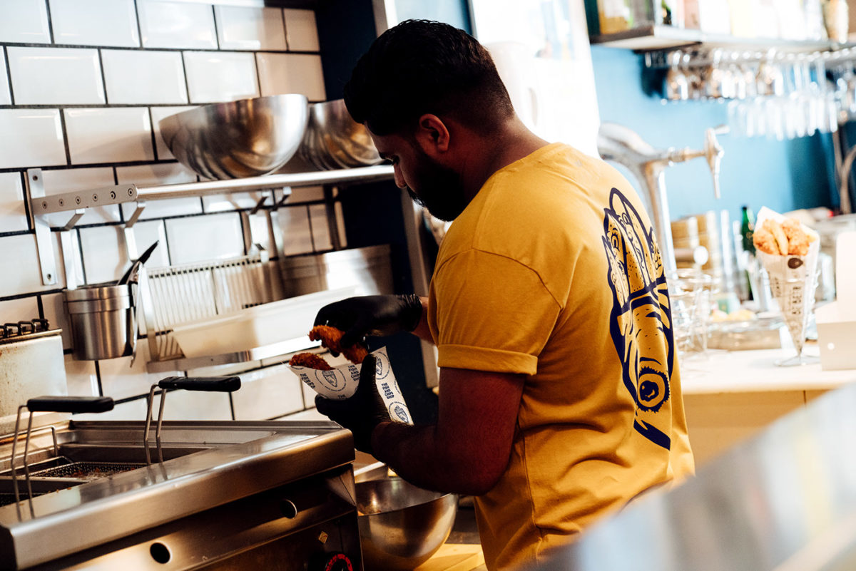
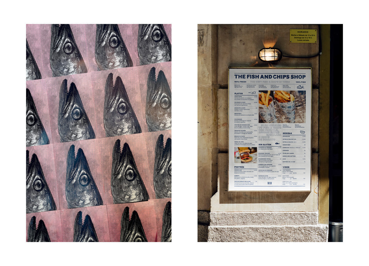
The concept of fish-n-chips is a bit foreign to Barcelonians, and so when Guud Studio went about branding the first shop of its kind in the city, they went a little off the walls. This resulted in a brand that is friendly, cheeky, eye-catching and a little bit weird, taking some cues from typical English fish-n-chips shops and turning them on their heads. Hand-done, imperfect type lend a welcoming feeling to the logotype, and subtly suggest the artisanal quality of the food. The color palette of mustard gold and deep navy feels traditionally English, but it’s application, such as the bright swaths of gold across uniforms and menus, feels fresh and new. My favorite asset in this entire suite is the weirdlt endearing illustration of the chips, given human faces, held in a fish head, acting as the parchment cone.
The Fish and Chips Shop by Guud Studio.


