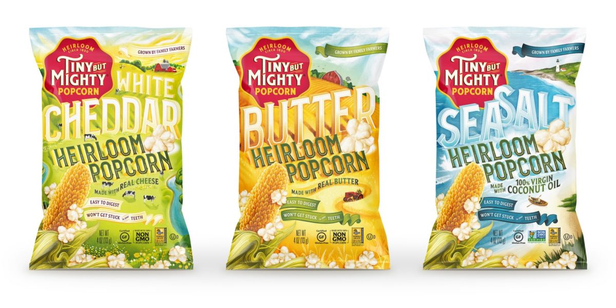
Often on this blog you’ll see design examples that lean pretty contemporary; clean lines, plenty of white space, and flat colors. Sometimes, though, we stumble across something that employs an older look in a new and innovative way. Tiny But Mighty popcorn definitely has a ‘heritage’ feel to it, with its painterly landscapes and woodcut inspired type. What it does differently with those assets takes this retro feel to the next level. The illustration is blown out over the entirety of the package, creating a striking look that consumes the bag and treats it more like an art piece. The typography is seamlessly incorporated into this landscape; the two visual components are beautifully married together, one unable to stand on its own without the other. The amount of detail on these bags invites a closer look from the consumer. My favorite details show people and animals, dwarfed by the typography and landscape.
Tiny but Mighty Popcorn Packaging Design by Moxie Sozo.