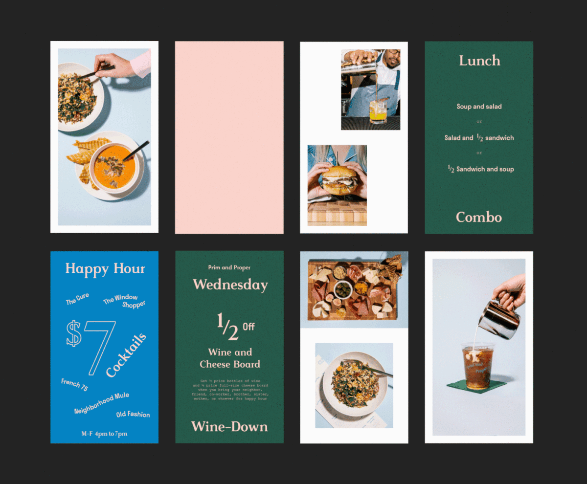
Prim and Proper is an inviting, all-day cafe and bar located inside a Plano, Texas department store. Designed for everyone from the early-morning commuters to the weekend brunchers, customers come for good food, fun, and some surprises. Tractorbeam was tasked with creating a visual identity that complimented the department store’s, but also stood on its own. The solution was inspired by vintage menu design and mid-century cafe/department store aesthetics with a modern vibrancy. This tension between the past and present is represented in all facets of the brand; the logotype transitions from modern geometric san serif to vintage spur serif, the menu is divided up using old-school materials and soft pastel papers, even the coaster transforms from sophisticated to bright and fun with a simple flip. As always, a compelling job well-done by Tractorbeam.
Prim and Proper Cafe Branding by Tractorbeam.


