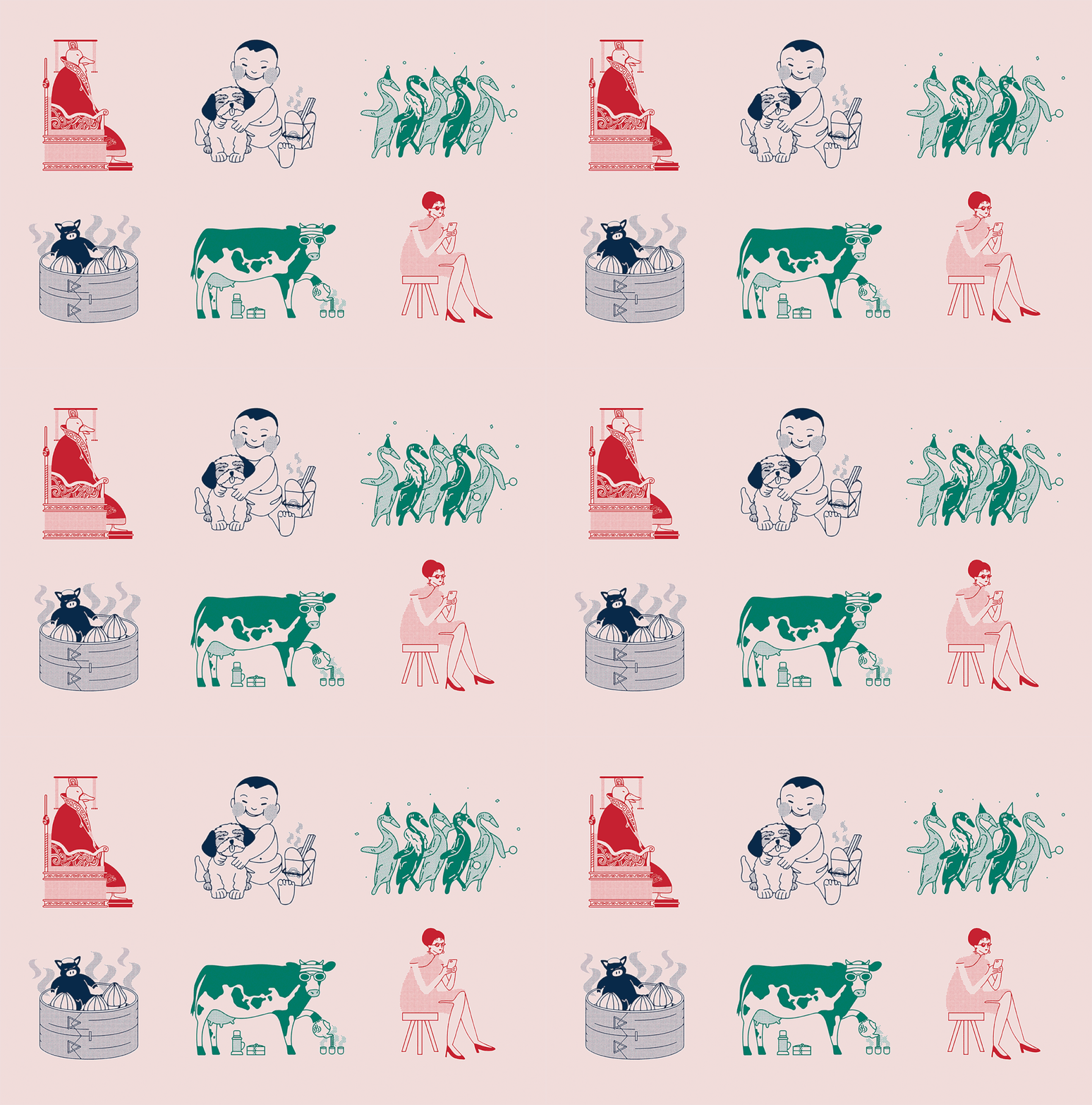
What’s more fun than a Peking duck parade? Getting to eat perfectly roasted peking duck while taking in the whimsical brand identity for Hong Kong Little Kitchen. While we can’t taste their Peking ducks for ourselves, we’ll settle for this feast for the eyes created by Serious Studio. Wanting to stand out among the litany of other Chinese restaurants in their region, Serious Studio looked instead to the vibrant and distinctly different graphic language of Hong Kong. Mahjong tiles, decorative posters, and vibrant wallpaper patterns, and Hong Kong’s distinct use of neon all served as visual inspiration. This cacophony of color and pattern is tied together by a series of lighthearted illustrations, including the aforementioned Peking duck parade.
Hong Kong Little Kitchen Restaurant Branding by Serious Studio.


