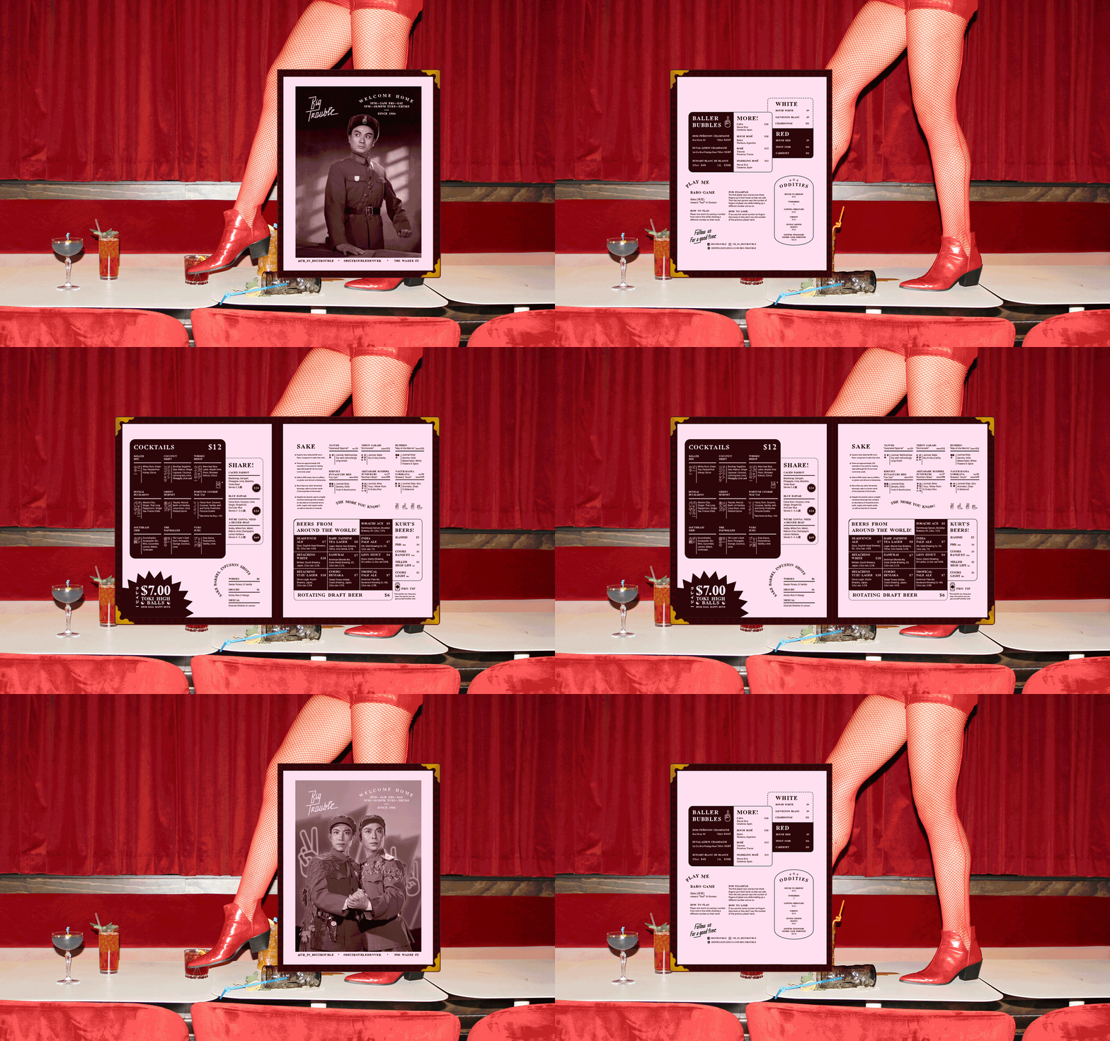
It’s Friday, time to get into some trouble. Well… that’s what I would be saying if bars here in Atlanta were open, I’d be going up the road and having a cocktail or two and enjoying the chaotic splendor of a night out. Instead, these days I’m living vicariously through case studies like this one by Wunder Werks. Big Trouble (I’m sure I won’t have to spell out the reference for you once you scroll down a bit) located in Denver, CO is a wonderful, transporting mishmash of styles and visual motifs, creating a never-ending crimson-hued feast for the eyes. Wunder Werks sought inspiration from an array of sources, listing post-war Asian romanticism, futurism, the microbars of Dotonbori that inspired Blade Runner, and the back alleys of Hong Kong among them. Located above a train-stop and market hall, the goal of Big Trouble was to create a hedonistic oasis away from the bustle below. The interiors are just as large a part of the brand as the graphic elements that Wunder Werks created; I’d argue even more so because the sense of place established at Big Trouble is probably what leaves the biggest impression on its bar-goers. They’re more likely to remember brushing up against floor-to-ceiling velvet curtains or the felt shoji-screen inspired partitions, and then take home a rad pin to remember that experience by.
Big Trouble Bar Branding & Interior Design by Wunder Werkz.


