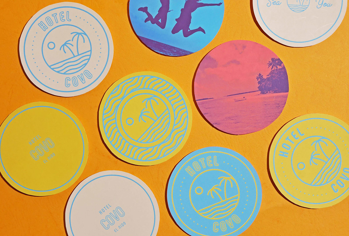
We’re trying to flesh out our hospitality case studies here at Grits & Grids. We feel there is a lot of overlap between food+beverage and hospitality branding, and you’ll often see designers beautifully design for both. We’ve featured Serious Studio before on a number of occasions, and like their other case studies we’ve featured, the brand designed for Hotel Covo is an energetic display of bright color, witty copy, and clean lines. Designed for the ‘unapologetically adventurous’, Hotel Covo’s logo features an island oasis they can escape to, represented in a simple but inviting monoline badge. An all-caps, rounded and condensed san serif is modern, space-efficient, and friendly — the typeface becomes the shining star on guest cards and posters, still highly legible when warped to ebb and flow like the sea. Trendy duo-tone imagery serves as lifestyle photography and backdrops for design, telling a story and establishing a vibe without being overall distracting. More boutique hotels should take cues from designs like this.
Hotel Covo Hotel Branding by Serious Studio.


