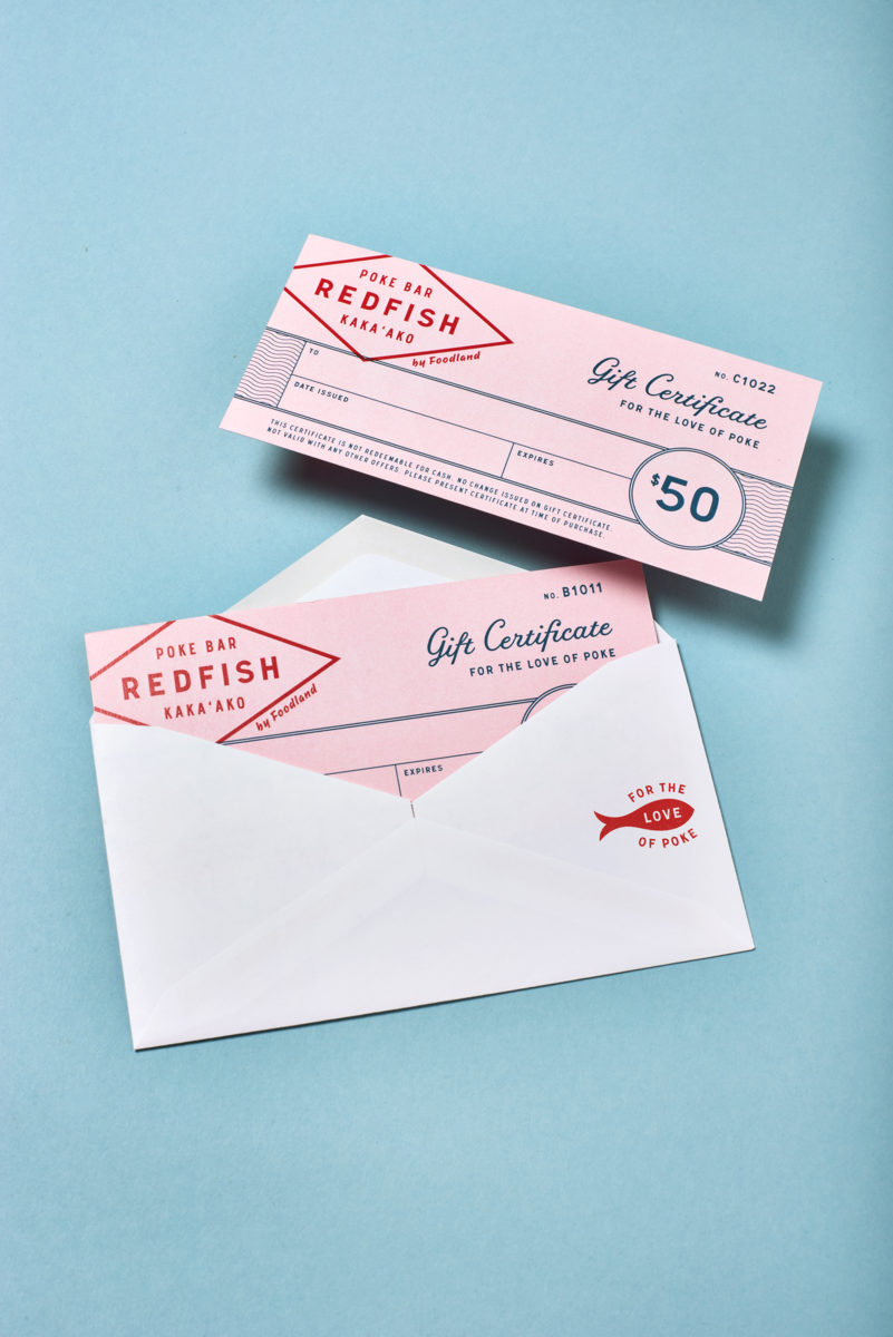
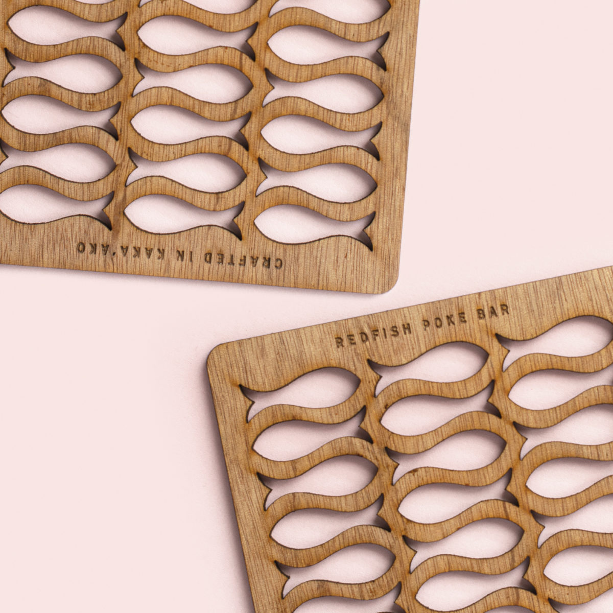
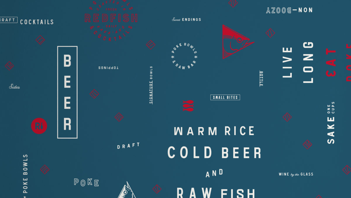
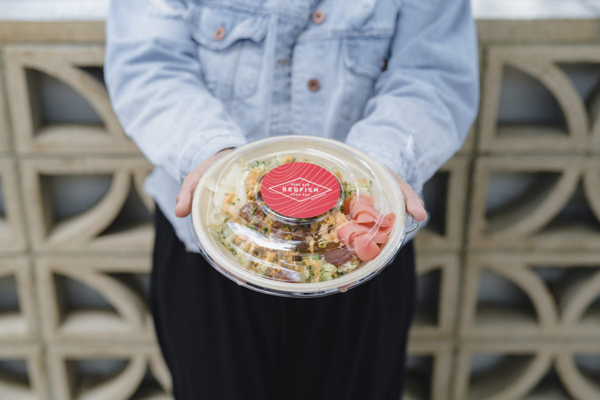
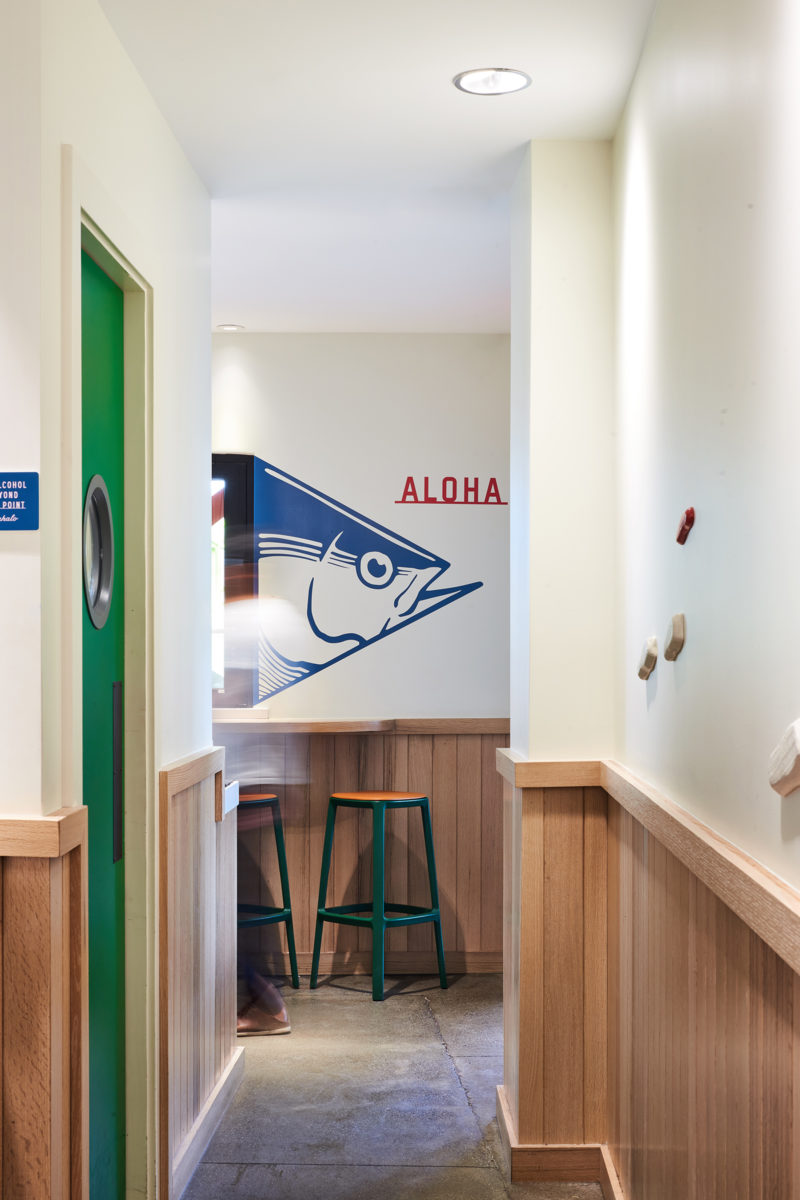
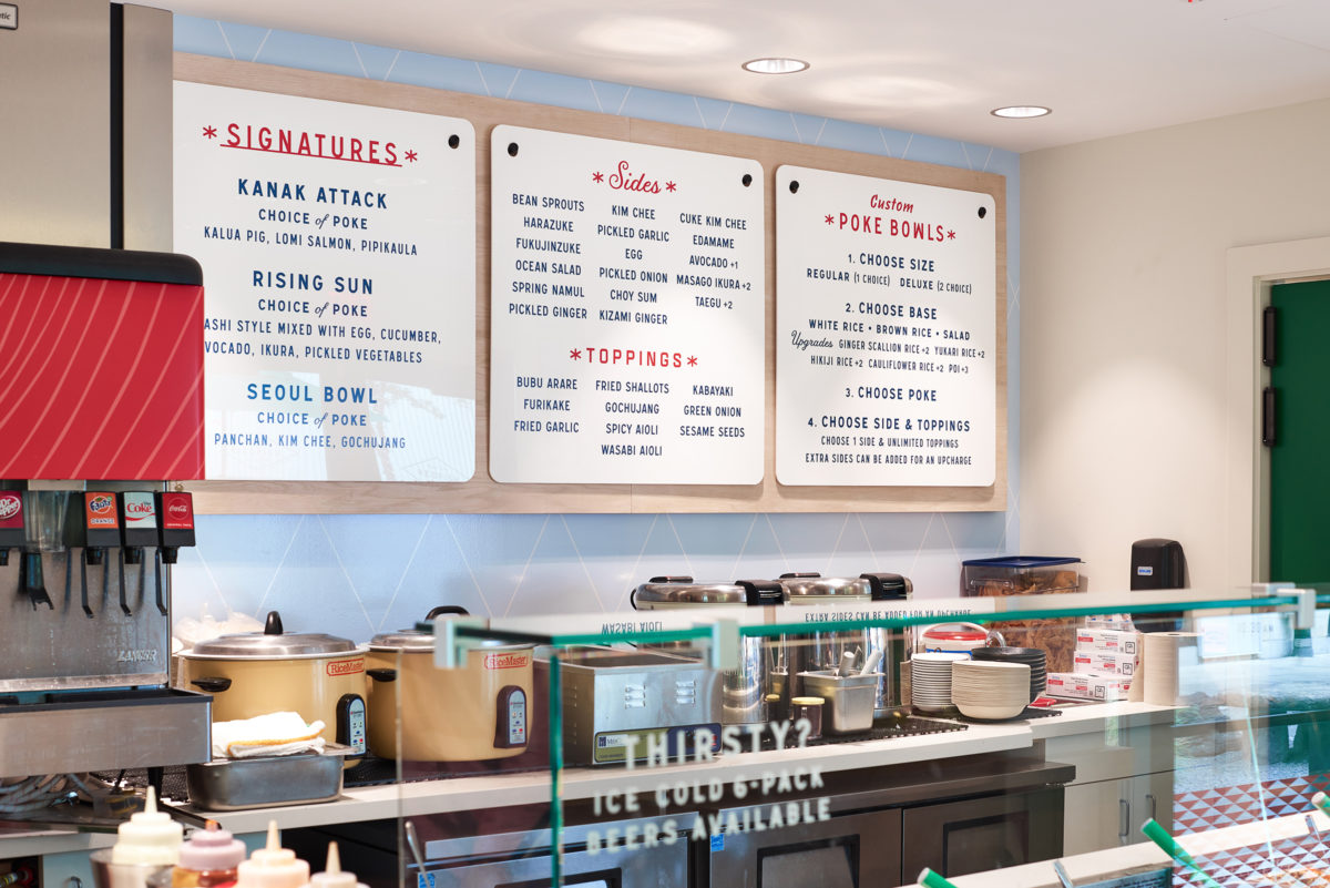
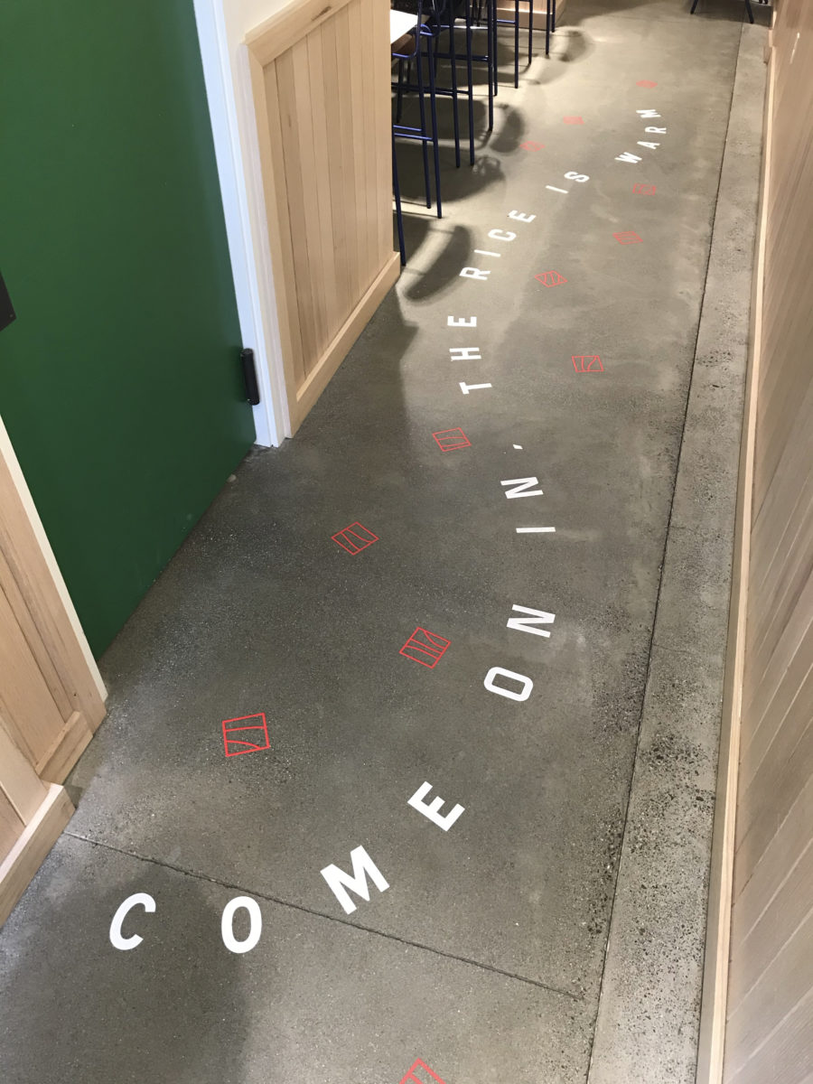
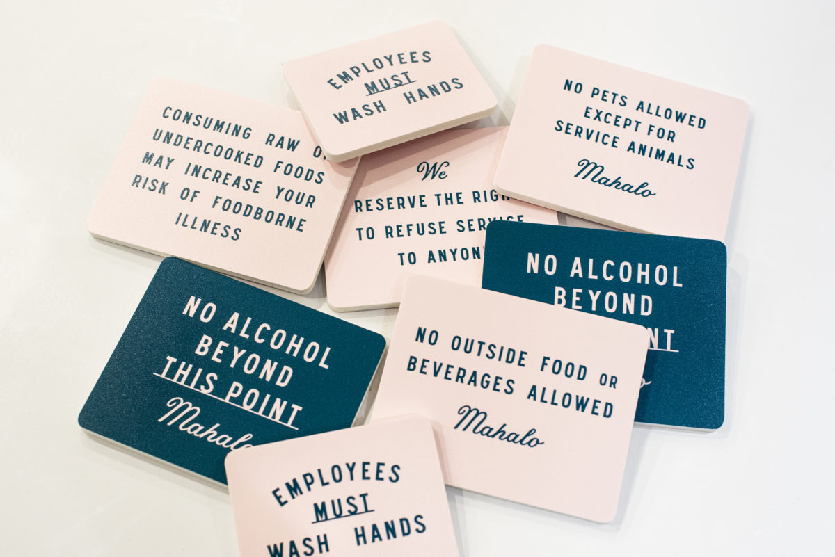
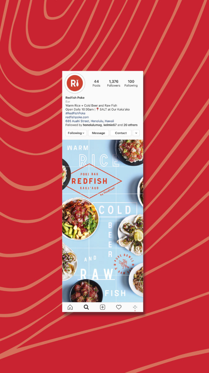
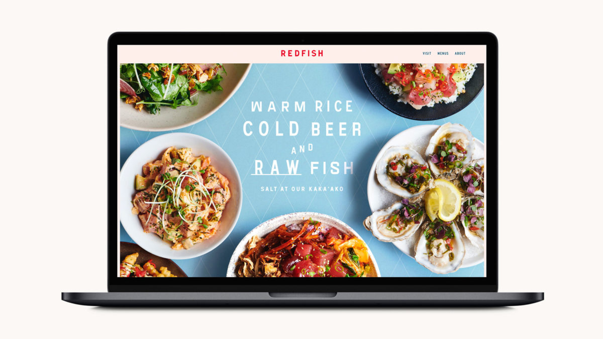
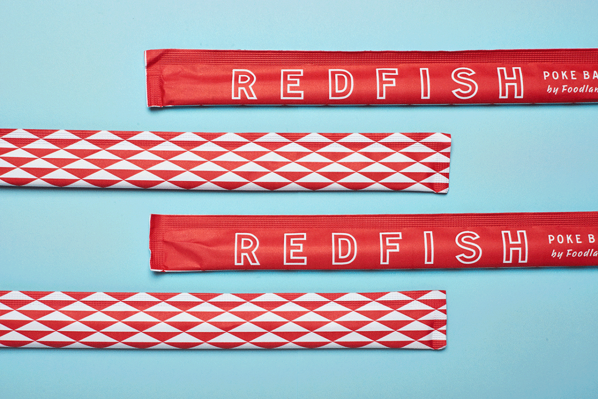
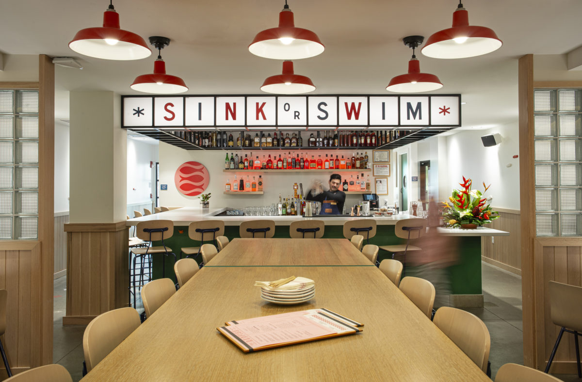
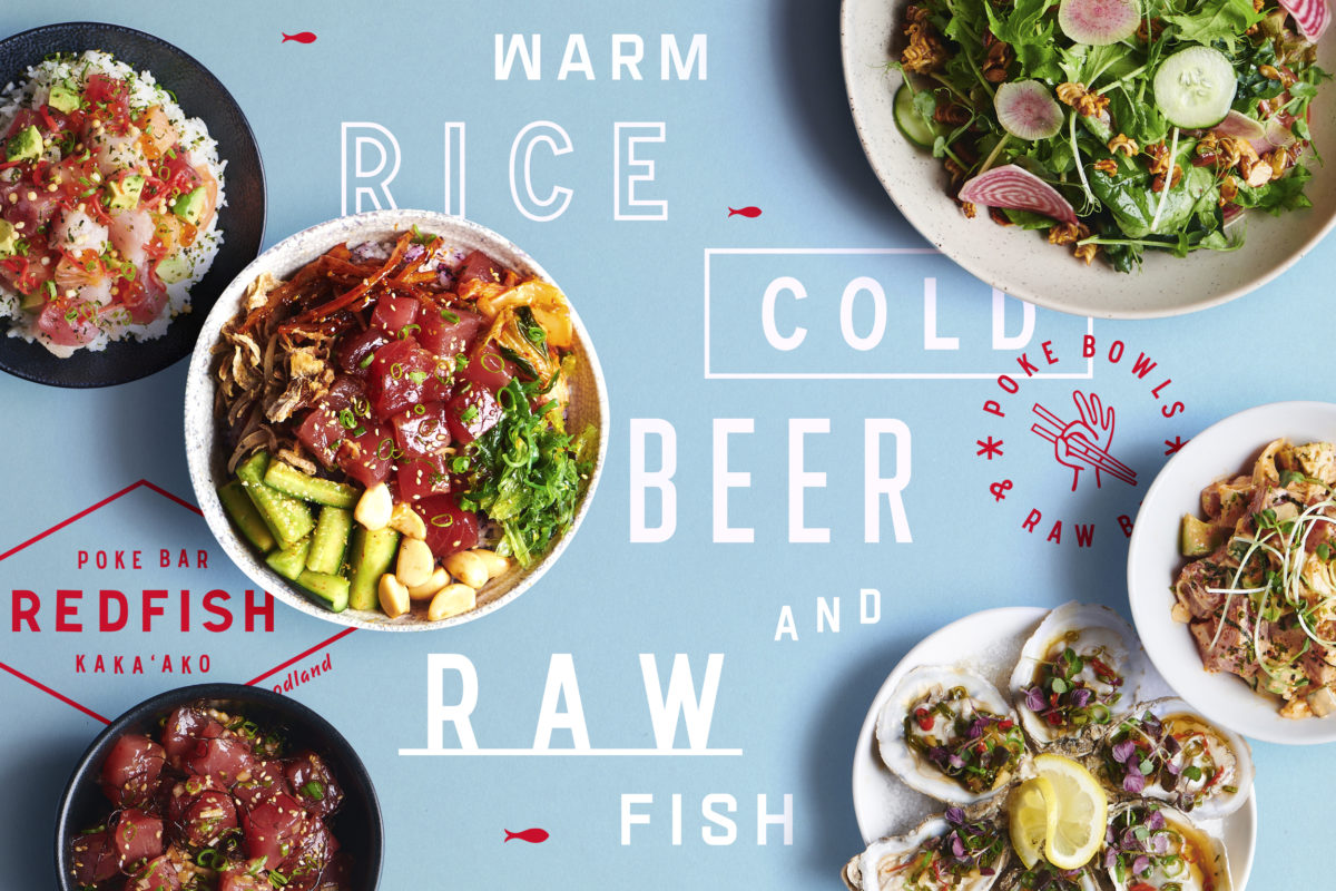
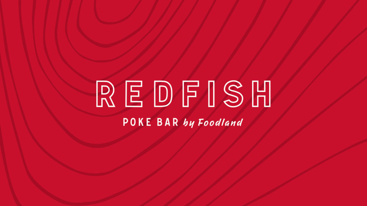
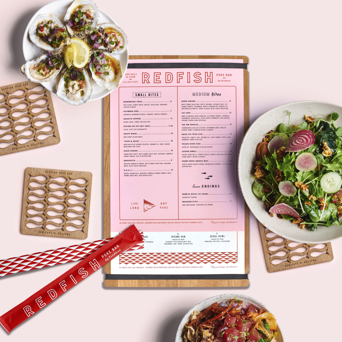
Poke has been a trendy food here in the states for a few years now, evolving a bit since it hopped across the Pacific from its native Hawaii. The folks at Redfish feel that poke has wandered away from its traditional roots, and hope to explore the cuisine through its native lens. Being located in Honolulu and associated with a longstanding Hawaiian grocery-store brand (Foodland), they were well-positioned to do just that. Looking to parent brand Foodland’s history, their brand is rife with playful type, quippy copy, bright colors, and a rolodex of eclectic ephemera. One detail about this brand I particularly enjoy is their use of patterns throughout, such as a gorgeous topographic map-esque pattern inspired by the flesh of ahi tuna cut on a bias and an Escher-inspired pattern of fish swimming with/against the current, to name a few. Every graphic detail is sharp and clean in its execution but softened through the easy-going color palette and a keen eye for adding imperfection where it makes sense, such as breaking up a perfectly balanced typographic lockup with some jumbled letters. The folks at Welcome Stranger really took their want to surprise and delight guests seriously with this one; from the menus to the interiors there’s something eyecatching and engaging around every nook and cranny.
Redfish Poke Bar Restaurant Branding by Welcome Stranger.
![]()
