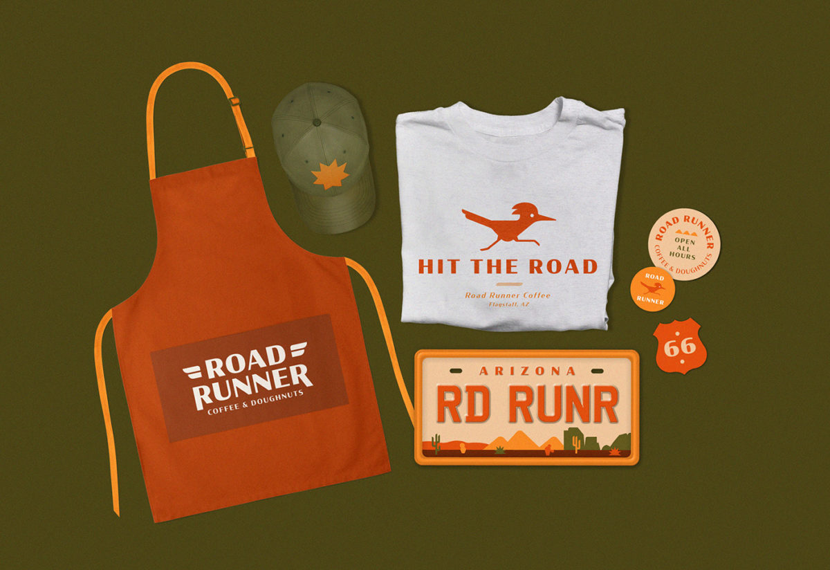
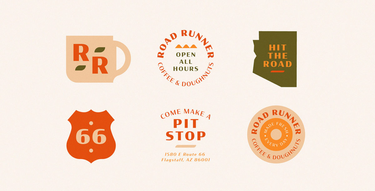
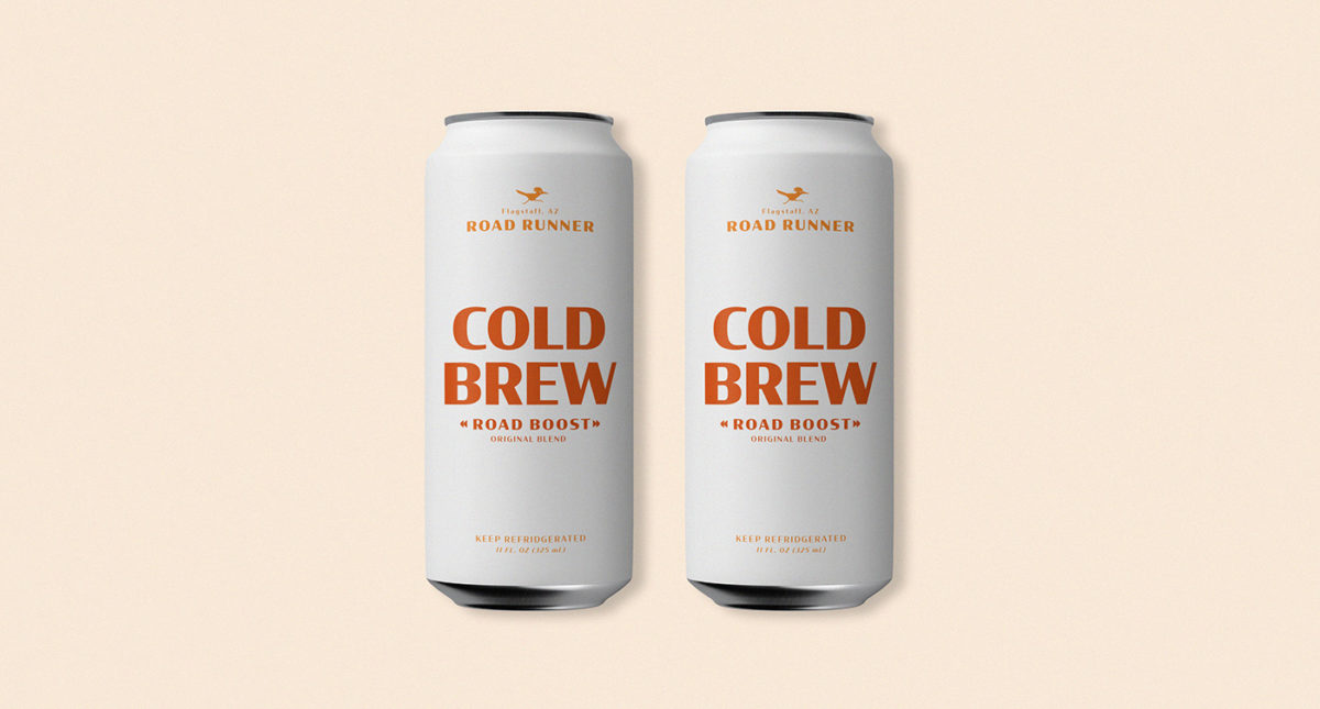
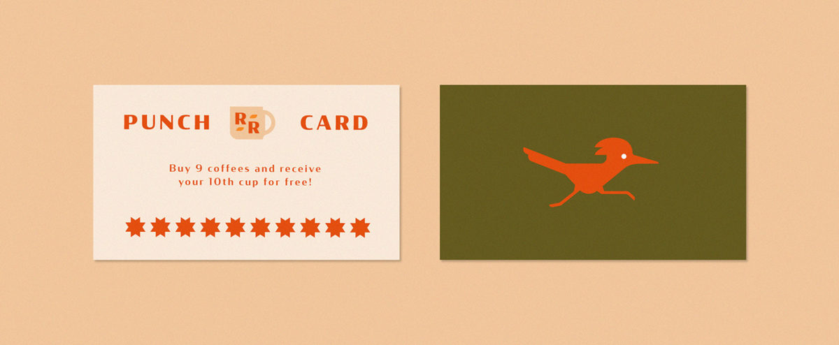
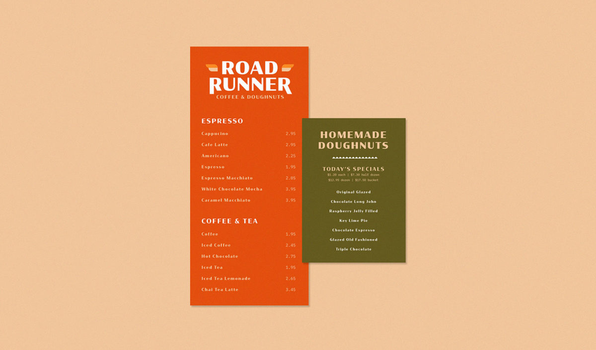
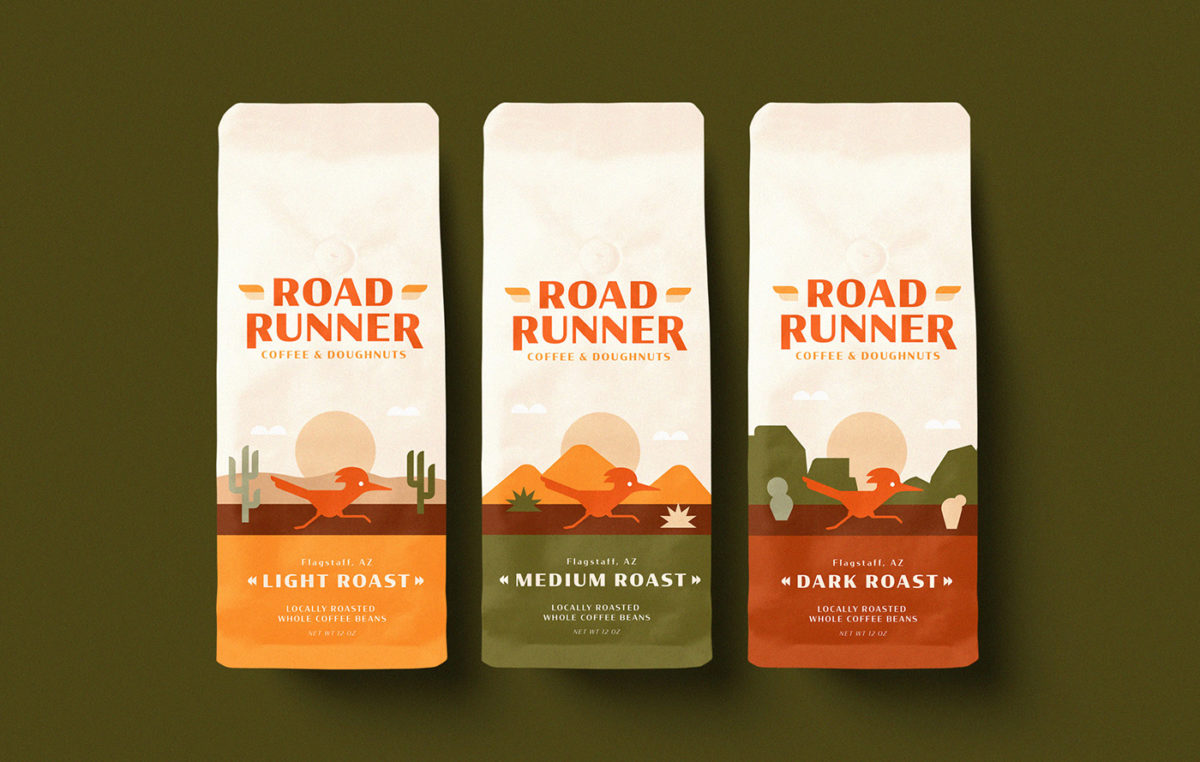
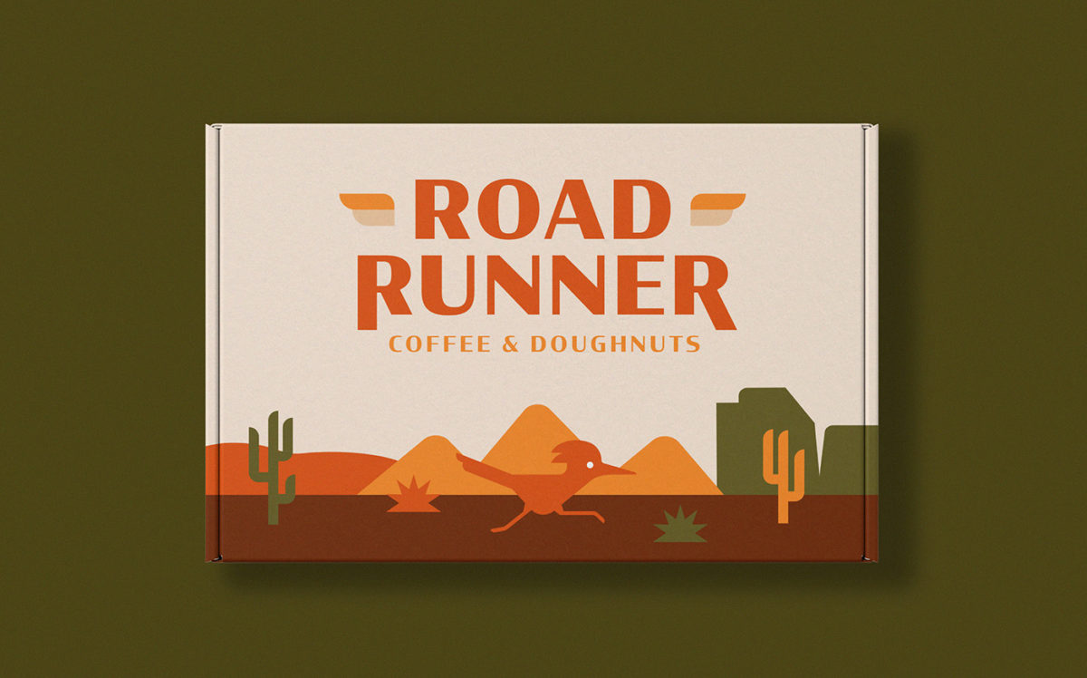
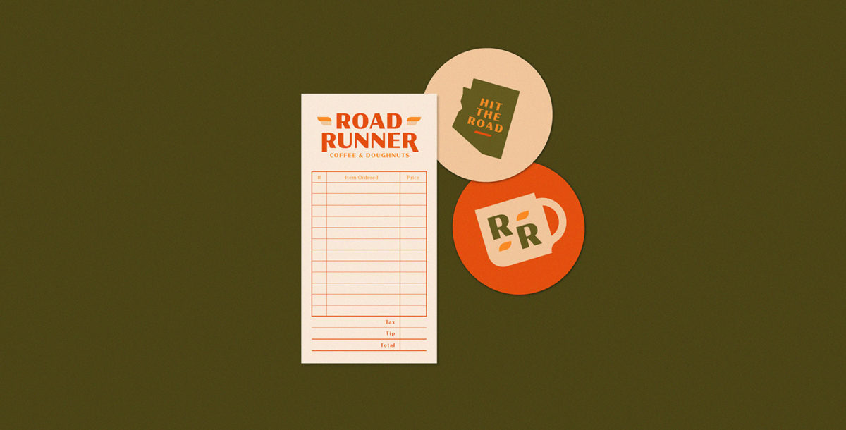
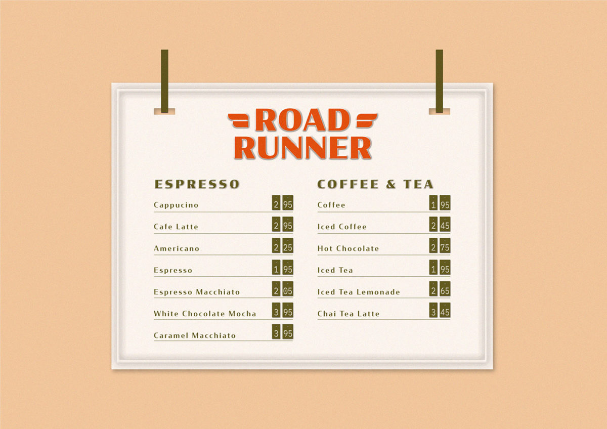
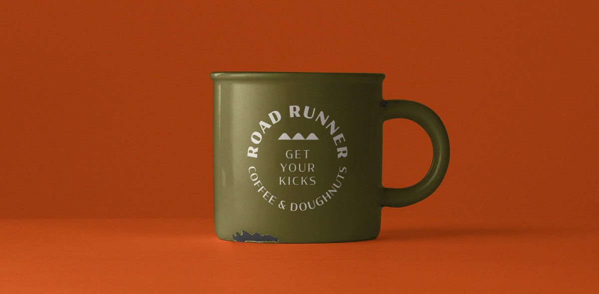
There’s nothing quite like the quintessential combination of coffee and doughnuts. It’s a combination of things that, when consumed over the course of a long road trip as part of a short pit stop, seems to be invariably more delicious. Unfortunately, most places travelers would stop and stretch their legs are lacking in good design. Road Runner Coffee & Doughnuts* shifts that perspective quite a bit, with a gorgeous clean, retro visual identity inspired by the American Southwest. Based in Arizona, Road Runner’s palette is inspired by the warm, dusty desert hues of the state it calls home, naturally imbuing the visual identity with a sense of warmth. Vintage typography, reminiscent of what you’d find in old-school car emblems, lends a sense of history to the brand and speaks specifically to an era of travel in the U.S. when families would take long, winding road trips across the country.
Road Runner Coffee & Doughnuts Cafe Branding by Hannah Wexler.
*please note that I am making a few assumptions here based on what I can glean from the design. At the time of writing this post, I was unable to find a Road Runner Coffee & Doughnuts that existed in Flagstaff, AZ.

