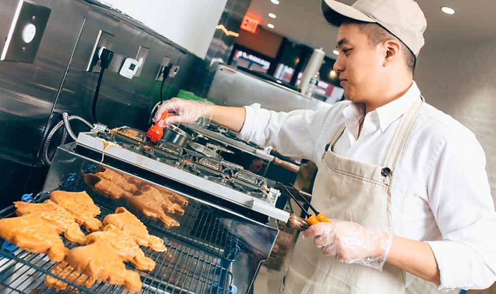
Yay! Friday is here again and you can bet we’re ready to have some fun and cheer up our spirits! Today it’s our joy to share a little magic with you. These geniuses combine two of the most amazing food inventions ever: ice cream and waffles. And they didn’t just combine them but found a way of doing it in the most wonderful way.
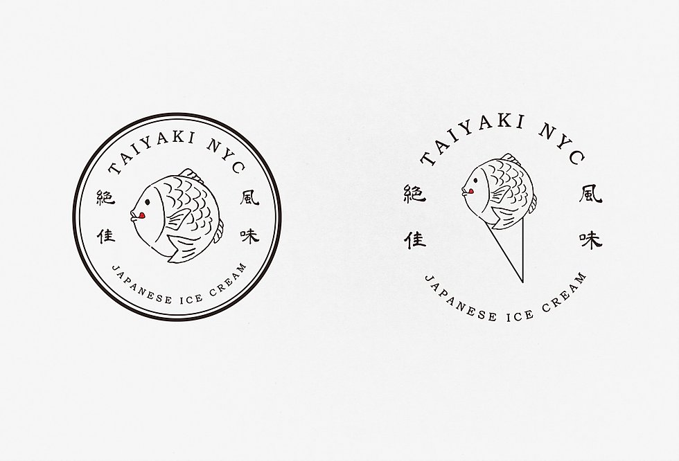
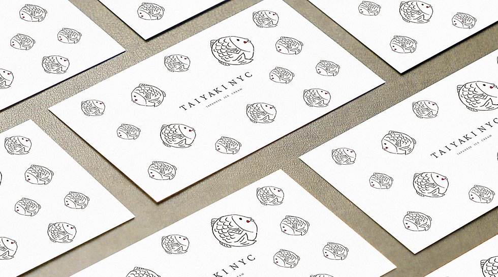
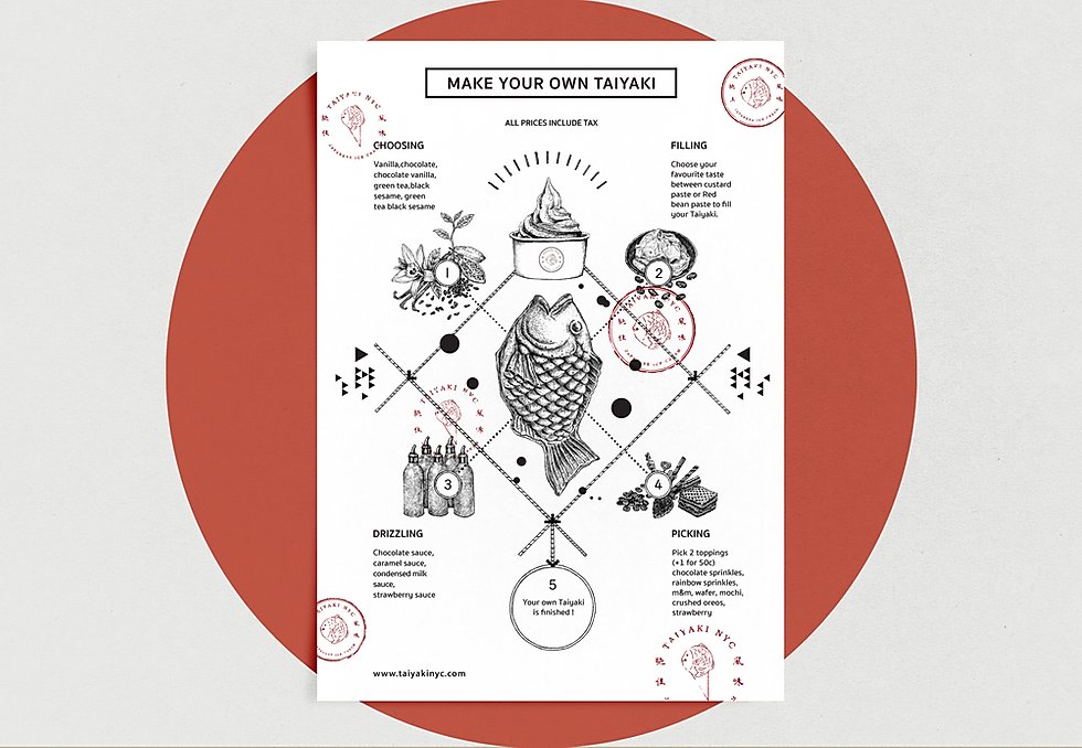
Deeply rooted in Japanese culture, Taiyaki means ‘baked fish’, and it’s been a symbol of celebration, luck, prosperity, and happiness; and that is exactly what this brand’s visual identity evokes. Refined, minimalist, and playful, Taiyaki NYC, is driven by curiosity, charm, excellence, and creativity in everything they do, and their visual identity stands and reflects all of that.
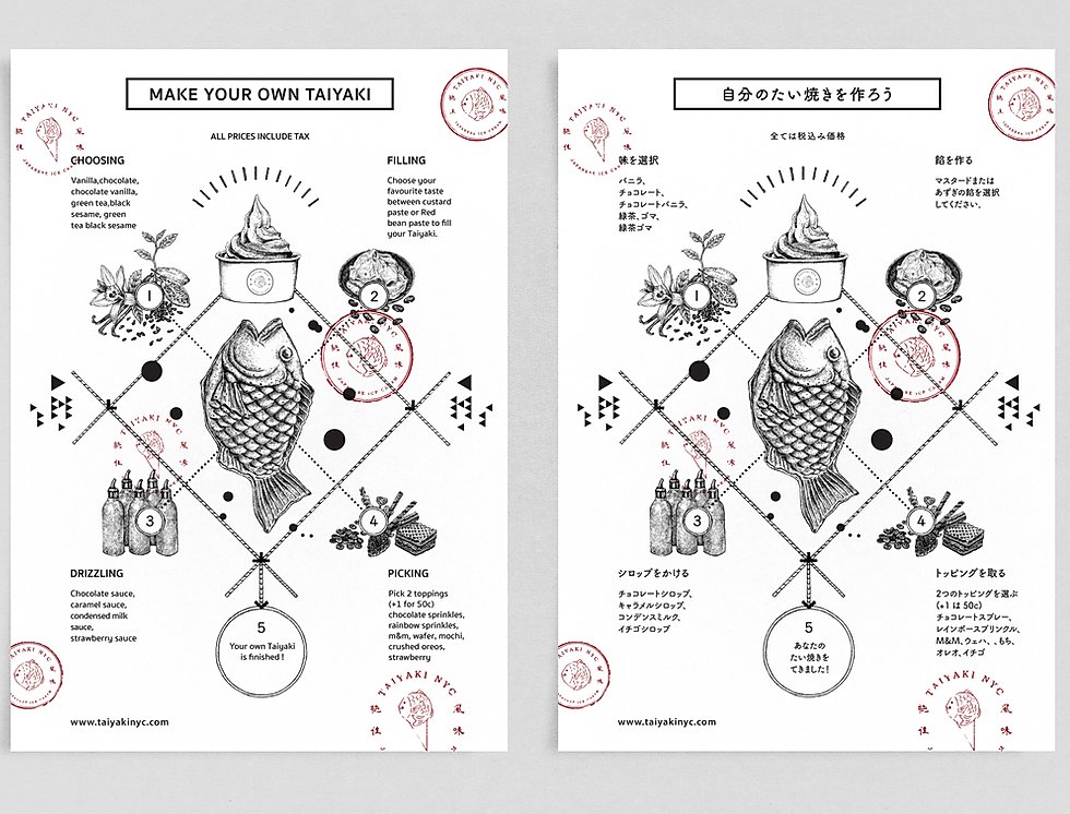
We can’t wait to get our hands on these little fish from heaven!
TAIYAKI NYC Branding by Mortise Design