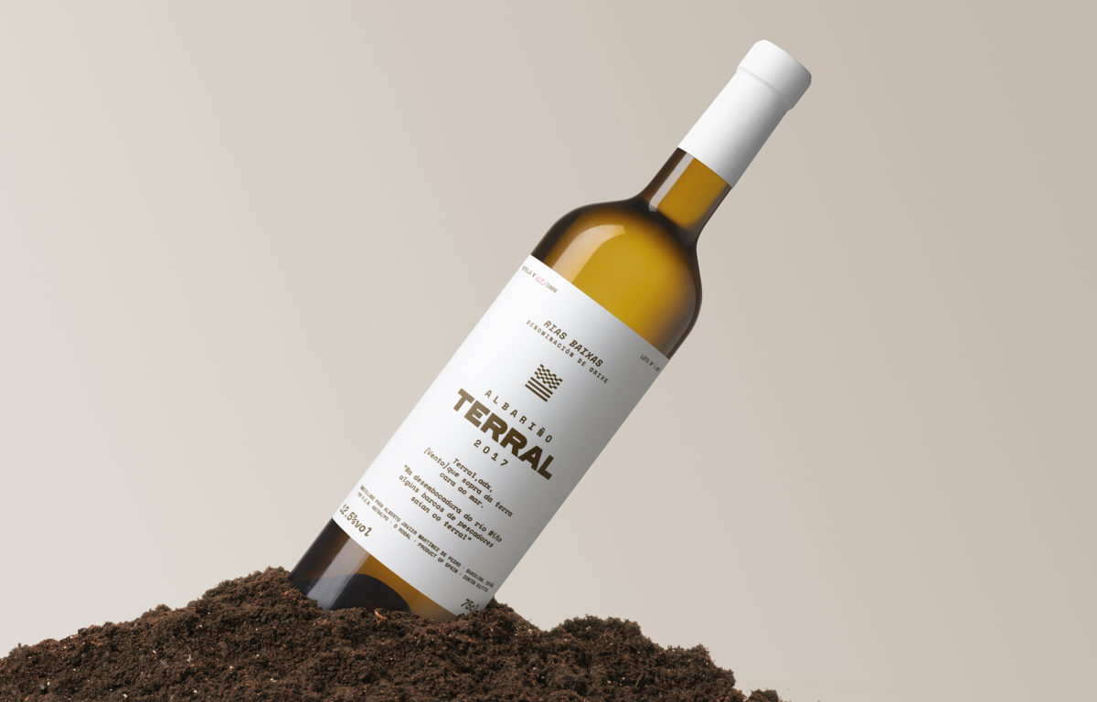
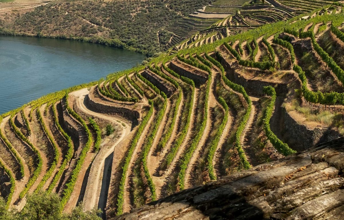
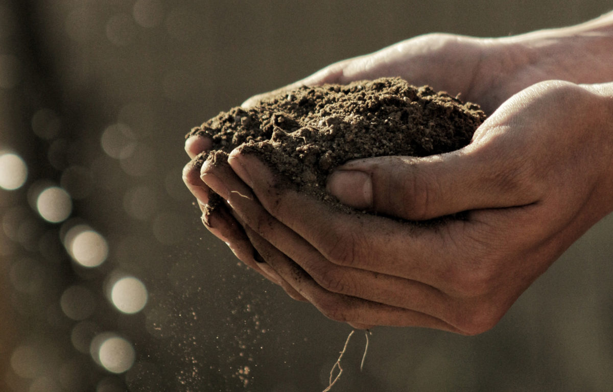
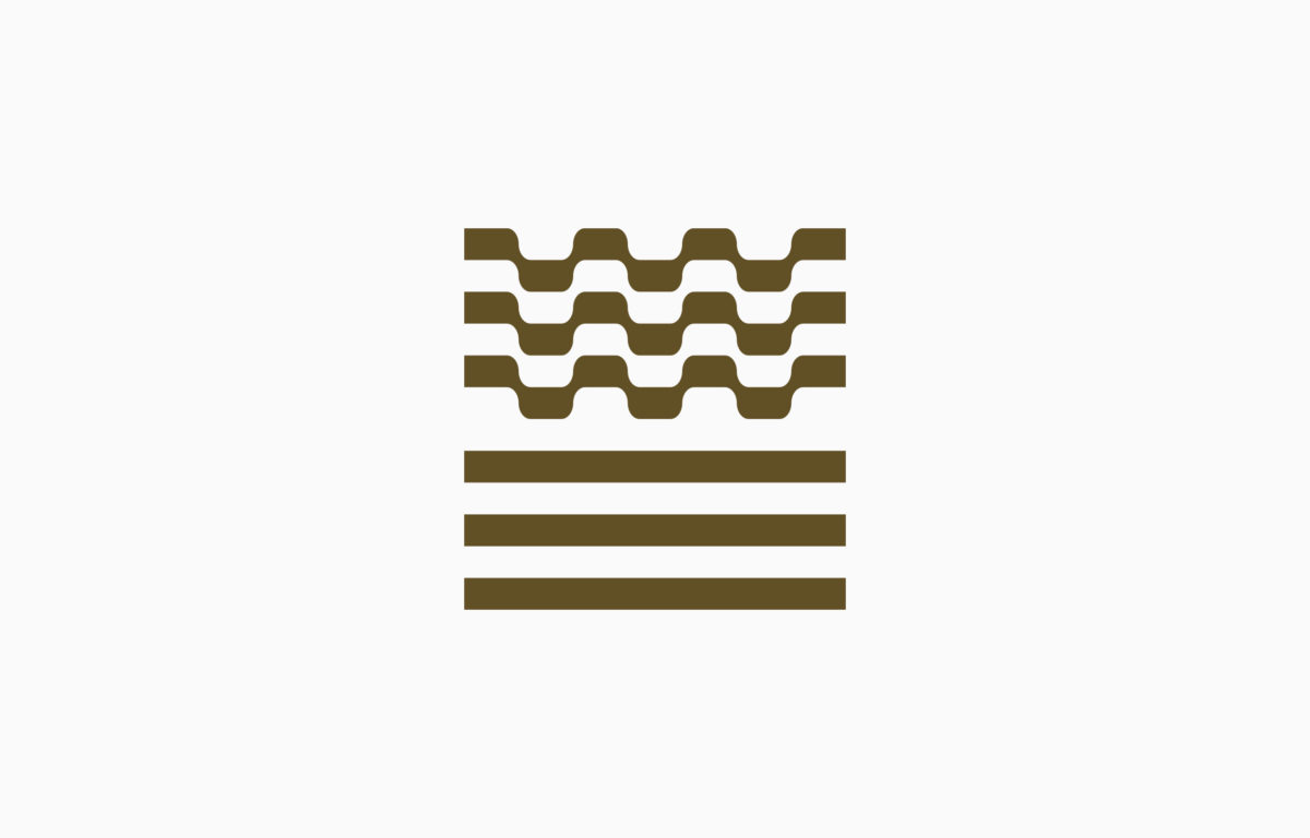
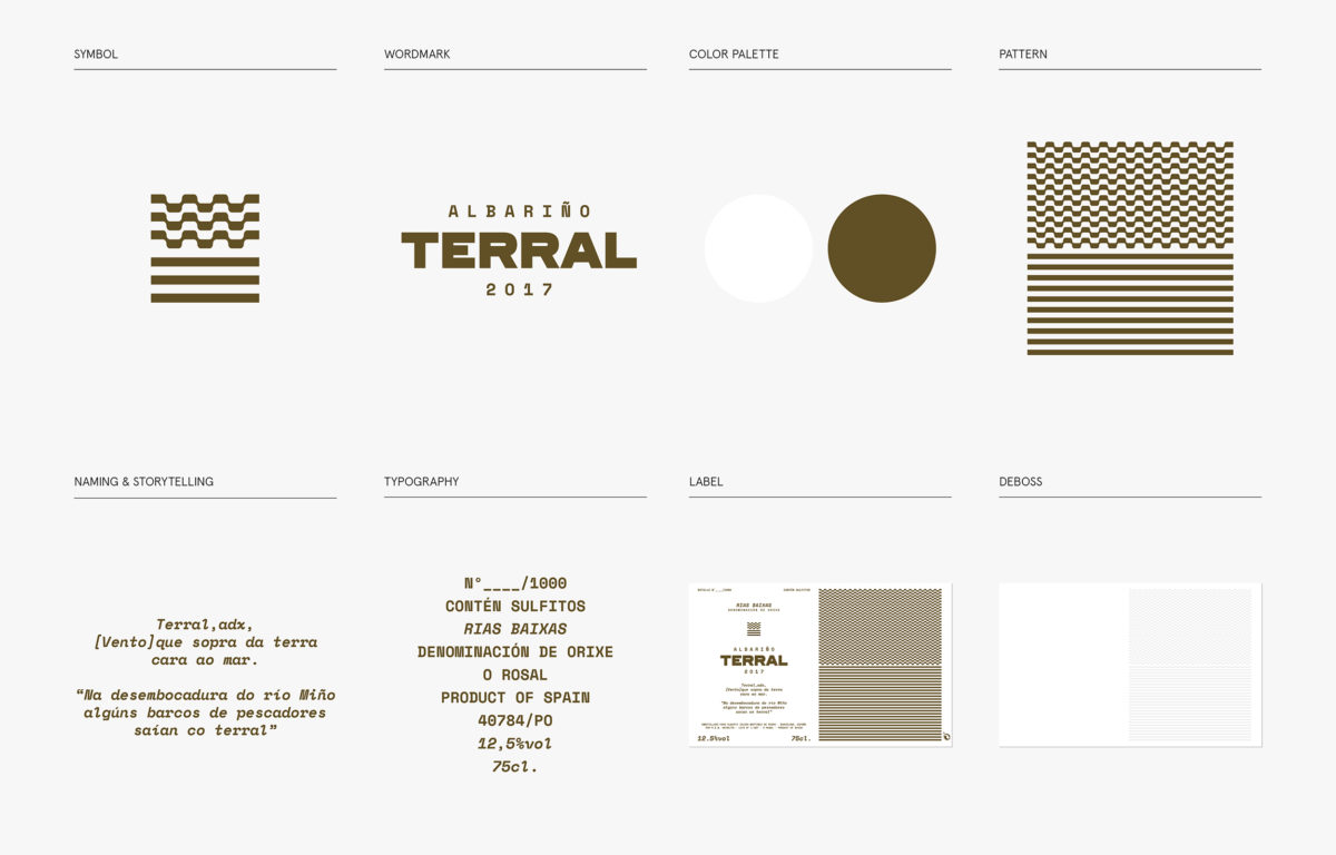
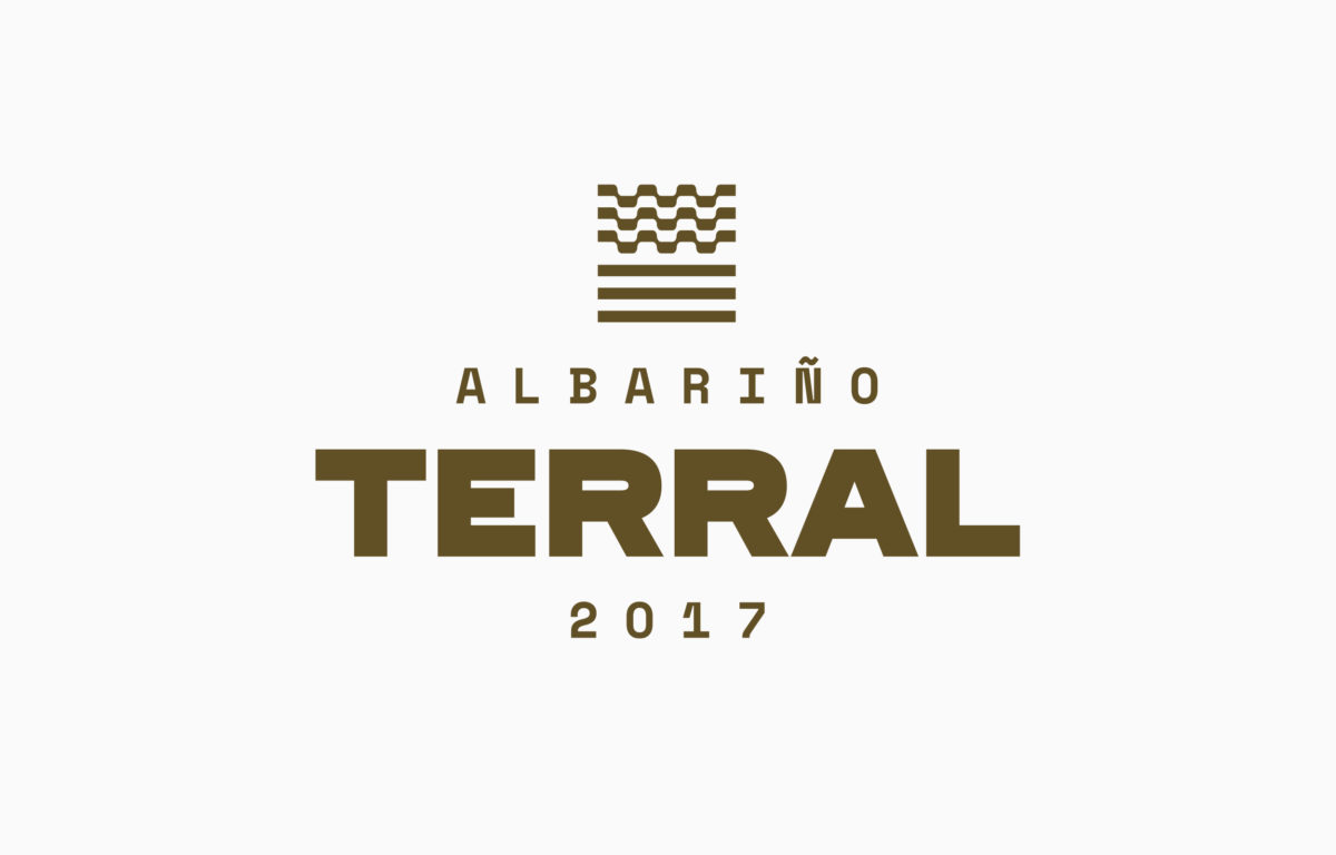
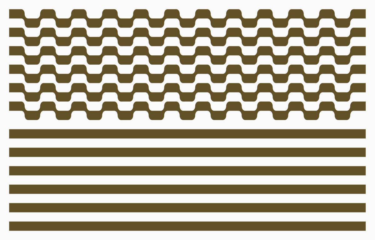
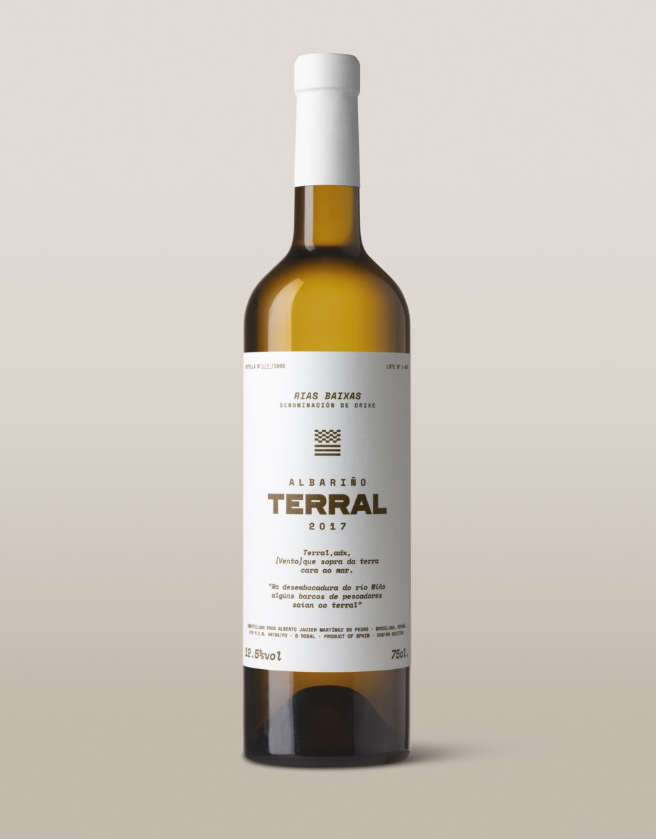
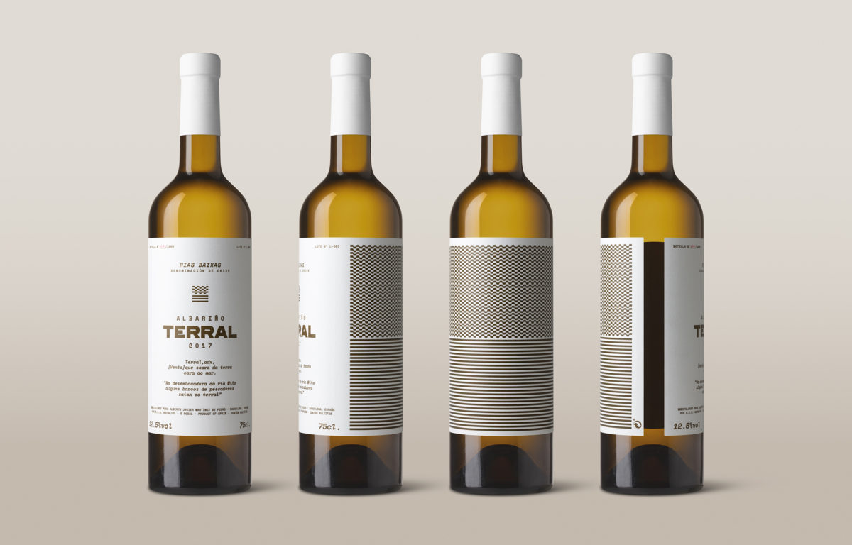
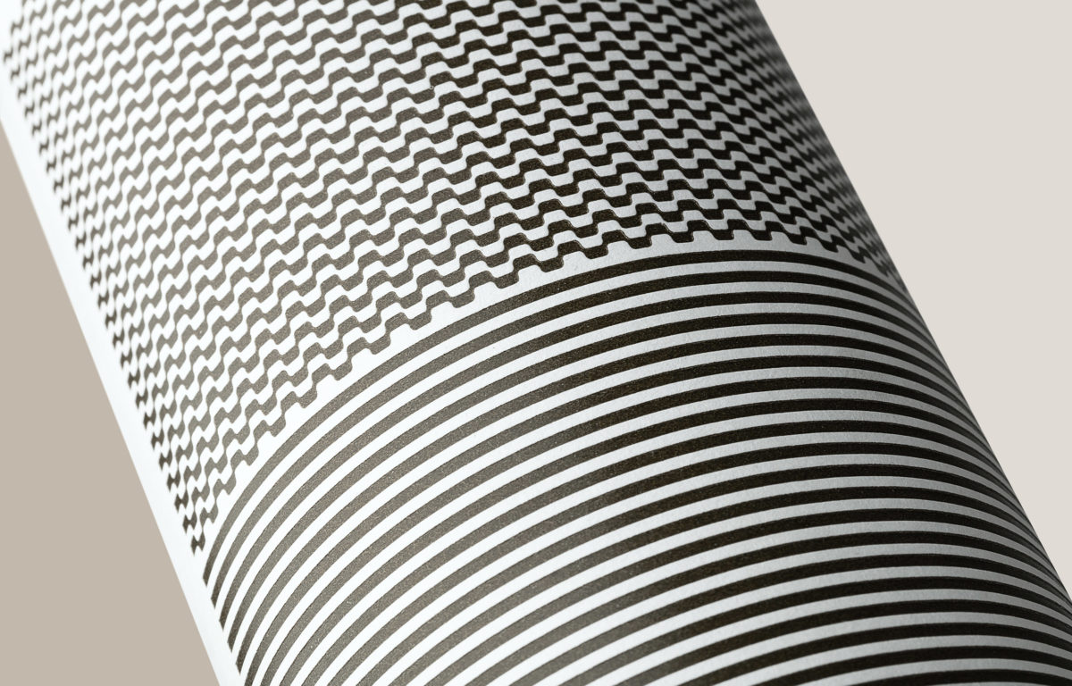
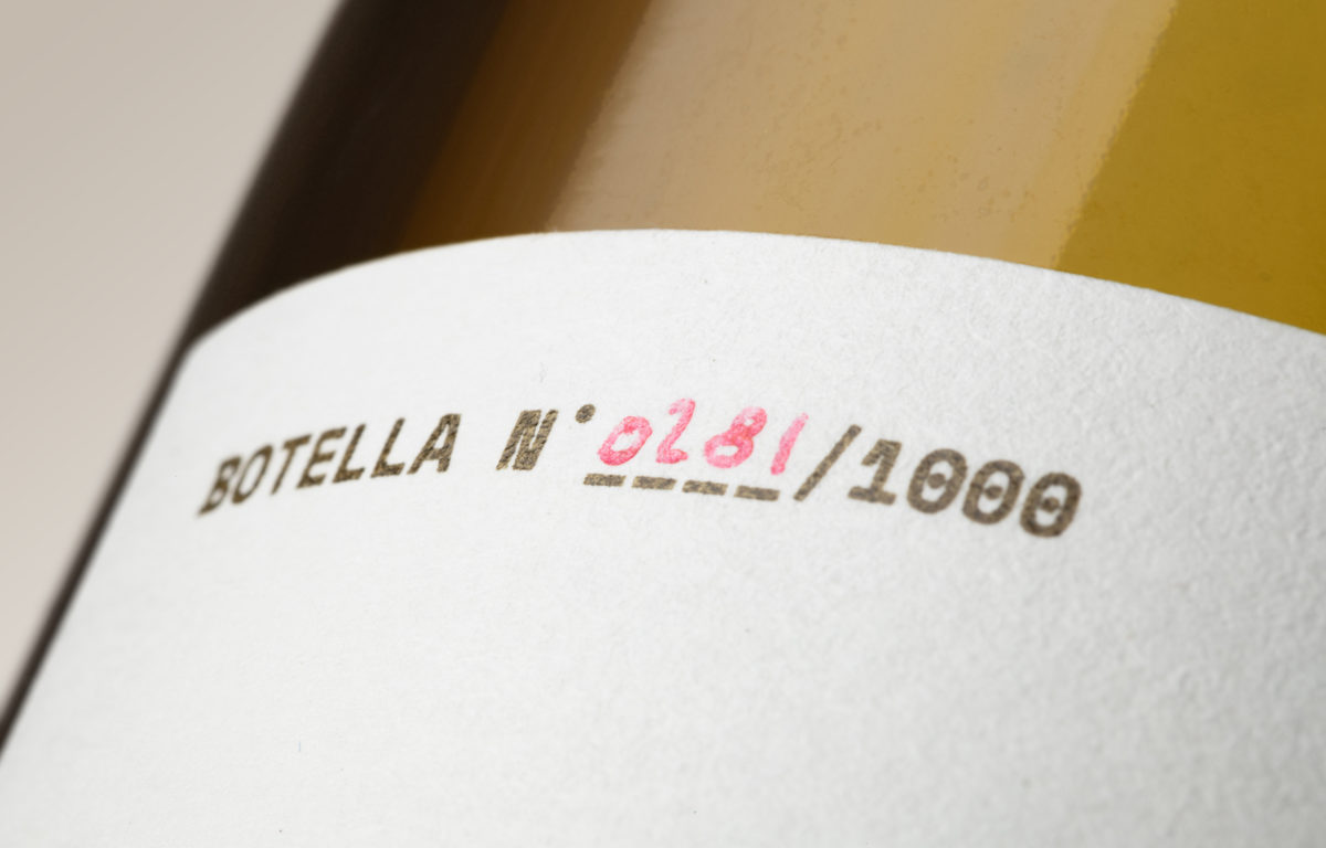
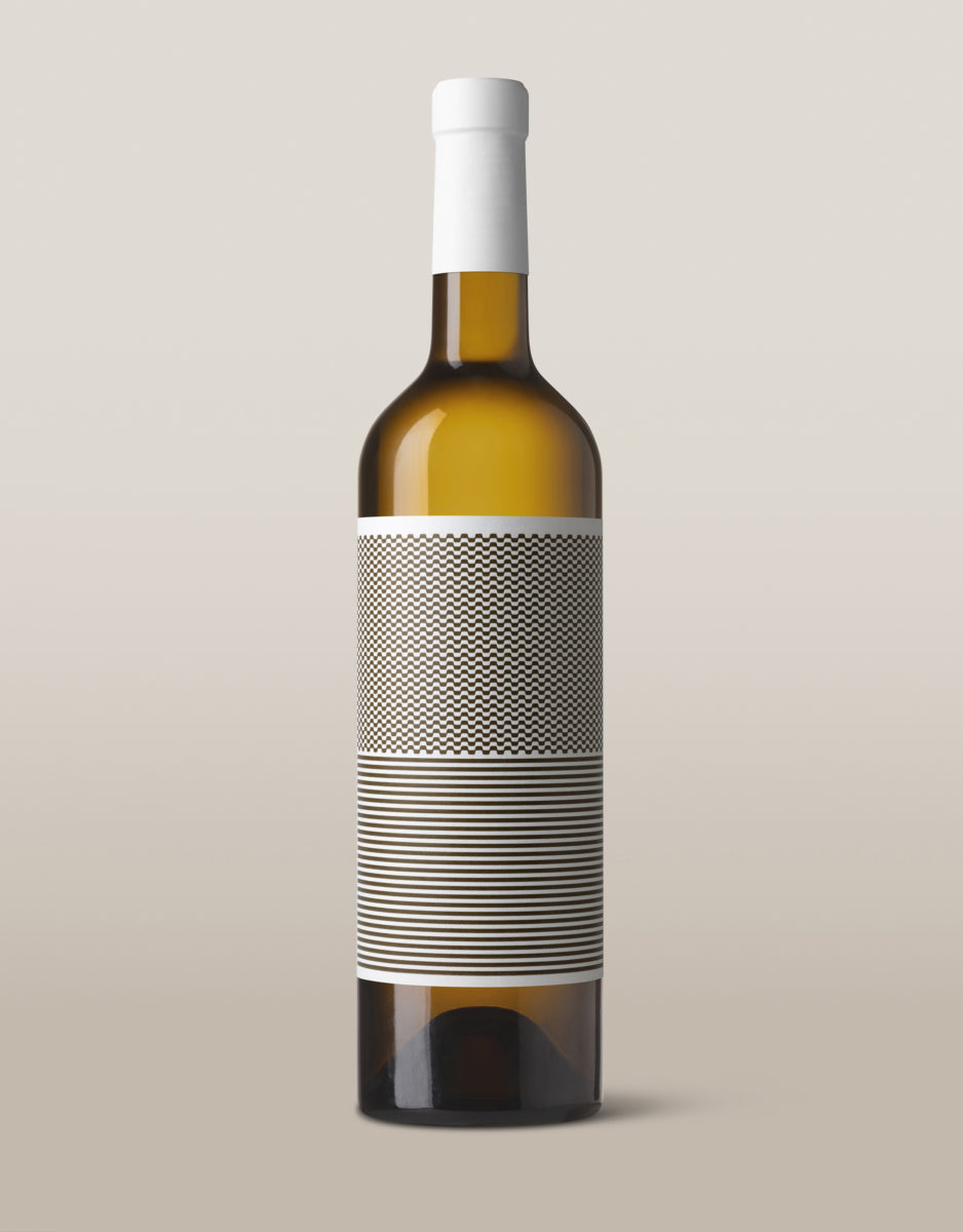
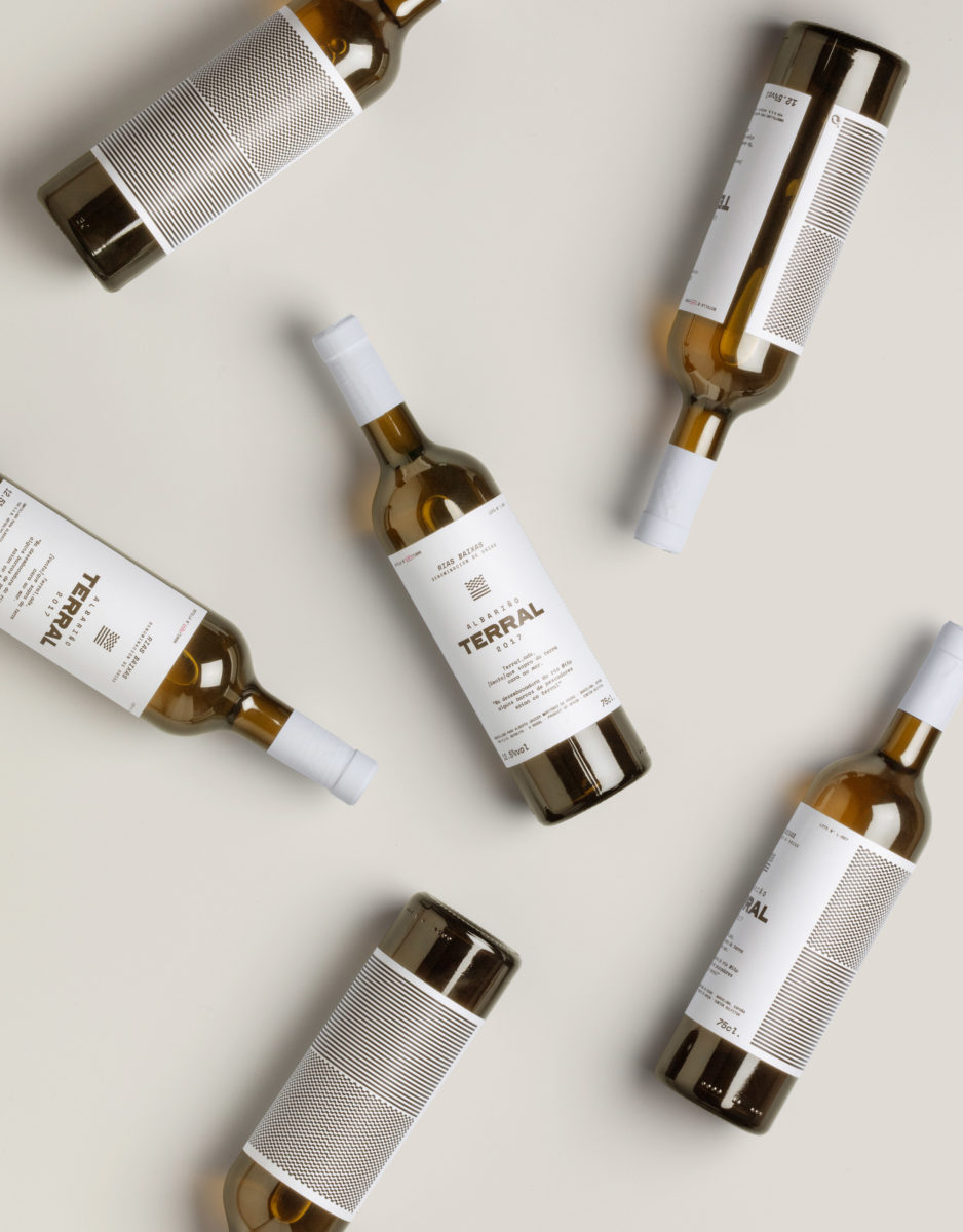
If you’re really into wine, you know how important the land, environment, and weather the grapes were grown is to the final wine’s flavor profile. If you’re not really into wine, those elements coming together in the form of flavor is known as the wines’ terroir. Terral, in name and in design, is all about it’s own terroir. Its name comes from a Galician word, meaning ‘wind that blows the soil facing the sea’, accurately describing the seaside mountains where the grapes are grown. This sense of place is also translated into the brandmark; six simple lines representing land and sea and wind, intermingled. the labels themselves are minimal in nature, instead letting the unique golden color of the white wine take center stage. The type too is minimal, and oddly modern for most wins, featuring a monospaced face as the primary font outside of the logotype. You’d think it would read as cold and technical, but set in an earthy olive tone on a field of a warm white, it feels oddly rustic, like a letter written on a typewriter.
Terral Wine Branding & Packaging by Diferente.
