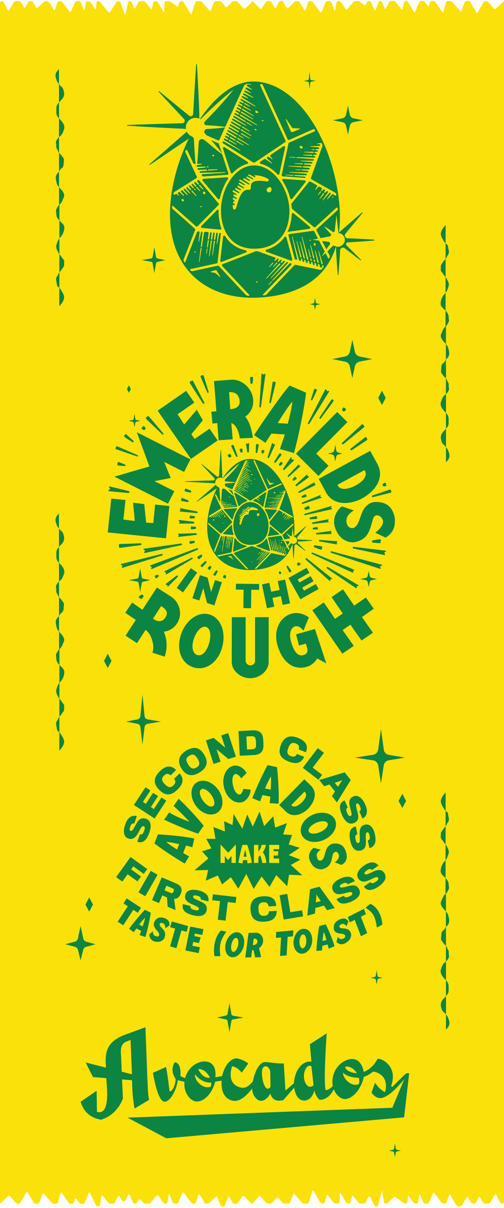
Some of the more interesting designs in the food and beverage space come from unexpected places. The produce section is one of those places. While some heritage, national brands have a more generic look that is easy to glance over, some smaller, local producers are taking note of the importance of standout branding and packaging. Emeralds in the Rough is one such purveyor of avocados. They specialize in B grade avocados, aka the gnarly weather-blemished kind. Hence the name, Emeralds in the Rough. Gold Lunchbox takes this concept and runs with it beautifully. The typography across the packaging is stellar, and the bright yellow label stands out in sharp contrast to the green of the produce. The standout detail for me in this project is the logo/icon create for the brand. The avocado is transformed into a beautiful, glimmering emerald, radiating deliciousness.
Emeralds in the Rough Produce Branding & Packaging by Gold Lunchbox.


