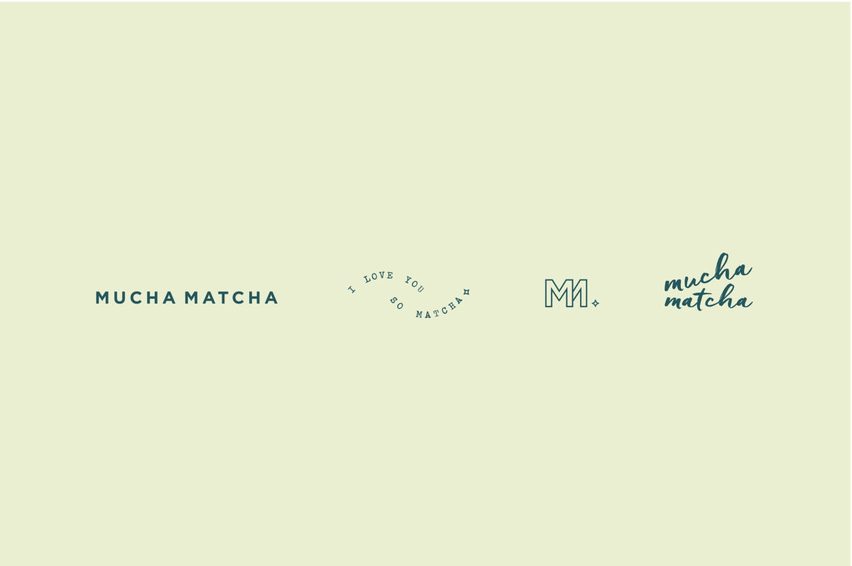
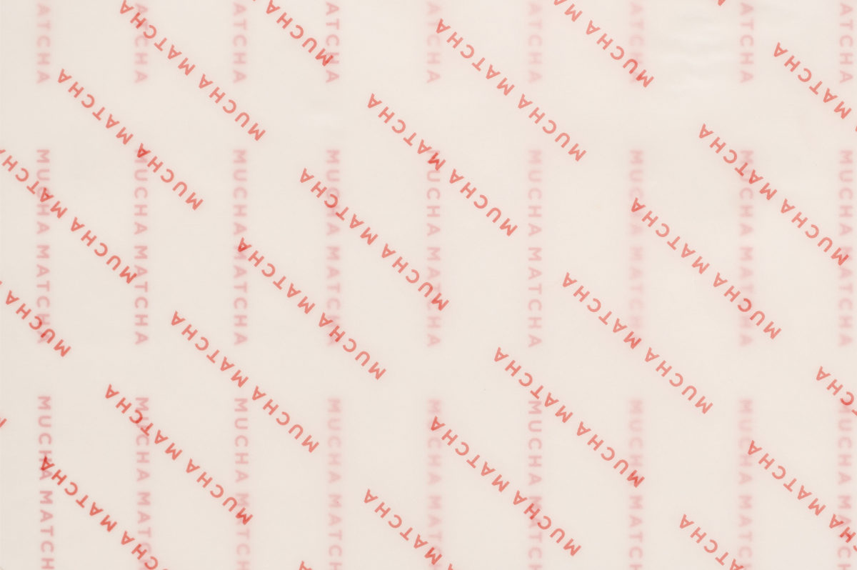
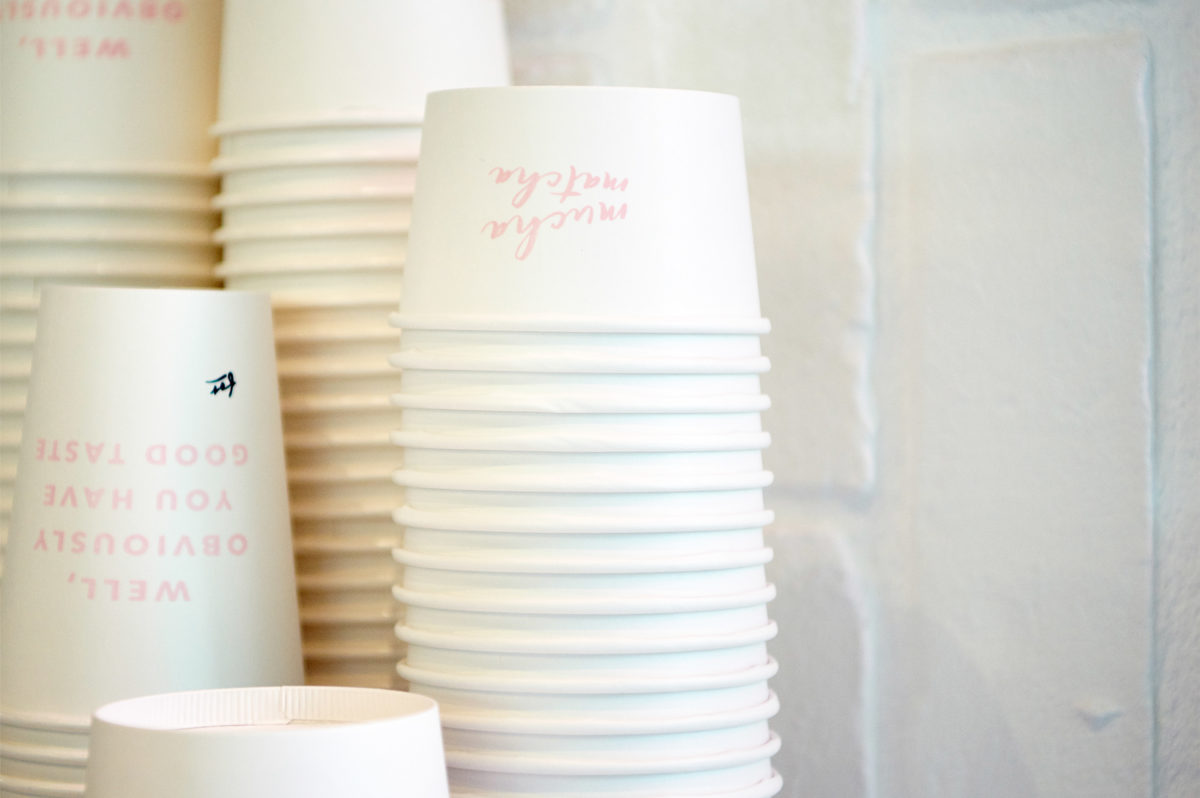
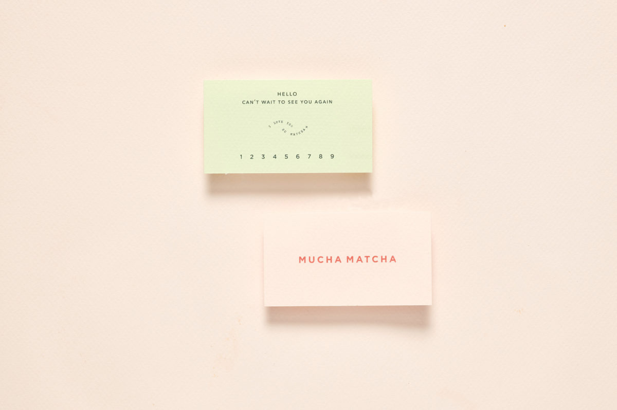
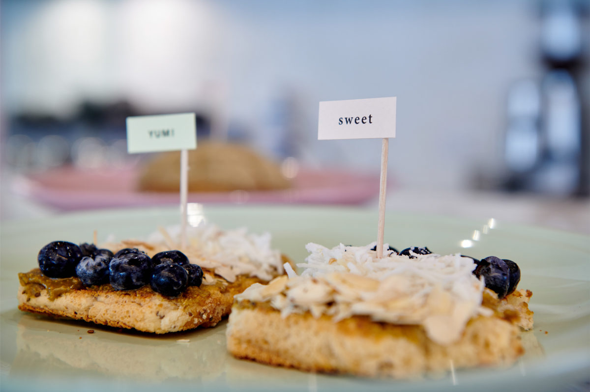
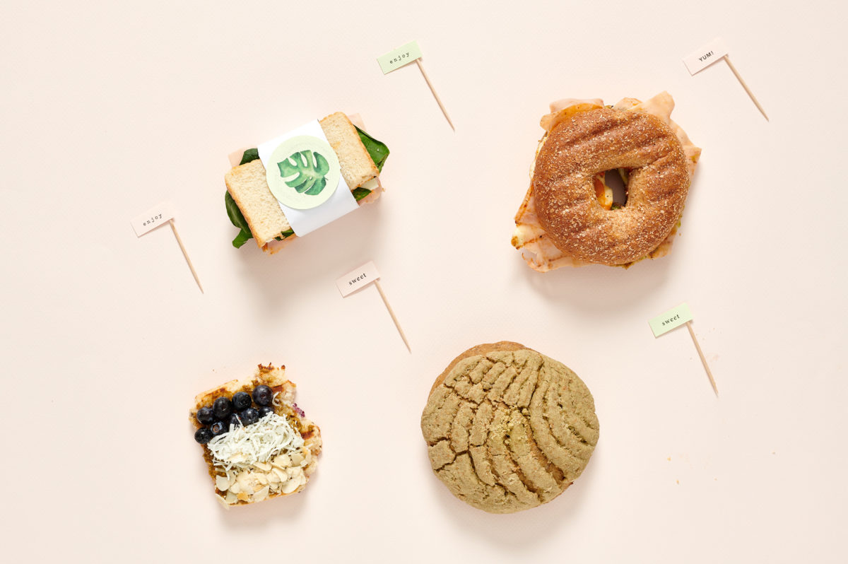
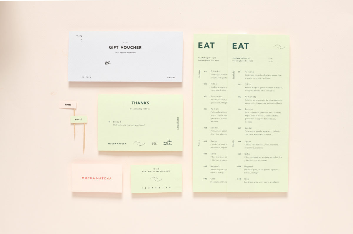
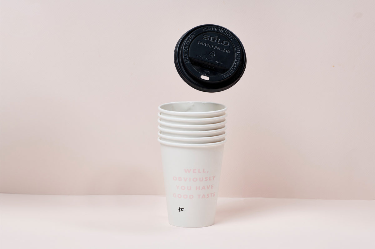
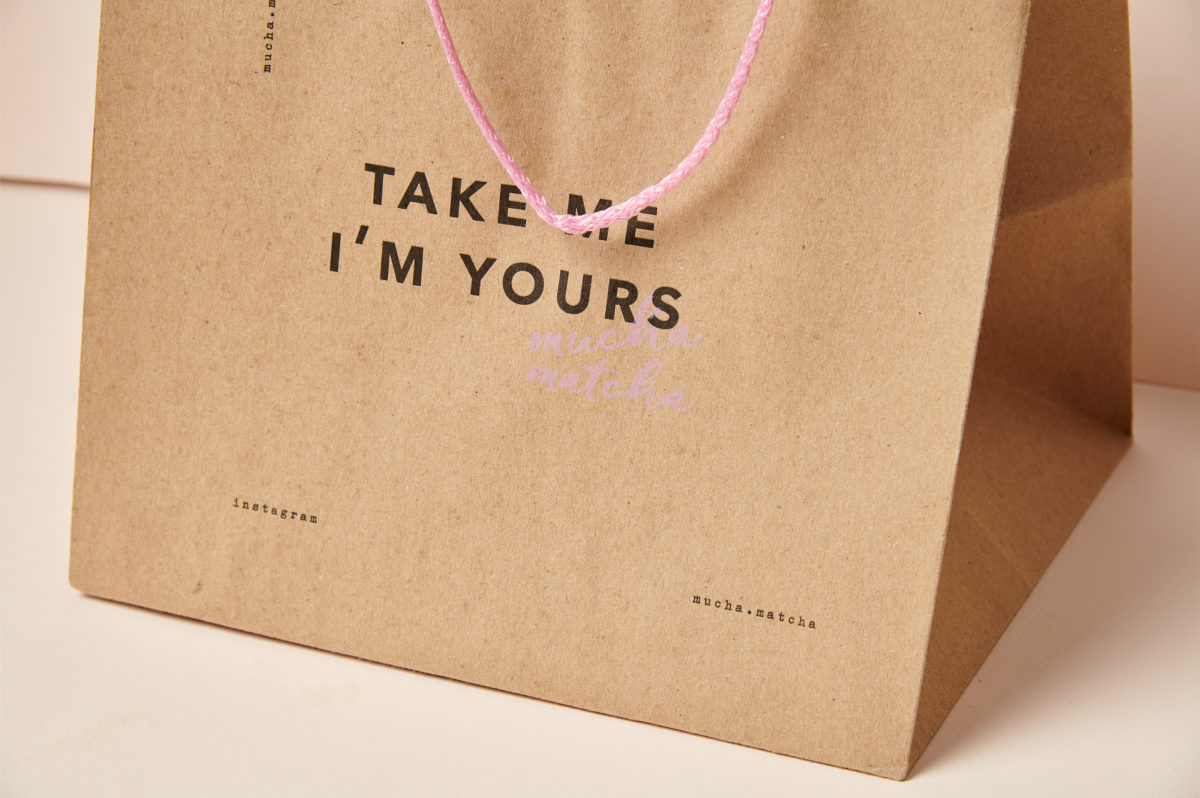
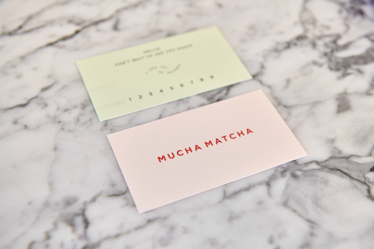
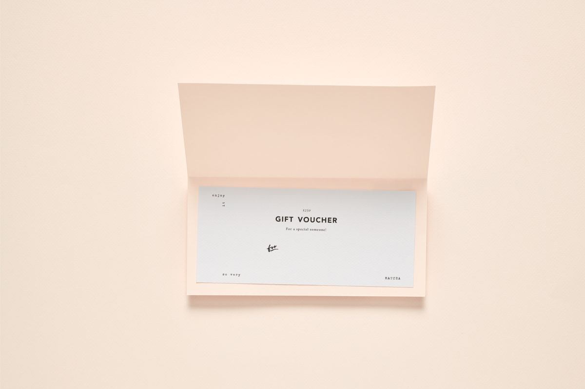
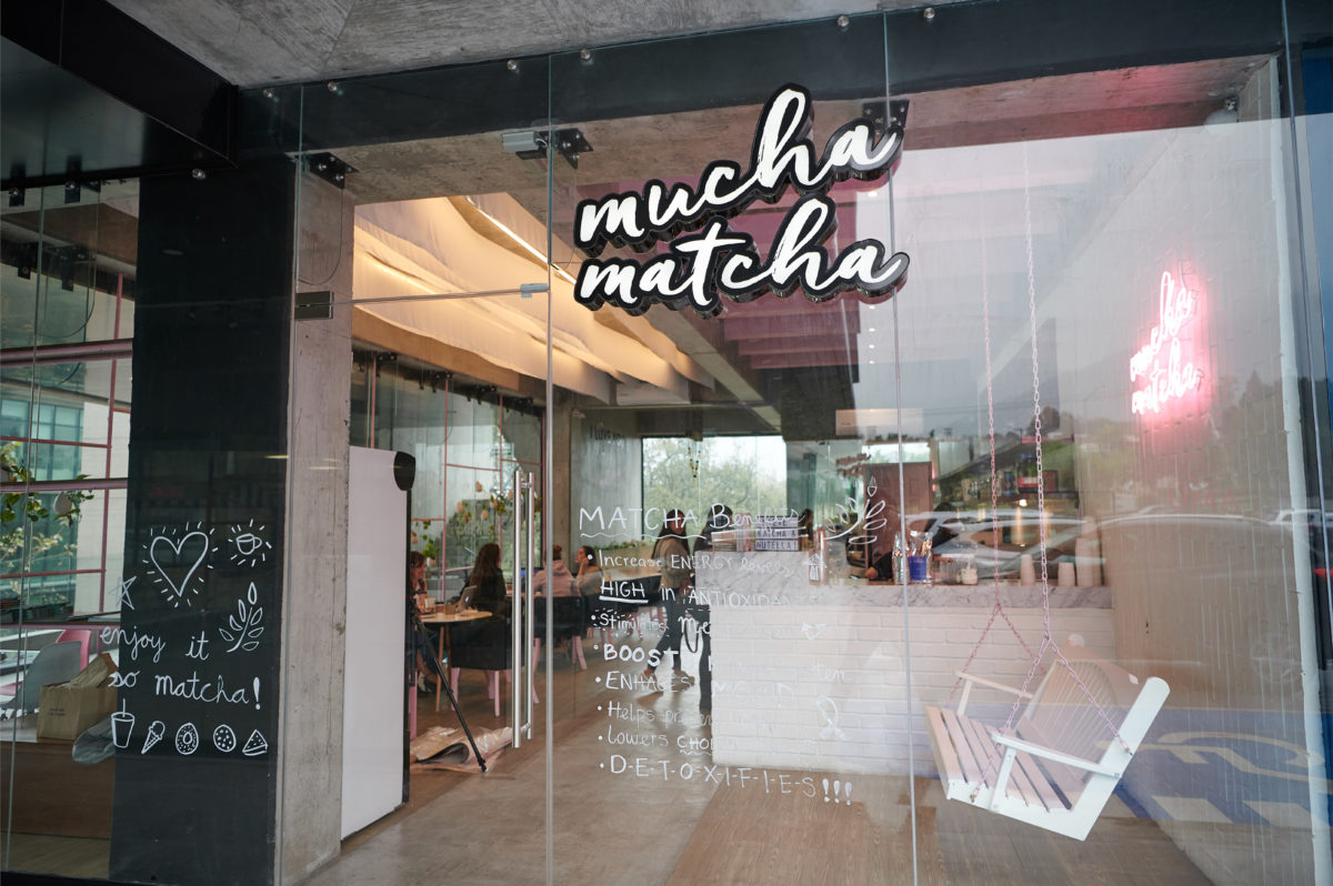
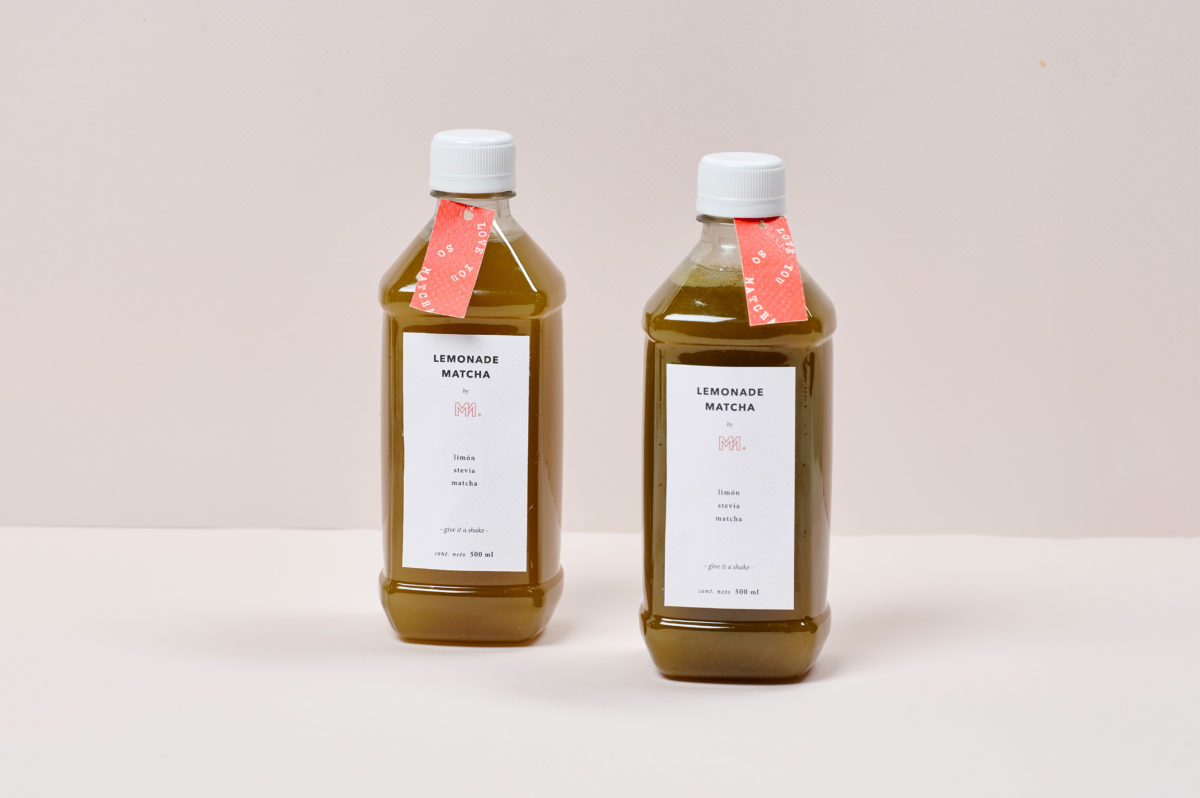
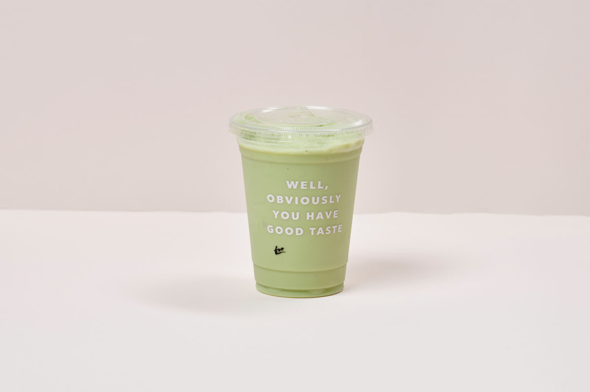
Matcha is a thing right now so it is no surprise than more and more we see an increase in the number of new matcha places, but with that come a new set of challenges; how to stand out in a category that is booming and flourishing all around? Mucha Matcha is a brand that did it in a quite simple and beautiful way. The simplicity of the brand is balanced through the incredible amount of small little details that are meant to surprise and delight whenever discover. The use of different type treatments makes Mucha Matcha feel approachable, ownable, and playful; almost as if you never fully know what surprise awaits you in each cup, bag, or pastry. It is not very often we get to see a brand that has such a dynamic brand identity but we think Emblema did a great job at achieving this balance and fluidity and still make it fill on brand and part of a whole universe.
Mucha Matcha Branding by Emblema Design Studio