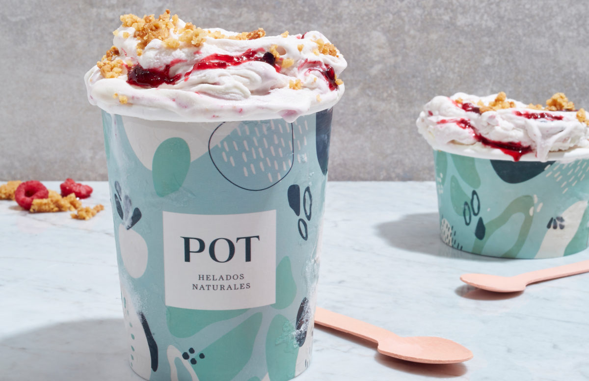
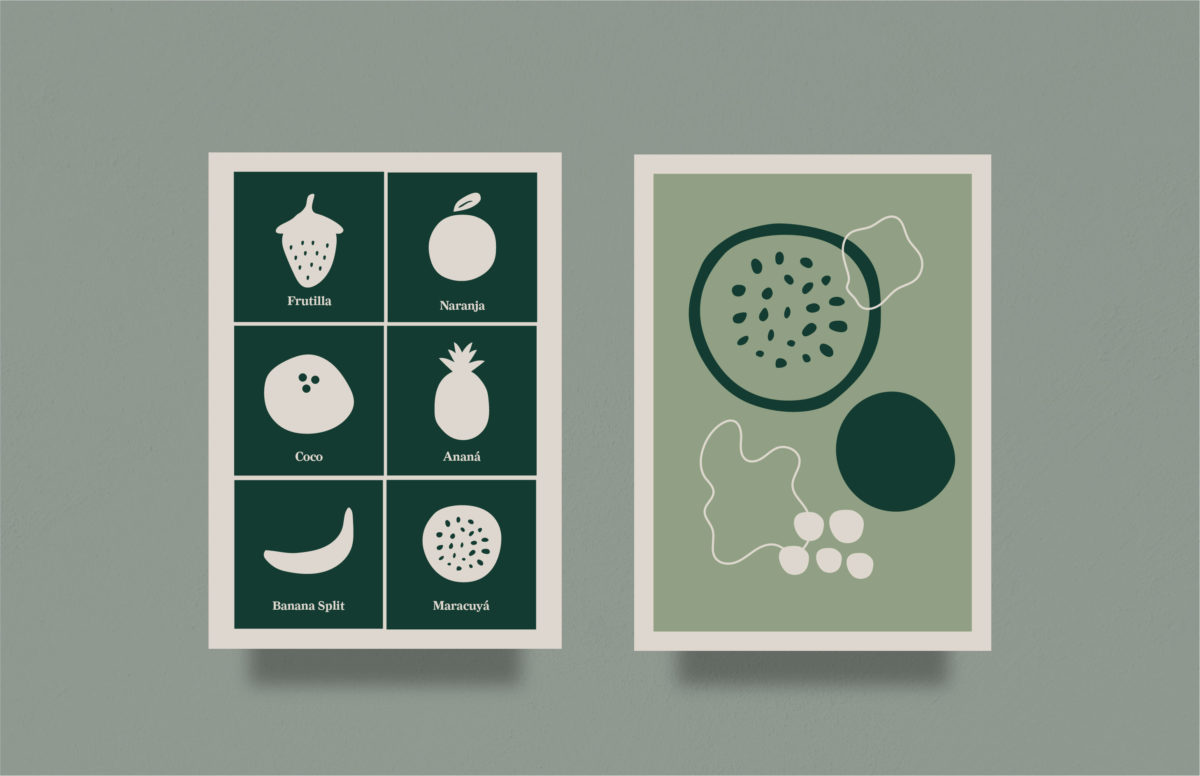
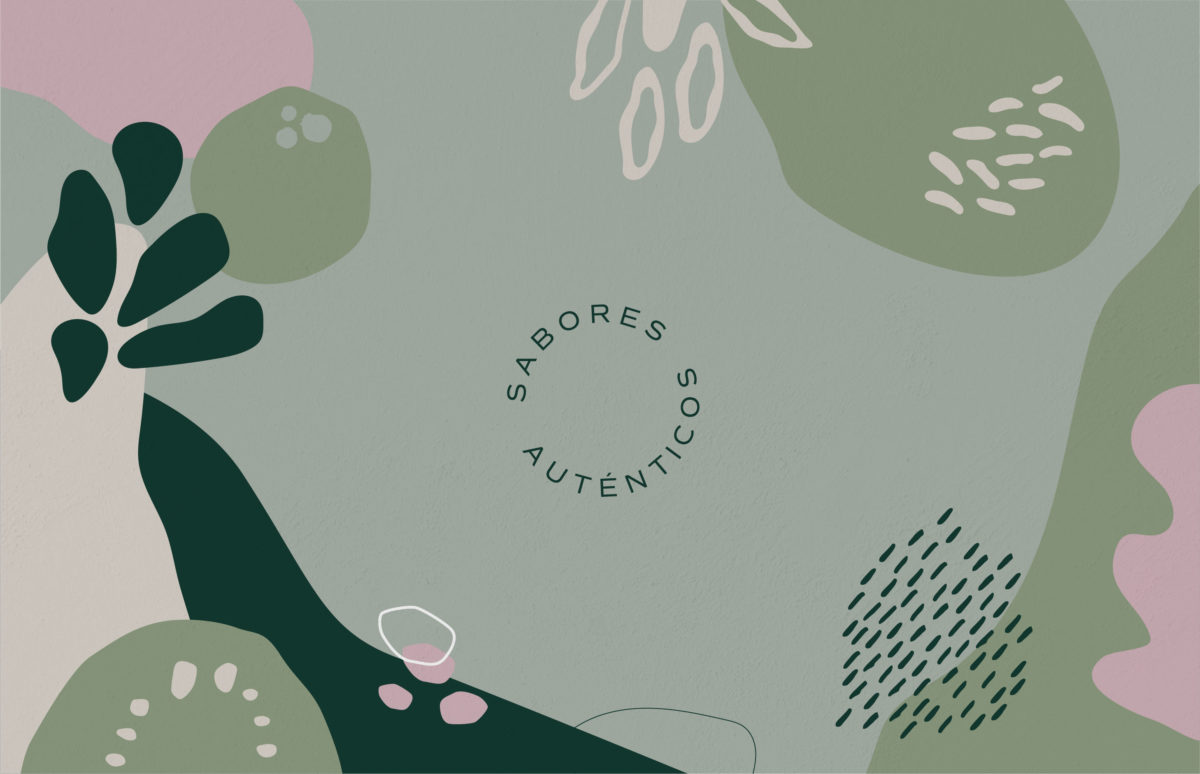
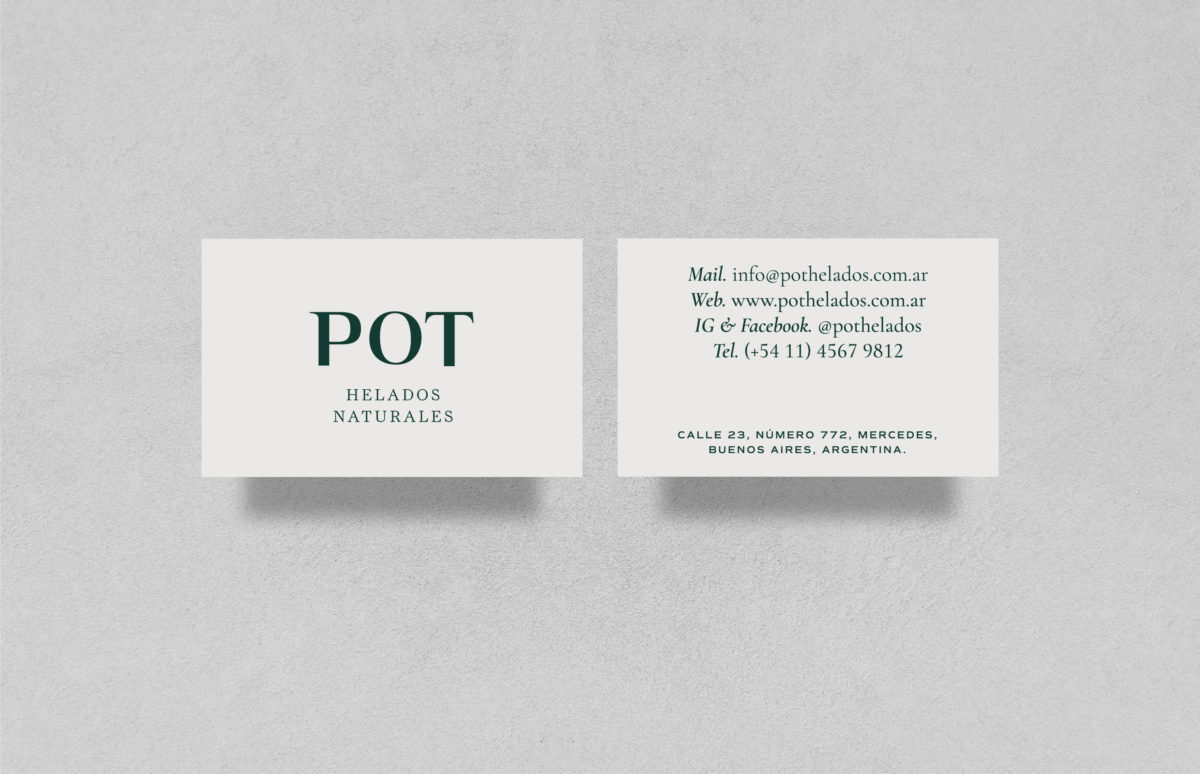
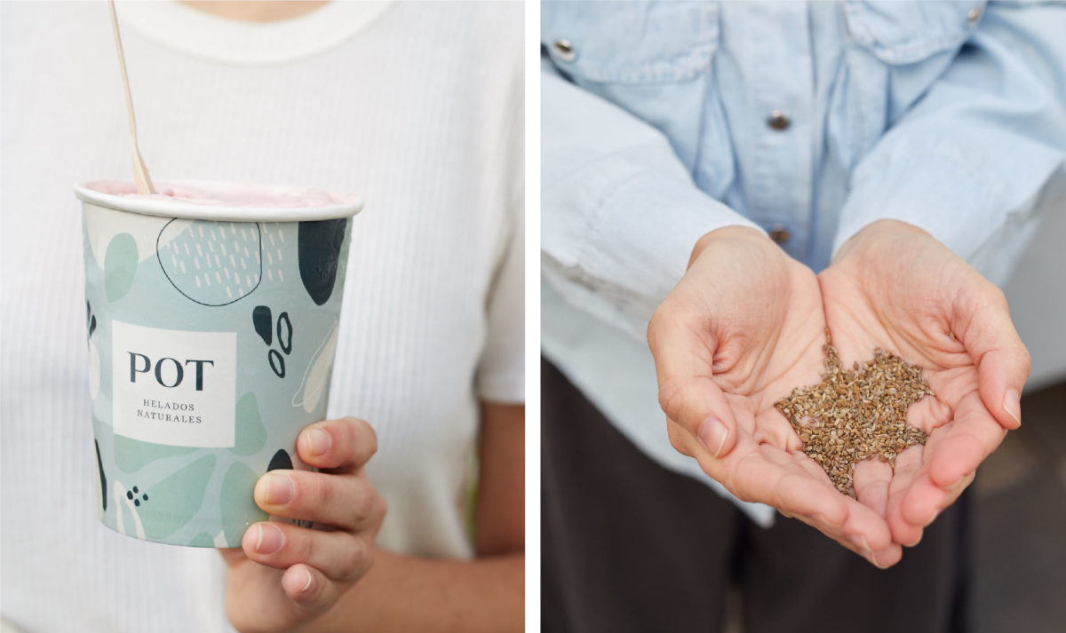
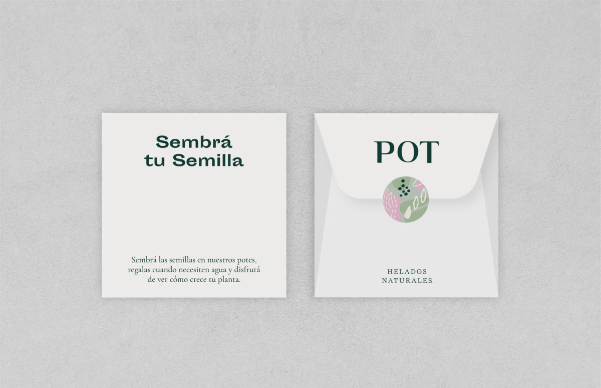
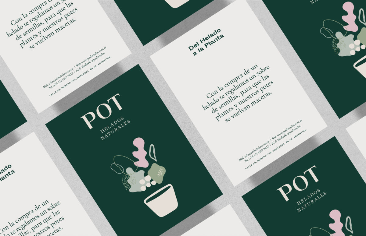
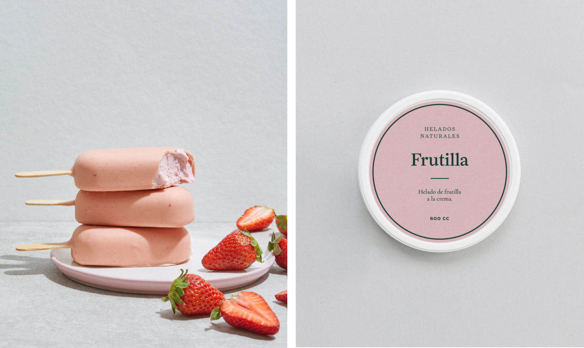
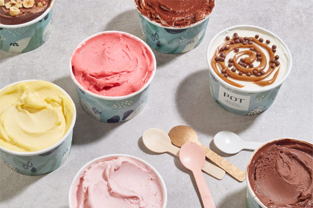
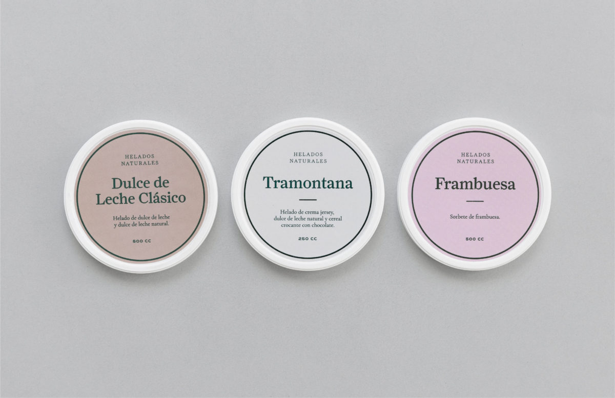
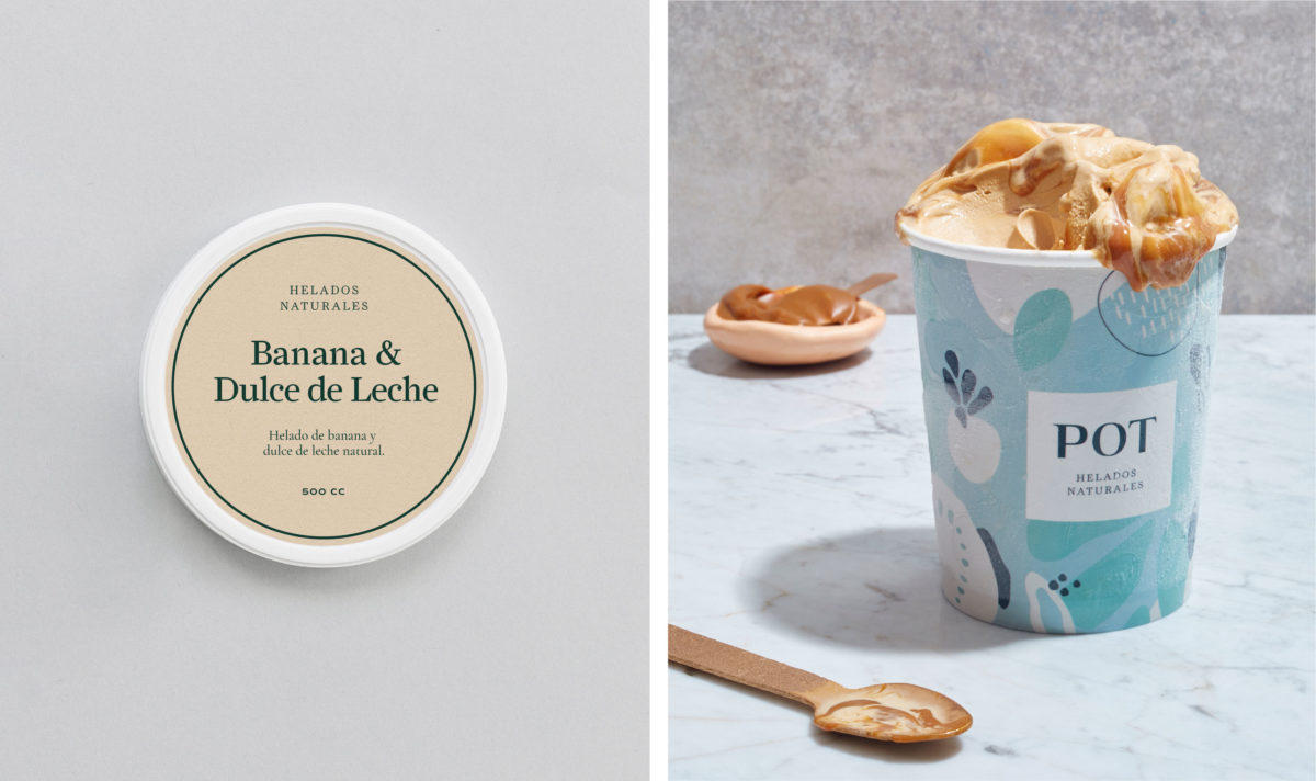
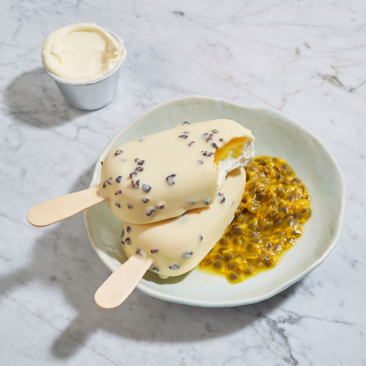
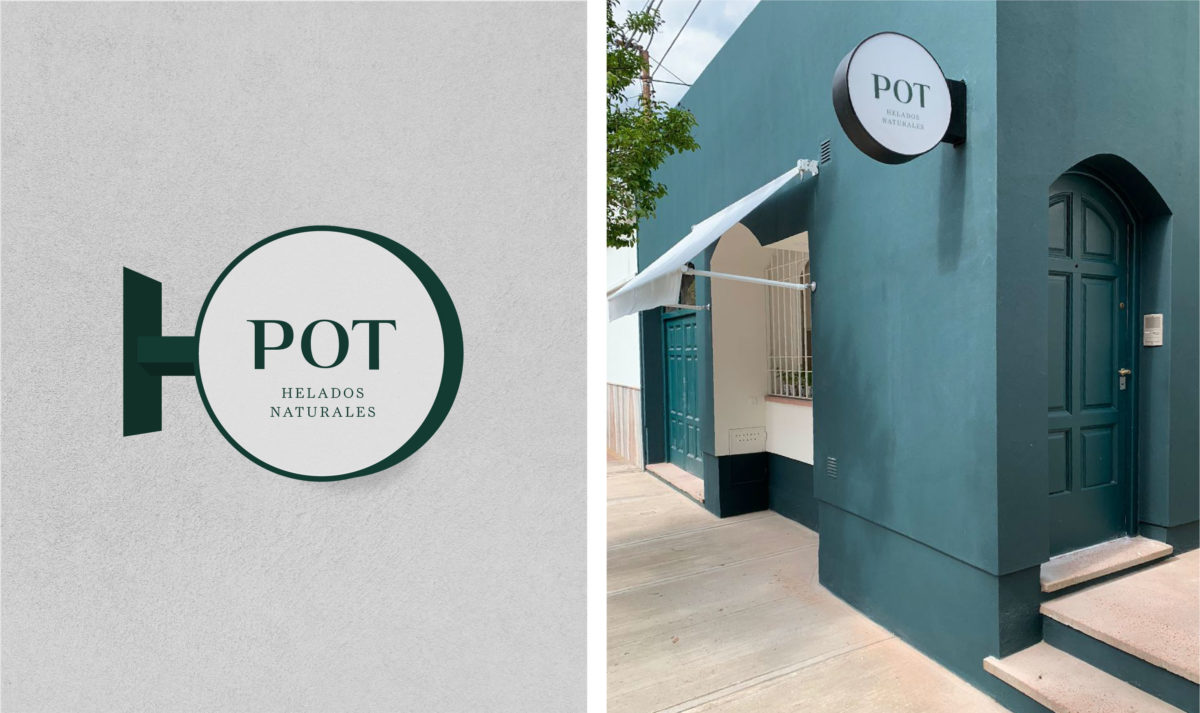
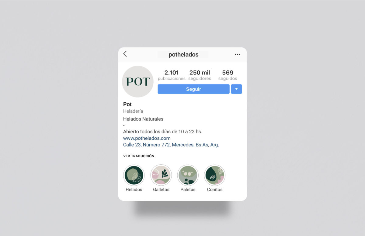
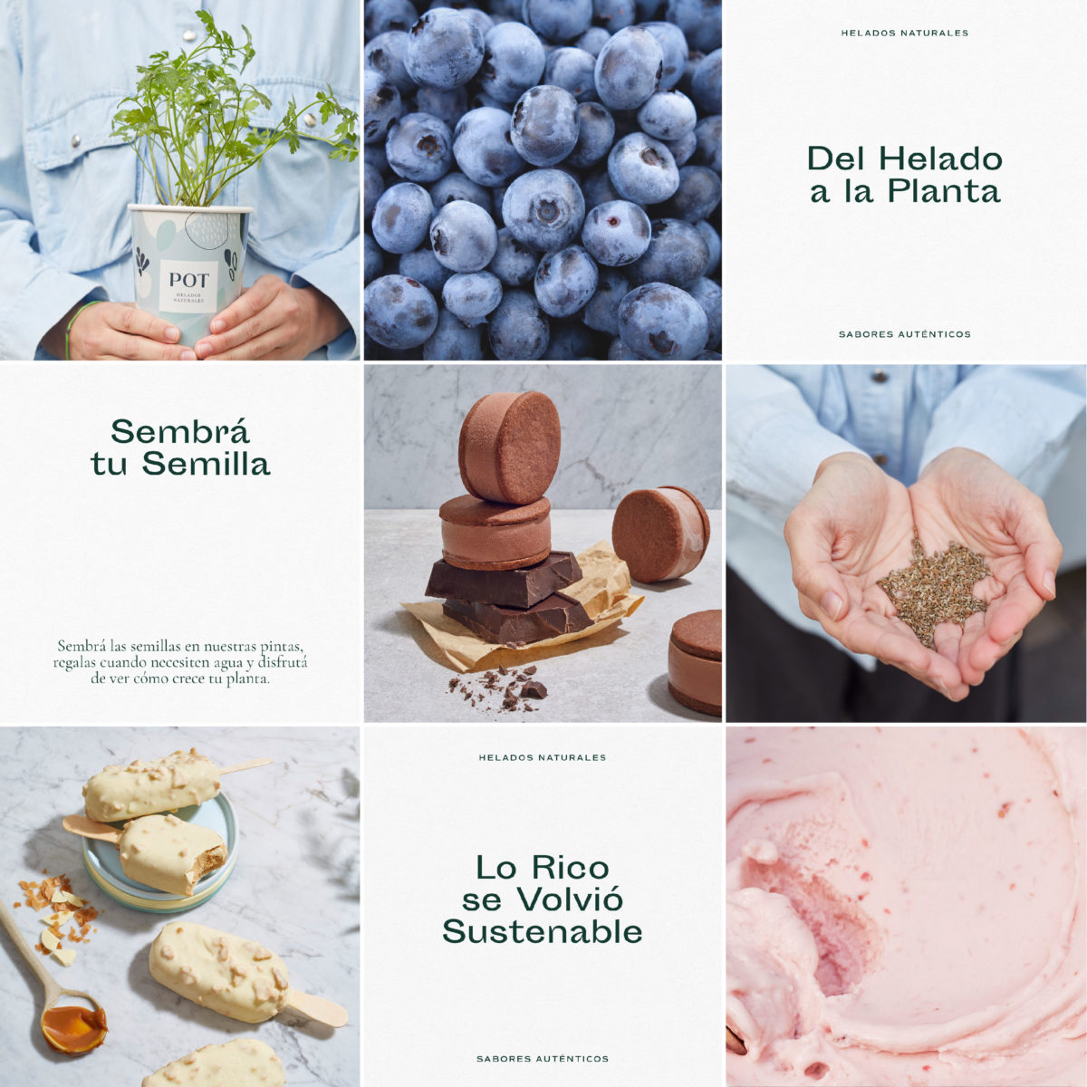
We’ve seen this trend before; amorphous, organic, and vaguely fruit-shaped blobs. It’s a pretty popular design device these days, typically used as a pattern or background texture for a brand that wants to say ‘oh we’re very health-conscious but we’re still fun’. Pot is no exception in its use of this device. Where it is different is in the tone in which the device is used. Normally, you see bright, rambunctious color used in these kinds of patterns. Pot focuses instead on calmer, muted tones of blues and greens. The pattern here acts as a backdrop for more classicly-inspired typography and layouts. Paired with gorgeous, softly lit product photography and the amorphous blobs we’ve seen time and time again feel new again.
Pot Natural Ice Cream Branding & Packaging Design by Estudio Nuar.
