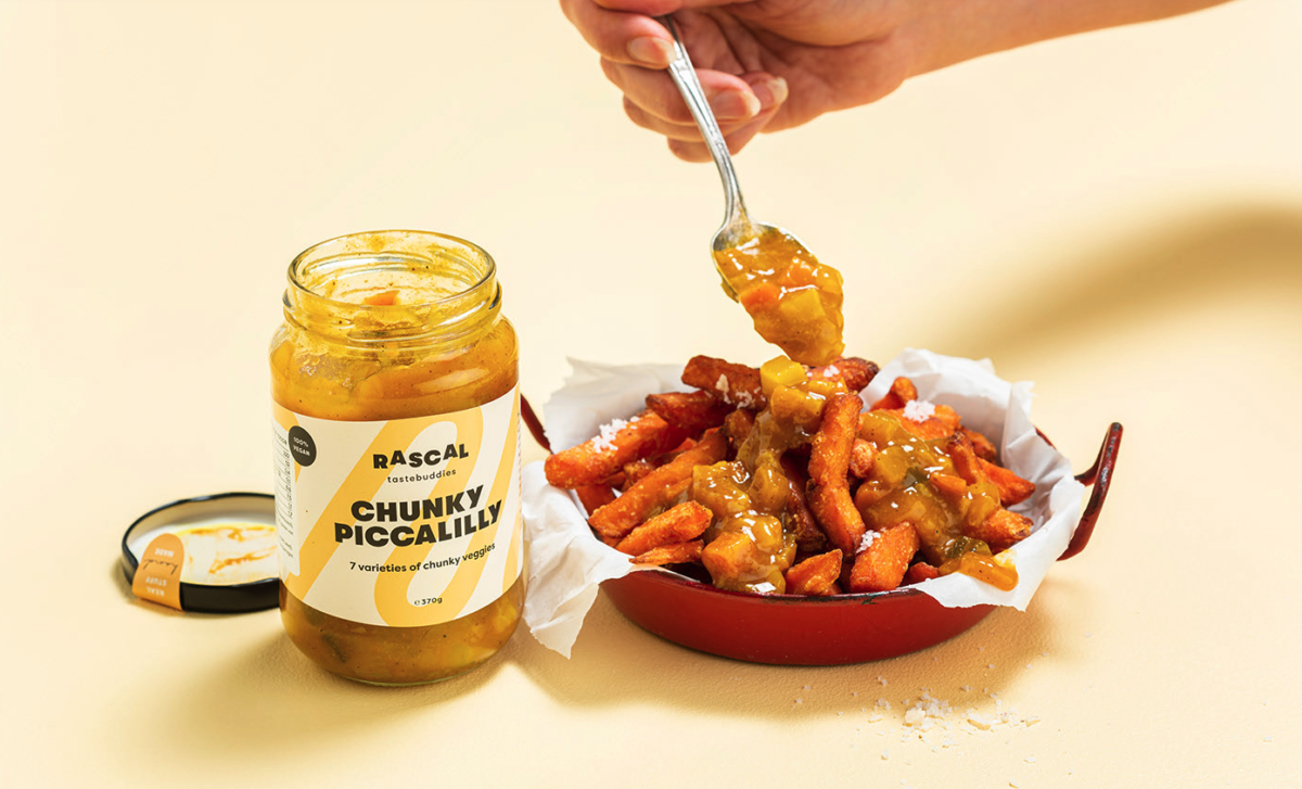
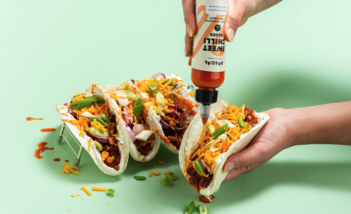
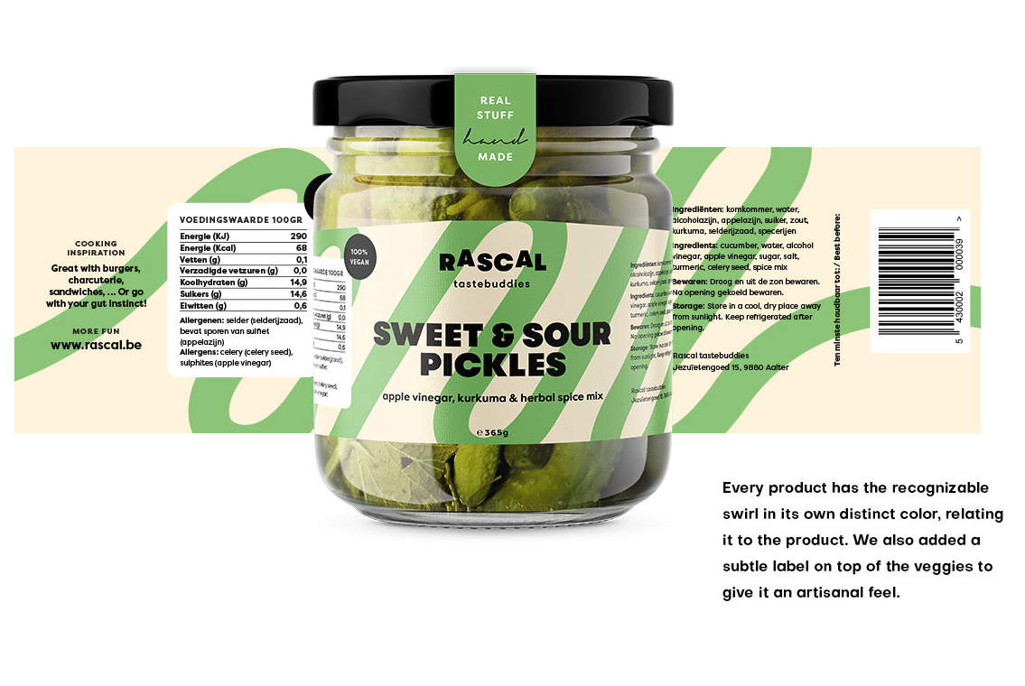
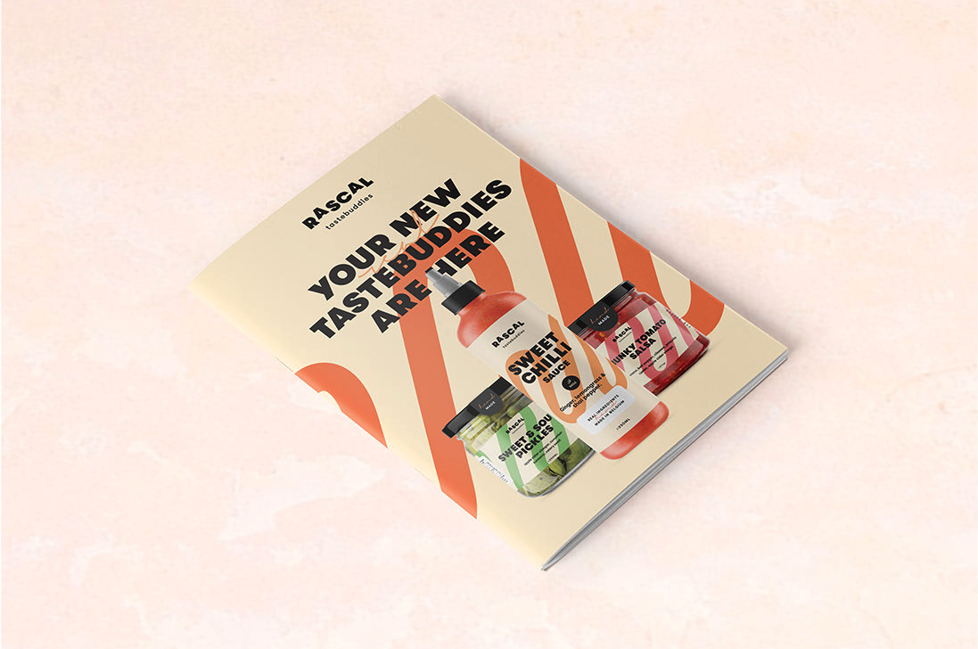
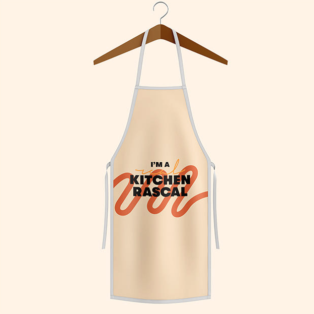
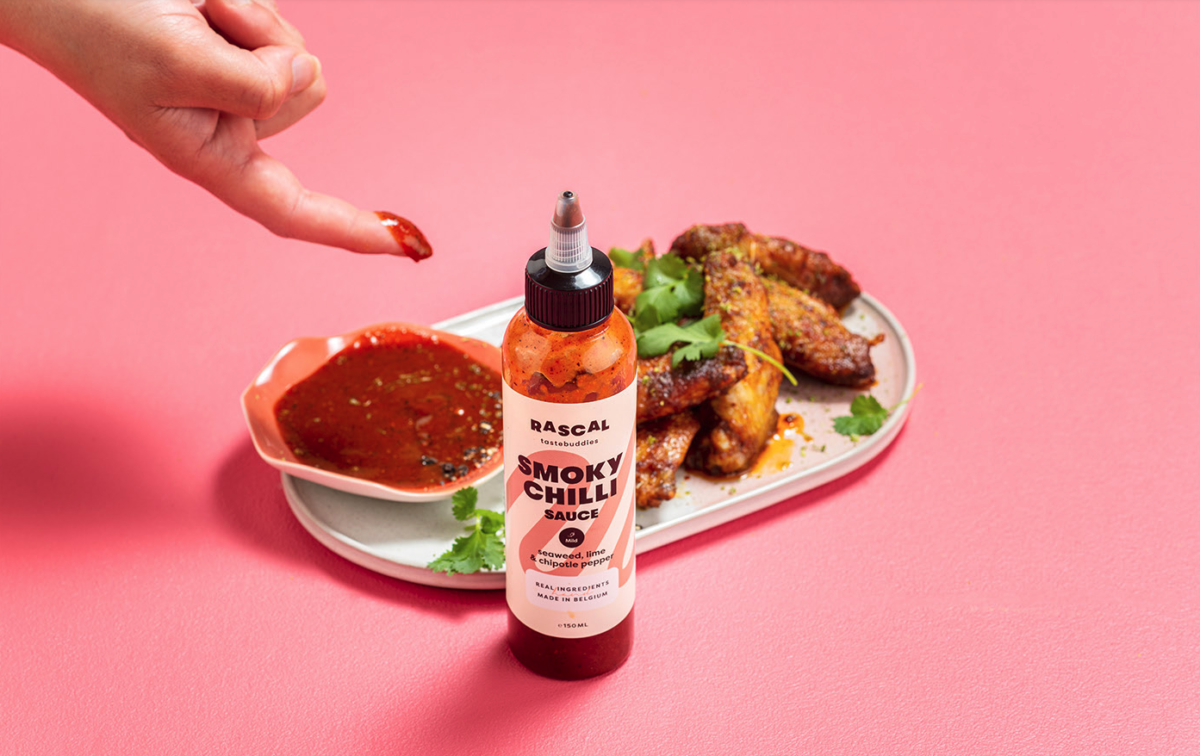
We absolutely love when a brand can identify and coin a universal truth and apply it somehow to their identity. Few things are as universal as people ‘drawing’ swirls and wavy lines with sauces on their food or plates. Yes, you know exactly what we are talking about, and that perhaps is our favorite thing about this brand, they were able to see that behavior and do something fun to bring it to their branding. Rascal, is a handmade veggie dips and chili sauces from Belgium. This brand as its name points to, is cheeky, humorous, and clever. Using the swirl as a background pattern and juxtaposing it with a mix of a modern and bold typeface and a hand script font, it takes the playfulness of this brand across all the packaging and touchpoints of the brand. We think the combination of quirkiness and hand-craftiness makes this product quite unique and it stands out on the shelves and next to its competitors.
Rascal Branding by Ollie
