Royale Bakery Branding by Nero

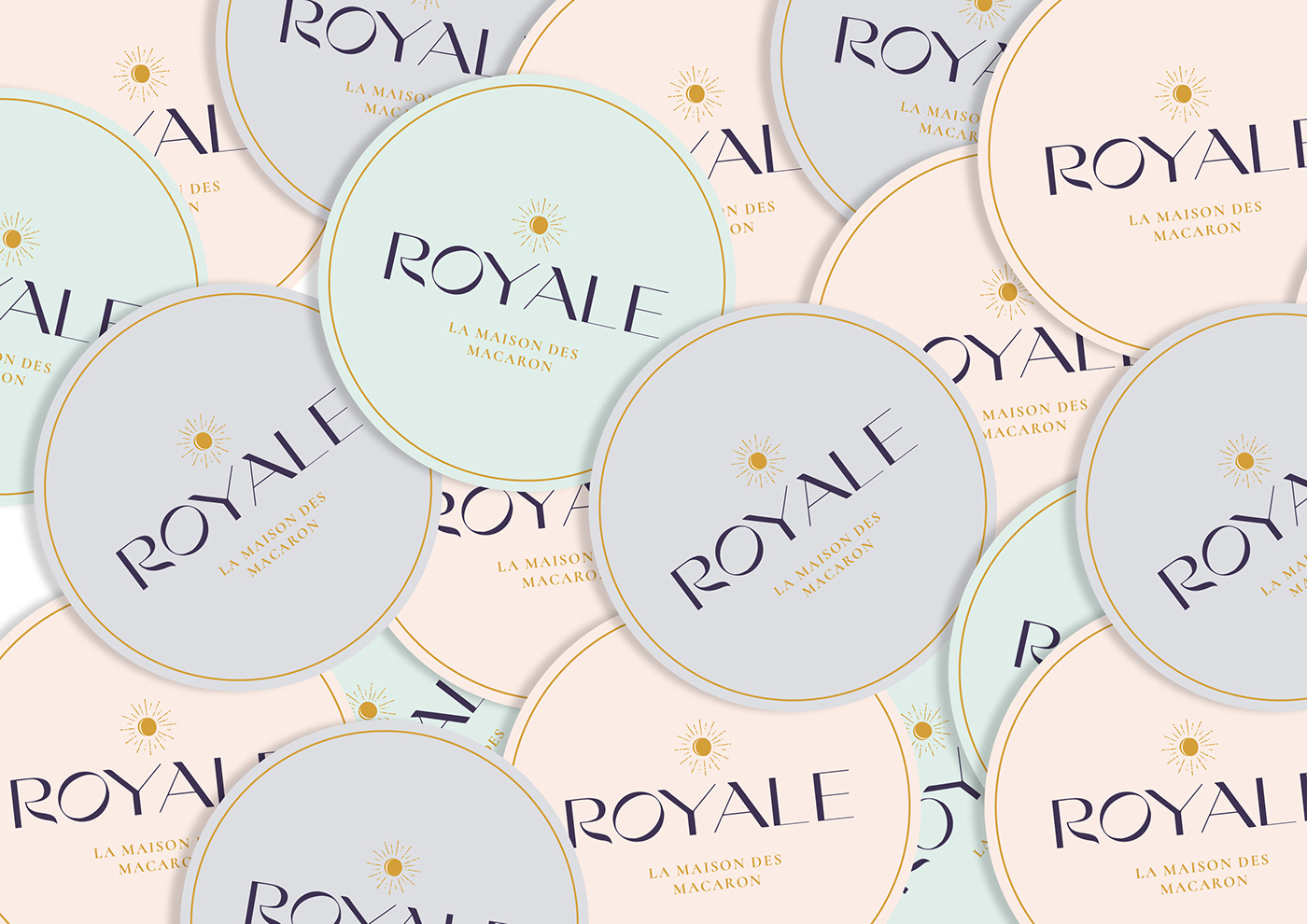
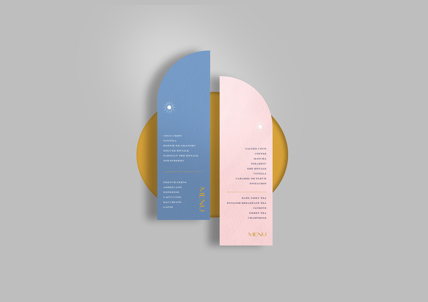
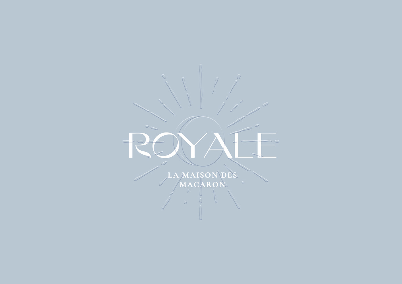
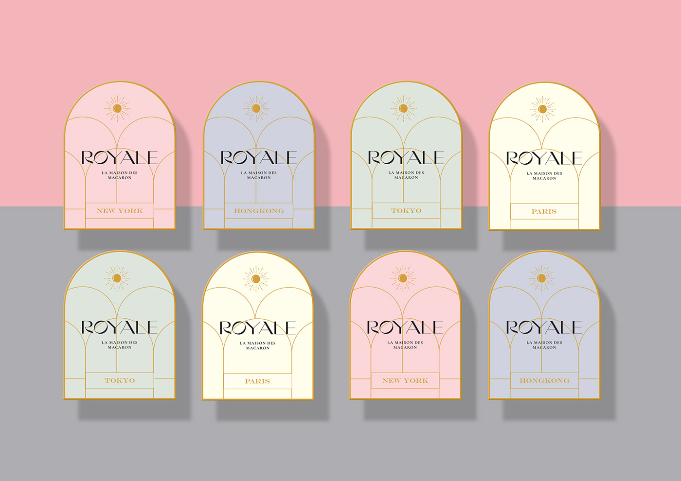
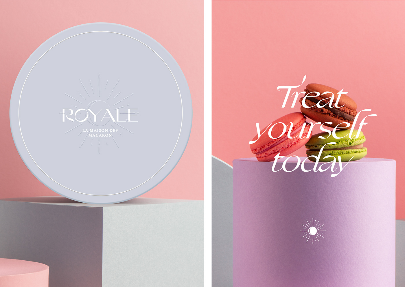
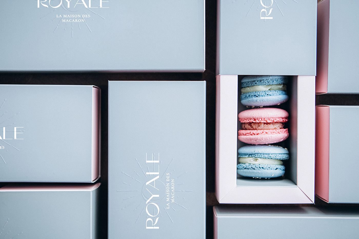
We love when a brand personality is reflected on every single detail, from naming to finishes on print. This is the case for Royale, everything about this brand talks about sophistication and royalty. Inspired by the traditional Parisian sweets and art deco movement, the color palette, brand identity, and packaging resemble this classic and sophisticated approach while at the same time remaining modern and minimal. This elegant brand identity is elevated even more through the use of different paper stock selection and different, subtle yet meaningful, details made with embossed patterns and icons.

Royale Branding by Nero

French cookies of different colors are packed in rectangular packages. Copy space. Macaroons copy space; Shutterstock ID 1724557066; Purchase Order: –

The Forktales Podcast™: Interviews with restaurant industry leaders and visionaries

Restaurant and advertising industry headlines and thinking

Reviews of restaurant experiences from around the globe 

Reviews of our favorite design, business, & restaurant books

Our favorite typography and fonts

Inspiration in your inbox

Get the latest inspiration in your inbox every Monday morning, for FREE!

"*" indicates required fields

This field is for validation purposes and should be left unchanged.

Delicious Bits in your Inbox!

Get the latest and greatest content delivered to your inbox for free!

"*" indicates required fields

This field is for validation purposes and should be left unchanged.