Mama Bear Preserves Branding & Packaging by Turtle and Hare

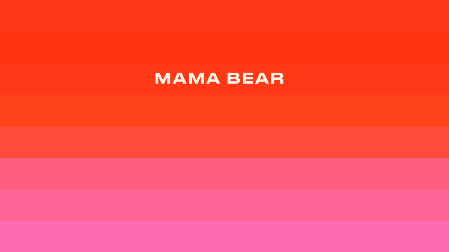
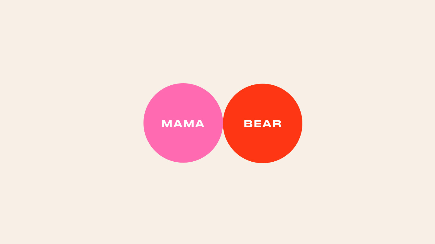
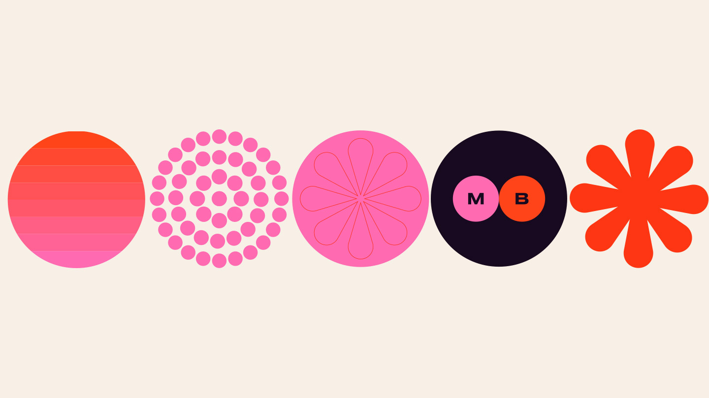
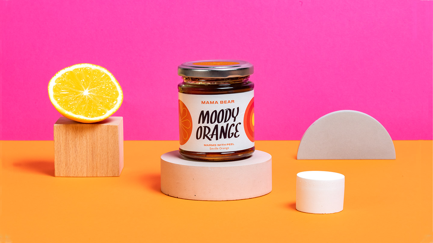
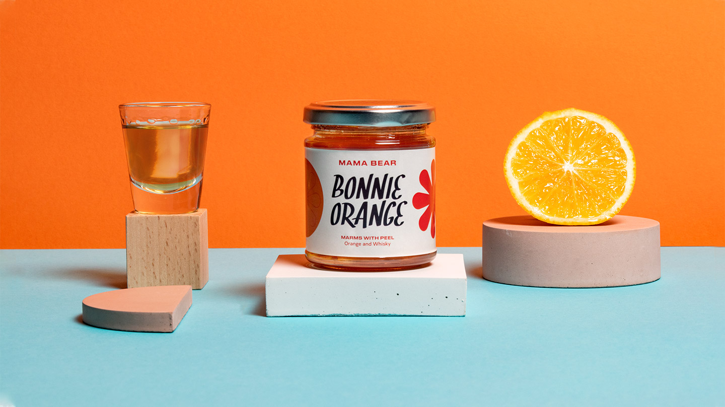
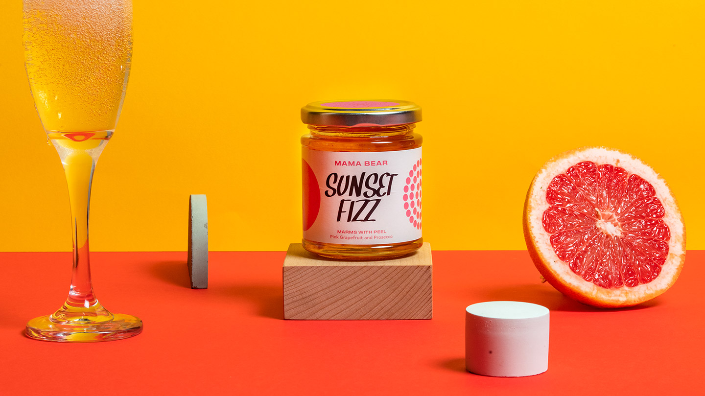
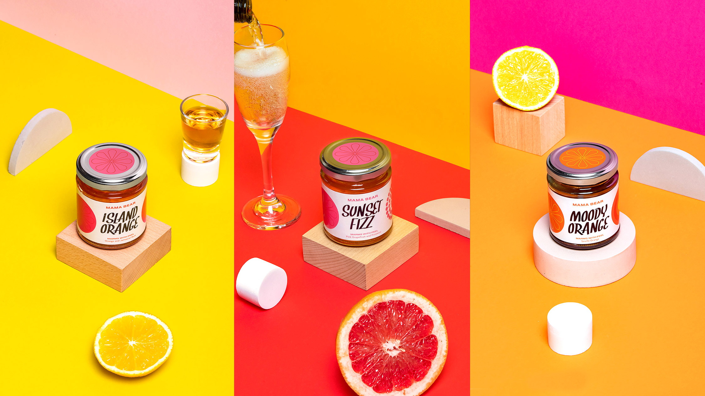
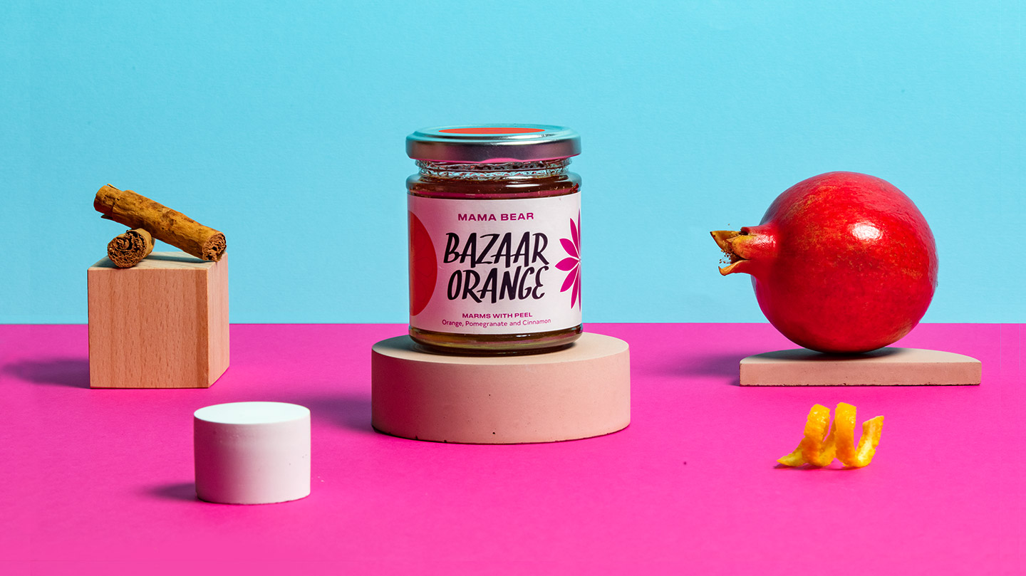
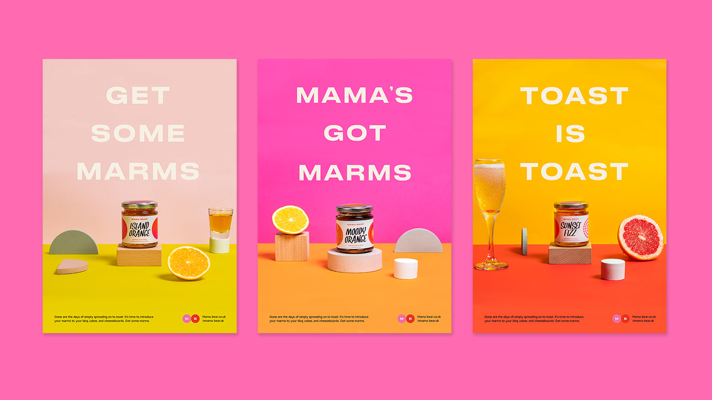
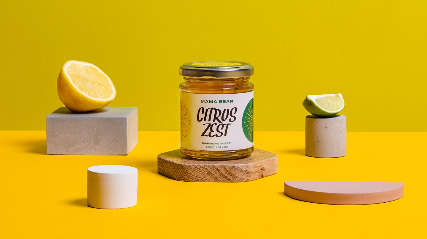
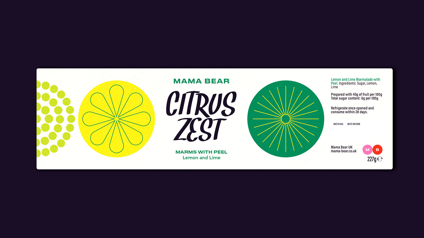
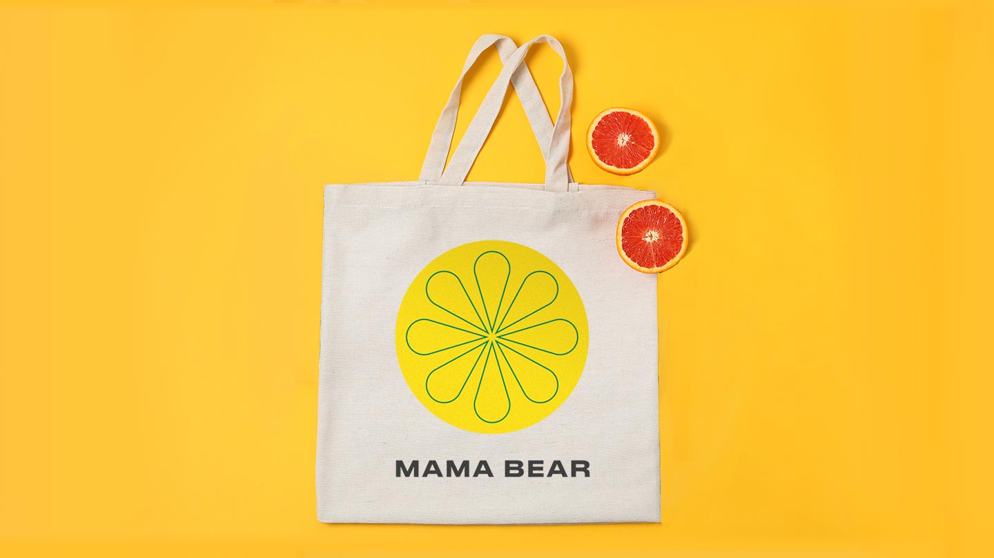
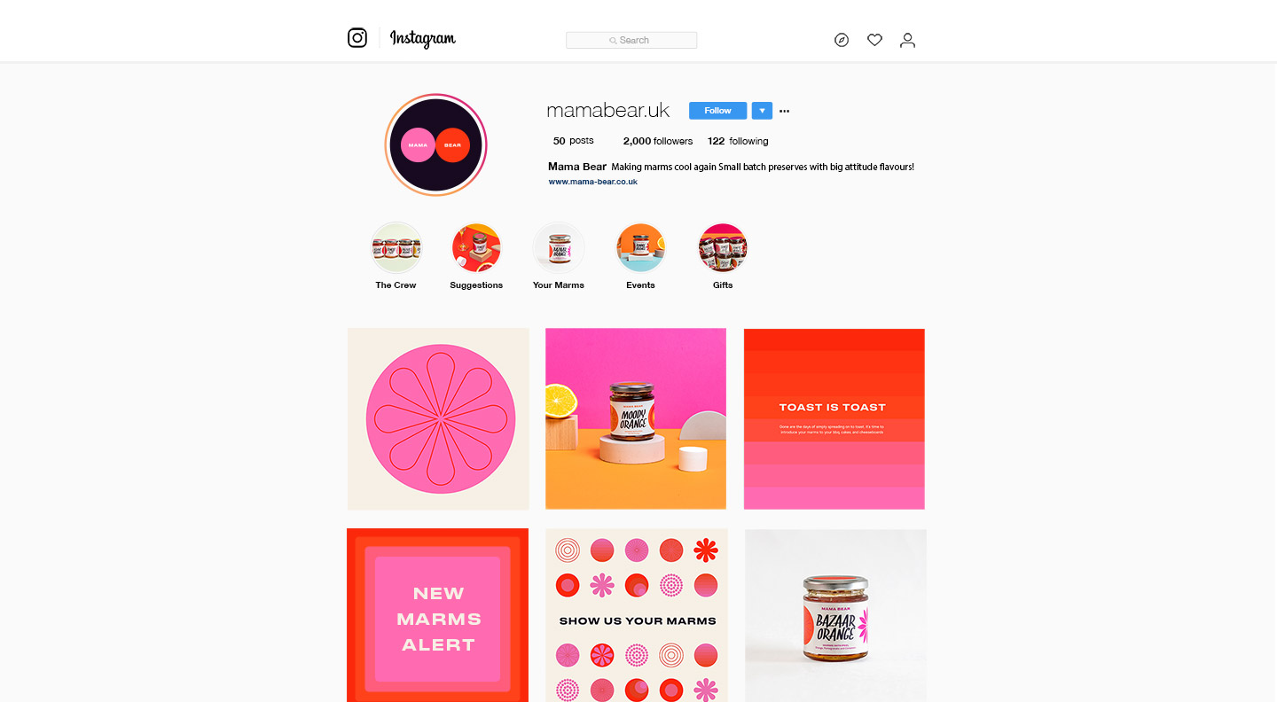
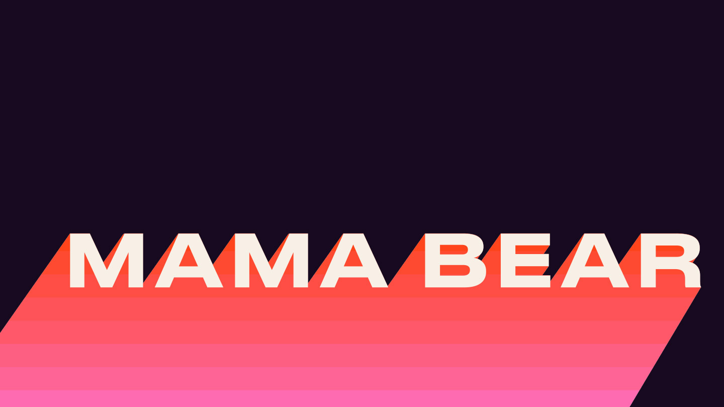
Mama Bear is a line of preserves that hopes to turn the jam industry upside down. Hoping to take a trendier approach that appealed to amateur foodies and professional chefs. Pairing a punchy, contemporary color palette with shapes and patterns inspired by mid-century design. The packaging design was kept simple and bold to stand out on the shelf. The use of handwritten typography alludes to the small-batch origins of the company. Each individual flavor stands out on its own with a bespoke color palette and illustration suite, but still works together cohesively as a brand overall.

Mama Bear Preserves Branding & Packaging by Turtle and Hare.

The Forktales Podcast™: Interviews with restaurant industry leaders and visionaries

Restaurant and advertising industry headlines and thinking

Reviews of restaurant experiences from around the globe 

Reviews of our favorite design, business, & restaurant books

Our favorite typography and fonts

Inspiration in your inbox

Get the latest inspiration in your inbox every Monday morning, for FREE!

"*" indicates required fields

This field is for validation purposes and should be left unchanged.

Delicious Bits in your Inbox!

Get the latest and greatest content delivered to your inbox for free!

"*" indicates required fields

This field is for validation purposes and should be left unchanged.